A Survey of Totschläger: a saintslayer’s songbook by Abigor. Chapter II, part 2: design, type, typography
The Old Conception of Black MetalSuperscripts⁶⁶⁶ explained, translated, validated → https://telegra.ph/footnotes-and-glossary-totschlaeger-chapter-II-03-09 ← there you may as well find a glossary with the words marked bold in the main text.
This is the second part of the design review. Read the first part here — https://telegra.ph/Abigor-Totschlaeger-design-ekphrasis-01-21
The booklet design
Everyone […] will find the lyrics printed in a lavish 20 page booklet…— says the press-release.
Twenty pages aren’t common in printed matter. A common number is divisible by sixteen or, at least, eight. Technically the saintslayer’s songbook consists of sixteen pages printed on Munken Pure Rough 150 gsm, staple-bound with a cover (which adds four pages) printed on 300 gsm, same Munken Pure Rough.
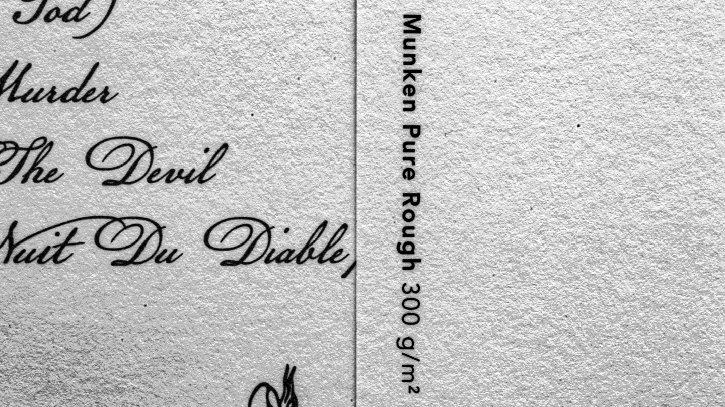
Unluckily, the thickness of chosen paper and especially staple-binding it (the cheapest binding option, by the way) with a sheet of 300 gsm paper doesn’t allow the booklet to stay properly closed. The upwarp next to the binding edge doesn’t go even in two years after binding.
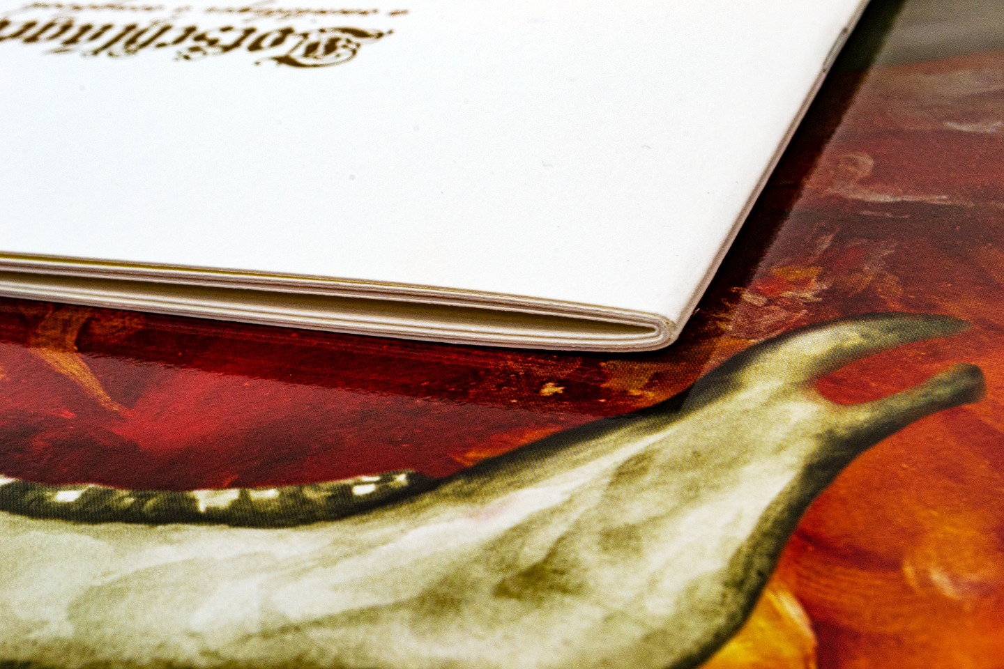
The binding machine did not manage to bind and cut the front edge properly because the paper in the block is too thick and because papers of different weight were bound together. This is a common problem, but the printers just as designers of black metal i.e. normal people in general are lazy, and often need to be kicked to do their job right.

So, chances are high that the fake cover was added to the booklet because the chosen layout didn’t allow the designers to fit everything on sixteen pages, while printing twenty pages is always complicated for the printers and creates so much waste that it’s easier to print a separate cover sheet and to bind everything together. The truth is the booklet did not have to look that particular way exclusively, and could be designed on sixteen pages without the fake cover, making it a plain octavo. Also, the same Munken Pure Rough paper but of 120 gsm weight would work better for the whole booklet, cost cheaper, while securing the demanded lavishness.
Many typographic projects begin with the necessity of selecting dimensions of the page. The page format of Totschläger booklet is a square with 210 mm side. But since Munken Pure Rough is supplied in B1+ size sheets (72×102 mm), for this print sheet the 215×215 mm book block size is the optimal one among the square formats — it creates minimum waste. Paper is expensive, and Munken Pure Rough is not at all cheap. Unless there was any metaphysical necessity to stick relevant to the DIN A formats (210 mm is the short side of A4), the choice of 210×210 mm size is unclear. Another argument in favor of the 215×215 mm format is the fact that the largest square within an LP disc, given its diameter is twelve inches, has the size of 215.53 mm — thus choosing 215×215 mm would support the coherence of formats and sizes.
Supposedly, a square format was chosen because of the five illustrations in the booklet which have a landscape (horizontal) orientation. The square, “this pure, neutral form is at least good because it doesn’t play up to illustrations of any single proportion.”²⁷
But there’s a counter-opinion:
To escape the dilemma posed by horizontal pictures, nearly square book shapes have recently been used, a move that has to be opposed. Truly monstrous books have been produced that give every bibliophile the creeps.²⁸
— proven by the fact that the square (double square when open) is an unhandy format, “it is difficult for an unsupported hand to master a square book — even more difficult than to hold the ugly A5 format.”²⁹ It is true: the album booklet suggests reading from a table surface, and is not convenient to hold in hands.
But then which listener has a reading and writing table separating him from the stereo? I guess none. A coffee table possible, but it’s absolutely not for reading, simply because it’s too low.
Thus, since (most probably) the illustrations were created exclusively for the album, the luckier booklet design steps could have been:
- estimate the amount of text and define the number of necessary illustrations;
- plan the most equitable layout of texts and define spaces for illustrations — in a handy page format;
- forward the plan to the illustrator, and illustrate the booklet according to the plan.
Marginal drawings by Albrecht Dürer.
https://www.digitale-sammlungen.de/en/view/bsb00087482?page=109
These simple steps would help avoid the bulky square format, create more coherence between the text and the illustrations and the page format, and save the paper and money.
Back in 2014 the booklet of Leytmotif Luzifer was printed in four colors (CMYK) even though it needed only one.
Luckily, the lesson was learned, and this time they used one color, a “golden ink” like Pantone™ Rich Gold or Cream Gold. The choice may have been a reference to the design of Nachthymnen; otherwise, neither in the songs, nor anywhere else relating to the concept I found any links to gold, or to any scriptures in it. Or was it about lavishness? (Note: golden metallic inks on uncoated papers appear bronze-brownish.)
An act of Lavish Laziness is copy-pasting the layout from one medium right into another. (Imagine using a CD mastering for vinyl — TT won’t appreciate that.) The booklets for the CD and the LP are identical, the former being an 83% downscale of the latter, or, if the succession was the opposite, the LP booklet is an upscale of the CD booklet at 120%. Let’s demystify the secret: two different media with different capacities shall always be approached individually. There exist no identical typographic challenges, something is always different.
“The normal reading distance separating the eye from the brochure, book or newspaper is 30–35 cm. At this distance the text should be agreeable to read.”³⁰ The listener holds the CD and LP booklets at the same distance from the eyes. Are the owners of the CDs supposed to put higher strain on their eyes? Or was it a part of some distribution plan: CDs — to Laos, vinyls — to The Netherlands?
Illustrations
Even though the illustrations seem exclusive, their creation wasn’t a part of a coherent design process. Their formats tend to 1:√2 proportion (except the one opposite of “Tartaros Tides” lyrics), which is the DIN A format. Highly likely they were created on A5 or A4 paper which rarely is a deliberate choice, but usually is following — mostly unconsciously — the industrial standard. In the world of industrial standards stepping away from the hermaphrodite³⁰ DIN A proportion is so rare that it’s almost a heroic act — it shall be performed more often.
Downscaling the illustrations in Leytmotif Luzifer did not bring out any problems with pairing them with text, due to their nature: the illustrations were hand-drawn, and the text was set in a font. But in Totschläger both illustrations and writing have a freehand nature, though originating from using different tools. The unconformity of their strokes hits the eye, and could be perceived as another argument in favor of asking the illustrator to create the illustrations and copy the texts, maybe even with a similar (if not the same) tool, and even in the chosen booklet size.
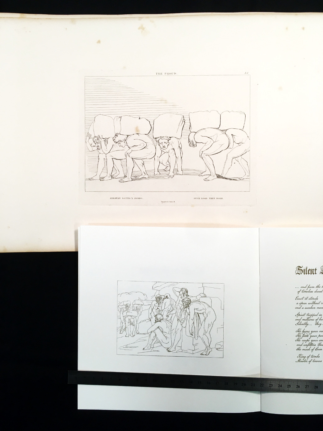
The reader knows from one of my past publications — and thanks to Abriel Carpio — that the illustrations were made after the engravings made by Thomas Piroli after compositions by John Flaxman. Here are a few photographs of the original engravings.
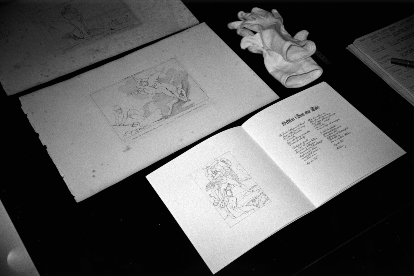
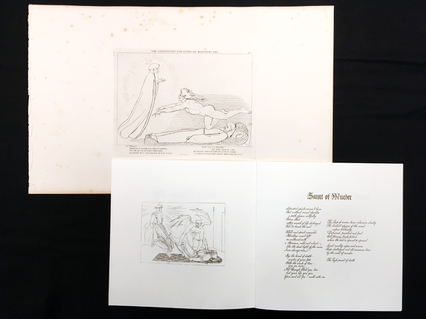
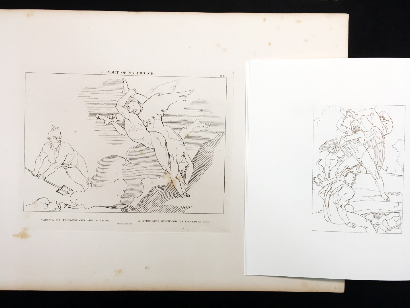
The proportion of the images in the original engravings tends to the same 1:√2 which was much-much more rare back in 1807 when they were published.
Proof-reading
Readability is the domain of authors and editors, legibility that of type designers, typographers and graphic designers.³² The texts in the album received no proper preliminary legibility proofreading. Usually for a work of the scope of Totschläger a good typographer may suffice, as all typographers have experience as readers, and all the better typographers are known as conscious and inquisitive ones.
The lyrics are clearly written, only one spelling mistake caught my eye, which is errect instead of erect in “Silent Towers, Screaming Tombs”. Possibly a few grammar mistakes are present, but it makes no sense to analyze them post factum.
The title “The Saint Of Murder” from the songlists turns inside the booklet into just “Saint of Murder” without the preceding article The, with a lower-case o, while “Flood Of Wrath” retains the upper-case O. Critically unimportant, but obviously incoherent.
Speaking of preliminary legibility proof-reading — none was performed. Let’s point out a few basic mistakes.
There is an easy way to test if a typographer or editor has ever read a single specialized book: just take a look at how he uses the apostrophe, quotes, and dashes. If in one typographic work the usage of the three is correct, then the guy is highly likely to have at least a basic curiosity for the trade. Yes, you guess it right where I’m leading to.
A perfectly annoying mistake in most of Abigor albums (and common among the preys of German keyboard layout) is the use of acute accent (TT´s) instead of the apostrophe (TT’s). I say most albums and not all of them because somehow in Nachthymnen the band used the grave accent (TT`s). How come? — I don’t know. But that was the ’90s, the dark medieval times before the Photoshop Wizards plague, and was absolutely excusable by the general context.
A technical intermezzo: It would be too long to explain here how it happened that most of typographers around the world (including black magic practitioners) do not know for sure how an apostrophe looks like, and cannot distinguish between the dashes. Long story short, the reason is the typewriter — they were limited in keys, so substitutes were used. A hyphen (-) was used for the hyphen and for all the dashes: the en-dash (–), the em-dash (—), the minus (−). Sometimes a double-hyphen was used for the em-dash (--). A single dumb quote (') was invented and substituted the apostrophe (’), the prime (′) and the single-quote (’). It was used to type the double quotes (“ ”), the double-prime (″) etc, although a dumb double-quote (") was also invented for those purposes and was used, too. Later these solutions (nonexistent in typography) moved to computers because in early days the digital encodings were also too limited in symbols. Typographers never considered those symbols as any sort of any substitution, and they were never found in books until, roughly, 1985 when the personal computers started spreading. Distinguishing between these symbols is the ABC-level knowledge for any designer. And it’s probably impossible to find a specialized book which skips this information.
So, in our case, even though a script typeface allows a more vast area of error, it still is very clear that the designers of Totschläger are blind in their work. In the booklet we find a mix of dashes, including (suddenly, but not unexpectedly!) a tilde (~) which is used instead of an em-dash — and only in two songs lyrics: “Guiding…” and “Scarlet Suite…” Those guys are really special.
Confusing the acute accent and the apostrophe is the global result of the typewriter story. Black metal designers tend to be as conscious as normal office workers. They read for the joy of contents, and type to meet the deadlines. They are blind to what’s being fed to them, and their hearts are full of trust. This blindness is like confusing letters b and d, or a violin and a piano, “Why bother? Both are made of wood and strings after all.”
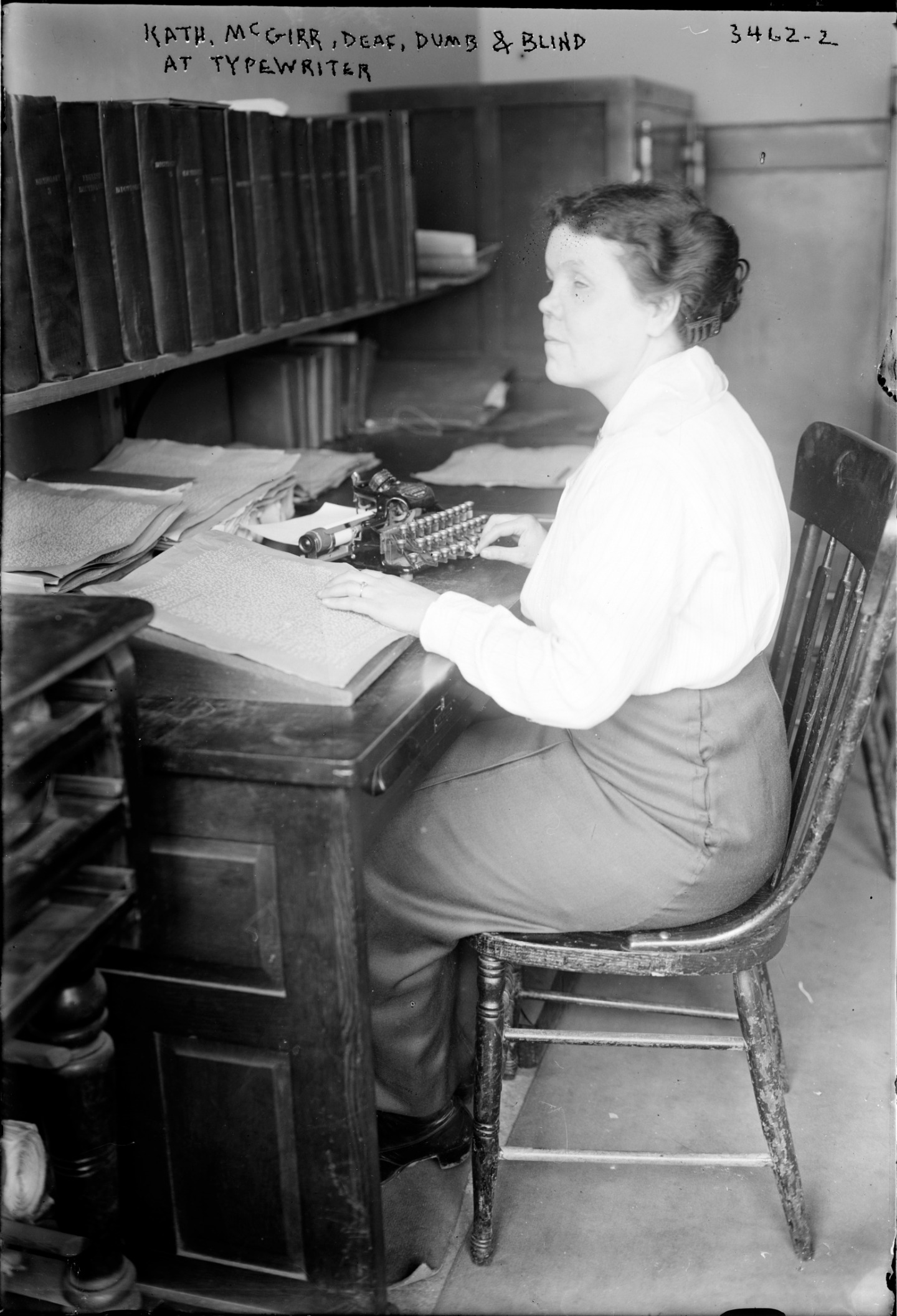
Source — https://www.loc.gov/resource/ggbain.19021/
Once again, “everything has a certain task.” Punctuation is less important in a web fanzine or in social media, but when we buy official releases for money, we have all the rights to demand better treatment. An acute accent instead of an apostrophe in a music album, rephrasing the press-release, puts every self-declared it’s-black-metal-there-are-no-rules designer right into the kindergarten. From a collective of thinkers who distinguish between dozens of demons and sell their art for money one may expect enough expertise to distinguish between a few punctuation marks, too.
But we see this error in Abigor albums, in all their posts on social media, in most of their interviews, including the latest one in No Contact zine — a zine published by a designer with a high status in the scene, a zine so much focused on design aesthetics. It’s all around, from sold-out pop stars to the undergroundest of the underground, budgets play no role. It’s clear: one hand is enough to count all the designers in the scene who have consciously read on typesetting and digested what they’d read.
“Chaos is right here and unfolds before our blinded eye.”
Setting the album title
The real apostrophe appears only twice in the whole design: in the quote from “Orkblut (Sieg oder Tod)” inside the gatefold, and in the subtitle of the album on the front cover (duplicated on the “first page” of the booklet).
Now that the designs of both primary typefaces are from an early date, another fair question arises: would it benefit the album appearance if the designers chose to preserve the long s in the whole design, including the lyrics?
The typesetting of the album title has errors. Three (!) errors in one word, to be precise.
First, German typesetting in Fraktur obliges to use the long s ( ſ ). No exceptions!
Setting in blackletter, it is unacceptable to use the round s where the long s ( ſ ) shall be, or where the ligatures ſi, ſſ, ß, ſt shall be. This barbarism is spreading right in front of us, and we shall resist. Every good type designer and graphic artist should strictly ensure that he does not violate this irrefutable rule. It is invalid to refer to France, England and America where they use the round s exclusively when setting in Textur. Those countries aren’t used to blackletter anymore and cannot even read it. (Tschichold³³)
Examples of typesetting in Fraktur which come from England and the USA unfortunately display the complete disappearance of the long s. But such examples should not be accepted as any reason for tolerance towards these mistakes. This round-s-Kobold in Fraktur is particularly common on shop labels, book jackets and on television, and can only be taken as a sign of the absence of knowledge of Fraktur typesetting.³⁴ Setting in blackletter, ſ (the long s) is indispensable. (Kapr³⁵)
This is all valid, Fraktur is just that script in which the long s never went out of use, especially in German typesetting. But if the band had a necessity for the album to look more international then again it would be an argument for having chosen a more current-day blackletter typeface, not a Fraktur which is essentially German, and without so much of the cultural dust of the past. And title the album not in German, but in English — The Killer.
Second, setting in Fraktur requires the use of ligatures. No exceptions!
The use of ligatures is vital [essential, requisite].³⁶
Cöllnisch Current-Fractur doesn’t have the ſch ligature, but it has the long s and the ch ligature. They should’ve been used, just like in the old book.

Also in Österreichische Nationalbibliothek — https://onb.digital/result/109792DE
The third mistake is the wrong umlaut, as was explained earlier.
Now let’s look at the title one last time.
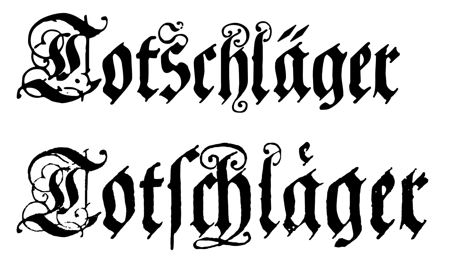
* tracing can be done better (especially of T), but not my concern this time
Der lieblos Teufel steckt im Detail.
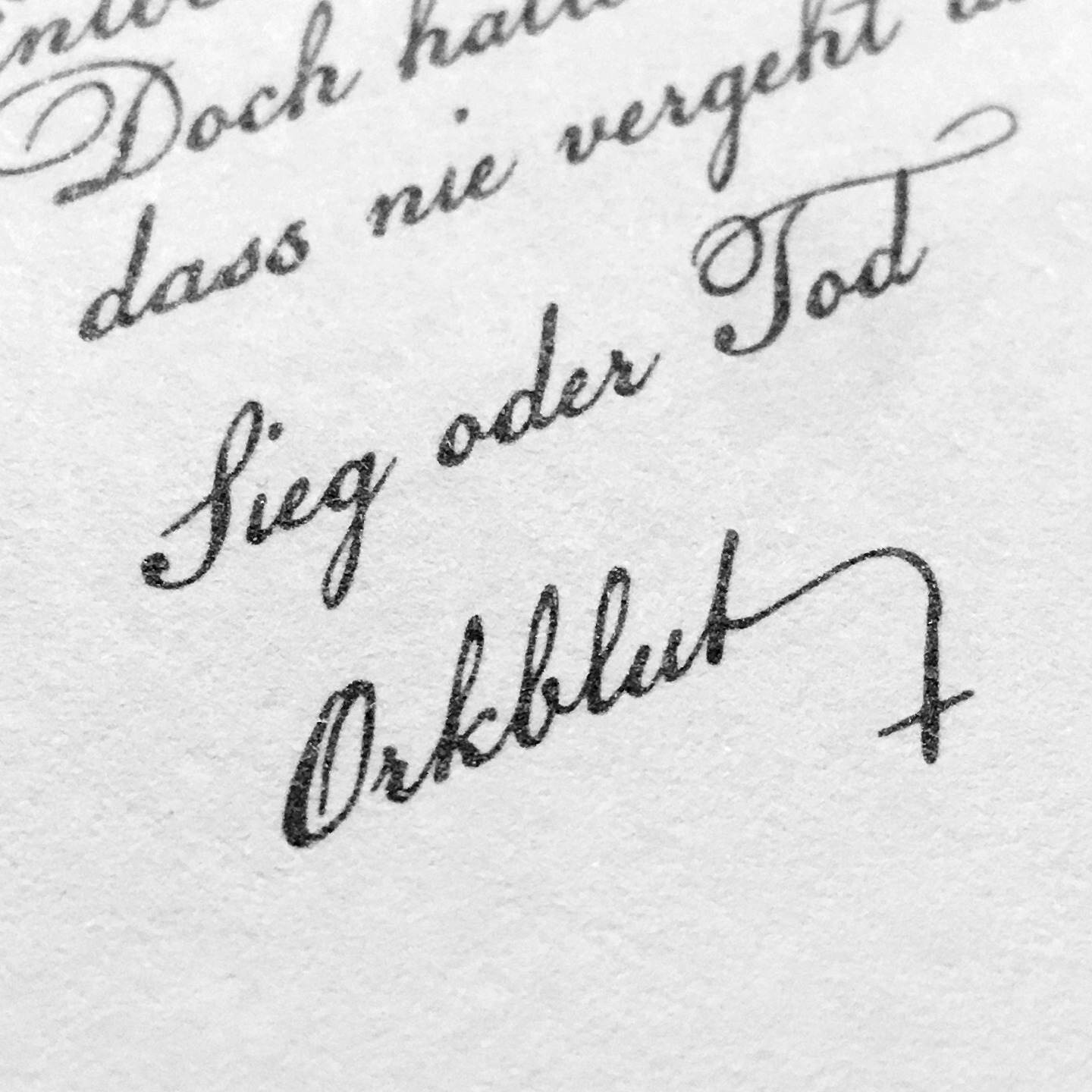
Orkblut
Exclusive to the vinyl design is the quote from “Orkblut (Sieg oder Tod)” inside the gatefold:
When all worship is done
when all candles burned down
Sacred daggers filled our
silver cups with blood — drink up!
Now it’s time to claw at knife and sword again
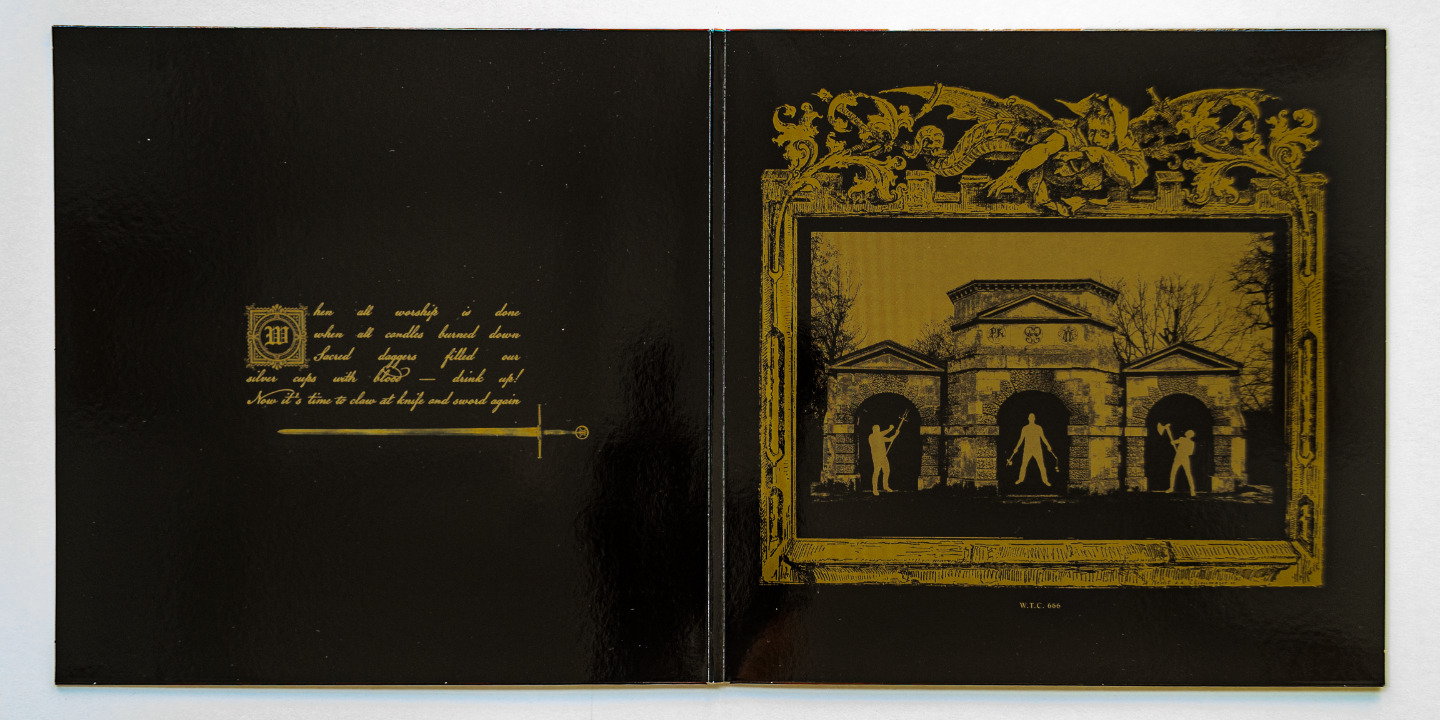
(Maybe the sequence of tenses in the first two lines is corrupt: passive voice in the present simple vs. active voice in the past simple.)
How did it escape the otherwise identical CD version design? — I don’t know.
Quoting from “Orkblut (Sieg oder Tod)” inside the gatefold links to the CD version of Leytmotif Luzifer where the word Worship was written inside the digipak.
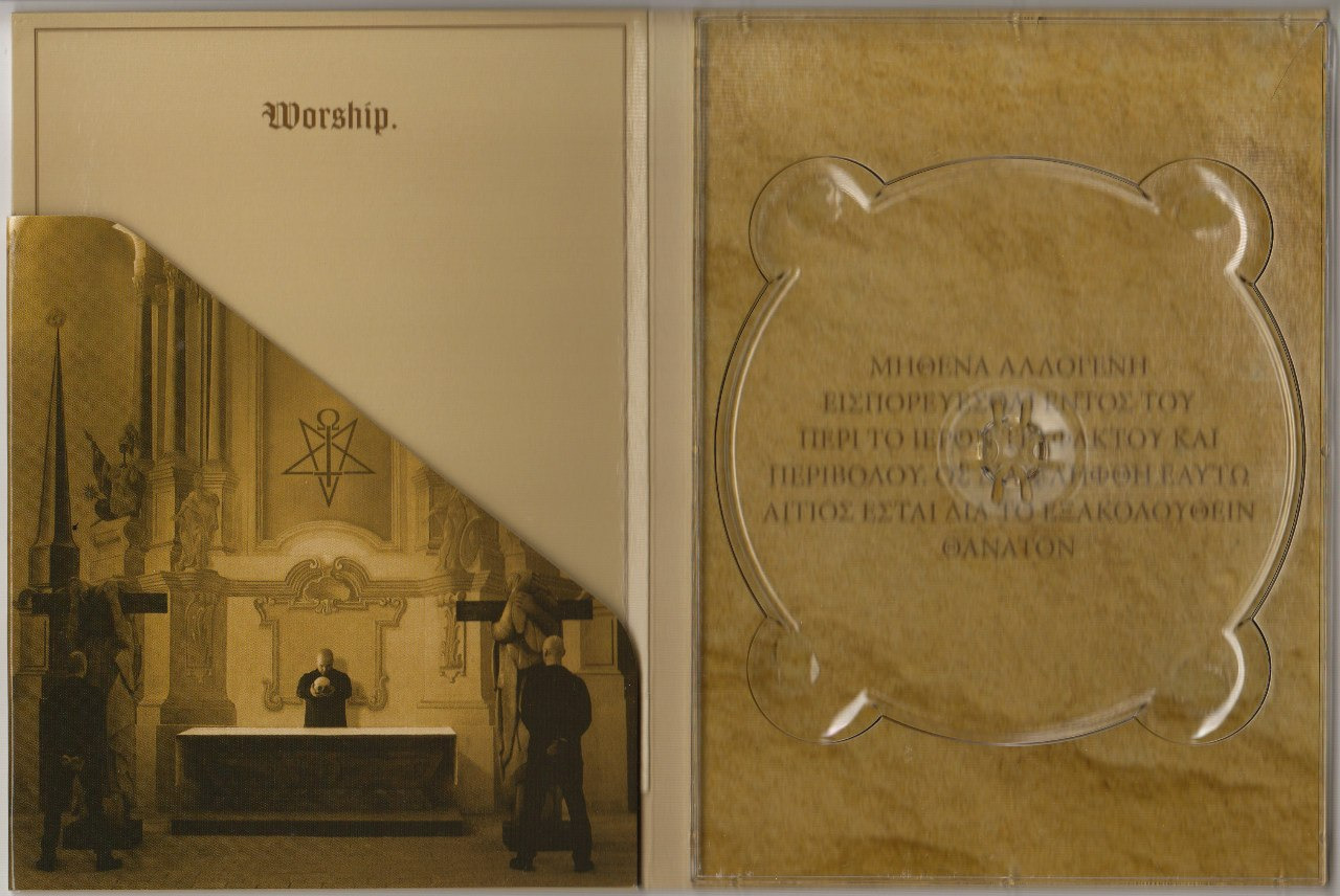
But now “the Worship is done.”
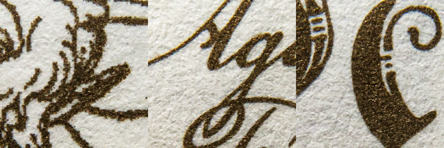
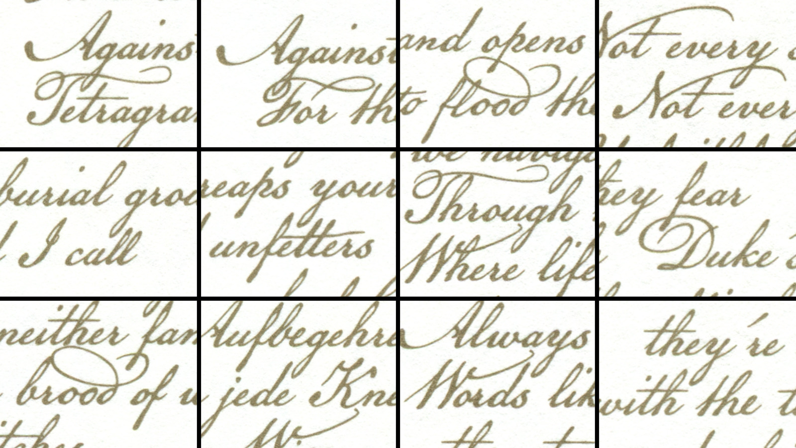
The look of the quote speaks once again for having preferred an actual handwriting to the digital script typeface. It says nobody creates the same character-forms when writing in notably different sizes. The same letter proportions in sizes twice as different, comparing to the font size in the booklet, including proportionally thicker stroke, only displays the designers’ lack of experience in conscious handwriting.

This typography is a clear homage to the album Satanized. (You think I’m fucking with you? I am not fucking with you.) If you remember that album, you may as well recall a few parts in which the guitars were playing in one tempo while the drums were punctuating in a completely different one. Here you see the same trick transferred to typography. Script faces as any other face have a rhythm, which shall not be broken. While in the case of Satanized it gave a peculiar taste to music, in the case of Totschläger typography it’s a peculiarly outrageous incompetence — full justification when setting in script type is unimaginable, because such writing is nonexistent neither among living humans, nor among demons of war. It exists only in the fucked-up minds of those who spend too much time in front of a computer display monitor — lovely children or the true office zombies.
A notable element of the design is the ornament for initials which is used in many Abigor albums’ designs. Here it is used in the setting of the discussed quote.

This decoration appeared at least as early as the Moonrise demo. It is in Verwüstung…, Orkblut, Nachthymnen designs. Then it disappears for two decades and reappears on Höllenzwang.
I don’t know where it comes from, but my guess — only a guess — is that it belongs to the American Type Founders, because they had a very similar initial among the “Electrotyped Initials” in their 1897 catalog.

Of course its fulfillment in Abigor designs is ugly — you cannot just remove the original letter and install another one from a different font. But since on one hand it is obvious even to the least experienced designer, and on the other hand it continues to reappear in the albums, then this particular ugliness must be done with a purpose. The upper-case W in the initial in the quote is from Linotype Text typeface this time.
Remember Silenius’s Kreuzweg Ost Iron Avantgarde album? The track “Der Feuersturm von Dresden” in which someone’s sampled voice speaks “…completely idiotic…” — this is what rings in my memory when I look at the typography of the quote.
Booklet typography
In the end, let’s look at what an immeasurable monster the booklet is — the errors are literally countless. The general disadvantages of setting long runs of texts in script typefaces were explained earlier, but it would be fair to point out a few specifically harmful peculiarities added by the album designers. Type designs come alive in typography. It’s like wearing clothes: on a hanger they may look nice, but only when worn do they show up well. Thus we witness the “wizards” having dressed up the album in a lavish clown suit.
The songlist — or, more correctly, the list of musical pieces, because two of the titles belong to instrumentals — is half-baked.
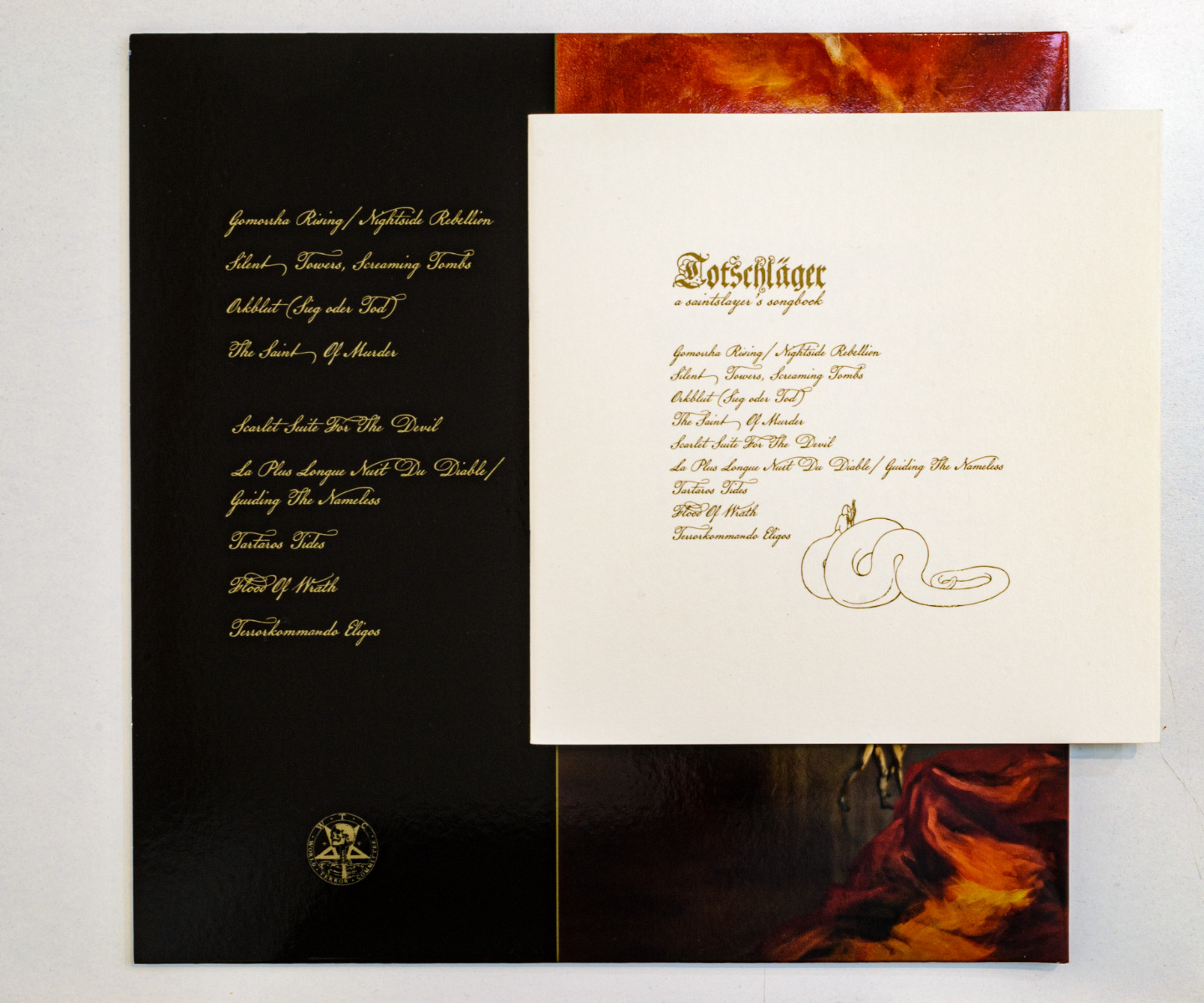
The use of the virgule (/) is questionable. Though it’s used in compound titles of tracks consisting of two pieces (an instrumental plus a song), the lyric pages mark it clearly which titles belong to actual songs. There can be no confusion matching the titles with the pieces. (If doubts are even possible, listeners shall be granted a chance to think sometimes.) Reduced interlinear space between the lines La Plus Longue Nuit Du Diable and Guiding the Nameless on the gatefold rear cover together with employing the virgule is excessive. Marking out the virgule with a space only on its right side is unbalanced (see “…Rising/_Nightside” and, in the booklet, “…Diable/_Guiding…”).
Looking at a medieval manuscript or at a Renaissance printed book (to say nothing about later books and well-written documents) we normally see the following.
- That text lines are equidistant. Often in manuscripts we may notice straight horizontal lines — like in ruled paper copybook — which helped the scribe to preserve the perfect regularity.
- When written in columns, the vertical arrangement of the lines was preserved in all columns.
- In poetry and songs the verses weren’t marked out by an empty line until, probably, the second half of the sixteenth century. (This is prone to debate if the lyrics of black metal songs are actual verses which need to be marked out by an empty line. Probably often yes, but I’m unsure if the whole A Saintslayer’s Songbook falls under such a category.)
But that was long ago (for some). Now, with the help of a powerful twenty-first century computer, designers perform such “historical reenactment.”
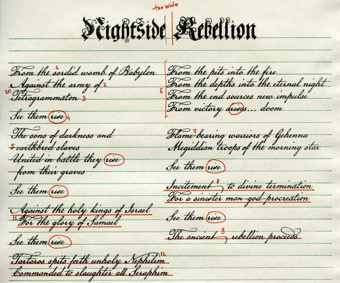
The small red numbers in the image above mark just a few of the following errors. But honestly this whole page begs to be reset.
- The aforementioned broken stroke between s and any following letter. Found twenty-one times on this page only.
- A very short word at the end of a (broken!) line — of is about to fall.
- Interlinear space suddenly increased, the line is set below the expected baseline.
- rise appears seven times on the page — each time set in exactly the same glyphs. The repetition of the is alternate ligature is strobing.
- Suddenly the line starts with an empty space — for d and f not to clash.
- The strobing clones of From.
- The hyphen is raised and kerned to e — probably to lessen the clash of g and t.
To explain nos. 8, 9, and 10, 11 it has to be said that American Scribe is designed with such a body size which preserves the distance between the lines of the US Declaration of Independence engraving, i.e. if you keep the distance between the baselines equal to the font size (e.g. 12 points size, and 12 points leading) the setting will look just as in the American document.
The Declaration is written in very long lines. Such writing or typesetting is normally accompanied by bigger interlinear space to help the eye find the beginning of the following line more easily. And because of the bigger interlinear space, the scribe of the Declaration allowed himself some embellishing.
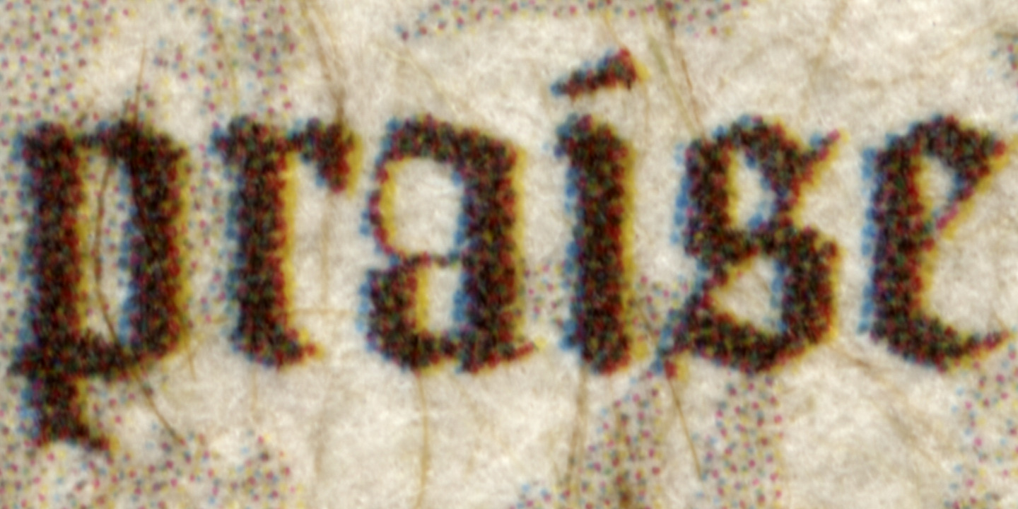
The wizard used negative leading (reduced interlinear space), too small for American Scribe. It could work in case of real handwriting, when the calligrapher could solve the problem by adjusting lengths of ascenders and descenders, but this isn’t our case. Our case is a catastrophe. The lyrics are set in a font size 18 pt with 14 pt leading by default (if my numbers are wrong, the relation 18/14 is still close to correct). The reduction of interlinear space was done (if at all consciously) because the lines are short, and if set with the leading equal to the font size the lines may seem too far apart. But the result is the stupid clash of strokes found all around the booklet (in the image above nos. 10 and 11), which only proves the design plan failed.
Such clashes of descenders and ascenders, though present in the US Declaration, are not as regular and not as annoying in the penmanship source.
Bloody annoying is the use of an alternate letter t — the one designed to be used in the end of the line and only if necessary — where a normal t should be used in the middle of the line. This results are “Silent__________ Towers” or “The Saint_____________ of Murder” etc.

The trick destroyed the rhythm of writing and detached the words from each other. Neglect? Voluntarily stupidity is what it is.
Look at this Nightside — who the hell would sign up for such a rebellion? Clowns?

Abominable manipulations with baselines. Can be found several times.
A few letters are compound from several glyphs, e.g. here Abigor ends with a stroke from the letter T

Or this Orkblut — ridiculous how inaccurately it’s done.
It may have been tolerable if such nuances were seen only with a magnifying glass, but they are seen with a naked eye. Mine need glasses, and I don’t wear them.
One last remark for today. Assume the designers’ native tongue is German. Normally, the German books are typeset with bigger interlinear space than the English ones, because in German much more uppercase letters are used (all nouns begin with an uppercase). Thus, the space above the x-height in German texts is always darker. How could they choose negative leading knowing there would be lines in German? “Give your answers in the comments.”

Resolution
We have at hand a twenty-first century black metal record from Vienna, behind what some call a Goya-style artwork, set in a German Renaissance blackletter next to an English-American penmanship of the late eighteenth century, letterforms from the twentieth century, a photograph from London placed in an ornamented frame from probably German late nineteenth century fairy-tale book, guided by a series of illustrations after the engravings after the compositions by an Englishman from the late eighteenth century after Dante’s Divine Comedy. It is said that Cain is the patron over all of this (he truly is the patron of our lives and times). Generally speaking, it’s too much of everything.
A few years ago I read in O’Gilvy on Advertising a thought which may be transposed to design. David O’Gilvy writes:
I once asked Sir Hugh Rigby, Surgeon to King George V, “What makes a great surgeon?” Sir Hugh replied, “There isn’t much to choose between surgeons in manual dexterity. What distinguishes the great surgeon is that he knows more than other surgeons.” It is the same with advertising agents. The good ones know more.
I asked an indifferent copywriter what books he had read about advertising. He told me that he had not read any; he preferred to rely on his own intuition. “Suppose,” I asked, “your gall-bladder has to be removed this evening. Will you choose a surgeon who has read some books on anatomy and knows where to find your gall-bladder, or a surgeon who relies on his intuition? Why should our clients be expected to bet millions of dollars on your intuition?”
Can the design of Totshläger be called good? Addressing this question to myself, I recall a passage from William Blake’s The Marriage of Heaven and Hell.

“Good is the passive that obeys Reason, Evil is the active springing from Energy. Good is Heaven. Evil is Hell.” So yes, the design of Totschläger is good. Heaven it is. “Why bother? It’s only music” the designers may have thought, doing “the work of men sub-human in their irresponsibility and moved by no enthusiasm but that of material achievement.”³⁷
They sing, “Luziferianisches Wissen — unauslöschlich brennt ein Feuer in uns. Doch halte aus — dass nie vergeht die Flamme,” — this is valid for music and lyrics. Then look at the design — but a passive obeying the twenty-first-century office reason: meet the deadline.
“This is black metal, there are no rules” many say. The faith of the simple! La fede dei semplici.
It’s vast and valid for almost the whole scene. The awareness of its designers is below the level required to master a typewriter. It is just true. So when these days you hear the cries about AI’s influence on the “business”, ask yourself, “What has been done in the past twenty five years to secure black metal art from being wiped away by the machine?” They are afraid because they truly deserve to be afraid.
Funny enough, you’ll hardly find a metal designer who is able to support a seriously deep talk about design and typography. But you’ll find quite a few who’re more willing to speak about magic, and even more about drugs. Very good.
The End of Chapter II.
Ending titles
Contact tocobm@protonmail.com
Running a fanzine like The Old Conception of Black Metal is a work. You can balance it — https://telegra.ph/Support-tocobm-with-crypto-10-11
The Old Conception of Black Metal:
- telegram
- patreon.com (subscribers have early access to the yet unpublished works)
- substack