如何系统地学习Python 中 matplotlib, numpy, scipy, pandas?
www.zhihu.com
Python全面语法教程系列篇,可以关注我的主页了解更多知识,持续更新中。
这篇是我自己总结的Pandas使用
pandas 在使用时语法感觉很乱,有什么学习的技巧吗?
- 这篇是我自己总结的Numpy使用
lrhao:Numpy全面语法教程 & 更好理解Numpy用法

- 这篇是我自己总结的Matplotlib使用
lrhao:Matplotlib全面语法教程 & 更好的理解Matplotlib用法

以上的总结都是非常全面且有用,能够应对工作学习大部分问题,欢迎一键三连。
前言
在前面的教程中,我们介绍了Pandas全面语法教程&更好的理解Pandas用法,Numpy全面语法教程&更好的理解Numpy用法,本文将总结matplotlib相关用法,内容非常全面,且非常有用,欢迎一键三连再看。
Matplotlib库:Matplotlib是一个Python 2D绘图库。Matplotlib可以在Python脚本、Python和IPython shell、jupiter笔记本、web应用服务器和四个图形用户界面工具包中使用。
- 调用Matplotlib
- Matplotlib对象层次结构
- 保存图像为文件
- 图片风格样式
- 双层接口
- MATLAB-style Interface
- Object-oriented interface
- 散点图
- plot
- scatter
- 彩色散点图
- 基础的Errorbars
- 直方图、条形图、核密度图
- 彩色直方图
- 二维直方图和条形图
- 自定义plot的图例legend
- 为图例legend选择元素
- 多个图例Legends
- 自定义Colorbars
- 多个Subplots
- Subplots中的网格
- 更复杂的设计
- 文本注释
- 箭头注释
- 自定义坐标轴ticks
- 自定义Matplotlib: 配置和风格
- Matplotlib中的三维plot
- Basemap地理图
- 快速参考
- 线条风格参考
- 线条风格汇总
- 填充风格
- 不填充标记
- 填充标记
- 特殊标记
- 颜色
- Pokemon Matplotlib
- 条形图
- 水平条形图
- 堆叠条形图
- 分组条形图
- 入门级饼图
- 高阶型饼图
- 带有label的饼图
- 嵌套饼图
- Legend案例
- Legend:下侧
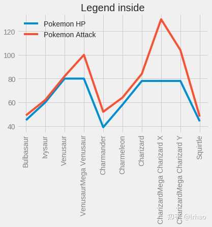
- Legend:内部
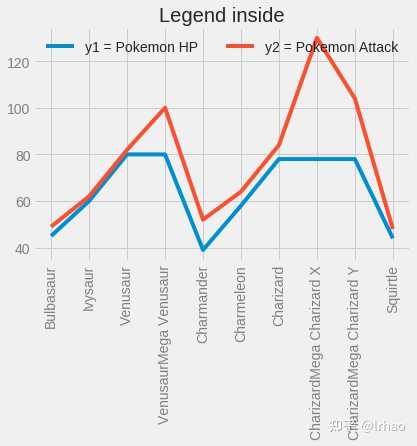
- Legend:内部2
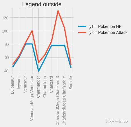
- Legend 外部
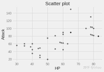
- 散点图
- 直方图
- 图堆叠Stackplot
- 2个Subplot
- 3个Subplot
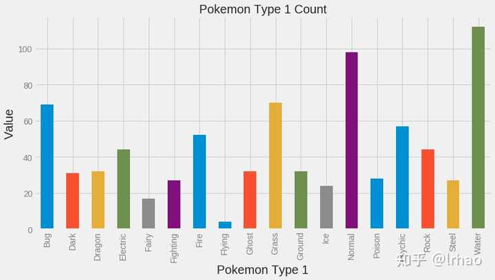
- 彩色条形图
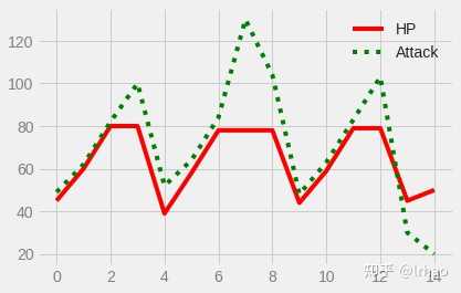
- 线性图
- 参考文献
调用Matplotlib
import matplotlib.pyplot as plt
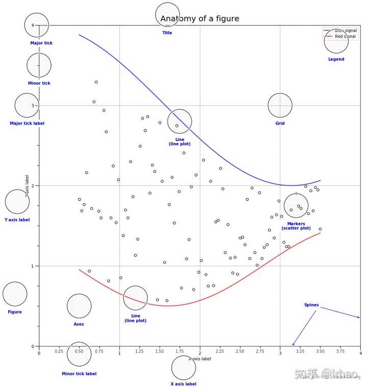
Matplotlib对象层次结构
为了充分利用matplotlib,需要了解它的层次结构:
from matplotlib.ticker import AutoMinorLocator, MultipleLocator, FuncFormatter

np.random.seed(19680801)

X = np.linspace(0.5, 3.5, 100)
Y1 = 3+np.cos(X)
Y2 = 1+np.cos(1+X/0.75)/2
Y3 = np.random.uniform(Y1, Y2, len(X))

fig = plt.figure(figsize=(15, 15))
ax = fig.add_subplot(1, 1, 1, aspect=1)


def minor_tick(x, pos):
    if not x % 1.0:
        return ""
    return "%.2f" % x

ax.xaxis.set_major_locator(MultipleLocator(1.000))
ax.xaxis.set_minor_locator(AutoMinorLocator(4))
ax.yaxis.set_major_locator(MultipleLocator(1.000))
ax.yaxis.set_minor_locator(AutoMinorLocator(4))
ax.xaxis.set_minor_formatter(FuncFormatter(minor_tick))

ax.set_xlim(0, 4)
ax.set_ylim(0, 4)

ax.tick_params(which='major', width=1.0)
ax.tick_params(which='major', length=10)
ax.tick_params(which='minor', width=1.0, labelsize=10)
ax.tick_params(which='minor', length=5, labelsize=10, labelcolor='0.25')

ax.grid(linestyle="--", linewidth=0.5, color='.25', zorder=-10)

ax.plot(X, Y1, c=(0.25, 0.25, 1.00), lw=2, label="Blue signal", zorder=10)
ax.plot(X, Y2, c=(1.00, 0.25, 0.25), lw=2, label="Red signal")
ax.plot(X, Y3, linewidth=0,
        marker='o', markerfacecolor='w', markeredgecolor='k')

ax.set_title("Anatomy of a figure", fontsize=20, verticalalignment='bottom')
ax.set_xlabel("X axis label")
ax.set_ylabel("Y axis label")

ax.legend()


def circle(x, y, radius=0.15):
    from matplotlib.patches import Circle
    from matplotlib.patheffects import withStroke
    circle = Circle((x, y), radius, clip_on=False, zorder=10, linewidth=1,
                    edgecolor='black', facecolor=(0, 0, 0, .0125),
                    path_effects=[withStroke(linewidth=5, foreground='w')])
    ax.add_artist(circle)


def text(x, y, text):
    ax.text(x, y, text, backgroundcolor="white",
            ha='center', va='top', weight='bold', color='blue')


# Minor tick
circle(0.50, -0.10)
text(0.50, -0.32, "Minor tick label")

# Major tick
circle(-0.03, 4.00)
text(0.03, 3.80, "Major tick")

# Minor tick
circle(0.00, 3.50)
text(0.00, 3.30, "Minor tick")

# Major tick label
circle(-0.15, 3.00)
text(-0.15, 2.80, "Major tick label")

# X Label
circle(1.80, -0.27)
text(1.80, -0.45, "X axis label")

# Y Label
circle(-0.27, 1.80)
text(-0.27, 1.6, "Y axis label")

# Title
circle(1.60, 4.13)
text(1.60, 3.93, "Title")

# Blue plot
circle(1.75, 2.80)
text(1.75, 2.60, "Line\n(line plot)")

# Red plot
circle(1.20, 0.60)
text(1.20, 0.40, "Line\n(line plot)")

# Scatter plot
circle(3.20, 1.75)
text(3.20, 1.55, "Markers\n(scatter plot)")

# Grid
circle(3.00, 3.00)
text(3.00, 2.80, "Grid")

# Legend
circle(3.70, 3.80)
text(3.70, 3.60, "Legend")

# Axes
circle(0.5, 0.5)
text(0.5, 0.3, "Axes")

# Figure
circle(-0.3, 0.65)
text(-0.3, 0.45, "Figure")

color = 'blue'
ax.annotate('Spines', xy=(4.0, 0.35), xycoords='data',
            xytext=(3.3, 0.5), textcoords='data',
            weight='bold', color=color,
            arrowprops=dict(arrowstyle='->',
                            connectionstyle="arc3",
                            color=color))

ax.annotate('', xy=(3.15, 0.0), xycoords='data',
            xytext=(3.45, 0.45), textcoords='data',
            weight='bold', color=color,
            arrowprops=dict(arrowstyle='->',
                            connectionstyle="arc3",
                            color=color))

ax.text(4.0, -0.4, "Made with http://matplotlib.org",
        fontsize=10, ha="right", color='.5')

plt.show()
保存图像为文件
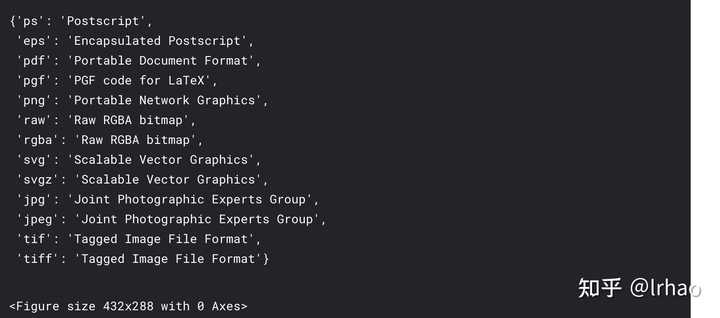
fig = plt.figure()
# fig.savefig('my_figure.png') -> This code save the your figure.
fig.canvas.get_supported_filetypes()
图片风格样式
Matplotlib中有许多可用的样式。所有这些样式都列在下面。
plt.style.available
# plt.style.use('stylename')
--
['seaborn-poster',
 'seaborn-darkgrid',
 'seaborn-paper',
 'seaborn-dark-palette',
 'seaborn-colorblind',
 'fast',
 'seaborn-talk',
 'grayscale',
 'ggplot',
 'fivethirtyeight',
 '_classic_test',
 'seaborn-white',
 'bmh',
 'seaborn-bright',
 'dark_background',
 'Solarize_Light2',
 'seaborn-muted',
 'seaborn-notebook',
 'seaborn-pastel',
 'seaborn-whitegrid',
 'seaborn-dark',
 'seaborn-deep',
 'seaborn-ticks',
 'classic',
 'tableau-colorblind10',
 'seaborn']
- plot_scatter
- plot_colored_sinusoidal_lines
- plot_bar_graphs
- plot_colored_circles
- plot_image_and_patch
- plot_histograms
- plot_figure
def plot_scatter(ax, prng, nb_samples=100):
    """Scatter plot.
    """
    for mu, sigma, marker in [(-.5, 0.75, 'o'), (0.75, 1., 's')]:
        x, y = prng.normal(loc=mu, scale=sigma, size=(2, nb_samples))
        ax.plot(x, y, ls='none', marker=marker)
    ax.set_xlabel('X-label')
    return ax


def plot_colored_sinusoidal_lines(ax):
    """Plot sinusoidal lines with colors following the style color cycle.
    """
    L = 2 * np.pi
    x = np.linspace(0, L)
    nb_colors = len(plt.rcParams['axes.prop_cycle'])
    shift = np.linspace(0, L, nb_colors, endpoint=False)
    for s in shift:
        ax.plot(x, np.sin(x + s), '-')
    ax.set_xlim([x[0], x[-1]])
    return ax


def plot_bar_graphs(ax, prng, min_value=5, max_value=25, nb_samples=5):
    """Plot two bar graphs side by side, with letters as x-tick labels.
    """
    x = np.arange(nb_samples)
    ya, yb = prng.randint(min_value, max_value, size=(2, nb_samples))
    width = 0.25
    ax.bar(x, ya, width)
    ax.bar(x + width, yb, width, color='C2')
    ax.set_xticks(x + width)
    ax.set_xticklabels(['a', 'b', 'c', 'd', 'e'])
    return ax


def plot_colored_circles(ax, prng, nb_samples=15):
    """Plot circle patches.

    NB: draws a fixed amount of samples, rather than using the length of
    the color cycle, because different styles may have different numbers
    of colors.
    """
    for sty_dict, j in zip(plt.rcParams['axes.prop_cycle'], range(nb_samples)):
        ax.add_patch(plt.Circle(prng.normal(scale=3, size=2),
                                radius=1.0, color=sty_dict['color']))
    # Force the limits to be the same across the styles (because different
    # styles may have different numbers of available colors).
    ax.set_xlim([-4, 8])
    ax.set_ylim([-5, 6])
    ax.set_aspect('equal', adjustable='box')  # to plot circles as circles
    return ax


def plot_image_and_patch(ax, prng, size=(20, 20)):
    """Plot an image with random values and superimpose a circular patch.
    """
    values = prng.random_sample(size=size)
    ax.imshow(values, interpolation='none')
    c = plt.Circle((5, 5), radius=5, label='patch')
    ax.add_patch(c)
    # Remove ticks
    ax.set_xticks([])
    ax.set_yticks([])


def plot_histograms(ax, prng, nb_samples=10000):
    """Plot 4 histograms and a text annotation.
    """
    params = ((10, 10), (4, 12), (50, 12), (6, 55))
    for a, b in params:
        values = prng.beta(a, b, size=nb_samples)
        ax.hist(values, histtype="stepfilled", bins=30, alpha=0.8, normed=True)
    # Add a small annotation.
    ax.annotate('Annotation', xy=(0.25, 4.25), xycoords='data',
                xytext=(0.9, 0.9), textcoords='axes fraction',
                va="top", ha="right",
                bbox=dict(boxstyle="round", alpha=0.2),
                arrowprops=dict(
                          arrowstyle="->",
                          connectionstyle="angle,angleA=-95,angleB=35,rad=10"),
                )
    return ax


def plot_figure(style_label=""):
    """Setup and plot the demonstration figure with a given style.
    """
    # Use a dedicated RandomState instance to draw the same "random" values
    # across the different figures.
    prng = np.random.RandomState(96917002)

    # Tweak the figure size to be better suited for a row of numerous plots:
    # double the width and halve the height. NB: use relative changes because
    # some styles may have a figure size different from the default one.
    (fig_width, fig_height) = plt.rcParams['figure.figsize']
    fig_size = [fig_width * 2, fig_height / 2]

    fig, axes = plt.subplots(ncols=6, nrows=1, num=style_label,
                             figsize=fig_size, squeeze=True)
    axes[0].set_ylabel(style_label)

    plot_scatter(axes[0], prng)
    plot_image_and_patch(axes[1], prng)
    plot_bar_graphs(axes[2], prng)
    plot_colored_circles(axes[3], prng)
    plot_colored_sinusoidal_lines(axes[4])
    plot_histograms(axes[5], prng)

    fig.tight_layout()

    return fig


if __name__ == "__main__":

    # Setup a list of all available styles, in alphabetical order but
    # the `default` and `classic` ones, which will be forced resp. in
    # first and second position.
    style_list = list(plt.style.available)  # *new* list: avoids side effects.
    style_list.remove('classic')  # `classic` is in the list: first remove it.
    style_list.sort()
    style_list.insert(0, u'default')
    style_list.insert(1, u'classic')

    # Plot a demonstration figure for every available style sheet.
    for style_label in style_list:
        with plt.style.context(style_label):
            fig = plot_figure(style_label=style_label)

    plt.show()


























两个接口
有两种不同的方式使用MatPlotLib:
- 第一种是MATLAB风格
- 第二种是面向对象的界面风格
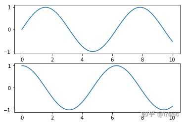
MATLAB风格
plt.figure()  # create a plot figure
x = np.linspace(0, 10, 100)
# create the first of two panels and set current axis
plt.subplot(2, 1, 1) # (rows, columns, panel number)
plt.plot(x, np.sin(x))

# create the second panel and set current axis
plt.subplot(2, 1, 2)
plt.plot(x, np.cos(x));
plt.show()
面向对象界面风格
# First create a grid of plots
# ax will be an array of two Axes objects
fig, ax = plt.subplots(2)

# Call plot() method on the appropriate object
ax[0].plot(x, np.sin(x))
ax[1].plot(x, np.cos(x));
散点图
散点图表示有不同的方法和自定义。
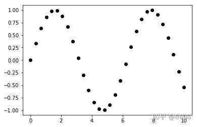
Plot
x = np.linspace(0, 10, 30)
y = np.sin(x)

plt.plot(x, y, 'o', color='black');
plt.show()
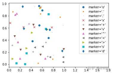
rng = np.random.RandomState(0)
for marker in ['o', '.', ',', 'x', '+', 'v', '^', '<', '>', 's', 'd']:
    plt.plot(rng.rand(5), rng.rand(5), marker,
             label="marker='{0}'".format(marker))
plt.legend(numpoints=1)
plt.xlim(0, 1.8);
plt.show()
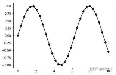
plt.plot(x, y, '-ok');
plt.show()
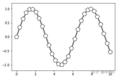
plt.plot(x, y, '-p', color='gray',
         markersize=15, linewidth=4,
         markerfacecolor='white',
         markeredgecolor='gray',
         markeredgewidth=2)
plt.ylim(-1.2, 1.2);
散点
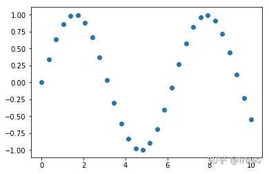
plt.plot相比较plt.scatter的主要区别:Plot可以用来创建散点图,每个点的属性(大小、面色、边缘色等)可以单独控制或映射到数据中。
plt.scatter(x, y, marker='o');
plt.show()
彩色散点图
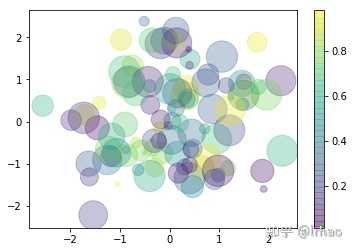
rng = np.random.RandomState(0)
x = rng.randn(100)
y = rng.randn(100)
colors = rng.rand(100)
sizes = 1000 * rng.rand(100)

plt.scatter(x, y, c=colors, s=sizes, alpha=0.3,
            cmap='viridis')
plt.colorbar();  # show color scale
基础的Errorbars
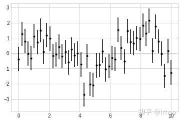
plt.style.use('seaborn-whitegrid')
x = np.linspace(0, 10, 50)
dy = 0.8
y = np.sin(x) + dy * np.random.randn(50)

plt.errorbar(x, y, yerr=dy, fmt='.k');
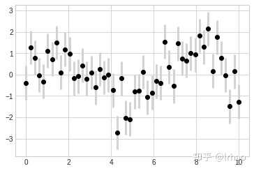
plt.errorbar(x, y, yerr=dy, fmt='o', color='black',ecolor='lightgray', elinewidth=3, capsize=0);
直方图、条形图、核密度图
plt.style.use('seaborn-white')

data = np.random.randn(1000)
plt.hist(data);
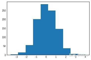
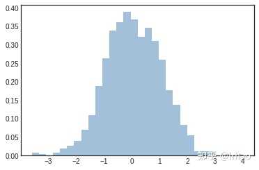
plt.hist(data, bins=30, normed=True, alpha=0.5,
         histtype='stepfilled', color='steelblue',
         edgecolor='none');
plt.show()
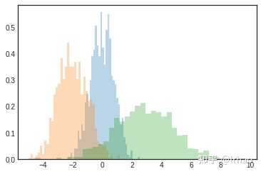
彩色直方图
x1 = np.random.normal(0, 0.8, 1000)
x2 = np.random.normal(-2, 1, 1000)
x3 = np.random.normal(3, 2, 1000)

kwargs = dict(histtype='stepfilled', alpha=0.3, normed=True, bins=40)

plt.hist(x1, **kwargs)
plt.hist(x2, **kwargs)
plt.hist(x3, **kwargs);
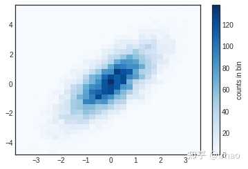
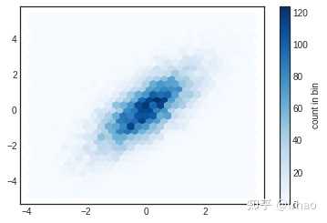
二维直方图和条形图
mean = [0, 0]
cov = [[1, 1], [1, 2]]
x, y = np.random.multivariate_normal(mean, cov, 10000).T
plt.hist2d(x, y, bins=30, cmap='Blues')
cb = plt.colorbar()
cb.set_label('counts in bin')
plt.hexbin(x, y, gridsize=30, cmap='Blues')
cb = plt.colorbar(label='count in bin')
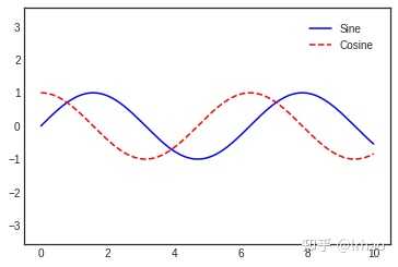
自定义plot的图例legend
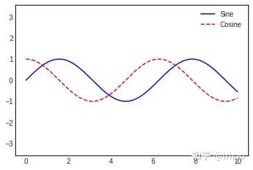
x = np.linspace(0, 10, 1000)
fig, ax = plt.subplots()
ax.plot(x, np.sin(x), '-b', label='Sine')
ax.plot(x, np.cos(x), '--r', label='Cosine')
ax.axis('equal')
leg = ax.legend();
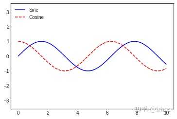
- loc='upper left'
ax.legend(loc='upper left', frameon=False)
fig
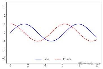
- loc='lower center'
ax.legend(frameon=False, loc='lower center', ncol=2)
fig
- framealpha=1, shadow=True, borderpad=1
ax.legend(fancybox=True, framealpha=1, shadow=True, borderpad=1)
fig
为图例legend选择元素
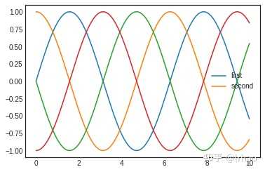
- lines[:2], ['first', 'second']
y = np.sin(x[:, np.newaxis] + np.pi * np.arange(0, 2, 0.5))
lines = plt.plot(x, y)

# lines is a list of plt.Line2D instances
plt.legend(lines[:2], ['first', 'second']);
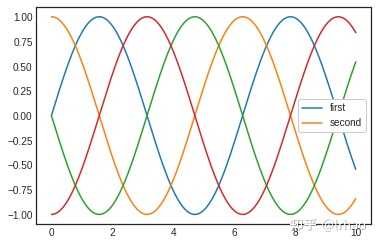
- label='first', label='second'
plt.plot(x, y[:, 0], label='first')
plt.plot(x, y[:, 1], label='second')
plt.plot(x, y[:, 2:])
plt.legend(framealpha=1, frameon=True);
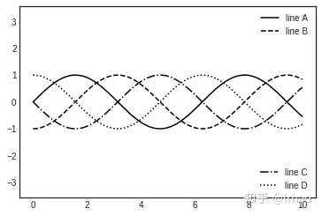
- 多个图例Legends
fig, ax = plt.subplots()

lines = []
styles = ['-', '--', '-.', ':']
x = np.linspace(0, 10, 1000)

for i in range(4):
    lines += ax.plot(x, np.sin(x - i * np.pi / 2),
                     styles[i], color='black')
ax.axis('equal')

# specify the lines and labels of the first legend
ax.legend(lines[:2], ['line A', 'line B'],
          loc='upper right', frameon=False)

# Create the second legend and add the artist manually.
from matplotlib.legend import Legend
leg = Legend(ax, lines[2:], ['line C', 'line D'],
             loc='lower right', frameon=False)
ax.add_artist(leg);
自定义Colorbars
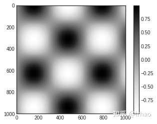
x = np.linspace(0, 10, 1000)
I = np.sin(x) * np.cos(x[:, np.newaxis])

plt.imshow(I)
plt.colorbar();
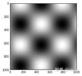
plt.imshow(I, cmap='gray');
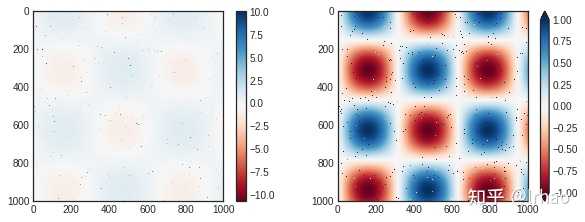
speckles = (np.random.random(I.shape) < 0.01)
I[speckles] = np.random.normal(0, 3, np.count_nonzero(speckles))

plt.figure(figsize=(10, 3.5))

plt.subplot(1, 2, 1)
plt.imshow(I, cmap='RdBu')
plt.colorbar()

plt.subplot(1, 2, 2)
plt.imshow(I, cmap='RdBu')
plt.colorbar(extend='both')
plt.clim(-1, 1);
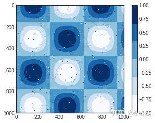
plt.imshow(I, cmap=plt.cm.get_cmap('Blues', 6))
plt.colorbar()
plt.clim(-1, 1);
多个Subplots
ax1 = plt.axes()  # standard axes
ax2 = plt.axes([0.65, 0.65, 0.2, 0.2])
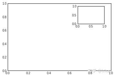
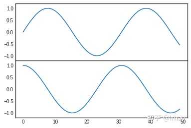
fig = plt.figure()
ax1 = fig.add_axes([0.1, 0.5, 0.8, 0.4],
                   xticklabels=[], ylim=(-1.2, 1.2))
ax2 = fig.add_axes([0.1, 0.1, 0.8, 0.4],
                   ylim=(-1.2, 1.2))

x = np.linspace(0, 10)
ax1.plot(np.sin(x))
ax2.plot(np.cos(x));
Subplots中的网格
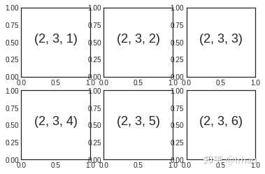
- 第一种写法
for i in range(1, 7):
    plt.subplot(2, 3, i)
    plt.text(0.5, 0.5, str((2, 3, i)),
             fontsize=18, ha='center')
- 第二种写法
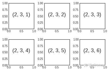
fig = plt.figure()
fig.subplots_adjust(hspace=0.4, wspace=0.4)
for i in range(1, 7):
    ax = fig.add_subplot(2, 3, i)
    ax.text(0.5, 0.5, str((2, 3, i)),
           fontsize=18, ha='center')
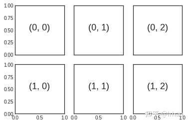
fig, ax = plt.subplots(2, 3, sharex='col', sharey='row')

# axes are in a two-dimensional array, indexed by [row, col]
for i in range(2):
    for j in range(3):
        ax[i, j].text(0.5, 0.5, str((i, j)),
                      fontsize=18, ha='center')
fig
更复杂的设计
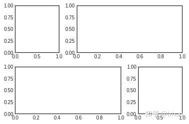
grid = plt.GridSpec(2, 3, wspace=0.4, hspace=0.3)
plt.subplot(grid[0, 0])
plt.subplot(grid[0, 1:])
plt.subplot(grid[1, :2])
plt.subplot(grid[1, 2]);
# Create some normally distributed data
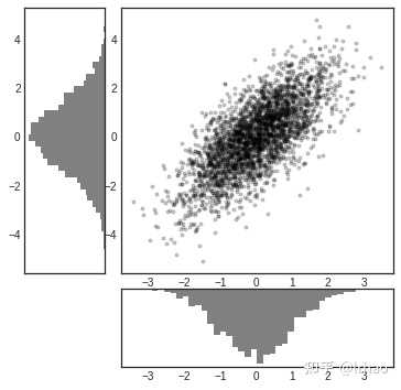
mean = [0, 0]
cov = [[1, 1], [1, 2]]
x, y = np.random.multivariate_normal(mean, cov, 3000).T

# Set up the axes with gridspec
fig = plt.figure(figsize=(6, 6))
grid = plt.GridSpec(4, 4, hspace=0.2, wspace=0.2)
main_ax = fig.add_subplot(grid[:-1, 1:])
y_hist = fig.add_subplot(grid[:-1, 0], xticklabels=[], sharey=main_ax)
x_hist = fig.add_subplot(grid[-1, 1:], yticklabels=[], sharex=main_ax)

# scatter points on the main axes
main_ax.plot(x, y, 'ok', markersize=3, alpha=0.2)

# histogram on the attached axes
x_hist.hist(x, 40, histtype='stepfilled',
            orientation='vertical', color='gray')
x_hist.invert_yaxis()

y_hist.hist(y, 40, histtype='stepfilled',
            orientation='horizontal', color='gray')
y_hist.invert_xaxis()
文本注释
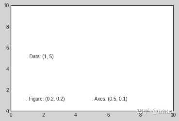
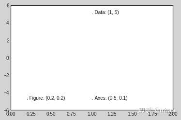
- ax.transData: 与数据坐标关联的转换
- ax.transAxes: 与轴相关的转换(以轴的维度为单位)
- fig.transFigure: 与图形相关的转换(以图形尺寸为单位)
fig, ax = plt.subplots(facecolor='lightgray')
ax.axis([0, 10, 0, 10])

# transform=ax.transData is the default, but we'll specify it anyway
ax.text(1, 5, ". Data: (1, 5)", transform=ax.transData)
ax.text(0.5, 0.1, ". Axes: (0.5, 0.1)", transform=ax.transAxes)
ax.text(0.2, 0.2, ". Figure: (0.2, 0.2)", transform=fig.transFigure);
ax.set_xlim(0, 2)
ax.set_ylim(-6, 6)
fig
箭头注释
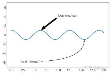
fig, ax = plt.subplots()

x = np.linspace(0, 20, 1000)
ax.plot(x, np.cos(x))
ax.axis('equal')

ax.annotate('local maximum', xy=(6.28, 1), xytext=(10, 4),
            arrowprops=dict(facecolor='black', shrink=0.05))

ax.annotate('local minimum', xy=(5 * np.pi, -1), xytext=(2, -6),
            arrowprops=dict(arrowstyle="->",
                            connectionstyle="angle3,angleA=0,angleB=-90"));
自定义tricks
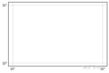
ax = plt.axes(xscale='log', yscale='log')
ax.grid();
自定义Matplotlib: 配置和风格
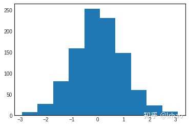
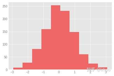
x = np.random.randn(1000)
plt.hist(x);
from matplotlib import cycler
colors = cycler('color',
                ['#EE6666', '#3388BB', '#9988DD',
                 '#EECC55', '#88BB44', '#FFBBBB'])
plt.rc('axes', facecolor='#E6E6E6', edgecolor='none',
       axisbelow=True, grid=True, prop_cycle=colors)
plt.rc('grid', color='w', linestyle='solid')
plt.rc('xtick', direction='out', color='gray')
plt.rc('ytick', direction='out', color='gray')
plt.rc('patch', edgecolor='#E6E6E6')
plt.rc('lines', linewidth=2)
plt.hist(x);
Matplotlib中的三维plot
from mpl_toolkits import mplot3d
fig = plt.figure()
ax = plt.axes(projection='3d')
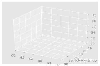
ax = plt.axes(projection='3d')

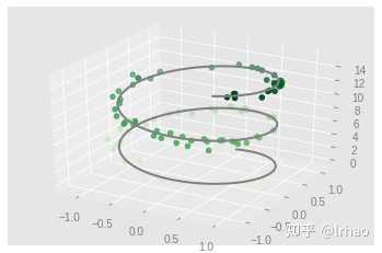
# Data for a three-dimensional line
zline = np.linspace(0, 15, 1000)
xline = np.sin(zline)
yline = np.cos(zline)
ax.plot3D(xline, yline, zline, 'gray')

# Data for three-dimensional scattered points
zdata = 15 * np.random.random(100)
xdata = np.sin(zdata) + 0.1 * np.random.randn(100)
ydata = np.cos(zdata) + 0.1 * np.random.randn(100)
ax.scatter3D(xdata, ydata, zdata, c=zdata, cmap='Greens');
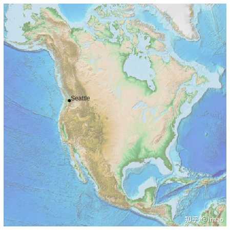
Basemap地理图
from mpl_toolkits.basemap import Basemap
plt.figure(figsize=(8, 8))
m = Basemap(projection='ortho', resolution=None, lat_0=50, lon_0=-100)
m.bluemarble(scale=0.5);
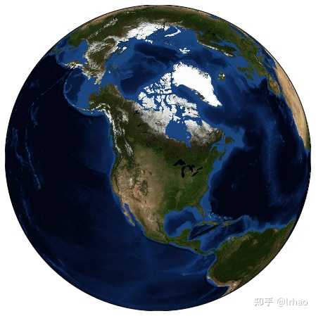
fig = plt.figure(figsize=(8, 8))
m = Basemap(projection='lcc', resolution=None,
            width=8E6, height=8E6,
            lat_0=45, lon_0=-100,)
m.etopo(scale=0.5, alpha=0.5)

# Map (long, lat) to (x, y) for plotting
x, y = m(-122.3, 47.6)
plt.plot(x, y, 'ok', markersize=5)
plt.text(x, y, ' Seattle', fontsize=12);
快速参考
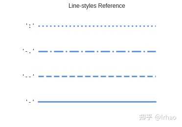
线条风格参考
color = 'cornflowerblue'
points = np.ones(5)  # Draw 5 points for each line
text_style = dict(horizontalalignment='right', verticalalignment='center',
                  fontsize=12, fontdict={'family': 'monospace'})


def format_axes(ax):
    ax.margins(0.2)
    ax.set_axis_off()


# Plot all line styles.
fig, ax = plt.subplots()

linestyles = ['-', '--', '-.', ':']
for y, linestyle in enumerate(linestyles):
    ax.text(-0.1, y, repr(linestyle), **text_style)
    ax.plot(y * points, linestyle=linestyle, color=color, linewidth=3)
    format_axes(ax)
    ax.set_title('Line-styles Reference')

plt.show()
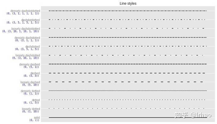
线条风格汇总
from collections import OrderedDict
from matplotlib.transforms import blended_transform_factory

linestyles = OrderedDict(
    [('solid',               (0, ())),
     ('loosely dotted',      (0, (1, 10))),
     ('dotted',              (0, (1, 5))),
     ('densely dotted',      (0, (1, 1))),

     ('loosely dashed',      (0, (5, 10))),
     ('dashed',              (0, (5, 5))),
     ('densely dashed',      (0, (5, 1))),

     ('loosely dashdotted',  (0, (3, 10, 1, 10))),
     ('dashdotted',          (0, (3, 5, 1, 5))),
     ('densely dashdotted',  (0, (3, 1, 1, 1))),

     ('loosely dashdotdotted', (0, (3, 10, 1, 10, 1, 10))),
     ('dashdotdotted',         (0, (3, 5, 1, 5, 1, 5))),
     ('densely dashdotdotted', (0, (3, 1, 1, 1, 1, 1)))])


plt.figure(figsize=(10, 6))
ax = plt.subplot(1, 1, 1)

X, Y = np.linspace(0, 100, 10), np.zeros(10)
for i, (name, linestyle) in enumerate(linestyles.items()):
    ax.plot(X, Y+i, linestyle=linestyle, linewidth=1.5, color='black')

ax.set_ylim(-0.5, len(linestyles)-0.5)
plt.yticks(np.arange(len(linestyles)), linestyles.keys())
plt.xticks([])

# For each line style, add a text annotation with a small offset from
# the reference point (0 in Axes coords, y tick value in Data coords).
reference_transform = blended_transform_factory(ax.transAxes, ax.transData)
for i, (name, linestyle) in enumerate(linestyles.items()):
    ax.annotate(str(linestyle), xy=(0.0, i), xycoords=reference_transform,
                xytext=(-6, -12), textcoords='offset points', color="blue",
                fontsize=8, ha="right", family="monospace")
ax.set_title('Line styles')
plt.tight_layout()
plt.show()
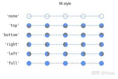
填充风格
from matplotlib.lines import Line2D


points = np.ones(5)  # Draw 3 points for each line
text_style = dict(horizontalalignment='right', verticalalignment='center',
                  fontsize=12, fontdict={'family': 'monospace'})
marker_style = dict(color='cornflowerblue', linestyle=':', marker='o',
                    markersize=15, markerfacecoloralt='gray')


def format_axes(ax):
    ax.margins(0.2)
    ax.set_axis_off()


fig, ax = plt.subplots()

# Plot all fill styles.
for y, fill_style in enumerate(Line2D.fillStyles):
    ax.text(-0.5, y, repr(fill_style), **text_style)
    ax.plot(y * points, fillstyle=fill_style, **marker_style)
    format_axes(ax)
    ax.set_title('fill style')

plt.show()
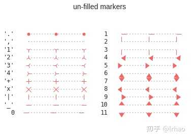
未填充标记
points = np.ones(3)  # Draw 3 points for each line
text_style = dict(horizontalalignment='right', verticalalignment='center',
                  fontsize=12, fontdict={'family': 'monospace'})
marker_style = dict(linestyle=':', color='0.8', markersize=10,
                    mfc="C0", mec="C0")


def format_axes(ax):
    ax.margins(0.2)
    ax.set_axis_off()
    ax.invert_yaxis()


def nice_repr(text):
    return repr(text).lstrip('u')


def math_repr(text):
    tx = repr(text).lstrip('u').strip("'").strip("$")
    return r"'\${}\$'".format(tx)


def split_list(a_list):
    i_half = len(a_list) // 2
    return (a_list[:i_half], a_list[i_half:])

fig, axes = plt.subplots(ncols=2)
fig.suptitle('un-filled markers', fontsize=14)

# Filter out filled markers and marker settings that do nothing.
unfilled_markers = [m for m, func in Line2D.markers.items()
                    if func != 'nothing' and m not in Line2D.filled_markers]

for ax, markers in zip(axes, split_list(unfilled_markers)):
    for y, marker in enumerate(markers):
        ax.text(-0.5, y, nice_repr(marker), **text_style)
        ax.plot(y * points, marker=marker, **marker_style)
        format_axes(ax)

plt.show()
填充标记
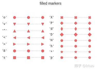
fig, axes = plt.subplots(ncols=2)
for ax, markers in zip(axes, split_list(Line2D.filled_markers)):
    for y, marker in enumerate(markers):
        ax.text(-0.5, y, nice_repr(marker), **text_style)
        ax.plot(y * points, marker=marker, **marker_style)
        format_axes(ax)
fig.suptitle('filled markers', fontsize=14)

plt.show()
特殊标记
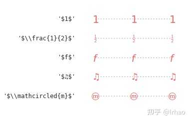
fig, ax = plt.subplots()
fig.subplots_adjust(left=0.4)

marker_style.update(mec="None", markersize=15)
markers = ["$1$", r"$\frac{1}{2}$", "$f$", "$\u266B$",
           r"$\mathcircled{m}$"]

for y, marker in enumerate(markers):
    ax.text(-0.5, y, math_repr(marker), **text_style)
    ax.plot(y * points, marker=marker, **marker_style)
format_axes(ax)

plt.show()
颜色
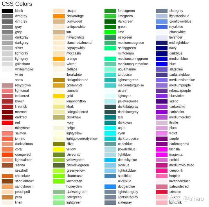
import matplotlib.colors as mcolors


def plot_colortable(colors, title, sort_colors=True, emptycols=0):

    cell_width = 212
    cell_height = 22
    swatch_width = 48
    margin = 12
    topmargin = 40

    # Sort colors by hue, saturation, value and name.
    by_hsv = ((tuple(mcolors.rgb_to_hsv(mcolors.to_rgba(color)[:3])), name)
                    for name, color in colors.items())
    if sort_colors is True:
        by_hsv = sorted(by_hsv)
    names = [name for hsv, name in by_hsv]

    n = len(names)
    ncols = 4 - emptycols
    nrows = n // ncols + int(n % ncols > 0)

    width = cell_width * 4 + 2 * margin
    height = cell_height * nrows + margin + topmargin
    dpi = 72

    fig, ax = plt.subplots(figsize=(width / dpi, height / dpi), dpi=dpi)
    fig.subplots_adjust(margin/width, margin/height,
                        (width-margin)/width, (height-topmargin)/height)
    ax.set_xlim(0, cell_width * 4)
    ax.set_ylim(cell_height * (nrows-0.5), -cell_height/2.)
    ax.yaxis.set_visible(False)
    ax.xaxis.set_visible(False)
    ax.set_axis_off()
    ax.set_title(title, fontsize=24, loc="left", pad=10)

    for i, name in enumerate(names):
        row = i % nrows
        col = i // nrows
        y = row * cell_height

        swatch_start_x = cell_width * col
        swatch_end_x = cell_width * col + swatch_width
        text_pos_x = cell_width * col + swatch_width + 7

        ax.text(text_pos_x, y, name, fontsize=14,
                horizontalalignment='left',
                verticalalignment='center')

        ax.hlines(y, swatch_start_x, swatch_end_x,
                  color=colors[name], linewidth=18)

    return fig

plot_colortable(mcolors.BASE_COLORS, "Base Colors",
                sort_colors=False, emptycols=1)
plot_colortable(mcolors.TABLEAU_COLORS, "Tableau Palette",
                sort_colors=False, emptycols=2)

#sphinx_gallery_thumbnail_number = 3
plot_colortable(mcolors.CSS4_COLORS, "CSS Colors")

# Optionally plot the XKCD colors (Caution: will produce large figure)
#xkcd_fig = plot_colortable(mcolors.XKCD_COLORS, "XKCD Colors")
#xkcd_fig.savefig("XKCD_Colors.png")

plt.show()


Pokemon Matplotlib
条形图
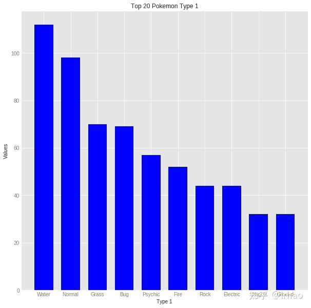
# Bar Chart
type1Names = df['Type 1'].value_counts().index
type1Values = df['Type 1'].value_counts().values

plt.figure(figsize=(10,10))
plt.ylabel('Values', fontsize='medium')
plt.xlabel('Type 1', fontsize='medium')
plt.title('Top 20 Pokemon Type 1')
plt.bar(type1Names[:10],type1Values[:10], width = 0.7, color="blue",linewidth=0.4)
plt.show()
水平条形图
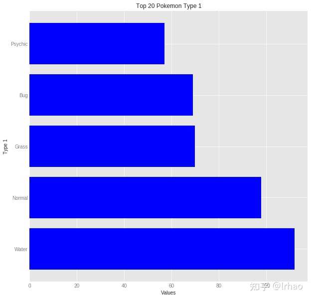
fig, ax = plt.subplots(figsize=(10,10))
plt.ylabel('Type 1', fontsize='medium')
plt.xlabel('Values', fontsize='medium')
plt.title('Top 20 Pokemon Type 1')
plt.style.use('fivethirtyeight')
ax.barh(type1Names[:5], type1Values[:5],color="blue")
plt.show()
堆叠条形图
# Stacked Bar Chart
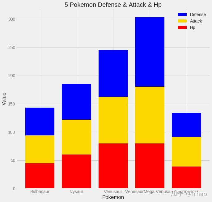
pokemon = df['Name'][:5]
hp = df['HP'][:5]
attack = df['Attack'][:5]
defense = df['Defense'][:5]
ind = [x for x, _ in enumerate(pokemon)]

plt.figure(figsize=(10,10))
plt.bar(ind, defense, width=0.8, label='Defense', color='blue', bottom=attack+hp)
plt.bar(ind, attack, width=0.8, label='Attack', color='gold', bottom=hp)
plt.bar(ind, hp, width=0.8, label='Hp', color='red')

plt.xticks(ind, pokemon)
plt.ylabel("Value")
plt.xlabel("Pokemon")
plt.legend(loc="upper right")
plt.title("5 Pokemon Defense & Attack & Hp")

plt.show()
分组条形图
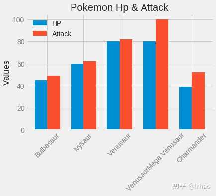
N = 5
pokemon_hp = df['HP'][:5]
pokemon_attack = df['Attack'][:5]

ind = np.arange(N)
width = 0.35
plt.bar(ind, pokemon_hp, width, label='HP')
plt.bar(ind + width, pokemon_attack, width,label='Attack')

plt.ylabel('Values')
plt.title('Pokemon Hp & Attack')

plt.xticks(ind + width / 2, (df['Name'][:5]),rotation=45)
plt.legend(loc='best')
plt.show()
入门级饼图
# Pie Chart
plt.figure(1, figsize=(8,8))
df['Type 1'].value_counts().head(5).plot.pie(autopct="%1.1f%%")
plt.legend()
plt.show()
高阶饼图
# Pie chart

fig1, ax1 = plt.subplots()
ax1.pie(type1Values[:5], labels=type1Names[:5], autopct='%1.1f%%',shadow=True, startangle=90)
ax1.axis('equal')  # Equal aspect ratio ensures that pie is drawn as a circle.
plt.legend()
plt.show()
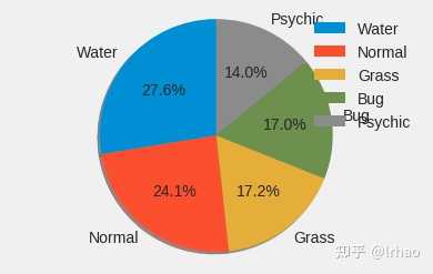
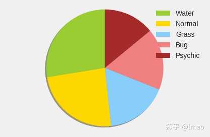
饼图带有label
colors = ['yellowgreen', 'gold', 'lightskyblue', 'lightcoral','brown']
patches, texts = plt.pie(type1Values[:5], colors=colors, shadow=True, startangle=90)
plt.legend(patches, type1Names[:5], loc="best")
plt.axis('equal')
plt.tight_layout()
plt.show()
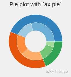
嵌套的饼图
# nested pie chart
fig, ax = plt.subplots()

size = 0.3
vals = np.array([[60., 32.], [37., 40.], [29., 10.]])

cmap = plt.get_cmap("tab20c")
outer_colors = cmap(np.arange(3)*4)
inner_colors = cmap(np.array([1, 2, 5, 6, 9, 10]))

ax.pie(vals.sum(axis=1), radius=1, colors=outer_colors,
       wedgeprops=dict(width=size, edgecolor='w'))

ax.pie(vals.flatten(), radius=1-size, colors=inner_colors,
       wedgeprops=dict(width=size, edgecolor='w'))

ax.set(aspect="equal", title='Pie plot with `ax.pie`')
plt.show()
legend案例
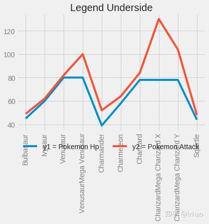
Legend:下侧
y1 = df['HP'][:10]
y2 = df['Attack'][:10]
x = df['Name'][:10]
fig = plt.figure()
ax = plt.subplot(111)
ax.plot(x, y1, label='y1 = Pokemon Hp')
ax.plot(x, y2, label='y2 = Pokemon Attack')
plt.title('Legend Underside')
plt.xticks(rotation=90)
ax.legend(loc='upper center', bbox_to_anchor=(0.5, -0.05),  shadow=True, ncol=2)
plt.show()
Legend:内部
y1 = df['HP'][:10]
y2 = df['Attack'][:10]
x = df['Name'][:10]
fig = plt.figure()
ax = plt.subplot(111)
ax.plot(x, y1, label='Pokemon HP')
ax.plot(x, y2, label='Pokemon Attack')
plt.title('Legend inside')
plt.xticks(rotation=90)
ax.legend()
plt.show()
Legend:内部2
y1 = df['HP'][:10]
y2 = df['Attack'][:10]
x = df['Name'][:10]
fig = plt.figure()
ax = plt.subplot(111)
ax.plot(x, y1, label='y1 = Pokemon HP')
ax.plot(x, y2, label='y2 = Pokemon Attack')
plt.title('Legend inside')
plt.xticks(rotation=90)
ax.legend(loc='upper center', bbox_to_anchor=(0.5, 1.00), shadow=True, ncol=2)
plt.show()
Legend:外部
y1 = df['HP'][:10]
y2 = df['Attack'][:10]
x = df['Name'][:10]
fig = plt.figure()
ax = plt.subplot(111)
ax.plot(x, y1, label='y1 = Pokemon HP')
ax.plot(x, y2, label='y2 = Pokemon Attack')
plt.title('Legend outside')
chartBox = ax.get_position()
plt.xticks(rotation=90)
ax.set_position([chartBox.x0, chartBox.y0, chartBox.width*0.6, chartBox.height])
ax.legend(loc='upper center', bbox_to_anchor=(1.45, 0.8), shadow=True, ncol=1)
plt.show()
散点图
Scatter Plot

Return Contents

# Create data
x = df['HP'][:35]
y = df['Attack'][:35]
colors = (0,0,0)
area = np.pi*9

# Plot
plt.scatter(x, y, s=area, c=colors, alpha=0.5)
plt.title('Scatter plot')
plt.xlabel('HP')
plt.ylabel('Attack')
plt.show()
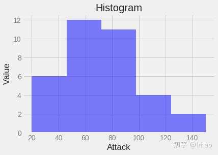
直方图
#Histogram
x = df['Attack'][:35]
num_bins = 5
n, bins, patches = plt.hist(x, num_bins, facecolor='blue', alpha=0.5)
plt.title('Histogram')
plt.xlabel('Attack')
plt.ylabel('Value')
plt.show()
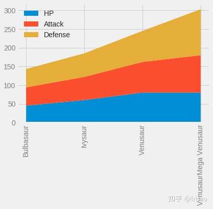
堆叠图
# Stackplot
x = df['Name'][:4]
y1 = df['HP'][:4]
y2 = df['Attack'][:4]
y3 = df['Defense'][:4]

labels = ["HP ", "Attack", "Defense"]

fig, ax = plt.subplots()
ax.stackplot(x, y1, y2, y3)
ax.legend(loc='upper left', labels=labels)
plt.xticks(rotation=90)
plt.show()
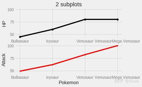
子图2
# Basic Subplot
# Data for plotting
x1 = df['Name'][:4]
x2 = df['Name'][:4]
y1 = df['HP'][:4]
y2 = df['Attack'][:4]

# Create two subplots sharing y axis
fig, (ax1, ax2) = plt.subplots(2, sharey=True)

ax1.plot(x1, y1, 'ko-')
ax1.set(title='2 subplots', ylabel='HP')

ax2.plot(x2, y2, 'r.-')
ax2.set(xlabel='Pokemon', ylabel='Attack')

plt.show()
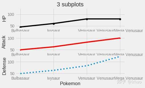
子图3
# Basic Subplot
# Data for plotting
x1 = df['Name'][:4]
x2 = df['Name'][:4]
x3 = df['Name'][:4]
y1 = df['HP'][:4]
y2 = df['Attack'][:4]
y3 = df['Defense'][:4]

# Create two subplots sharing y axis
fig, (ax1, ax2,ax3) = plt.subplots(3, sharey=True)

ax1.plot(x1, y1, 'ko-')
ax1.set(title='3 subplots', ylabel='HP')

ax2.plot(x2, y2, 'r.-')
ax2.set(xlabel='Pokemon', ylabel='Attack')

ax3.plot(x3, y3, ':')
ax3.set(xlabel='Pokemon', ylabel='Defense')

plt.show()
彩色条形图
ax = df['Type 1'].value_counts().sort_index().plot.bar(figsize = (12,6),fontsize = 14)
ax.set_title("Pokemon Type 1 Count", fontsize = 20)
ax.set_xlabel("Pokemon Type 1", fontsize = 20)
ax.set_ylabel("Value", fontsize = 20)

plt.show()
线性图
plt.plot(df['Attack'][:15], ':g')
plt.legend()

plt.show()
参考文献
- https://jakevdp.github.io/PythonDataScienceHandbook/04.00-introduction-to-matplotlib.html
- https://www.stat.berkeley.edu/~nelle/teaching/2017-visualization/README.html
- https://realpython.com/python-matplotlib-guide/
- https://matplotlib.org/index.html
- http://benalexkeen.com/blog/
以上就是matplotlib的用法,matplotlib是所有python绘图者都会使用到的工具,因此掌握matplotlib一些高阶用法,能够让你的数据探索变得更具竞争力。
如果你感觉这对你的工作学习有帮助,请点赞关注一键三连,支持我的工作!
Source www.zhihu.com