“The aesthetics of an utility vehicle”: Oleg Andreev on Tonkeeper Pro
The Daily TON
We’ve already written about Tonkeeper Pro, a more “advanced” version of the regular Tonkeeper. But it’s more interesting to hear details firsthand — from the person leading the development of both apps. What makes Pro different, how did it come about, and who is it for? And how do you design an app for advanced crypto users?
Oleg Andreev answered these and other questions for us. On Telegram we published a shortened version of the interview, but here is the full version for those who want the complete picture — an “Interview Pro,” so to speak.
TDT: Let’s start from the beginning. There’s the regular Tonkeeper, well known and loved. Why did the idea even arise to create another wallet?
Oleg: It goes back to the web version of Tonkeeper, which we launched more than two years ago. In crypto there’s a lot of regulatory uncertainty, with rules changing constantly. We wanted to hedge against the risk of Apple removing Tonkeeper from the App Store for some reason.
Telegram had a similar experience: they built two polished web versions so that, if needed, people could switch from the mobile app to those. A good insurance policy. That’s why we first decided to build a web wallet.
Once we had the web version, we realized it already worked as insurance — but now it needed its own value. We understood that sometimes we needed “advanced” features and a place to test new technologies.
Tonkeeper has introduced a lot of innovations to TON — the W5 wallet standard, TON Connect, and more. But innovation isn’t just about “coming up with something.” It requires iteration: invent, test, evaluate, refine. And we realized we could use our web wallet to add new features before releasing them to mass users. Pro users better understand what they’re doing, so the security risks are lower.
That’s why we first added W5 support, TRON support with gasless, and two-factor authentication to Tonkeeper Pro. 2FA is still only available there.
Although we started with the web version, we saw that users needed these capabilities on desktop and mobile too. So now Tonkeeper Pro is multi-platform, with a shared codebase.
TDT: Got it. Now imagine a user opens the app store, sees two different Tonkeepers, and wonders “what’s the difference?” How would you explain?
Oleg: They’re designed from two different starting points. Tonkeeper is made for the mass user: how do we make it as comfortable as possible? Tonkeeper Pro is designed around technological needs that must be met: its users need a variety of tools, so how do we implement all of them conveniently?
Mass users need basics like secure storage. Pro users are much more active in crypto. Some need treasury management. Some need to run payroll. Tech folks need to connect wallets to servers. Pro is built around these use cases. The optimization is for these cases, not for “packaging.”
Roughly speaking, Tonkeeper is like a Mercedes. Tonkeeper Pro is like an utility vehicle, a giant haul truck — in the best sense. Its dashboard has every button visible, nothing hidden behind ten clicks. But still with air conditioning and backlighting.
This design philosophy means the interface leans toward “feature-ism.” Navigation is built for lots of functions, all easily accessible.
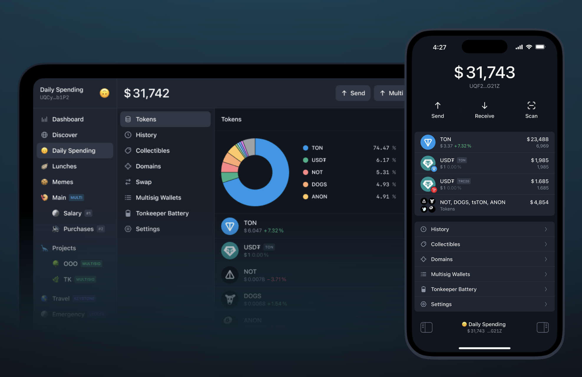
Tonkeeper Pro has three columns.
- The left column is navigation across all wallets. If you’re active in crypto, you’ve got lots of wallets — across jurisdictions, for different purposes, hardware, multisig, corporate treasuries. Here, you can organize them into folders.
- The middle column is for features and tools. The idea is it can be infinitely tall. We can keep adding tools without trying to squeeze them elsewhere — just list them all. Multisends, multisigs, security settings, whatever. Navigation is multimodal: you can be inside one tool and quickly switch wallets to view it in a different context.
- And as soon as something experimental appears, we can easily add it. Whoever needs it will find it. The interface scales. On mobile, trying to cram everything into a neat grid of icons would be painful.
Another defining quality of Tonkeeper Pro is its “massiveness.” Everything is “multi”: multisend, multiwallet, multisig. For example, some people need to send more than 255 transactions at once. One reason we created the W5 standard was exactly this. Pro’s interface supports loading an Excel file with hundreds of recipients — very convenient.
TDT: Usually “advanced” workflows are associated with computers, and Tonkeeper Pro first came as a desktop app. But later you made a mobile version. How did you fit all that power into a small screen?
Oleg: When we started on mobile, we asked: what is mobile Tonkeeper Pro? Just “regular Tonkeeper with more buttons”?
The answer was: mobile Tonkeeper Pro is really desktop Tonkeeper Pro, just in another format.
People want that desktop-level multifunctionality and multimodality even on a small screen. Sure, you’ll scroll more, but navigation should feel close to desktop.
We came up with a “pedal” concept. There’s a workspace — one column always on screen. But you can tap a side “pedal” to open a sidebar with wallets or tools. So, even with a smaller screen, you’re always one tap away from everything. The columns are reordered compared to desktop, but all three are always available. That’s the big difference from regular mobile Tonkeeper.
Some said Pro’s design looked “lower quality,” less polished. I disagree. A haul truck has its own aesthetics. We want Tonkeeper Pro to be beautiful too, in a way that gives aesthetic pleasure. The design isn’t sloppy, it’s intentional. It’s just aimed at users who want to sit in a massive, powerful vehicle, not in a taxi that drives itself.
So beauty, smoothness, and elegance are there — just more industrial, less pop. Denser, stricter layouts. But I find Tonkeeper Pro beautiful. It’s built to be beautiful in a massive, utilitarian way.
Take 2FA, for example. It’s not in regular Tonkeeper yet because we haven’t figured out how to make it elegant for mass users. But in Pro, 2FA integrates with the Telegram bot @tonkeeper. Instead of clumsy SMS codes, you just hit “OK” and the bot vanishes. No copying codes, no typing six digits under pressure. Just “Confirm,” tap, done. A secure, delightful experience.
And it’s fully compatible with the TON ecosystem, since it uses the W5 standard feature for wallet plugins. One of those plugins is 2FA.
In W5’s architecture, we even allow disabling default key-signature checks on the main account. You can fully delegate wallet control to another wallet or smart contract, making 2FA the only way in. Why? Because if key-signing were always possible, stealing your key would mean stealing your funds, while 2FA would be bypassed. By disabling it and working via plugins, a whole world of options opens.
Pro hasn’t even scratched the surface yet. 2FA is just one example. More features are on the roadmap: full account delegation, migration if your seed phrase is stolen, you could keep old wallets as “folders” of assets controlled by new ones without manually moving everything and breaking mechanics like staking pools or SBTs.
TDT: Clearly Pro has an advanced audience, but it’s also a diverse one. A trader and a startup founder might both need advanced tools, but very different ones. How do you handle that?
Oleg: Exactly. Traders need one thing, CFOs another, founders something else, and developers may script half their work but still need manual tools like that sometimes.
It’s like Adobe Photoshop or Microsoft Word. Each user only needs about 5% of the features. But the power is in supporting all those different 5% needs across a broad audience. That’s the design: a toolbox for diverse users.
The trade-off is that it’s not for those who want one-click simplicity. It’s professional-grade. If you don’t know why you need it, you’ll walk right past it.
Tonkeeper Pro won’t hold your hand to explain what crypto is. It assumes you already know, you already have crypto, and you need those three specific buttons for your task.
Beginners asking “why buy Bitcoin at all?” don’t need this tool. But once someone realizes they need those advanced 5%, they come here.
So it doesn’t make sense to segment Pro’s user base further. The only “segment” worth separating is the mass market, and that’s what regular Tonkeeper is for.
TDT: In consumer apps, mobile-first has won: services are built for phones first, then other platforms. For Tonkeeper Pro, is there a “primary” platform?
Oleg: I wouldn’t put it like that. For me and many others, it doesn’t matter. It depends on the situation.
One CFO told me: “Please make mobile Tonkeeper Pro, because I’m often one of the multisig signers, and if I’m in an airport or something, I don’t want to hold everyone up until I can open my laptop.”
So desktop and mobile Tonkeeper Pro aren’t two wallets — it’s one space. People just use whichever version fits their life at that moment. Imagine two startup founders: one at a desk, the other running around conferences. One uses desktop, one uses mobile. Tomorrow they might switch.
I personally use a big monitor, a laptop, and a phone. Same smart contracts, same wallets across all. If I’m settled, I use the monitor. If I’m on the go, I use my phone. It’s not a choice, just different interfaces for the same thing.
TDT: Last question. You said in Tonkeeper Pro nothing needs to be “hidden under the hood.” In mass-market products, complexity often has to be hidden from the user. Can you give an example of how this plays out differently in Tonkeeper and Pro?
Oleg: I’d say it’s less about “hiding complexity” and more about “making it elegant.” The expression changes with context.
Look at the bottom of the app. In regular Tonkeeper, there’s a four-item menu, immediately guiding users into separate sections. That’s the core navigation.
In mobile Tonkeeper Pro, it’s different. The current wallet is always visible, since you switch often and mustn’t get lost. That’s why we have a persistent bottom status bar. It shows your balance — even better than a wallet name, because you instantly know, “Oh, this is the one with the million.” And two navigation “pedals” are always visible.
So Tonkeeper surfaces limited navigation options right away. Pro tucks them slightly behind a pedal, but gives access to far more functions. And the current context is always clear. In regular Tonkeeper, your current wallet isn’t highlighted everywhere, since you don’t switch as often.
TDT: Thanks for the detailed answers!
While this interview was being prepared, Tonkeeper Pro continued to evolve: TRC-20 commission payments in TON appeared, and one TRC20 transfer per month was included in the subscription completely commission-free. This didn't make it into our questions – so we're just announcing it here.