labeling, lightfastness & toxicity (part I)
蛋挞报By Bruce MacEvoy
08-01-2015
Paint labeling is probably the least interesting topic on watercolor paints ... like reading the fire tag on a new mattress. Unfortunately, boredom leads to apathy, and apathy leads to ignorance, and it is this ignorance that paint manufacturers exploit through marketing hype.
Paint labels tell you what your are getting for your money, provided you know the difference between pigments, paints and "colors". If you don't, then marketing gimmicks will take control.
Lightfastness testing is certainly important, and the focus of recent consumer paint guides. But the claims of these sources need to be taken with a grain of salt.
Most paints sold today are required to carry health warnings, but you'll discover why these warnings often overstate the risks of using watercolor paints.
None of this information is hard to understand, and it's important background. Look it over, and absorb what you can. It's here for reference when you need it.
Table of contents
- pigments, paints & "colors"
- the marketing romance
- paint ingredient information
- lightfastness tests
- lightfastness with a grain of salt
- artistic responsibility
- health & environmental issues
pigments, paints & "colors"
The most important point to understand about the names of watercolor paints is the simple difference between pigments and "colors." This distinction is essential to understand if you want to get the right pigments in the watercolor paints you buy.
Because most artists have been trained under the "color theory" dogma that paints are just "colors", even knowledgeable artists or authors such as Michael Wilcox, Charles Reid, Susanna Spann, Jim Kosvanec or the late Zoltan Szabo do not always keep the distinction clear between pigments (colored powders), paints (mixtures of pigments and liquid vehicle) and "colors" (the product names given to paints). This results in frequent inaccuracies and outdated information in art instruction books, as explained in my book reviews. The editors at publishing houses such as Watson-Guptill, North Light or Watercolor Magazine share in the responsibility — after all, packaging and distributing information is their business. This confusion is an entrenched habit, abetted by the marketing techniques of art materials manufacturers, but a conscientious effort by artists, authors and publishers can put it in the past.
What's in a Name? The diagram below shows that the problem comes down to a single question: what exactly is in this paint?
What you actually buy online (or in a store) is, of course, the paint — the physical runny substance packed into a little tube. The paint is given a marketing name that allows you to identify it in the paint rack or catalog page. But what you really pay for is the pigment powder, because pigments create the color.Confusion can arise because the marketing name may not tell you anything about the pigment ingredients that are actually in the paint.

the problem with paint marketing names
Looking only at the pigment ingredients, watercolor paints come in three basic types: single pigment paints, convenience mixtures, and hue mixtures.
The single pigment paints contain only one pigment, with vehicle and additives, period. A paint with the marketing name cobalt blue contains only one pigment ingredient: cobalt blue (PB28). This is always the preferable formulation for artist's paints. You can directly see the quality (color, saturation, tinting strength) of the pigment, different brands of paint made with the same single pigment are usually very similar, and the lightfastness of the paint is as good as it gets. You know what you are working with.
Artists often mix paints to get specific colors that no single pigment matches exactly. This is especially true for pastel or whitened colors, purples, greens and dark valued (near black) colors. Paint makers often premix and package these recipes as convenience mixtures of two or more pigments. So a paint with the marketing name cyanine blue might actually contain the pigments ultramarine blue (PB29) and phthalo blue (PB15). Buying premixed paints is not usually an advantage over buying the pigments as separate paints, because premixed paints can hide flaws in the quality of individual pigments, and because the convenience paints are often modified by the artist anyway. You can just as easily mix the color you want from scratch, using single pigment paints.
Paint manufacturers also use mixtures of relatively cheap pigments to match the color appearance of more expensive pigments (usually in "student" paints); or they may use a mixtures of reliable modern pigments to match the color of traditionally popular but fugitive pigments. So a paint with the marketing name cobalt blue might actually be made of ultramarine blue and phthalo blue; a paint named alizarin crimson might actually be made with a quinacridone violet. Many of the traditional "earth" pigments (yellow ochre, raw sienna, raw umber, burnt sienna, burnt umber, PBr7), as well as fugitive pigments (carmine NR4, alizarin crimson PR83, and rose madder NR9), polluting pigments (manganese blue, PB33), expensive pigments (cobalt blue, cadmium yellow, PY35, cadmium red, PR108) and highly toxic historical pigments (vermilion, naples yellow, emerald green) are imitated in this way. These hue mixtures can be quite acceptable color substitutes for the original pigments, but they may suffer the same quality and lightfastness problems as convenience mixtures.
In each of these three cases — single pigment, convenience mixture or hue mixture — the paint manufacturer is free to give the paint whatever marketing name it deems appropriate.
Finally, the generic chemical names of modern synthetic organic pigments can make your eyes bug out. Phthalocyanine, diarylide, isoindolinone, benzimidazolone, anthraquinone, pyrazoloquinazolone, anthrapyrimidine, quinophthalone ... these are technical words that paint manufacturers almost always translate into something less forbidding.
In a few cases, paint companies adopt the proprietary pigment trade names — hansa yellow, irgazine red, monastal blue — which often reliably designate a specific pigment.
But in the majority of cases, paint manufacturers simply replace the awkward pigment name with an arbitrary marketing alternative. The most common choices are:
• the names of historical, fugitive or toxic pigments that are no longer used (mauve, carmine, rose madder, vermilion, bright red, dragon's blood, naples yellow, gamboge, indian yellow, chrome yellow, sap green, emerald green, van dyke brown, sepia, indigo, etc.)
• outdated labeling conventions peculiar to the art materials market (spectrum yellow, primary yellow or permanent yellow). "Permanent" is especially misleading: it was originally a 19th century paint marketing label that meant "a synthetic organic pigment that is not derived from aniline"; it has never meant "a paint that won't fade".
• proprietary paint manufacturer names or pigment nicknames (winsor red, blockx red, scheveningen red, australian red, thalo red, azo red)
• nonspecific color poetry (brilliant orange, vivid orange, translucent orange, warm orange, coral orange).
In all cases, again, these names tell you nothing about what is actually in the paint.
The crux of the problem is that paint manufacturers can name a paint anything they want. The result? If the marketing name is all you rely on, it is impossible to tell if two paints with the same name ("cobalt blue") contain the same ingredients, or if two paints with different names ("cobalt blue" and "cyanine blue") contain different ingredients — and in every case, you don't know what those ingredients really are.
the marketing romance
There is another layer of marketing that defines the paint manufacturer's trade image or brand style — a statement of the company's goals, its ingredient choices and paint manufacturing methods — and of course its relationship to you, the purchasing artist. I call this the marketing romance, and it exerts an amazing power over the many compulsive collectors of colored gum among watercolor painters.
Nowhere else are exotic marketing names and picturesque stories used more consciously and skillfully than in the Daniel Smith mail catalog or web site. Take for example their "PrimaTek® pure, authentic mineral pigment" paints, made (as they claim) from crushed regional rocks. (What exactly is an impure, inauthentic, nonmineral pigment made from crushed rocks?) Here is the tout from the Daniel Smith Summer 2004 mail catalog for a paint made of powdered turquoise:
"Many cultures thought an amulet [of turquoise] worn on a horse's bridle protected the horse and rider from a fall. The legends are many. The magic is yours to own. ... The mystic beauty of turquoise has been felt by every culture and its use has crossed national and cultural boundaries. Paint with DANIEL SMITH Natural Sleeping Beauty Turquoise Genuine and catch a piece of its rich and colorful history for yourself. Prepare to be captivated."
Set aside the suggestion that you might be painting while riding a horse, and focus on the proposition that you catch a piece of rich and colorful history by purchasing a tube of paint. And ask yourself ... how big is the piece of rich and colorful history that fits into a tube of paint? (And if you get more colorful history, does that mean you get less paint?)
Laughably, this kind of marketing gibberish actually works. People are coaxed to buy these paints because they covet protection, legend, magic, mysticism, tradition, colorful history or captivation ... in short, because they seek a consumer experience. For these amateur artists, buying an amulet in an Indian ersatz souvenir shop, and buying a piece of colorful history, are pretty much the same thing.
Most marketers do not attempt to seduce you outright, as Daniel Smith does, but rather to distract your attention or mislead through adjectives that deliver empty claims. These hackneyed romance stories make liberal use of nonsense buzzwords such as genuine, pure, natural, authentic, made by hand, craftsmen, rare, classic, workshop, historical, time honored, original recipe, founded in ("founded in 1664"), handed down for generations, used for centuries and, of course, trusted by professional artists.The nonsense here is that none of these terms have any legal force, nor do they refer to any industry standards or regulated practices. They claim much, but guarantee nothing.
You defang this kind of marketing bite by reversing the qualifiers in each case (for example, "impure, inauthentic, nonmineral") or by looking into the technical documentation. Here for example is the "quality guarantee" used for many years by Blockx:
"We never use non lightfast pigments and never made second quality range. We want artists confortable with quality question so we make only the best one. We still use stone mills the only ones to reproduce an handmade job. All our colors are made in our workshop in Belgium by specialised craftsmen working under the leading of Jacques Blockx himself" [sic throughout!].
So ask: what is an unspecialised craftsman? ("Paintmaker" does not sound so romantic.) What is a handmade job? All commercial watercolor paints are manufactured in the same way: with ingredients measured by hand into large premixing tubs, thoroughly mixed on three roller milling machines fed and controlled by hand, packed in tubes with hand operated crimping machines, and identified with self adhesive labels applied by hand or with paint information preprinted on the tube. No paint is made by blending pigment and vehicle by hand with a mortar and pestle. And how specifically is paint milled with stone rollers superior to paint milled with the standard metal rollers (beyond the mere claim that "old ways are better")? And how does the fact that Blockx doesn't make a student (second quality) range of paints create any assurance about the quality of the paints they do make?
Finally, as I explain elsewhere, during the many years this guarantee appeared in the Blockx marketing literature, Blockx did in fact use impermanent pigments in several paints (see for example PY1, PR3, PR83 and PR106). Isn't it a more reliable guide to quality that a paint company lies or does not lie to you in its marketing materials?
As an example of factual investigation, let's drop by those diligent artisans at Old Holland and see what they have to say about their line of 168 watercolors:
"One of the unique characteristics of these watercolours is the unparalleled colour strength (maximum pigmentation). And while this high colour strength requires a slightly different approach on the part of the aquarellist (so little paint is needed from the tube or cup for the desired colour effect that you have to get used to the ratio of paint to diluent), the advantages are clear.
It is well-known that Old Holland attaches a hand-painted colour strip to its tubes of oil paint and acrylic paint, showing the paint in the tube in question. A different solution was chosen for the watercolours. The labels of the tubes and cups of watercolour do not show the full tone of the paint, but the undertone (a logical choice following on from the technique of watercolour painting). The colours on the labels are screen printed with the watercolour in this undertone, using a screen printing technique developed specially for Old Holland."
The unparalleled colour strength referred to is assessed by tinting test. I have personally inspected the comparative tinting tests of several watercolor paint brands conducted by a USA watercolor paint manufacturer, and while Old Holland watercolor paints are not noticeably weaker than other brands, they are certainly not "unparalleled".
It's relevant to examine the paint ingredient information to find out what pigments we are getting at unparalleled colour strength. To do this we must consult the Old Holland web site, and click on individual color swatches for ingredient information. A tedious process, but we discover that their two cobalt violet paints are actually convenience mixtures of three (cobalt violet dark) or four (cobalt violet light) pigments, none of them genuine cobalt violet (PV14 or PV49); that sap green lake extrais formulated with black pigment (PBk7) plus four (!) other pigments; and that a staggering 28 colors (!) contain white pigment (PW4) — and that's excluding another 6 shades of white or gray paint!
Pause for a minute. Why would watercolor paints be formulated with white or black paint? Added white paint is an acceptable ingredient in oil paints, but is generally something to avoid in watercolors. The realization comes if we browse over to the oil paint section:
"Oil paint has a special place at Old Holland. It is the first product we manufactured. ... In 1985, following extensive research, Old Holland presented a revolutionary range of 168 oil paints, each with the highest degree of lightness [sic]."
Old Holland makes 168 oil colours and 168 watercolors ... it's obvious what has happened. They purchased pigments and formulated pigment mixtures to create their inaugural line of oil colors, and when it came time to add watercolors to their brand, they just mixed the oil color pigment formulations with some gum arabic and glycerine — unparalleled strength of white pigment and all!
As a last bit of detective work, we're alerted that something is amiss by the fact that most of the description of the watercolor paints is actually focused on the watercolor paint labels — the missing color swatches, in fact. I worked for several years in the printing industry, and I can affirm that there is no screen printing technique "developed specially" for any client. Modern printing technology is highly standardized. But why print color samples that would be much easier to create with fast drying watercolors than with sticky and slow drying acrylic or oil colors? My conjecture is: the painted labels would fade in the retail display rack. After all, 28 of the nonwhite paint colors contain white pigment!
Here is the sleeve magic from Sennelier:
"Only the purest pigments are chosen and in the time honored tradition. The pigments are soaked in purified water for 24 hours before cold grinding for maximum consistency and luminosity. The binding solution is composed of hand-picked gum arabic from Senegal and honey from the Alps. The result is intensely deep colors that offer delicate transparencies and the distinctive "satin luminosity" unique to French watercolors."
In fact, these are standard manufacturing details described to make them sound special. All modern industrial powdered pigments are shipped in "pure" form, all paint manufacturers premix the paint ingredients before milling; all genuine gum arabic is harvested by hand, etc. A few euphemisms (grindingmeans milling, binding solution means vehicle) and nonsense claims (honey from the Alps is the same as honey from anywhere else, there is no distinctive "satin luminosity" unique to French watercolors) are thrown in for poetic effect.
It's quite a shock, then, to read the brief and factually accurate product claims in a 2005 Utrecht catalog:
Made in our Brooklyn plant, Utrecht brand professional Artists' Watercolors rank among the world's finest for their transparency, lightfastness and working properties — all at a friendly Utrecht price.
Your only defense against marketing romance, refund aside, is to apply common sense to the marketing claims. The easiest way is to put the claim in a different context. Handmademay sound as desirable as homemade, but if you imagine that handmade means some guy with an industrial blender in his garage, and homemade means granny drooled in the batter, then the magic evaporates. Does the fact that Old Holland started making paints in 1664 guarantee the quality of products made by the company today? Answer: no, it doesn't. Is honey from the Alps really a better humectant than honey from Spain or France? Answer: no, it's not. Are traditional manufacturing methods really better than modern methods? Answer: it depends, but typically no, they are not.
If you can't explain what the marketing claim means, or explain why the marketing claim makes a difference to the quality of the gummy stuff in the tube, then you can see the emptiness of the marketing gibberish and you've disarmed the marketing magic. The spell is broken, and you're a free spirit again. Now that'smagical!
paint ingredient information
So how do you find out about the pigment in the paint? You find it listed on the paint packaging. After a long period of rampant labeling and marketing abuse, the art materials industry has voluntary adopted the ASTM standards for commercial paint labeling. These require manufacturers to list the paint pigments on the packaging, both as the pigment common name (such as "Dioxazine Violet" or "Cadmium Red") and as the pigment color index generic name, a code that identifies each pigment as a generic chemical compound.
(A third identifier, the five to seven digit color index constitution number, is a numerical code assigned to pigments to indicate a specific chemical formulation. This number is occasionally withheld to protect proprietary pigment recipes, and is not part of the ASTM standards.)
Color Index Name. The color index naming system is standardized, regulated and disseminated by the Society of Dyers and Colourists, London (UK), in collaboration with the American Association of Textile Chemists and Colorists (USA). The current naming codes for pigments and dyes are available to subscribers as the massive Colour Index International, currently in its 4th (2001) edition.
The pigment common name is often a technical chemical name ... something about benzimidazolone, or quinacridone, or quinophthalone, or thioindigoid ... we're no longer in that warm and fuzzy realm of poetic paint names that marketers use to move that product.
No matter: the color index name lets you identify pigmentswithout the chemical jargon. It's a simple code, that consists of:
• The letter P to denote a pigment (rather than a dye, D, or a basic dye, B); you will occasionally see N to refer to natural pigments such as cochineal, rose madder, gamboge or lapis lazuli
• A letter to denote one of ten basic color categories: R for red, O for orange, Y for yellow, G for green, B for blue, V for violet, Br for brown, W for white, Bk for black and M for metallic
• A number referring to a standard list of pigments within each color category. This number is assigned as a pigment is introduced for commercial use, and may be withdrawn or deleted if the pigment is no longer manufactured. (The symbol "N/A" for "not applicable" is used in the rare cases when a pigment is commercially available but is not included in the pigment list to protect a proprietary formulation.)
So PY40 refers to the 40th entry in the list of yellow pigments (aureolin), PO20 to the 20th pigment in the list of oranges (cadmium orange), NR4 refers to the fourth red listed in the natural pigment list (cochineal), and so on. (Numbering is not consecutive, as some pigments or dyes have been deleted over time.)
Now, the color index name or constitution number is the most reliable way to identify paint ingredients. To help you learn this color naming system — which is very easy to use once you get familiar with it — all paints in the guide to watercolor pigments are grouped by color index name.
The Color Index and "Color". Unfortunately, the color index name does not identify a consistent paint color, because some chemically equivalent pigments can exist in several forms, each with a different hue. Some of the most important examples: cadmium yellow (PY35) can be anything from a lemon yellow to a near orange, cadmium red (PR108) can range from a scarlet red to a dark maroon, natural iron oxide (PBr7) can be anything from a dull yellow or orange to a brownish black, quinacridone violet (PV19) can be a bright red, dull carmine, bright rose, or dark reddish violet, cobalt turquoise (PB36) can be a cerulean blue or a dull turquoise green, and cobalt titanate green (PG50) can range from a pale bright turquoise to a dull yellowish green.
The color index name and number refer primarily to the chemical composition of the pigment. So color varieties within the same CI name are produced through adustments in the manufacturing methods (especially in the amount of time the pigment is calcinated and in the extent or method of grinding into fine particles) or through variations in the the proportions of pigment ingredients or in the structure of the pigment crystal. Thus, the iron oxide color variations are produced by differences in the amount of added manganese, in the length of the calcination, and in the particle size; the cobalt and cadmium variations are produced by the particle sizes and the proportion of added secondary metals (tin or aluminum for cobalts, selenium for cadmiums); the quinacridone variations by the crystal form and particle size, and so on.
Even with these important exceptions, the color index naming system is very useful. A look at some commercially available green paints will show you immediately how the color index names are much superior to the manufacturers' marketing names if you want to find out the actual ingredients and paint colors involved in your paint selection:
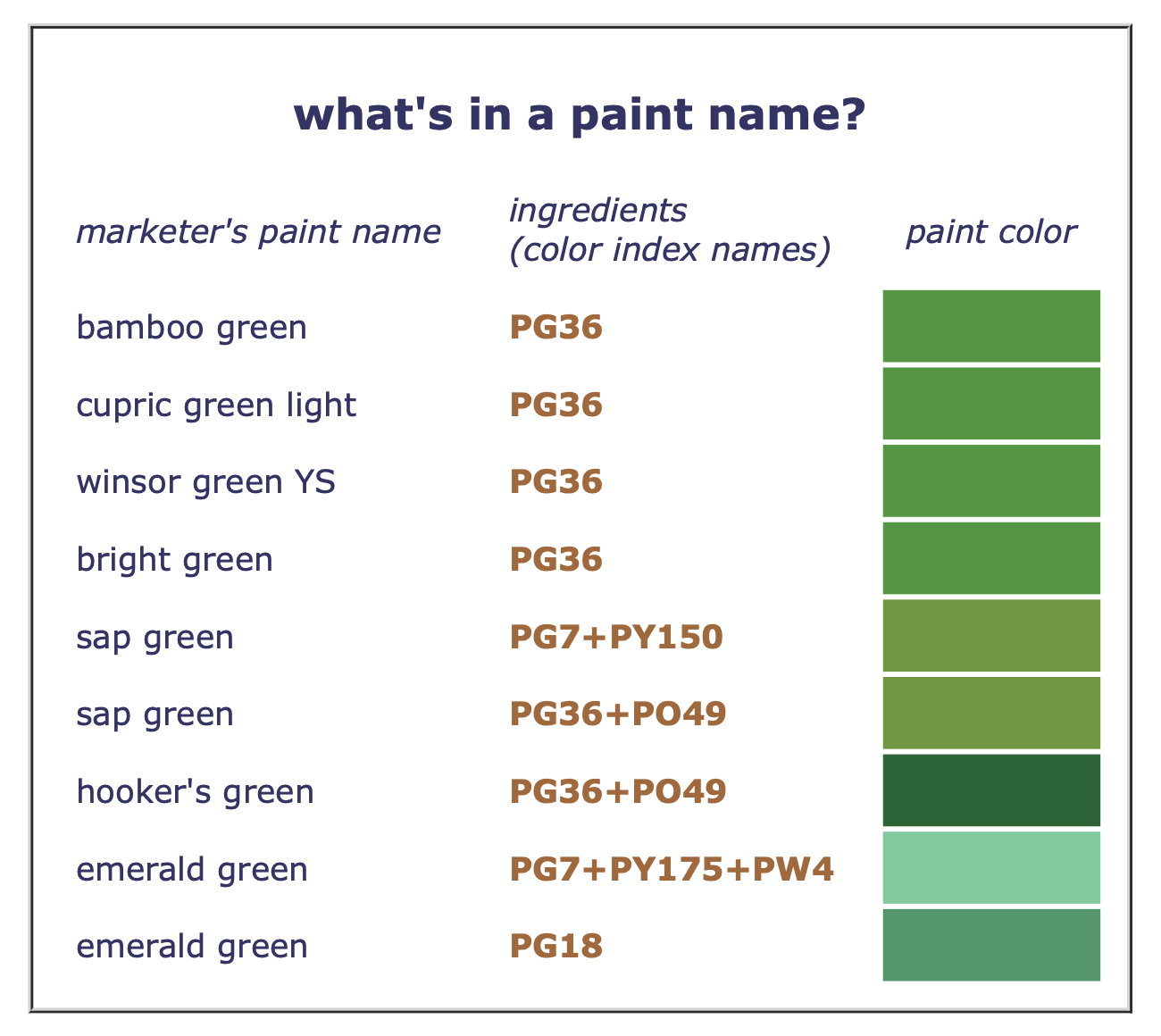
The first four greens are made of exactly the same pigment, and will look almost identical on the paper, even though they have completely different marketing names. None of these manufacturer labels refers to the pigment's common name (phthalocyanine green), so the labels don't explain what is really in the paints, which might tell you whether or how much their colors or handling attributes differ.
The next three greens are mixtures of two pigments: the first two paints have different ingredients even though the marketing names and actual paint colors are the same; the last two paints are made with exactly the same ingredients (in different proportions), yet the marketing names (and paint colors) are different. Again, without the color index names, it would be impossible to sort this out.
The last two examples show two paints with the same name. Using the color index name, you find that one is made of three ingredients, the other of a completely different single pigment that almost every other paint manufacturer calls by its common name, viridian. (Vert émeraude is the common name for viridian in France.) You also can verify that neither paint contains a speck of the historical pigment emerald green, PG21, the poisonous copper acetoarsenite.
"Hue" Paints. To conform to the ASTM labeling standards, manufacturers must also use the designation hue for a paint that is named with a pigment common name but that does not actually contain the pigment. For example, a paint named Manganese Blue must contain the pigment "Manganese Blue, PB33," and if it does not, it must be called Manganese Blue Hue. Every paint manufacturer I know of does not respect the letter of this standard, especially for historical color names — carmine, madder, sepia, indigo, van dyke brown, gamboge, emerald green, and any color name with sienna, umber or earthin it. No matter: even in these cases, the color index information will clear up most of the confusion.
Finally, the ASTM standards recommend that the packaging show the paint's ASTM or manufacturer lightfastness rating, and federal or state (California) law requires a health warningfor pigments that may poison or cause allergic reactions (as described below).
Although paint manufacturers have become more forthright, you cannot depend on paint manufacturers to name paints accurately. With the color index name you cut through the marketing clutter and actually see what you're getting for your money. Always refer to the color index name to be sure of what you are buying, and only choose paints that show the pigment common name and color index name on the tube: "Dioxazine Violet, PV23," "Cadmium Red, PR108," and so on. Pigments listed in the guide to watercolor pigments, in the complete palette, or mentioned elsewhere in this site, always refer to the color index name so you know which pigment is being talked about.
If you encounter a paint that does not provide this industry standard information on the paint packaging and in the brochure, you have a simple remedy — don't buy it!
next: part II