iOS 26 Liquid Glass UI in Flutter: Issues & Solutions with MaterialApp and Cupertino Icons
FlutterPulseThis article was translated specially for the channel FlutterPulseYou'll find lots of interesting things related to Flutter on this channel. Don't hesitate to subscribe!🚀
Learn how Flutter developers can adapt to iOS 26's new Liquid Glass design. Explore issues with Cupertino widgets, MaterialApp solutions…
Learn how Flutter developers can adapt to iOS 26's new Liquid Glass design. Explore issues with Cupertino widgets, MaterialApp solutions, and how to use cupertino_icons for an attractive iOS app.
Introduction
Apple's iOS 26 introduced the sleek Liquid Glass design language, characterized by semi-transparent frosted glass containers, vibrant gradients, and smooth blur effects. While this adds elegance and depth to native iOS apps, Flutter developers face a challenge: Cupertino widgets are still based on pre-iOS 26 design standards, resulting in a UI that feels outdated.
For apps targeting iOS users, maintaining a native look and feel is critical. This article explores the problems, solutions, and practical implementation strategies to create a modern Liquid Glass UI in Flutter.
If you are a member, please continue ;otherwise read the full story here.
1. Problem: Cupertino Widgets Are Outdated
Flutter's Cupertino widget library models iOS widgets from before iOS 26. Developers may notice:
- Outdated Toolbar and Navigation appearance — lacks modern blur and transparency effects
- Non-adaptive colors for dark mode — iOS 26 introduces dynamic dark/light mode blending
- Limited frosted glass effects — existing Cupertino widgets cannot replicate the smooth blur seen in iOS 26
These shortcomings can make Flutter apps feel "non-native" on modern devices, negatively impacting user experience.
2. Solutions in Flutter
To adopt the Liquid Glass design in Flutter, developers can combine custom widgets, MaterialApp theming, and cupertino_icons.
2.1 Custom Widgets for Liquid Glass
Creating custom widgets allows full control over blur, transparency, and gradients.
Example:GlassToolbar
import 'dart:ui';
import 'package:flutter/material.dart';

class GlassToolbar extends StatelessWidget {
  final String title;
  const GlassToolbar({required this.title, super.key});
  @override
  Widget build(BuildContext context) {
    return ClipRRect(
      borderRadius: BorderRadius.circular(20),
      child: BackdropFilter(
        filter: ImageFilter.blur(sigmaX: 15, sigmaY: 15),
        child: Container(
          color: Colors.white.withOpacity(0.15),
          padding: const EdgeInsets.symmetric(vertical: 12, horizontal: 16),
          child: Text(
            title,
            style: TextStyle(
              color: Theme.of(context).primaryColor,
              fontSize: 18,
              fontWeight: FontWeight.bold,
            ),
          ),
        ),
      ),
    );
  }
}
Pros: Complete control over UI, easy to adapt future design changes
Cons: Manual maintenance, more development effort
2.2 MaterialApp with ThemeData
Using MaterialApp allows global theming and easier management of colors, brightness, and background.
MaterialApp(
  theme: ThemeData(
    brightness: Brightness.dark,
    scaffoldBackgroundColor: Color(0xFF1E1E1E),
    primaryColor: Colors.blueGrey,
  ),
  home: HomeScreen(),
)
Benefits:
- Set dark mode globally
- Define primary colors for consistency
- Combine with custom widgets to achieve Liquid Glass look
Limitations: MaterialApp alone cannot replicate frosted glass — custom widgets are still needed.
2.3 Using cupertino_icons
The cupertino_icons package ensures icons match the native iOS style.
Icon(CupertinoIcons.settings, color: Theme.of(context).primaryColor)
- Ensures consistency across menus, navigation bars, and buttons
- Works seamlessly with MaterialApp and custom glass widgets
Version recommendation:cupertino_icons: ^1.0.8
2.4 Adaptive Styling
To ensure compatibility, detect iOS version and apply Liquid Glass only for iOS 26+.
if (Theme.of(context).platform == TargetPlatform.iOS) {
  // Apply Liquid Glass widgets for iOS 26+
} else {
  // Fallback to default Cupertino widgets
}
This avoids breaking the UI on older devices.
2.5 Fallback Strategy
Even with a modern Liquid Glass UI, always provide:
- Non-blurred fallback for low-end devices or older iOS versions
- Dynamic color theming using
Theme.of(context).primaryColorinstead of hardcoding colors - Optimized blur performance with
sigmaXandsigmaYvalues
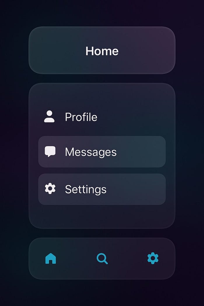
3. Example: Implementing a Liquid Glass UI in Flutter
Here's a simple full-screen example combining toolbar, menu, and bottom navigation:
class LiquidGlassHome extends StatelessWidget {
  @override
  Widget build(BuildContext context) {
    return Scaffold(
      backgroundColor: Theme.of(context).scaffoldBackgroundColor,
      appBar: PreferredSize(
        preferredSize: Size.fromHeight(60),
        child: GlassToolbar(title: "iOS 26 Liquid Glass"),
      ),
      body: Center(
        child: GlassMenu(),
      ),
      bottomNavigationBar: GlassNavBar(),
    );
  }
}
Key Widgets Used:
BackdropFilter– for blur effectClipRRect– for rounded cornersThemeData– for dark/light theme and primary colorscupertino_icons– for iOS-style icons
4. Tips for an Attractive Liquid Glass UI
- Use gradient backgrounds to add depth
- Apply rounded corners to all glass elements
- Highlight text and icons with ThemeData.primaryColor
- Keep opacity 10–20% for subtle frosted glass
- Add animations on hover or tap for interactive feel
- Ensure contrast for readability, especially in dark mode
5. Conclusion
Adapting Flutter apps to iOS 26 Liquid Glass UI requires:
- Custom widgets with
BackdropFilterand semi-transparent containers - Proper use of
MaterialAppwithThemeDatafor global theming - Consistent iOS-style icons via
cupertino_icons - Adaptive logic for older iOS versions
By combining these techniques, Flutter developers can build modern, fluid, and native-feeling iOS apps that embrace the Liquid Glass aesthetics, ensuring both elegance and usability on iOS 26+ devices.
Pro Tip: Always leverage dynamic theming and avoid hardcoded colors. This ensures your app adapts gracefully to future UI changes and dark/light mode updates.