a Twitter thread from @tbuytaer
@TwitterVid_bot1.
The more people in society are vaccinated, the more of the deaths will be among vaccinated people.
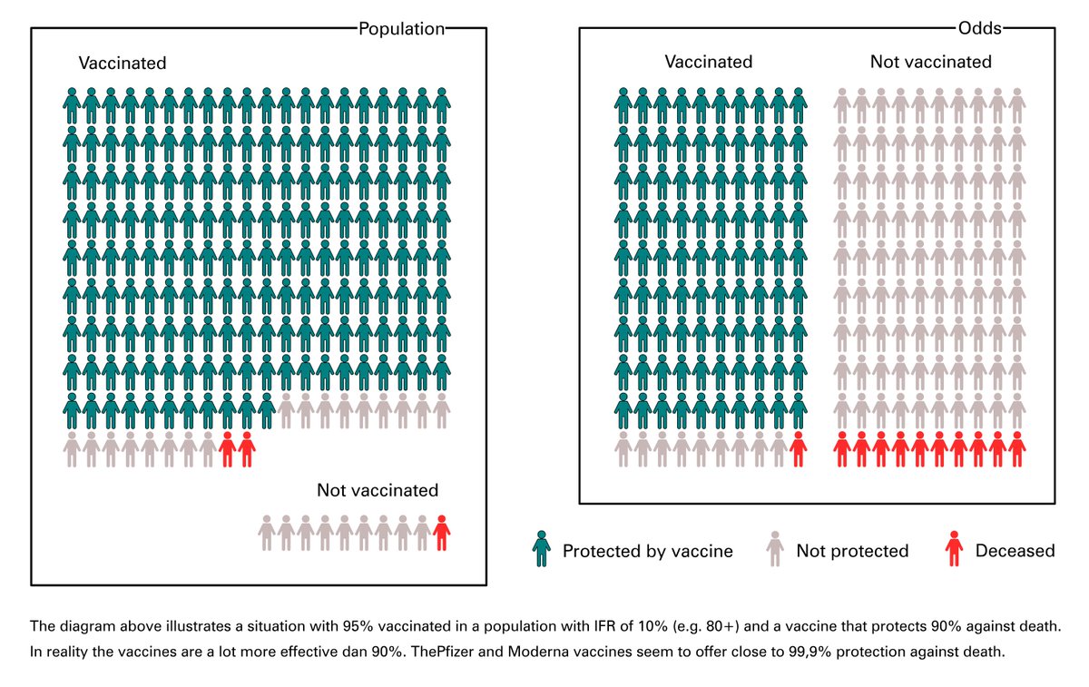
Imagine a scenario where 95% is vaccinated, with a vaccine that is 90% effective, in a target group where IFR is 10% (80+).
(In reality vaccines are a lot more effective)
2.
In that scenario the total number of deaths among vaccinated people will be 2x higher, but their individual chance is 10x lower than that of people who are unvaccinated.
So that might sound like the vaccines are not working.
3.
That the total number is higher among the vaccinated is thus normal, and a result of the fact that there are simply more vaccinated people around. 🤷
If there are more red cars driving around on the roads, more red cars will crash.
4.
You can see the actual (individual) protection provided by the vaccine on the right side, which shows the odds of dying* for vaccinated and non-vaccinated groups.
* For this fictional scenario of only 90% protection. In reality protection is a lot higher.
5.
The vaccines do not offer 100% protection against heavy illness or death (although it is very close) .
So sometimes a (small!) part of the vaccinated people will still end up in hospital.
It's much less likely than if you are not vaccinated, but sometimes still possible.
6.
In my infographic you see two views of the same situation: absolute numbers and odds.
left box:
- 10 unvaccinated, of which 1 died
- 190 vaccinated, of which 2 died
right box:
- 1 out of 100 vaccinated people died
- 10 out of 100 unvaccinated people died
7.
The left box corresponds to "the numbers" that you will see in the news and on dashboards published by CDC, Worldometer, RIVM,...
But the right box is the one that counts.
That one indicates that the vaccines do make a big difference.
8.
So if you might hear about vaccinated people still ending up in hospital, keep this in mind.
This is an example of the 'Base Rate Fallacy':
https://en.wikipedia.org/wiki/Base_rate_fallacy
9.
If someone is throwing percentages at you, a good reflex is to ask yourself: "exactly WHAT is this a percentage of?"
Or you could draw an example: "If I have 100 people in this group and 100 in the other, what happens to those percentages then?" 🤔
10.
Reality is, of course, more complex than just one aspect.
In addition to what I mentioned in the Twitter thread above, there are other aspects to keep in mind when comparing numbers.
Such as, for example, whether the risk is the same in both groups. (e.g. age difference)
11.
The numbers I used in my infographic are fictitional, just to illustrate this concept.
Actual protection of vaccines against death (also with the variants) is more than 90%. (maybe even close to 99.9%)
But I didn't want to draw 10,000 people on my infographic 🤷
12.
See for example this study in the United States, which found that the Moderna vaccine offered between 91.0% and 99.8% protection against death after double vaccination.
https://www.medrxiv.org/content/10.1101/2021.04.21.21255873v1
13.
Or this study from Qatar where among 265,410 doubly vaccinated, 1616 people were infected, of which 2 died.
2 out of 1616 ➡️ 99.88% protection
https://www.nejm.org/doi/10.1056/NEJMc2104974
14.
https://twitter.com/Jeffely/status/1408500890999328770?s=19
➖➖➖➖➖➖➖➖➖➖➖
Jeffrey Ely (@Jeffely)
The base-rate fallacy is about to become a daily nuisance when it comes to processing outbreak data in highly vaccinated societies. Here's a cautionary tale.
➖➖➖➖➖➖➖➖➖➖➖
Read this thread on Twitter
Made by @TwitterVid_bot