Writing

Writing Task 1
IELTS Academic Writing Task 1 requires you to write 150 words about data (in the form of a bar chart, line graph, pie chart or table), a process or map. This is a skill many students have not practiced before and don’t do so well as a result. The key to doing well in Writing Task 1 is knowing how your essay is marked and then using this information to give the examiner exactly what they want.
I advise my students to use a 5 step approach:
- Understand the marking criteria
- Paraphrase the question
- Write an overview
- Support overview with detail
- Check your work
By breaking the task down into smaller parts the task becomes much easier. Below I will look at each of the 5 steps in more detail and then give you some sample answers so you can see what it looks like in practice.
Note: Please note that I will be giving you the opportunity to correct my work at the end so if you see some mistakes don’t go crazy in the comments section. Mistakes are intentional to demonstrate the value of checking your work and allowing people to really think about the answer.
We will be using the question below to help us:
If I had to say just three general things about the graph above, they would be:
- Burglary decreases dramatically.
- Car theft increases steadily.
- Robbery remains steady throughout the period.
That’s it. You don’t need to over-complicate it. Just find the three or four most obvious things and pick them out.
We are now ready to take our three main features and add them to our overview paragraph. An overview paragraph should normally be 2 sentences and state the main features in general terms. Never support the main features with data in the overview. Dates are fine, but don’t use any other numbers.
Our overview paragraph will look like this:
The most noticeable trend is that burglary fell dramatically over the period. Car theft fluctuated until 2008, upon which it rose steadily; whereas the number of robberies remained relatively stable between 2003 and 2012.
Again, this paragraph is very simple, clear and easy to read. Please see our Task 1 grammar guide for more ways to describe general trends.
Now that we have finished our overview it is time to support it with more detail in the next two paragraphs.
4. Support Overview with Detail
We reported three main features in the overview and now we must take each of those features and describe them in more detail.
- If we take robbery first we notice that it goes up a little first, then there is a big drop until 2008 when it goes up slightly and then remains steady.
- Car theft goes up and down slightly (fluctuates) until 2008, when it rises steadily.
- Robbery also fluctuates throughout the period but not by much. It rises slightly and drops, then remains steady for a number of years, before rising and falling slightly again.
Now that we have looked at these in more detail we need to put them into sentences.
Burglaries started at just below three and a half thousand in 2003 and apart from a small rise of around five hundred offences in 2004, fell drastically to just over one thousand incidents in 2008. 2009 saw a slight rise to just below fifteen hundred and it remained in and around this figure until the end of the time period.
From 2003 to 2008 the number of car thefts shifted between just below two thousand five hundred and just over two thousand, before rising steadily to nearly three thousand in 2013. Over the entire period robbery never rose above one thousand and did not go under five hundred.
5. Check Your Work
The first draft of our essay looks like this:
The line graph displays alterations for burglary, car theft and robbery in the centre of Manchester between 2003 and 2012.
The most noticeable trend is that burglary fell dramatically over the period. Car theft fluctuated until 2008, upon which it rose steadily; whereas the number of car thefts remained relatively stable between 2003 and 2012.
Burglary started at just below three and a half thousand in 2003 and apart from a small rise of around five hundred offences in 2004, fell drastically to just over one thousand incidents in 2008. 2009 saw a slight rise to just below fifteen hundred in 2009 and it remained in and around this figure until the end of the time period.
From 2003 to 2008 the number of car thefts shifted between just below two thousand five hundred and just over two thousand, before rising steadily to nearly three thousand in 2013. Over the entire period robbery never rose above one thousand and did not go under five hundred.
We now should have a few minutes to check our work for mistakes and see if there are any improvements we could make. This is a crucial stage and you should aim to have at least 3-4 minutes at the end to check and improve everything.
When we check our work we should:
- Check spelling and punctuation
- Check verb tenses. Are they the correct tense?
- Check accuracy of the data used.
- Check vocabulary. Is there any repetition we could remove with synonyms?
- Check paragraphing.
- Check word limit. Over 150?
You should write your answer in pencil so you can make quick alterations.
Check the draft essay above. What changes would you make?
Sample Essay
Here is another question and an example of a good answer so you can see the 5 step system in action.

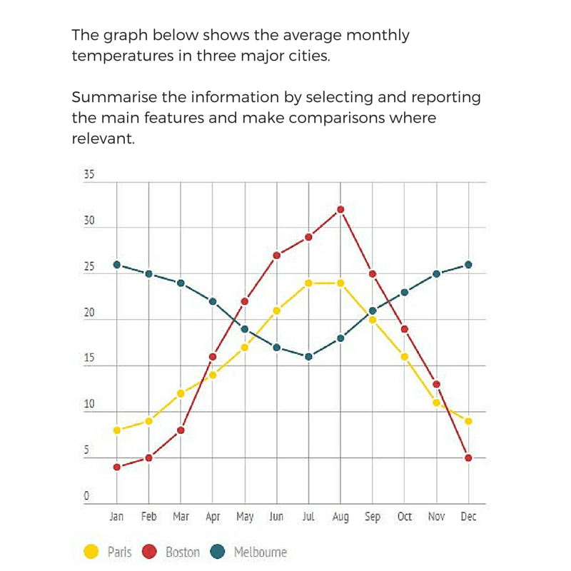
The chart gives information on average monthly temperatures in Paris, Boston and Melbourne.
Paris and Boston have similar climates; both having lower temperatures between November and March and higher temperatures for the rest of the year, peaking in July and August. Melbourne has the opposite cycle with cooler temperatures between May and August, with the hotter months being from September to April.
Boston’s coldest month is January with an average temperature of just under 5 Celsius and the weather gets increasingly hotter until it reaches a peak of over 30 degrees. It then continues to decline by approximately 5 degrees per month until December. Similarly January is also Paris’s coldest, but with a milder temperature of just below 10 C and it steadily rises until it reaches a peak of just under 25 C in July and August, before becoming consistently cooler until the end of the year.
In contrast, January and December are Melbourne’s hottest months when temperatures average just over 25 degrees Celsius. They then steadily fall each month until they get to a low of around 15 degrees, before getting warmer each month until December.
Summary
