Why Consistent Labels Improve Conversion on Ecommerce Sites
In the evolving landscape of ecommerce, one thing remains clear: user experience (UX) is a critical driver of conversion. Among the many elements contributing to UX, the clarity and consistency of navigation labels often go overlooked, yet they play a pivotal role in guiding customers effortlessly through product discovery and purchase. This post explores why consistent labels—especially within site search boxes and product categories—are essential to reducing friction, minimizing choice overload, and ultimately boosting conversion rates.
The Problem of Choice Overload: An Organization IssueOne of the biggest challenges ecommerce sites face is choice overload. When shoppers are presented with too many options without a clear organizational framework, they can become overwhelmed, leading to decision paralysis or site abandonment.
Choice overload is fundamentally an information architecture problem. Properly organized information helps users quickly understand what’s available and where to find it. Without intuitive navigation labels and a logical hierarchy, users waste energy trying to decode the site, increasing friction and decreasing the likelihood of conversion.

Think of labels as the signposts on a shopping journey. If signs point inconsistently or incorrectly, shoppers get lost or frustrated and abandon the trip altogether.
Information Architecture as Part of the ProductToo often, ecommerce sites treat navigation and labeling as an afterthought—something to bolt on after product, design, and marketing decisions are made. However, the information architecture (IA)—the structure, hierarchy, and labeling system of the site—is a fundamental part of the product itself.
IA is the lens through which shoppers interpret the entire product catalog. A poorly architected site forces users to expend effort just to figure out where things live, increasing cognitive load and decreasing engagement.
Integrating IA Early in Product Design Align categories with user mental models: How do customers think about your products? Forcing them into unnatural groupings causes friction. Use consistent language: A product called “blazer” in one place shouldn’t be under “jackets” in another if users expect a clear category. Iterate based on real user behavior: Analytics from site search and category navigation reveal where labels need tuning. Categories as a Mental Map: Guiding Product DiscoveryCategories aren’t just containers for products; they serve as a mental map that helps users understand how an ecommerce site is organized. Well-labeled categories empower users to browse with confidence, turning the act of exploration into active product discovery rather than aimless wandering.
How Clear Categories Enhance UX Conversion Provide context: Categories contextualize what products belong together, telling users “these items are related.” Support browsing behavior: While site search is vital, many users prefer to browse categories to discover new items they might not have known to search for. Reduce cognitive friction: Users don't have to guess where to look; consistent category labels eliminate uncertainty.For example, if a site’s visual hierarchy categories shift terminology mid-navigation—calling something "Home Office" in one menu but "Workspace" in another—users lose confidence in their mental map. This inconsistency undermines smooth product discovery, increasing drop-off.
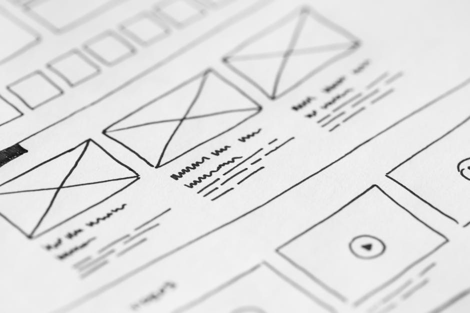
Many ecommerce sites overly rely on the site search box as a crutch, assuming that users will simply search for what they want instead of navigating via categories or menus. This is a UX mistake that can reduce conversion by obscuring the true scope of the product offering.
The Limitations of Site Search Assumes users know what to search for: New or casual shoppers may not have the precise terminology or product names. Ignores browsing preference: Some users prefer to explore categories and see product groupings visually. Search results quality varies: Ineffective search algorithms or poor tagging can return irrelevant results, increasing frustration. Why Browsing with Clear Categories Still MattersCategories offer a structured browsing path that complements search. Clear labels and consistent organization reduce the cognitive load for users deciding whether to dive deeper or refine their choices. When labels are inconsistent or confusing, users might skip browsing altogether, relying on search that might not deliver.
Practical Tips to Implement Consistent Labels that Improve ConversionHere are actionable ways to leverage consistent labeling to reduce friction and boost product discovery:
Conduct user research: Understand the language and terminology your customers use to describe products. Create and maintain a labeling style guide: Ensure everyone on the product, content, and design teams use consistent terms. Audit existing categories and labels: Align similar categories under the same naming conventions and remove redundant or ambiguous labels. Test navigation with real users: Observe where users hesitate or misinterpret labels and refine accordingly. Integrate site search and categories: Use search analytics to identify popular terms and incorporate those into category labels where appropriate. ConclusionImproving UX conversion on ecommerce sites is about more than just beautiful design or smooth checkout flows; it's about making product discovery effortless and intuitive. Consistent labels within categories and site search act as foundational building blocks of the information architecture that make this possible.
By reducing choice overload, supporting natural browsing behavior, and complementing search with clear mental maps, consistent labels minimize friction and keep users engaged. Treating information architecture as an integral part of the product—not an afterthought—leads to happier customers who can find what they want faster, mobile navigation menu patterns discover more products, and ultimately convert at higher rates.
Remember, when you design navigation that even your mom could click through confidently, you’re on the right track to successful ecommerce UX.