Vehicle Graphics in London: Design Tips for Memorable Mobile Advertising
A vehicle can do something a billboard never will. It moves through neighbourhoods, waits at intersections, parks outside job sites, and turns ordinary traffic into repeated exposure. For many local businesses, that makes vehicle graphics one of the most efficient ways to stay visible without paying for media every month.
That efficiency, however, depends on design. A poorly planned wrap might be expensive, technically well installed, and still forgettable. I have seen vans with beautiful gradients, clever taglines, and dense service lists that no one can read past 50 kilometres an hour. I have also seen a plain white service truck with a bold logo, one strong colour, and a clean phone number generate calls for years. Memorable mobile advertising is rarely about showing everything. It is about showing the right things, at the right size, in the right place.
For businesses investing in vehicle graphics London companies can trust, the strongest results usually come from a practical mindset. Think less like a brochure designer and more like someone trying to communicate to a distracted person in three seconds. That shift changes almost every design choice.
What makes a vehicle graphic memorablePeople do not experience a wrapped vehicle the way they experience a website or a printed flyer. They catch fragments. A logo at a red light. A colour block in a parking lot. A web address in the lane beside them. Most impressions happen quickly and from imperfect angles.
That means memorability comes from simplification. The best designs are easy to recognize before they are easy to read. A viewer should understand the brand category almost instantly. Plumbing, courier, landscaping, home renovation, electrical, food service, real estate, cleaning. If the graphics communicate that much at a glance, the wrap is already doing its job.
From there, the second layer is brand recall. Distinctive colours, strong contrast, and a logo that is not crushed by background clutter matter more than decorative effects. A lot of business owners worry that a simple design will look too plain. Usually the opposite is true. On the road, simplicity reads as confidence.
There is a reason many established fleets repeat the same visual formula across every van. They are not being boring. They are building recognition through consistency. One truck seen once is an impression. Ten trucks seen over a year become familiarity. Familiarity becomes trust.
Start with the vehicle, not the artworkA common mistake in car wrapping London Ontario projects is designing on a flat screen and forgetting the shape of the vehicle itself. A van side is not a blank poster. It has seams, fuel doors, handles, wheel arches, trim breaks, shadows, and curved panels that distort type and images.
Design should begin with the exact vehicle model. A compact hatchback, cargo van, pickup, cube truck, and trailer each create very different opportunities and limitations. The wheel arch alone can ruin a phone number if the layout was not built around it. Door handles can slice through key text. Rear doors can split a logo in half. I have seen wraps where the best design element landed precisely where road grime builds up fastest, which meant the strongest brand message looked dirty most of the week.
The vehicle’s use also matters. A downtown sales rep who parks in visible areas gets different value from a contractor whose truck spends long hours on the highway and in muddy lots. A delivery van seen from behind in traffic needs a stronger rear message than a showroom vehicle that mostly sits at the front of a building.
Good designers account for those realities early. They scale type to realistic viewing distances, avoid placing critical information over seams, and build layouts that work from side, rear, and front quarter views. They also think about replacement. If a fleet manager expects to add three more vans next year, the design should be repeatable across different body shapes without losing its identity.
The three-second rule is realIf you remember one principle, make it this one: design for the glance, not the stare.
Drivers and pedestrians rarely stop to study a moving advertisement. In practice, you get a few seconds at best. That is why dense service menus often underperform. A wrap that lists “kitchens, bathrooms, basements, decks, windows, doors, trim, flooring, painting, drywall, custom carpentry” may feel comprehensive to the owner, but at traffic speed it reads like noise.
A more effective approach is to choose a primary message and let everything else support it. For a service business, the hierarchy is usually brand name first, service category second, contact path third. If there is room, a short credibility cue can help, such as “residential and commercial” or “24-hour service.” Anything beyond that needs strong justification.
Here is a quick reality check I often use when reviewing artwork:
Can someone identify the business type in under three seconds? Is the company name readable from a practical distance? Is there one clear next step, usually a phone number or website? Does the design still work when the vehicle is dirty, in shadow, or viewed at an angle? Would the brand be recognizable if half the vehicle were blocked by traffic?If the answer is no to two or more of those questions, the layout usually needs simplification.
Colour choices that hold up on the roadColour is one of the fastest ways to build recognition, but it has to perform in the real world. That means accounting for light, weather, dirt, and motion. A colour combination that looks refined on a monitor can disappear outdoors.
High contrast almost always wins. Dark text on a light field, or light text on a dark field, gives a viewer a fighting chance. Mid-tone on mid-tone combinations are where many wraps go to fail. Navy on charcoal, silver on white, red on black with a glossy laminate. They may look sleek in a mockup, but readability drops sharply once reflections hit the panels.
London weather introduces its own considerations. Snow glare, rainy roads, overcast skies, and road salt can all change how graphics appear. White vehicles with pale grey lettering often look almost blank in winter conditions. Matte black can look sophisticated on delivery day and dusty a week later. Bright accent colours, used strategically, tend to age better in traffic because they keep the design visible under less than perfect conditions.
This is one reason local experience matters when choosing graphics London Ontario providers. A team that regularly produces and installs wraps in this market knows how certain colours read against local light conditions and how heavily used vehicles tend to wear over time.
Typography is where many wraps lose moneyMost businesses underestimate how much vehicle graphics depend on type. Fancy fonts, compressed lettering, thin scripts, and all-caps overload can make a good concept unreadable.
Large, clean letterforms beat decorative ones almost every time. Sans serif fonts with open counters and solid stroke weight are dependable because they stay legible at speed and from a distance. Script can work as a supporting accent, especially in beauty, food, or boutique retail, but it should never carry the essential information.
Spacing matters as much as font choice. Tight tracking may look polished on a business card, but on a curved panel it often collapses into a blur. The same goes for stacked text. A tall block of words can seem efficient, yet it forces the eye to work harder. Horizontal reading is faster and more natural, especially on long vehicle sides.
Phone numbers deserve special discipline. If you want calls, do not treat the number like an afterthought tucked beside a wheel arch. Put it where it can be read comfortably, scale it generously, and avoid breaking it into awkward clusters. The website should get similar respect. If your domain is long or contains a hyphen, consider whether a shorter landing page or brand-only URL would serve the vehicle better.
Photos and illustrations, when to use them and when to avoid themPrinted photos on wraps can be powerful, especially for food, custom interiors, florals, or pet services where the product itself sells emotionally. But photography is also where many wraps become dated or visually messy.
Large photos need excellent source quality and careful cropping. A low-resolution image stretched across a cargo van will not look charmingly gritty, it will look cheap. Busy scenes also compete with the core message. If the eye lands on a smiling technician or a plated entrée before it finds the business name, the image is overpowering the brand.
Illustration can be a smarter choice when the goal is character rather than literal explanation. A simple mascot, icon set, or stylized pattern often car wraps london ages better than stock photography. It also reproduces more consistently across different vehicle sizes. A plumbing company, for instance, may be better served by a bold icon system and a strong blue field than by a giant photo of a faucet no one will notice at speed.
The question is not whether images are attractive. It is whether they improve recall. If they do not, they are decoration, and decoration is expensive on a moving ad.
Full wraps, partial wraps, and spot graphicsNot every vehicle needs a full wrap. Budget, vehicle condition, fleet size, and expected lifespan all influence the right choice.
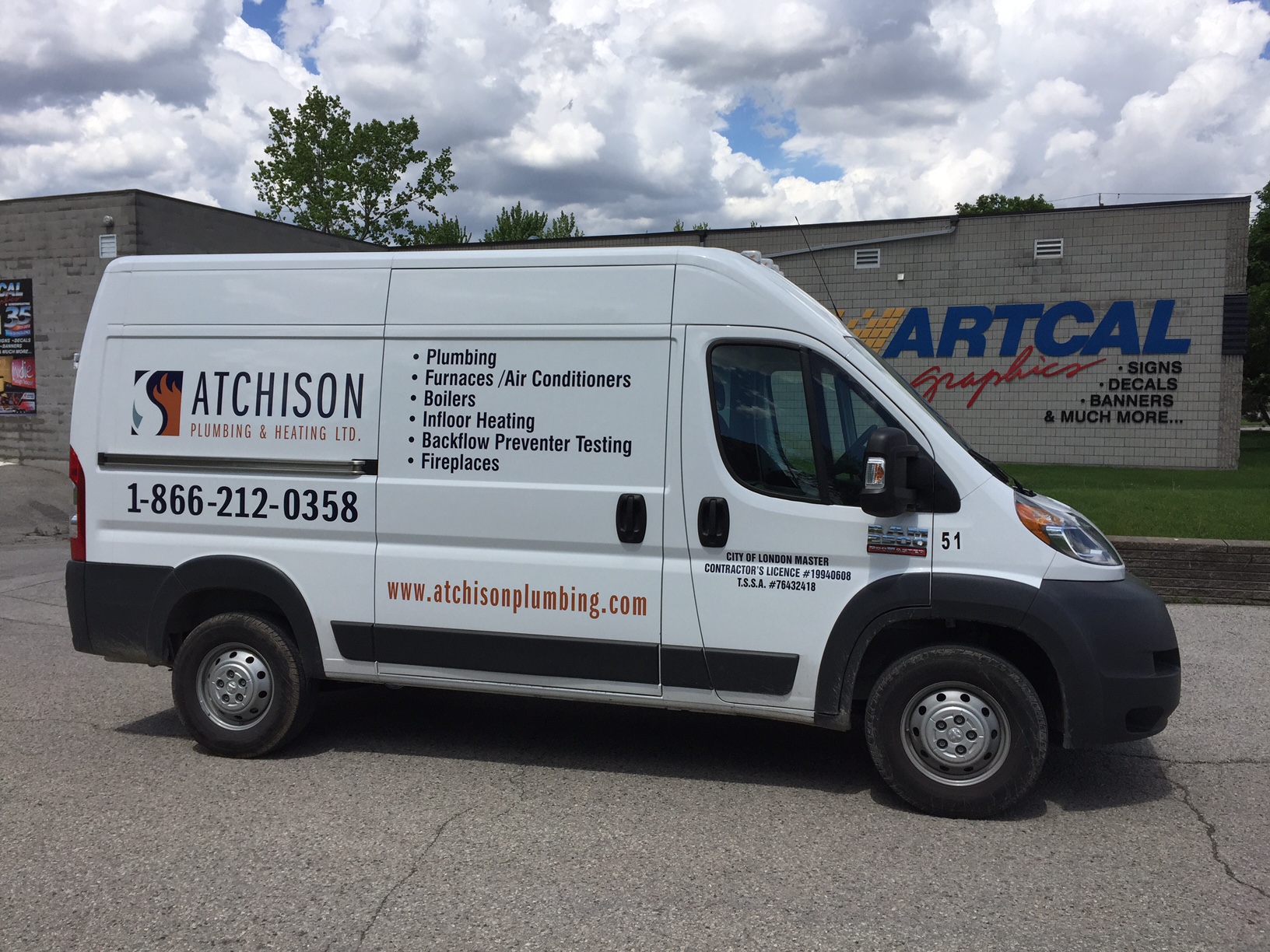
A full wrap offers the most visual impact and the greatest control over the appearance of the vehicle. It can completely transform mismatched fleet colours and create a polished, unified look. It is often the right move for brands that depend heavily on visibility, such as delivery, trades, and franchise operations.
Partial wraps can deliver much of the same value for less, provided the base vehicle colour works with the design. A well-planned partial does not look like a budget compromise. It looks intentional. The trick is using the vehicle’s paint as part of the composition rather than leaving graphics looking like stickers added at the last minute.
Spot graphics are the leanest option. For some companies, especially those with only one or two vehicles or modest local routes, simple door logos and rear contact details are enough. If the branding is strong and the layout is clean, this approach can still perform surprisingly well.
A practical comparison often looks like this:
Full wrap, best for maximum coverage, strongest visibility, and unified fleet branding Partial wrap, best for balancing impact and budget when the vehicle colour supports the design Spot graphics, best for straightforward identification and smaller budgets Rear-door emphasis, best for vehicles that spend time in traffic or stop frequently Fleet-standard layout, best for companies planning to add vehicles over timeThe right answer depends on how the vehicle is used, how long it will stay in service, and what the business expects from the advertising.
Designing for local audiences in London, OntarioGood local advertising always reflects where it will be seen. Vehicle graphics in London should feel clear and credible to local viewers, not generic. That does not mean plastering landmarks across the wrap. It means understanding driving patterns, neighbourhood density, and business context.
A residential HVAC company working across London and nearby communities benefits from immediate clarity. Homeowners seeing the van in a subdivision should know the trade instantly. A downtown restaurant delivery vehicle can lean a little more into style because it will often be viewed at lower speeds. A construction company serving industrial areas may need bolder, more rugged branding that still reads well from a distance.
This local lens also Sign Shop affects supporting materials. Businesses often search for signs London Ontario services, vehicle lettering, storefront branding, and fleet graphics from the same provider because consistency matters. A van should look like it belongs to the building, the site sign, and the lawn sign. When the identity shifts across each format, the business loses the compounding effect of repetition.
That is why the best vehicle branding is rarely designed in isolation. It should fit the broader visual system.
Common mistakes that make wraps look amateurThe first is overcrowding. Owners understandably want to mention every service, every certification, every city served, every phone number, every social handle. On a moving vehicle, more information usually means less communication.
The second is weak hierarchy. If the slogan, logo, website, background pattern, and stock image all compete equally, nothing wins. The eye needs a path.
The third is ignoring installation realities. I have seen beautiful proofs fall apart because crucial text crossed deep channels or stretched over heavily contoured surfaces. A wrap can only look as good as the design allows it to install.
The fourth is forgetting maintenance. Gloss laminates show a different character from matte finishes. White wraps reveal road film quickly. Door-edge wear, fuel spills, snow brushes, and pressure washing all affect long-term appearance. A design that depends on subtle detail may not survive daily use gracefully.
The fifth is chasing trends. Gradient overload, ultra-minimal monochrome, oversized QR codes, faux carbon textures. These can date fast. The businesses that get the best long-term value from car wraps London projects usually choose a concept that still feels solid three to five years later.
Why mockups are useful, but test views are betterDigital renderings help business owners visualize the finished product, and they are worth doing. But mockups can flatter a design. They present the vehicle clean, perfectly lit, and viewed from ideal angles. Real life is rougher.
Whenever possible, review key elements at actual scale. Print the company name and phone number on paper or tape them out on the side of the vehicle. Step back across the parking lot. Look from a second-floor window. Drive another car past it. These quick field checks reveal problems screens often hide.
I once watched a client insist on reducing the logo because it felt too large on the monitor. We taped the smaller version onto the van, walked fifty feet away, and it lost all authority. At full scale, what felt oversized on screen looked exactly right in person. Vehicle design has a physical truth that software cannot fully simulate.
The installation partner matters as much as the designA strong concept can still fail through poor production or installation. Material choice, surface prep, print quality, panel alignment, and post-heating all affect how the finished graphics look and how long they last.
That is especially important for car wrapping London Ontario businesses rely on for daily brand visibility. If edges lift, seams misalign, or colours band, the wrap stops feeling like advertising and starts feeling like neglect. Customers do notice that difference, even if they cannot explain why.
Experienced installers will also advise when a concept should be adjusted to suit the vehicle. Sometimes moving text two inches avoids a handle. Sometimes reducing a photo improves panel matching. Those are not compromises, they are the practical decisions that turn an attractive design into a durable one.
Ask to see real completed vehicles, not only digital concepts. Look at door recesses, around hinges, near wheel wells, and on the rear corners. That is where quality shows up.
Measuring whether your graphics are workingVehicle graphics are not always measured as neatly as digital ads, but they are far from impossible to evaluate. Ask new callers how they heard about you. Use a memorable landing page or trackable phone number if it fits your workflow. Pay attention to comments from customers who mention seeing the vehicle around town. Those casual remarks are often the tip of a much larger pattern.

The longer signal is easier to spot. Businesses with effective wraps tend to report more name recognition over time. They hear, “I’ve seen your vans everywhere,” even when they only operate a few vehicles. That perception of presence is valuable. It suggests scale, reliability, and consistency.
For local brands building market share, that may be the biggest advantage of all. Signs London Ontario businesses put on buildings are fixed. Vehicle graphics take the same identity into driveways, school zones, commercial plazas, and job sites every day. When the design is disciplined, readable, and built for real conditions, every trip becomes a branding opportunity.
A final design principle worth protectingThe most memorable mobile advertising does not try to prove everything. It aims to be recognized, understood, and recalled. That sounds simple, but it takes restraint. Every added line of text, every decorative flourish, every extra colour should earn its place.
If you are planning vehicle graphics London fleets or single-service vans can benefit from, start with clarity. Build around the actual vehicle. Choose colours that survive weather and speed. Let typography do its job. Keep the message honest and brief. Then work with a production team that understands both design and installation.
The businesses that get the strongest return from car wraps London and surrounding areas are not always the ones with the biggest budgets. More often, they are the ones that understand a moving ad has one primary job: be remembered.
Artcal Graphics & Printing — Business Info (NAP)Name: Artcal Graphics & Printing
Address: 779 Industrial Rd, London, ON N5V 3N5
Phone: +1519-453-6010
Website: https://www.artcal.com/
Hours:
Monday: 8:00 AM – 4:30 PM
Tuesday: 8:00 AM – 4:30 PM
Wednesday: 8:00 AM – 4:30 PM
Thursday: 8:00 AM – 4:30 PM
Friday: 8:00 AM – 4:30 PM
Saturday: Closed
Sunday: Closed
Open-location code (Plus Code): 2RGM+3R London, Ontario
Map/listing URL: https://www.google.com/maps/place/Artcal+Graphics+%26+Printing+Inc/@43.025226,-81.1680305,17z/data=!3m1!4b1!4m6!3m5!1s0x882eed2ae63a528d:0xc7068af2d391a354!8m2!3d43.025226!4d-81.1654556!16s%2Fg%2F1vm7c2pl?entry=ttu&g_ep=EgoyMDI2MDYwMS4wIKXMDSoASAFQAw%3D%3D
Embed iframe:
Socials (canonical https URLs):
Facebook: https://www.facebook.com/ArtcalGraphics
LinkedIn: https://www.linkedin.com/company/artcal-graphics-&-screenprinting-inc./
Instagram: https://www.instagram.com/artcalgraphics/
"@context": "https://schema.org",
"@type": "Store",
"name": "Artcal Graphics & Printing",
"url": "https://www.artcal.com/",
"telephone": "+1519-453-6010",
"address":
"@type": "PostalAddress",
"streetAddress": "779 Industrial Rd,",
"addressLocality": "London",
"addressRegion": "ON",
"postalCode": "N5V 3N5",
"addressCountry": "CA"
,
"openingHoursSpecification": [
"@type": "OpeningHoursSpecification", "dayOfWeek": "Monday", "opens": "08:00", "closes": "16:30" ,
"@type": "OpeningHoursSpecification", "dayOfWeek": "Tuesday", "opens": "08:00", "closes": "16:30" ,
"@type": "OpeningHoursSpecification", "dayOfWeek": "Wednesday", "opens": "08:00", "closes": "16:30" ,
"@type": "OpeningHoursSpecification", "dayOfWeek": "Thursday", "opens": "08:00", "closes": "16:30" ,
"@type": "OpeningHoursSpecification", "dayOfWeek": "Friday", "opens": "08:00", "closes": "16:30"
],
"geo":
"@type": "GeoCoordinates",
"latitude": 43.025226,
"longitude": -81.1654556
,
"hasMap": "https://www.google.com/maps/place/Artcal+Graphics+%26+Printing+Inc/@43.025226,-81.1680305,17z/data=!3m1!4b1!4m6!3m5!1s0x882eed2ae63a528d:0xc7068af2d391a354!8m2!3d43.025226!4d-81.1654556!16s%2Fg%2F1vm7c2pl?entry=ttu&g_ep=EgoyMDI2MDYwMS4wIKXMDSoASAFQAw%3D%3D",
"identifier": "2RGM+3R London, Ontario"
https://www.artcal.com/
Artcal Graphics & Printing provides signage and graphic design services for businesses and organizations in London, Ontario and surrounding areas.
If you need custom signs, printed graphics, or design support for marketing materials, the team can help you plan the right format and finish for your project.
Common requests include business signage, interior and exterior graphics, vehicle or window graphics, and printed items used for promotions and day-to-day operations.
Artcal Graphics & Printing serves London and nearby communities throughout Southwestern Ontario.
Hours listed are Monday–Friday 8:00 AM–4:30 PM, with Saturday and Sunday closed.
For directions and listing details, use the map listing: https://maps.app.goo.gl/A2EZfwDigfcN14zA8
To request pricing or share artwork details, call +1-519-453-6010 or use the contact options on https://www.artcal.com/.
What types of signage can a sign shop produce?
Many sign shops handle items like storefront signs, window graphics, decals, banners, and other custom displays (options depend on materials and project needs).
Do I need a print-ready file to place an order?
Not always—some shops can help with design or preparing artwork, but it’s best to confirm file formats, sizing, and resolution requirements before production.
How long does a signage or print project take?
Turnaround varies based on the product type, quantity, and production schedule. Sharing your deadline early helps confirm timing.
What are the hours for Artcal Graphics & Printing?
Hours listed: Monday–Friday 8:00 AM–4:30 PM; Saturday closed; Sunday closed.
How can I contact Artcal Graphics & Printing?
Phone: +1-519-453-6010
Website: https://www.artcal.com/
Map: https://maps.app.goo.gl/A2EZfwDigfcN14zA8
Landmarks Near London, ON
1) Victoria Park
2) Covent Garden Market
3) Budweiser Gardens
4) Western University
5) Fanshawe College
6) Springbank Park