The Chart Types
StockPro
3.1– Overview
Having recognized that the Open (O), high (H), low (L), and close (C) serves as the best way to summarize the trading action for the given time period, we need a charting technique that displays this information in the most comprehensible way. If not for a good charting technique, charts can get quite complex. Each trading day has four data points’ i.e the OHLC. If we are looking at a 10 day chart, we need to visualize 40 data points (1 day x 4 data points per day). So you can imagine how complex it would be to visualize 6 months or a year’s data.
As you may have guessed, the regular charts that we are generally used to – like the column chart, pie chart, area chart etc does not work for technical analysis. The only exception to this is the line chart.
The regular charts don’t work mainly because they display one data point at a given point in time. However Technical Analysis requires four data points to be displayed at the same time.
Below are some of the chart types:
- Line chart
- Bar Chart
- Japanese Candlestick
The focus of this module will be on the Japanese Candlesticks however before we get to candlesticks, we will understand why we don’t use the line and bar chart.
3.2 – The Line and Bar chart
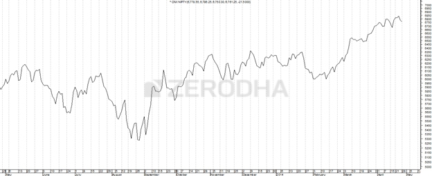
The line chart is the most basic chart type and it uses only one data point to form the chart. When it comes to technical analysis, a line chart is formed by plotting the closing prices of a stock or an index. A dot is placed for each closing price and the various dots are then connected by a line.
If we are looking 60 day data then the line chart is formed by connecting the dots of the closing prices for 60 days.
The line charts can be plotted for various time frames namely monthly, weekly, hourly etc. So ,if you wish to draw a weekly line chart, you can use weekly closing prices of securities and likewise for the other time frames as well.
The advantage of the line chart is its simplicity. With one glance, the trader can identify the generic trend of the security. However the disadvantage of the line chart is also its simplicity. Besides giving the analysts a view on the trend, the line chart does not provide any additional detail. Plus the line chart takes into consideration only the closing prices ignoring the open, high and low. For this reason traders prefer not to use the line charts.
The bar chart on the other hand is a bit more versatile. A bar chart displays all the four price variables namely open, high, low, and close. A bar has three components.
- The central line – The top of the bar indicates the highest price the security has reached. The bottom end of the bar indicates the lowest price for the same period.
- The left mark/tick – indicates the open
- The right mark/tick – indicates the close
For example assume the OHLC data for a stock as follows:
Open – 65
High – 70
Low – 60
Close – 68
For the above data, the bar chart would look like this:
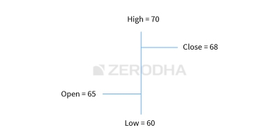
As you can see, in a single bar, we can plot four different price points. If you wish to view 5 days chart, as you would imagine we will have 5 vertical bars. So on and so forth.
Note the position of the left and right mark on the bar chart varies based on how the market has moved for the given day.
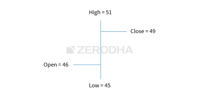
If the left mark, which represents the opening price is placed lower than the right mark, it indicates that the close is higher than the open (close > open), hence a positive day for the markets. For example consider this: O = 46, H = 51, L = 45, C = 49. To indicate it is a bullish day, the bar is represented in blue color.
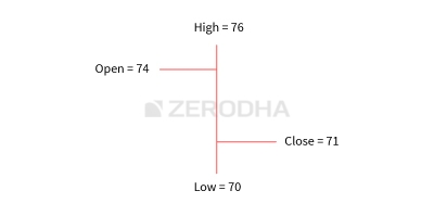
Likewise if the left mark is placed higher than the right mark it indicates that the close is lower than the open (close <open), hence a negative day for markets. For example consider this: O = 74, H=76, L=70, C=71. To indicate it is a bearish day, the bar is represented in red color.
The length of the central line indicates the range for the day. A range can be defined as the difference between the high and low. Longer the line, bigger the range, shorter the line, smaller is the range.
While the bar chart displays all the four data points it still lacks a visual appeal. This is probably the biggest disadvantage of a bar chart. It becomes really hard to spot potential patterns brewing when one is looking at a bar chart. The complexity increases when a trader has to analyze multiple charts during the day.
Hence for this reason the traders do not use bar charts. However it is worth mentioning that there are traders who prefer to use bar charts. But if you are starting fresh, I would strongly recommend the use of Japanese Candlesticks. Candlesticks are the default option for the majority in the trading community.
3.3 – History of the Japanese Candlestick
Before we jump in, it is worth spending time to understand in brief the history of the Japanese Candlesticks. As the name suggests, the candlesticks originated from Japan. The earliest use of candlesticks dates back to the 18th century by a Japanese rice merchant named Homma Munehisa.
Though the candlesticks have been in existence for a long time in Japan, and are probably the oldest form of price analysis, the western world traders were clueless about it. It is believed that sometime around 1980’s a trader named Steve Nison accidentally discovered candlesticks, and he actually introduced the methodology to the rest of the world. He authored the first ever book on candlesticks titled “Japanese Candlestick Charting Techniques” which is still a favorite amongst many traders.
Most of the pattern in candlesticks still retains the Japanese names; thus giving an oriental feel to technical analysis.
3.4 – Candlestick Anatomy
While in a bar chart the open and the close prices are shown by a tick on the left and the right sides of the bar respectively, however in a candlestick the open and close prices are displayed by a rectangular body.
In a candle stick chart, candles can be classified as a bullish or bearish candle usually represented by blue/green/white and red/black candles respectively. Needless to say, the colors can be customized to any color of your choice; the technical analysis software allows you to do this. In this module we have opted for the blue and red combination to represent bullish and bearish candles respectively.
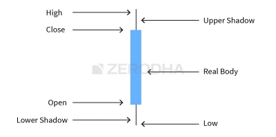
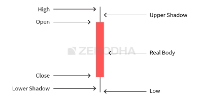
Let us look at the bullish candle. The candlestick, like a bar chart is made of 3 components.
- The Central real body – The real body, rectangular in shape connects the opening and closing price
- Upper shadow – Connects the high point to the close
- Lower Shadow – Connects the low point to the open
Have a look at the image below to understand how a bullish candlestick is formed:
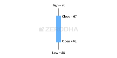
This is best understood with an example. Let us assume the prices as follows..
Open = 62
High = 70
Low = 58
Close = 67
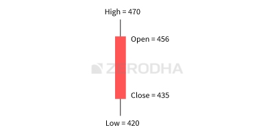
Likewise, the bearish candle also has 3 components:
- The Central real body – The real body, rectangular in shape which connects the opening and closing price. However the opening is at the top end and the closing is at the bottom end of the rectangle
- Upper shadow – Connects the high point to the open
- Lower Shadow – Connects the Low point to the close
This is how a bearish candle would look like:
This is best understood with an example. Let us assume the prices as follows..
Open = 456
High = 470
Low = 420
Close = 435
Here is a little exercise to help you understand the candlestick pattern better. Try and plot the candlesticks for the given data.
DayOpenHighLowCloseDay 1430444425438Day 2445455438450Day 3445455430437If you find any difficulty in doing this exercise, feel free to ask your query in the comments at the end of this chapter.
Once you internalize the way candlesticks are plotted, reading the candlesticks to identify patterns becomes a lot easier.
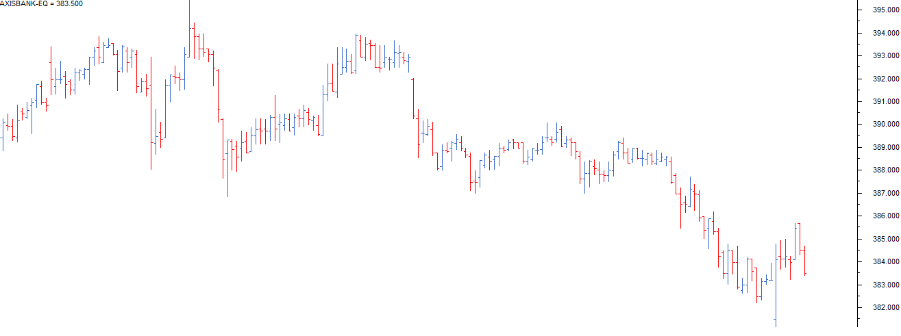
This is how the candlestick chart looks like if you were to plot them on a time series. The blue candle indicates bullishness and red indicates bearishness.
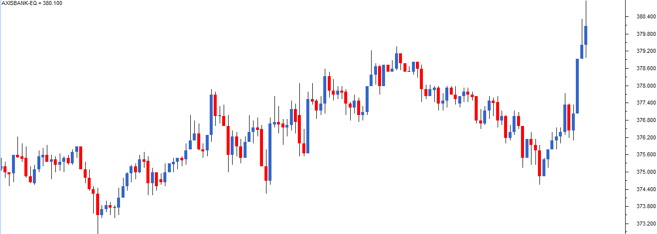
Also note, a long bodied candle depicts strong buying or selling activity. A short bodied candle depicts less trading activity and hence less price movement.
To sum up, candlesticks are easier to interpret in comparison to the bar chart. Candlesticks help you to quickly visualize the relationship between the open and close as well as the high and low price points.
3.5 – A note on time frames
A time frame is defined as the time duration during which one chooses to study a particular chart. Some of the popular time frames that technical analysts use are:
- Monthly Charts
- Weekly charts
- Daily or End of day charts
- Intraday charts – 30 Mins, 15 mins and 5 minutes
One can customize the time frame as per their requirement. For example a high frequency trader may want to use a 1 minute chart as opposed to any other time frame.
Here is a quick note on different types of time frames.
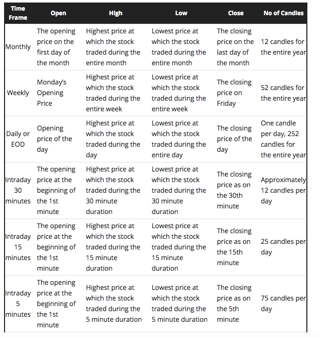
The data can either be information or noise. As a trader, you need to filter information from noise. For instance a long term investor is better off looking at weekly or monthly charts as this would provide information. While on the other hand an intraday trader executing 1 or 2 trades per day is better off looking at end of day (EOD) or at best 15 mins charts. Likewise for a high frequency trader, a 1 minute charts can convey a lot of information.
So based on your stance as a trader you need to choose a time frame. This is extremely crucial for your trading success, because a successful trader looks for information and discards the noise.
Key takeaways from this chapter
- Conventional chart type cannot be used for technical analysis as we need to plot 4 data points simultaneously
- Line chart can be used to interpret trends but besides that no other information can be derived
- Bar charts lacks visual appeal and one cannot identify patterns easily. For this reason bar charts are not very popular
- There are two types of candlesticks – Bullish candle and Bearish candle. The structure of the candlestick however remains the same
- When close > open = It is a Bullish candle. When close < open = It is a Bearish candle
- Time frames play a very crucial role in defining the trading success. One has to choose this carefully
- The number of candle increases as and when the frequency increases
- A traders should be in a position to discard noise from relevant information
Source: Zerodha Varsity