Refreshing the star logo
evtnI've had a specific six-point star on my logo/avatar for a while.

But this design is three years old (oh no!). It was tweaked a bit since 2020, but I definitely need something new.
I'm experimenting with Stable Diffusion a lot, and at some point, I've tried to play a little with the logo there.

The results were nice, but the core principle of my logo is that it's geometric and simple. So today I've booted up Inkscape and started working on something new.

I made a simple remake of the original version, to have something to start with. Then I thought it would be interesting to add fill to explore some similar shapes, which was eventually the direction I took. But first, I did a simple wireframe:

I've tried to go into some new direction from that wireframe, but that didn't really stick:

So I tried to play with stroke-less variants:

While this one didn't really stick either, I liked the shaping of the bottom left one, so I moved further with it, now adding a background-colored stroke:

From there, I produced several other variants with different shaping:
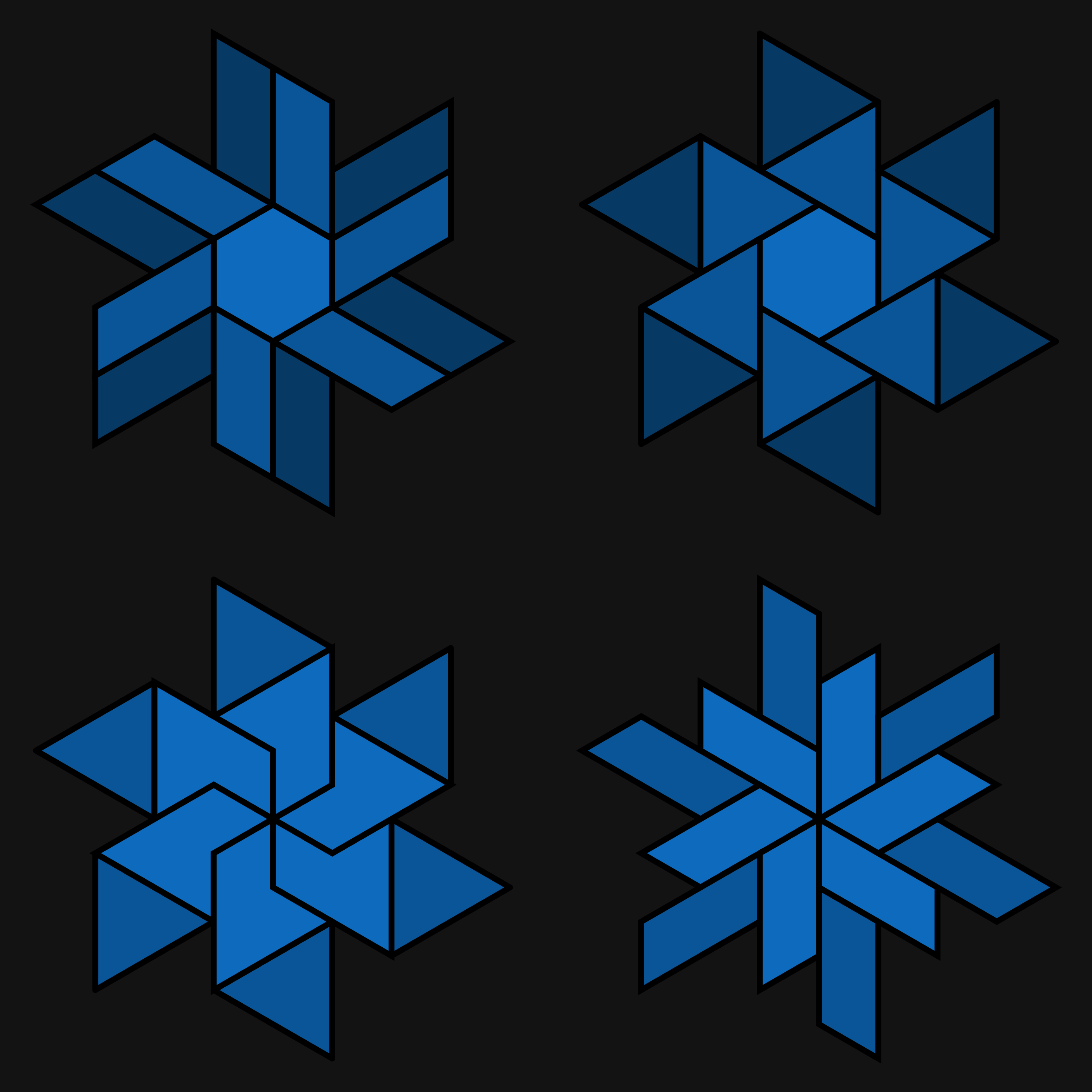
Well, the previous variant was somewhat better. But one thing was wrong: the parallelogram-shaped pieces were too wide. I've cut those in half and got this:

Better. But what if we also cut the triangles using the existing parallelogram shape?

And now we got to a shape that is simple, resembles the original, and looks fresh. Nice.
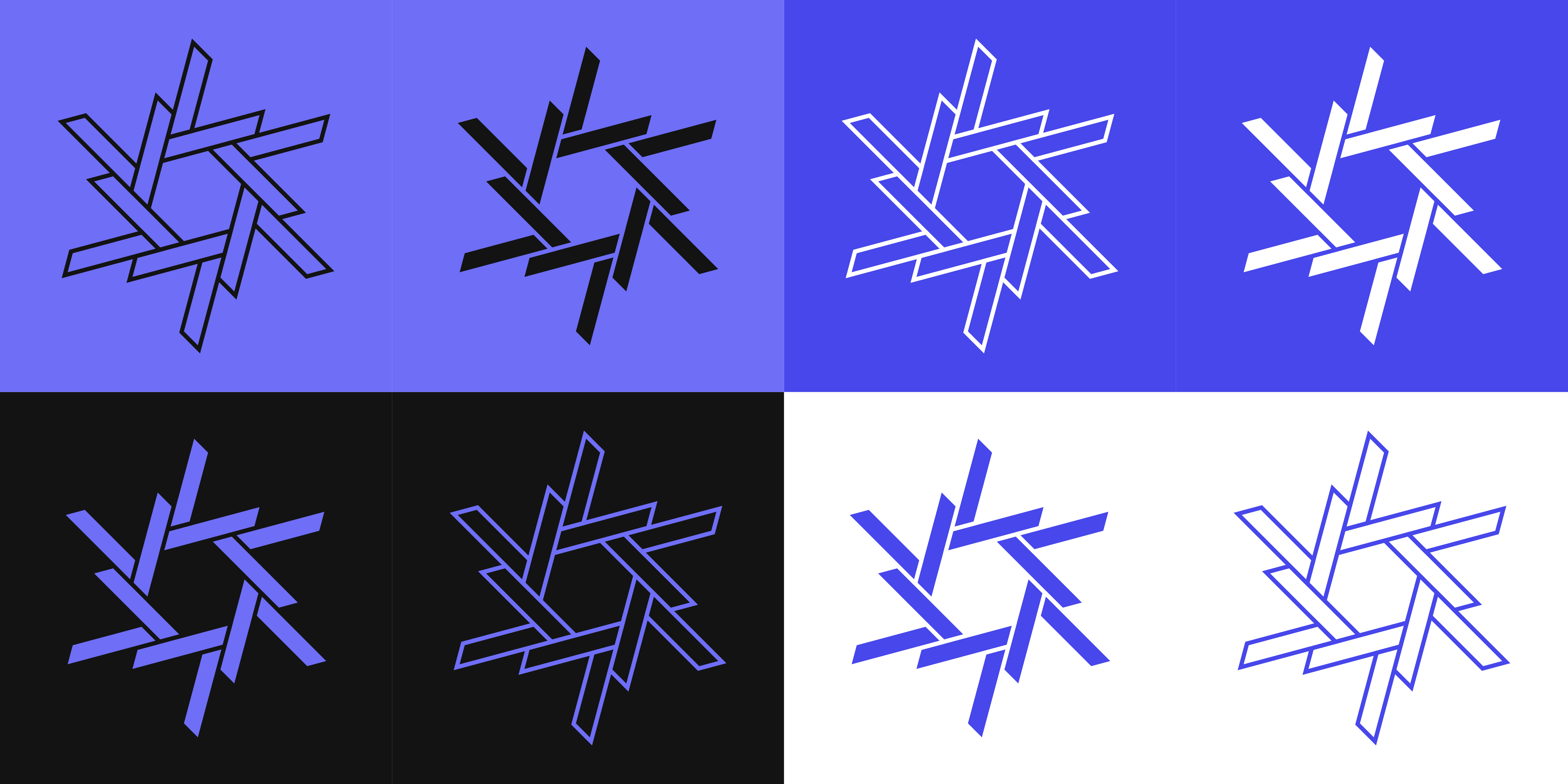
Let's produce some color variants now:
And here it is, the star for the next 3 years.
And for the comparison, new and old star side-by-side (with the same pattern and colors):
