Picking the Right Font To Use on Android UI
MistuThe font files you want to use :
MUST have at least the follow types of files/weights, otherwise, it will not look good
- Bold, Bold Italic, Regular, Medium
- Regular Italic or Medium Italic (not absolutely necessary, but preferred)
- If you want your font to really look good everywhere, then you should look for fonts that come with the following weights as well: Thin or Light
- Thin Italic or Light Italic
- Condensed-regular or condensed-medium. The more condensed versions the better (eg - condensed-bold, condensed-italic, condensed-light, etc.)
-------------------------------------
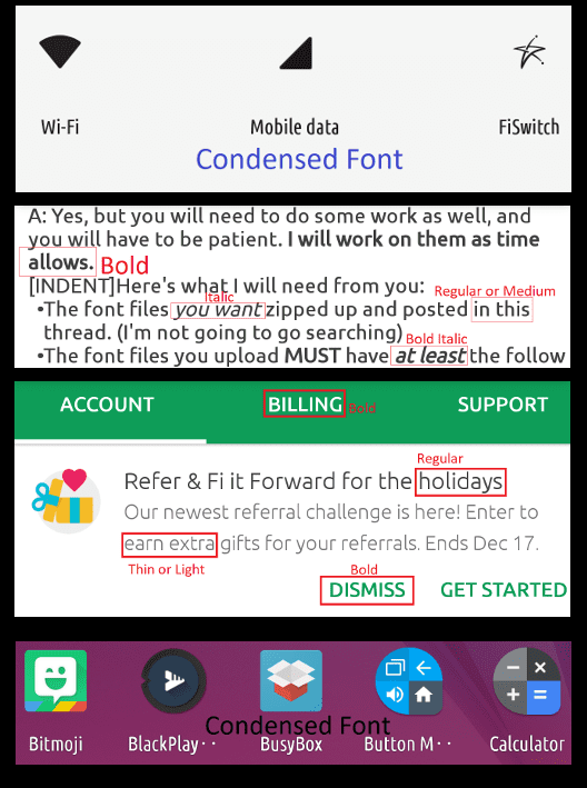
Notice the image below.
The screenshots are of the following: Quick Settings, XDA Labs, The Project Fi App, My app drawer

In just these four snippets we have six different font weights. A font-weight typically refers to the thickness or thinness of a font, as well as styles like italic.
As I mentioned that I will only put together files with a certain amount of font-weight files. This is because, as you can see from the image, they are necessary.
Now, you can Google your favorite font and find it in only one weight -- regular. Then you could apply that regular weight font to the twenty different types of font files that are found natively in /system/fonts so that all of your font files are now replaced by that one font-weight file you found.
What you'll have then is a mess, in my opinion. Apps layouts are designed with certain font weights in mind. Aside from that, they are also used to draw users' attention to certain things. Important things are usually bold. Headers are usually bold. Italics can emphasize a point in a different way. Some things, like the app drawer, for example, used a condensed font so that as many letters as possible can be used in the relatively small space allotted for icon text. As you can see in my image, even though I've used an Ubuntu condensed font for the app drawer, there still isn't enough room. Imagine if I used a non-condensed font. I might only get half of what I'm getting now.
My point is this: You should really try to find a font that has as many weights as possible.
Below is a list of all the native fonts in /system/fonts:
Roboto-Black.ttf
Roboto-BlackItalic.ttf
Roboto-Bold.ttf
Roboto-BoldItalic.ttf
Roboto-Italic.ttf
Roboto-Light.ttf
Roboto-LightItalic.ttf
Roboto-Medium.ttf
Roboto-MediumItalic.ttf
Roboto-Regular.ttf
Roboto-Thin.ttf
Roboto-ThinItalic.ttf
RobotoCondensed-Bold.ttf
RobotoCondensed-BoldItalic.ttf
RobotoCondensed-Italic.ttf
RobotoCondensed-Light.ttf
RobotoCondensed-LightItalic.ttf
RobotoCondensed-Medium.ttf
RobotoCondensed-MediumItalic.ttf
RobotoCondensed-Regular.ttf
Well, that's not entirely accurate. Those files listed are the important ones. Replacing those files will, for the most part, replace everything that you'll see.
Notice that there are twenty different font weights available for the Roboto font. This is the ideal situation.
I'll go ahead and say that you're not likely to find a font that you really like that comes with even half that many weights.
So, let's say you've found a font that has at least the weights that I recommend. Continue on to the next section.
Replacing the Stock Font Files with Your Own
For our example, we'll use the SonySketch font. Below are the font files that were the family could be found:
SonySketch-Bold
SonySketch-BoldItalic
SonySketch-Italic
SonySketch-Regular
Now technically, that's a little short of what I asked for; however, "Italic" can be taken to simply mean regular italic or medium italic, so it works.
Next, we have to figure out how to turn those four font files into the twenty stock files.
Basically, we'll just copy the SonySketch files, then rename the copies to match stock fonts.
So, lets start with the bold.
I know from double-clicking the font files on my PC and then viewing the font that, the "Black" font/weight is a bold or bold-ish weight. So, we'll use the SonySketch-Bold for the Roboto-Black file, Roboto-Bold, and RobotoCondensed-Bold.
I'll copy the SonySketch file and rename that copy to Roboto-Black. Now we have a Roboto-Black file that is actually the SonySketch-Bold font.
I'll repeat that step two more times for the other Roboto bold font-weight files.
I'll use the SonySketch-BoldItalic for Roboto-BlackItalic, Roboto-BoldItalic, and RobotoCondensed-BoldItalic (since the SonySketch didn't come with a condensed weight).
In the end, this is what we did:
SonySketch-Bold --> Roboto-Black
SonySketch-Bold --> Roboto-Bold
SonySketch-Bold --> RobotoCondensed-Bold
SonySketch-BoldItalic --> Roboto-BlackItalic
SonySketch-BoldItalic --> Roboto-BoldItalic
SonySketch-BoldItalic --> RobotoCondensed-BoldItalic
Now, let's look at the SonySketchRegular.
Since SonySketch didn't come with thin, light, or medium weights, we'll have to use Regular for those weights as well.
Following the same copying and renaming scheme from above, we'll do this with the SonySketch-Regular file:
SonySketch-Regular --> RobotoCondensed-Light
SonySketch-Regular --> RobotoCondensed-Medium
SonySketch-Regular --> RobotoCondensed-Regular
SonySketch-Regular --> Roboto-Light
SonySketch-Regular --> Roboto-Medium
SonySketch-Regular --> Roboto-Regular
SonySketch-Regular --> Roboto-Thin
We're almost there.
We have one more SonySketch file to deal with -- SonySketch-Italic.
Again, since we don't have thin-italic, light-italic, or medium-italic weights, we'll have to use the one SonySketch-Italic file for all of those.
Following the same copying and renaming scheme from above, we'll do this with the SonySketch-Italic file:
SonySketch-Italic --> RobotoCondensed-Italic
SonySketch-Italic --> RobotoCondensed-LightItalic
SonySketch-Italic --> RobotoCondensed-MediumItalic
SonySketch-Italic --> Roboto-Italic
SonySketch-Italic --> Roboto-LightItalic
SonySketch-Italic --> Roboto-MediumItalic
SonySketch-Italic --> Roboto-ThinItalic
That's it! We're done copying and renaming files. Now you should have all twenty stock font files replaced with your own font files.
=======xxxxxx======
This article is compiled from this post on XDA <https://forum.xda-developers.com/pixel-2-xl/themes/font-flashable-ubuntu-font-zip-pixel-2-t3710892>