Mysterious indents between inline elements
Be ready - Frontend questions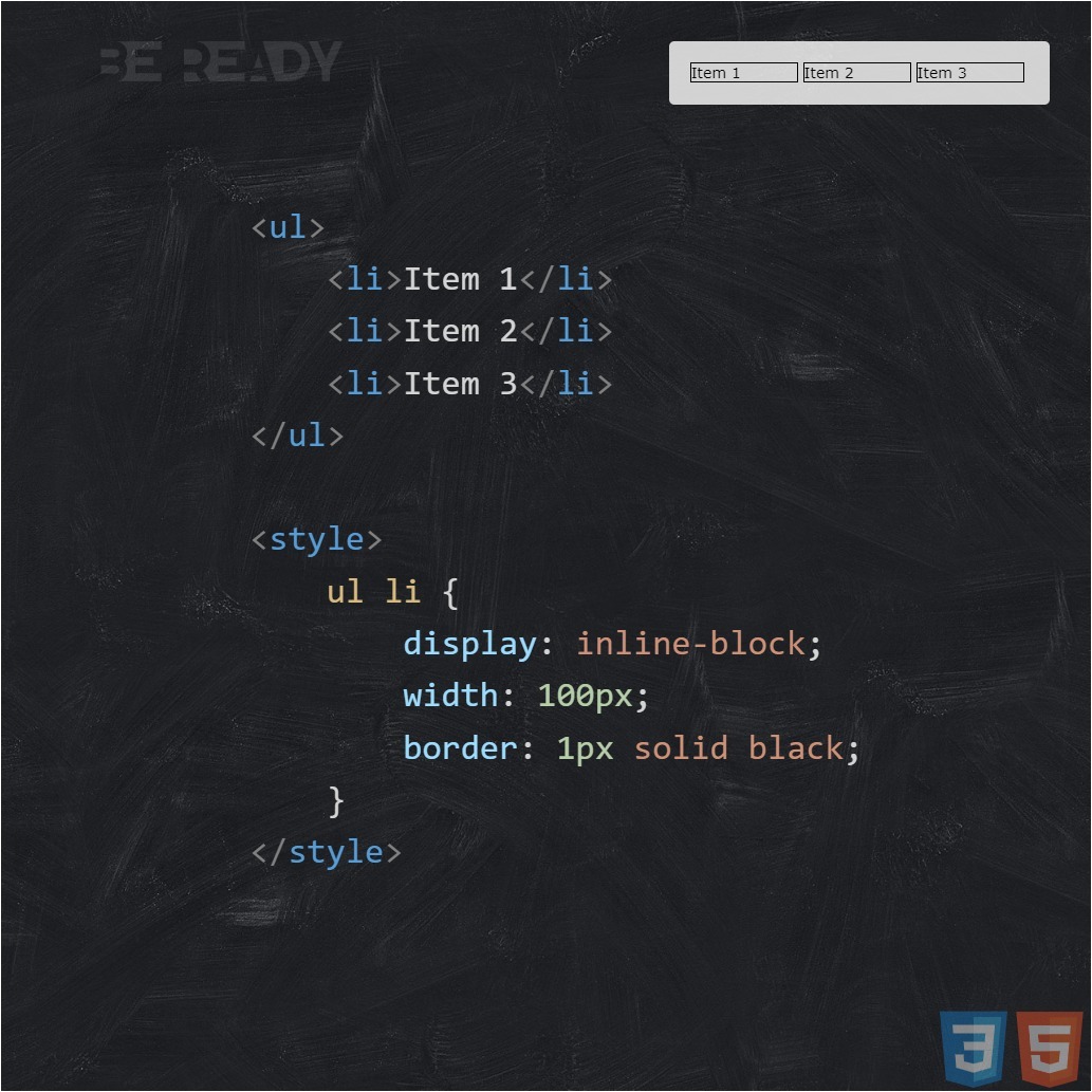
This means that inline-block is a kind of "box" that contains letters, i.e. a certain box of matches. This box is a block with line behavior, i.e. is essentially an inline-block element.
Inline-block's inline behavior allows it to stay on the same line with other inline elements, like <span> -th, or unnecessarily blend in with regular letters, i.e. behave like text on a line. Well, thanks to its blocking abilities, inline-block can safely set any properties that are inherent in block elements: width, height, top and bottom margins, for example, will already act like blocks.
Well, etc., in general, a kind of "block-line"
Inline-block feels the height and width that we assigned to it. You can also notice one interesting thing, our ward has aligned vertically, aligned the way most inline elements in html should be aligned, i.e. along the baseline, i.e. our block is aligned relative to its text, which is in it.
inline-block - like letter
One of the main things you should know is that our inline-block matchbox is basically just a letter - a symbol, i.e. our entire inline block is just one letter per line, one unit. Even though it contains a bunch of other symbols or elements. It is for this reason that inline-blocks are not "broken" like inline elements, but wrapped to the next line entirely. Well, and accordingly, if there are no spaces next to the inline-block, then the distance between it and adjacent letters will be the usual letter spacing (tracking), which can be controlled (kerning). If there are spaces, the same interval plus the width of the space will be up to the next letter.
Option 1 - margin-left
The first in line is the left negative margin. Let's see how he can help us. CSS code for clarity:
ul {
  font-size: 14px;
}
ul li {
  display : inline-block ;
  width : 100px; border :
  1px solid #E76D13;
  margin-left: -0.36em;
}
ul li:first-child {
  margin-left: 0;
}
You can see from the code that I set the font size to 14px for the general list (in our examples, it will be based on these values). And, of course, the negative left margin, equal to -.36em. As you may have noticed, for our purpose I chose the scalable unit of length (em), because, as we already know, our space dances with the font size, which means it can scale depending on it. Having fiddled with the values for a long time, I determined that -.36em) is the best for our font (otherwise we will have to select different values), so let's leave, perhaps, this particular scale.
Option 2 - font-size / display: table
As you already know, font-size affects the font size of an element, making it larger or smaller, depending on its value. Space is a character that comes from this very font size, which means that with the help of font-size we can try to influence it, for example, setting its value to zero and thus, it is possible to completely "hide" our hated space. Let's check it out in practice.
ul {
  font-size: 0;
  display: table; // Works for Safari
}
ul li {
  display : inline-block ;
  width : 100px; border :
  1px solid #E76D13;
  font-size: 14px;
}
Option 3 - letter-spacing
The third number we have is letter-spacing. Earlier, we found out that this property affects the spacing between characters, and since our inline-block is essentially one, large character, letter-spacing should still help in solving our problem. Just like last time, I fiddled with the scale and found that -.36em would be just what I needed.
* Yes, and it is also worth considering that letter-spacing, like font-size, is an inherited property, so we will have to do the same operation with zeroing children as in the second option.
ul {
  font-size: 0;
  letter-spacing: -0.36em;
}
ul li {
  display : inline-block ;
  width : 100px; border :
  1px solid #E76D13;
  letter-spacing: normal; //Returning to normal in descendants
}
Option 4 - word-spacing
Immediately I would like to note that word-spacing and letter-spacing are similar to each other and differ only in that the first works with the distance between characters, and the second between words. At the same time, word-spacing also has its drawbacks, but unlike letter-spacing, you can fight with the drawbacks of word-spacing, which is good news.
* It's also worth noting that word-spacing is also an inheritance property, so the overall code will look like letter-spacing code. So we select the meaning and go.
ul {
  font-size: 0;
  word-spacing: -0.36em;
}
ul li {
  display : inline-block ;
  width : 100px; border :
  1px solid #E76D13;
  word-spacing: normal; //Returning to normal in descendants
}
And, of course, it was not without incident again. But now both webkits (Chrome and Safari) have shown us their shortcomings. As we can see, word-spacing didn't work at all in these browsers, as if we hadn't assigned it. The behavior of webkits in this situation can most likely be called a bug, since the property that we used here is intended specifically for word spacing. The evidence in favor of the bug is that for ordinary inline elements, word-spacing just works in webkit as it should, but unfortunately not for inline-blocks.
The first question you ask is, "Is there a solution to this problem?" I will gladly answer you that YES! And, oddly enough, this solution is again our good old display: table, which helped us with problems in Safari, in the second version with font-size. So feel free to add this rule and see the result.
ul {
  font-size: 0;
  word-spacing: -0.36em;
  display: table; //A cure for webkit
}
ul li {
  display : inline-block ;
  width : 100px; border :
  1px solid #E76D13;
  word-spacing: normal; //Returning to normal in descendants
}
Option 5, 6 - Connection of elements (remove extra node element)
I decided to combine these two solutions into one whole, since they are similar in their essence and do almost the same thing, i.e. dock elements, removing spaces between them.
HTML of the first option:
<ul><li>Item 1</li><li>Item 2</li><li>Item 3</li></ul>
Well, and the second, respectively:
<ul><!--
  --><li>Item 1</li><!--
  --><li>Item 2</li><!--
  --><li>Item 3</li><!--
--></ul>
As you can see from the code, in the first version, we simply docked the elements back to back, moving the closing tags close to the opening ones. And in the second, we placed comments between the borders of the elements, replacing them with our spaces. Those. in fact, we deliberately deprived the elements of any indentation between them, deliberately connecting them in different ways. At the same time, how can you replace, these options have a good plus, they do not require any specials. properties and crutches in CSS, they work on their own, and in all browsers since IE6 +.
But meanwhile, these solutions carry a number of certain problems that are associated, firstly, with the readability of the code, and secondly, with accidentally dropping one element under another or removing one comment near the item, which will immediately affect the display of your site. far from the best. For example, your site may simply fall apart, or some item will jump to another line, etc.
In general, we can conclude that these options definitely have the right to life, but you can use them only when you know exactly and are sure of what you are doing.
Option 7
As it turned out, there is an even simpler, and most importantly, absolutely legal solution in the world that I want to share. The fact is that any HTML specification (but not XHTML) allows us to omit the closing tags for some elements, i.e. resolves their absence. There are as many as 18 such elements in the HTML5 specification. This means that we, on a completely legal basis, can enjoy this advantage. After all, no one forbids us to do this, does it?)
In our case, <li> elements fall into this list, so let's use that.
<ul><
  <li>Item 1
  <li>Item 2
  <li>Item 3
</ul>
Those. in fact, I just omitted the closing </li> tags, and since the content of the first element is immediately followed by the opening tag of the second, there should be no space between them, respectively. Which is clearly demonstrated in the screenshot.
* It is worth noting that in IE6-7, for example, optional closing tags in lists are still ignored, so this method is automatically obtained there. Because of this, in the first version with a negative left margin, we, separately, zeroed the margin-left for these browsers.
This method seems to me the most successful, at the same time easy and convenient than all the others that we have considered in this article. The only drawback is that such a structure is not accepted by any XML parsers.
The conclusion is that this method is not suitable for "validity for the sake of validity fanatics" who choose the XHTML doctype, but practitioners who are guided by modern specifications and the real result should not refuse such a solution =)