Matplotlib Color
CharlesMatplotlib Color is a crucial aspect of data visualization that can significantly enhance the clarity and impact of your plots. This comprehensive guide will explore the various ways to use color effectively in Matplotlib, from basic color specifications to advanced color mapping techniques. By mastering Matplotlib Color, you’ll be able to create visually appealing and informative plots that effectively communicate your data insights.
Matplotlib Color Recommended Articles
- Matplotlib color scales
- Matplotlib Color Palettes
- Matplotlib color names
- Matplotlib Color List
- Matplotlib Color Gradient
- Matplotlib Color by Column
- Matplotlib Color Based on Value
- Matplotlib Colors
- Matplotlib Line Colors
- How to Change Bar Color in Matplotlib
- Matplotlib Bar Colors
- Histogram Color with Matplotlib
- Blue Color in Matplotlib
- Matplotlib Histogram Color
Understanding Matplotlib Color Basics
Matplotlib Color provides a wide range of options for specifying colors in your plots. The most common methods include using color names, RGB values, and hexadecimal codes. Let’s explore these basic color specifications with some examples.
Using Color Names
Matplotlib supports a variety of predefined color names that you can use to specify colors in your plots. Here’s a simple example:
import matplotlib.pyplot as plt

plt.figure(figsize=(8, 6))
plt.plot([1, 2, 3, 4], [1, 4, 2, 3], color='red', label='Red Line')
plt.plot([1, 2, 3, 4], [2, 3, 4, 1], color='blue', label='Blue Line')
plt.title('Matplotlib Color Example - how2matplotlib.com')
plt.xlabel('X-axis')
plt.ylabel('Y-axis')
plt.legend()
plt.show()
Output:
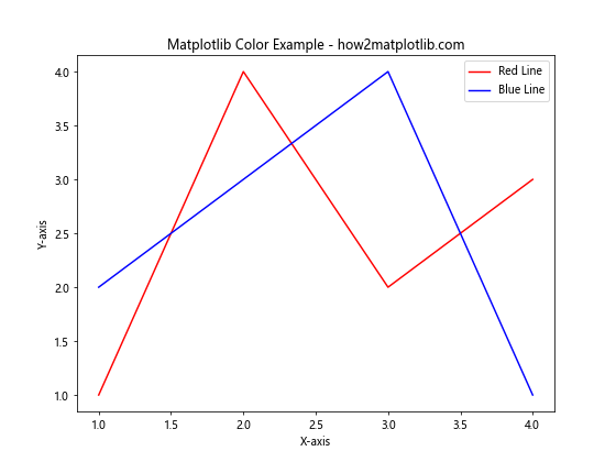
In this example, we create two line plots using the color names ‘red’ and ‘blue’. Matplotlib Color recognizes a wide range of color names, making it easy to specify colors without needing to remember specific color codes.
Using RGB Values
For more precise color control, you can use RGB (Red, Green, Blue) values to specify colors in Matplotlib. RGB values range from 0 to 1 for each color component. Here’s an example:
import matplotlib.pyplot as plt

plt.figure(figsize=(8, 6))
plt.plot([1, 2, 3, 4], [1, 4, 2, 3], color=(0.8, 0.2, 0.1), label='Custom Red')
plt.plot([1, 2, 3, 4], [2, 3, 4, 1], color=(0.1, 0.5, 0.9), label='Custom Blue')
plt.title('Matplotlib Color with RGB Values - how2matplotlib.com')
plt.xlabel('X-axis')
plt.ylabel('Y-axis')
plt.legend()
plt.show()
Output:
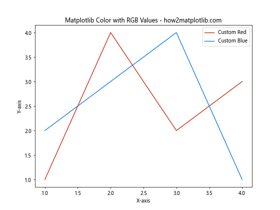
In this example, we use RGB tuples to specify custom shades of red and blue. The RGB values allow for fine-tuned color selection, giving you more control over the exact hues in your plots.
More matplotlib color tutorials: https://github.com/eyeandroid/Best-IT-Tutorials