Susan Kare’s London font in black metal classics
an open graveForeword
This memo was submitted to Fonts In Use in early February 2025. After an unusually long moderation period I contacted the staff and received two replies:
- Notification of the article submission marked as blocked;
- A reply from the head of staff, saying that, among other things, the article could not be published on FIU due to who Varg Vikernes is. Basically: no mentioning of Vikerness on the website, especially when I write pseudonymously, and without “critical engagement” into who Vikernes is.
This reply means that my next article about Gregorian FLF (Casady & Greene) font will not pass the editors’ filters on that — in fact, truly great — website. Before submitting the text, I did expect complications around Vikernes’s name, but knowing FIU present a Mein Kampf cover set in American Text concluded we would find a solution. I did not even attempt, since their statement was clear enough and strict. It is their mistake, indeed, but I also do understand what led to those conclusions in their minds.
Lastly, since the article was submitted to an “outsider” website, its initial language was different from which I generally use when writing for the metal scene. I attempted to edit it back to our normal, but probably in some parts it still appears too official.
London in classical black metal designs
London aka London 18 was a bitmap font in the Old English style, designed by Susan Kare as a part of the “City” fonts for the Macintosh.

Unlike Cloister Black (and thus Altenglische Gotisch {Old English}, too) or ITC Zapf Chancery — the two most prominent typefaces of classical black metal…


source > http://blog.livedoor.jp/blackmetal_daisuki/archives/51679039.html
…London is rarely found among the scene’s designs, probably due to limited access of the metal underground artists to Apple Macintosh computers during the time when London was a part of the default fonts set. (OS Version 7.5 {launched on September 12, 1994} seems to be the version since which London forever disappeared from Macintosh.) Nevertheless, it appeared on some iconic releases e.g. the first two Burzum full-lengths: the 1992 Burzum (discogs) and 1993 Det Som Engang Var (discogs). The former was published by Euronymous’s Deathlike Silence Productions.


Det Som Engang Var was released by Varg Vikernes through his own Cymophane Productions and retained the font of the debut album.


London was a bitmap font (or a “pixel” font), and never was redesigned in curves. I do not know and somehow fail to understand how the processing of this font worked, so that the edges turned out smooth. Was it some PhotoShop or QuarkXPress magic, or LaserWriter driver “smooth text” in PostScript options... I asked a few old-timers, but didn’t get a clear definitive answer.
With the third album Burzum shifted to Gregorian FLF (Casady & Greene) instead of London, and the more common mid-’90s Misanthropy Records’ reissues of the first two albums employed it as well.

Also, the names of designers of the London-era Burzum albums remain a mystery to me. Could be another “horribly expensive layout agency.” Or, then, who of the Norwegian scene had a Macintosh?
Before the Burzum albums, London appeared on the cover of Abruptum 1991 Evil 7″ vinyl — as London Italic, without the “smooth text” effect, and of course in all-caps as is the most common in black metal.

Before Abruptum, London was noticed on Thou Shalt Suffer 1991 Open the Mysteries of Your Creation 7″ vinyl, designed by Christian “Cricka” Carlquist, a co-founder of Swedish Close-Up magazine, whose father worked in an advertising agency and had an access to computers. And though Thou Shalt Suffer weren’t a black metal band, but a “Dark Death Metal” one, it requires no justification why they appear in this text.


After the Burzum debut, we find London on Marduk 1992 Dark Endless album flyer.

In late 1993 Sigh got their debut album Scorn Defeat released on Deathlike Silence as well. As the history knows, Euronymous was dead by the time, but either because the release of this album was planned by him and a DSP-style design could have existed for a while, or because Voices of Wonder who took operations of DSP after Euronymous’s death wanted to keep the recognizable look, the album design employed London as well. https://www.discogs.com/release/369566-Sigh-Scorn-Defeat

A later appearance of London is on a popular 1996 bootleg CD-pressing of Mayhem Pure Fucking Armageddon 1986 demo — clearly, set with not the original Macintosh font, but with someone’s vectorization (e.g. original London P descends from the baseline, while here it is positioned on the baseline).


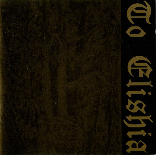
And maybe the last classic ’90s black metal employment of London was Ophthalamia To Elishia compilation in 1997, and the accompanying merch had slanted London, just like Abruptum Evil. Although some may fairly object that the band was essentially black metal, I mention it here because of its members, and because the ’90s scene was so much richer in the artists’ musical expressions than anytime after.


Later appearances of London in officially released ’90s’ black metal albums aren’t known to me.
It is worth mentioning that London can be traced in the extreme metal demo tapes of the ’90s (and not the ’80s), as demonstrated in the two volumes of Analogue Black Terror. The list is as follows:
Grimorium 1990 Dead Tales demo
Denial of God 1992 Oscularium Infame demo
Gorgon 1992 Call From Unknown Depths demo
Swordmaster 1994 Studio-reh[earsal]. March ’94
Isvind 1994 Nivelheimen demo
Isvind 1994 Herskerinnen promo
Virgin’s Cunt 1994 Dark Aureoles Gathering demo
Thyrfing 1995 demo ’95
Hirilorn 1997 A Hymn To The Ancient Souls demo
Unpure 1998 promotape
Tsjuder 1999 Atum Nocturnem promo
and Old Wainds 1997 Здесь никогда не сходят снега demo reissue by Stellar Winter in 2000 closed the decade. Although there also was not the original Macintosh font, but a vectorization which included Cyrillics.