IV Contest 2.0 - MilanNews.it - Improving user experience
Giovanni M.1. The situation
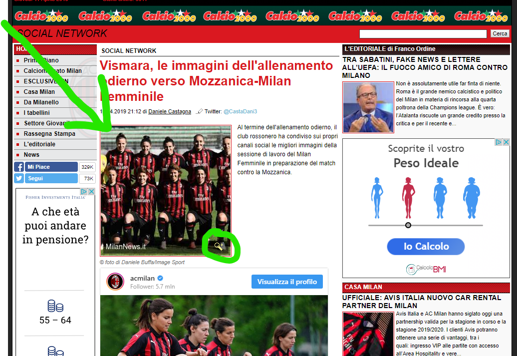
All articles of this domain have a representative square image at the top of the page, see the screenshot below. This image comes from the website's photo archive after being cropped and scaled. By clicking the button at the bottom right of the image you can reach the archive page with the original photo.

There are always three versions of this image, each with different sizes:
- THUMB1 [260px X 260px] (the one used for the image in question)
- THUMB2 [100px X 100px]
- THUMB3 [570px X 320px] (available in meta tags)
Unfortunately we can't get the URL of the original photo because it requires an ajax call to a third-party domain (more here). So using THUMB3 is the best we can do to improve image quality.
2. The issue
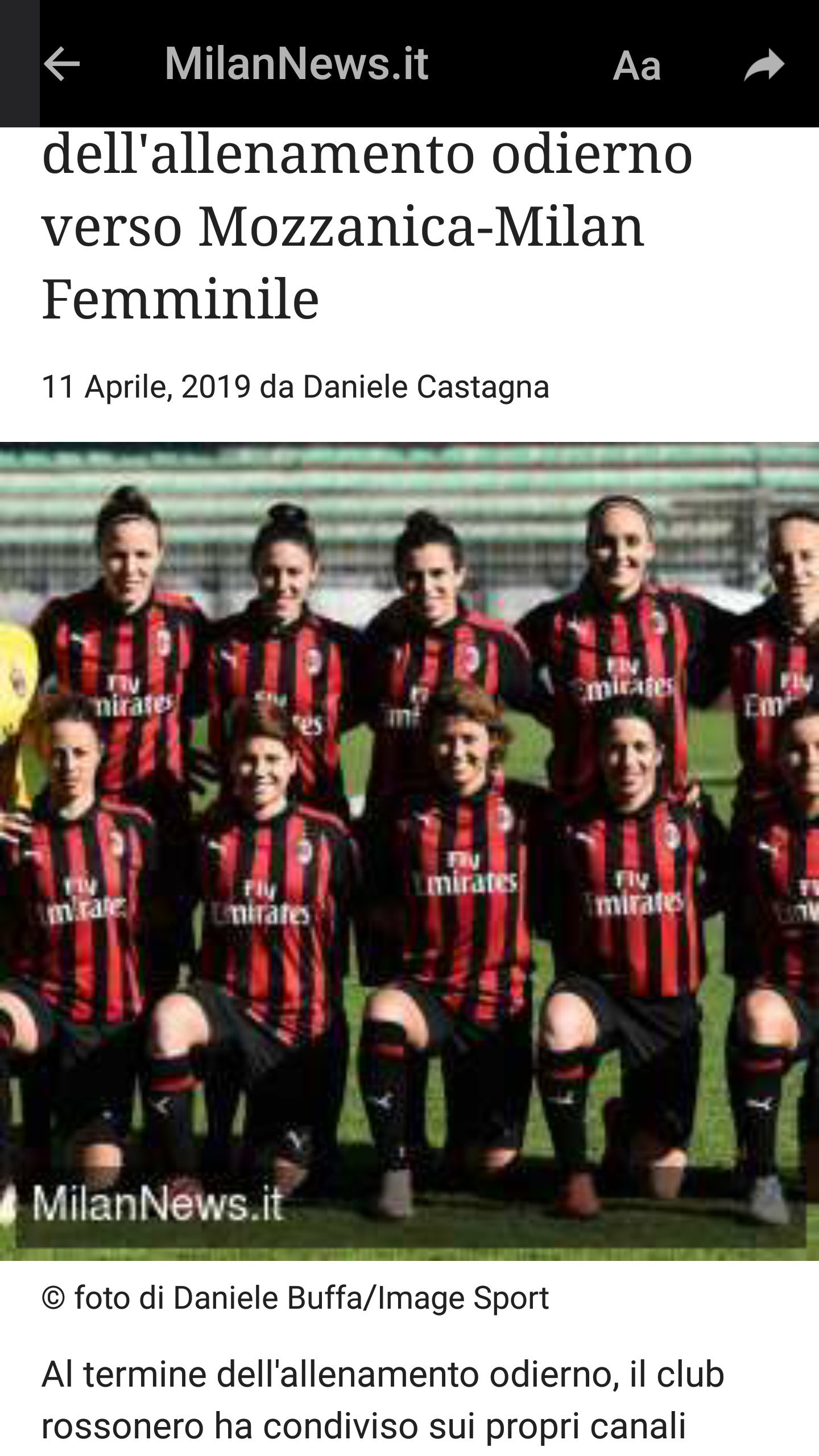
All other participants use THUMB1 (this small 260x260 version) with a very poor result. If I try to do the same and view it in telegram, this is the ugly result I get:

Clearly a resolution of 260px X 260px is not enough and leads to a bad user experience. The checklist also mentions a minimum resolution of 320px.
In addition, preserving the link to the photo archive is essential because all this thumb images are cropped (see the yellow footballer on the left). Two of my opponents don't do this in their current template.
3. My solution
My solution is to use THUMB3 because is the bigger image available and (optionally) to use it as cover because in this format it's only a representative image of the article. I also include the link of the page containing the original photo so that users can see the uncropped version (see the icon in the upper right corner). Yes, even THUMB3 is cropped, see the legs at the bottom.

4. In conclusion
If user experience is still important in this contest I think that my solution should taken into account.