Here are the differences I am talking about [screenshots]
Here are the differences I am talking about [screenshots]
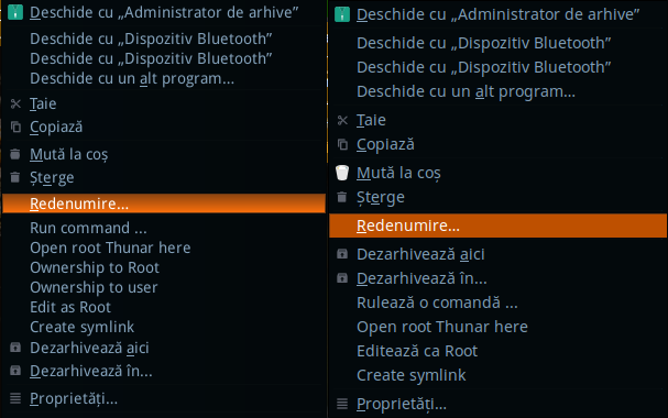
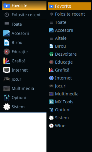
Below there are some cropped screenshots that explain the differences between the looks on the different systems; the older screenshots were taken on MX 16.1 while the newer ones were taken on MX 17 (only the right-click menu was re-done so there is a similar right-click menu on a similar file, in order not to create confusion):
Here is how the menu selection looks like on MX-16 (on the left) and how it looks like on the later versions (right). The selected area on the left looks like is having some gradient that gives the selected element some depthThis becomes even more evident if you check the Whisker Menu selector. Notice how on MX 16.1 (left) the selector seems to look more as intended, having some feel of depth while on MX 17 (right) and on the later versions as well, the selector looks only like a rectangle coloured in a paint program (the files were the same, unmodified in each case)On the scrollbars side, you can also see that their appearence is different not only in regards to the gradient, but also in regards to the aspect of it, where the selector has some 3 lines on MX 16.1 (left) while on the later versions the scrollbar looks like a plain yellow rectangleHere is the scrollbar with nothing selected to explain what am I talking about.
And I don't like to say it, but sorry if my english is bad. I tried to give my best :)