Guide to Describing Charts and Graphs
wordandpicLet's start with types of graphs & charts.
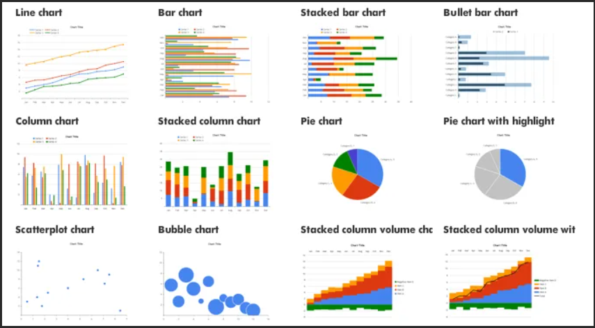
There're a lot of them, so let's focus on the main types:

Here are some common ones:
- Bar charts. These charts represent data with rectangular bars, making them ideal for comparing values between categories.
- Line graphs. They show changes in data over time and help identify trends or patterns that may occur within a particular period.
- Histograms. These are similar to bar graphs but explicitly used for displaying frequency distributions of continuous variables, such as age or time intervals.
- Scatter plots. Such charts show relationships between two variables and help to identify correlations or patterns.
- Pie charts. They illustrate proportions and percentages, making them popular for presenting data as fractions or parts of the whole.
Elements of Charts and Graphs
To know how to write graphs, you must first identify different elements. Here are some key terminology words that can help:
- Axis [ˈæksɪs] – refers to the horizontal (x-axis) or vertical (y-axis) lines on a chart or graph that help indicate the scale and context of the data being displayed.
- Data point [ˈdeɪtə poɪnt] – an individual piece of information plotted on a chart or graph, representing a specific value for a given variable.
- Legend [ˈlɛdʒənd] – a chart component that explains what various colors or symbols used to represent different data points mean. It helps readers understand how to interpret a graph easily.
- Label [ˈleɪbəl] – a word or phrase that identifies a specific element of a chart or graph, such as the x-axis, y-axis, or data series.
- Scale [skeɪl] – the range of values represented on an axis, indicating the minimum and maximum values in a given dataset.
- Gridlines [ˈɡrɪdlaɪnz] – horizontal and vertical lines that divide a chart or graph into smaller sections to make it easier to read and interpret the data.
- Interval [ˈɪntərvəl] – the space or distance between markers on a scale or axis, often representing regular units or increments.
- Caption [ˈkæpʃən] – an explanation or description written beneath an image illustrating information about it.
- Trendline [ˈtrɛndlaɪn] – a line that indicates the general direction or trend, often drawn by connecting data points or using statistical methods to find the best fit.
- Title [ˈtaɪtəl] – a brief, descriptive heading at the top of a chart or graph that provides an overview of the data and helps readers understand the main idea of the visual representation.
These terms are foundational in describing a chart or graph and clarifying the visual aid’s components.
Making Comparisons and Contrasts
Once you’ve identified vital terminology, it’s essential to describe the trends or patterns in the graph. Here are some expressions that can help you do just that:
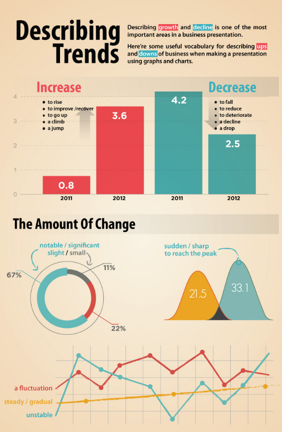
GOING UP
- Verbs rise, increase, grow, go up, improve, jump, surge, shoot up , soar, rocket
- Nouns a rise, an increase, growth, an upward/rising/increasing trend, an improvement, a jump
GOING DOWN
– Verbs fall, decrease, drop, decline, go down
– Nouns a fall, a decrease, a decline, a downward/falling/decreasing trend
Rise rapidly
Drop suddenly
Increase dramatically
Decrease steadily
NO CHANGE
– Verbs remain stable/constant, stay at the same level, stabilize
FREQUENT CHANGE Up and Down
- Verb fluctuate, zig-zagged, flutter
– Noun fluctuation, zig-zag
AT THE TOP
– Verbs reach a peak, peak., reach its/their highest point
AT THE BOTTOM
– Verbs reach/hit a low (point), hit/reach its/their lowest point
By mastering these terms and expressions, you can effectively describe how the data points in a chart or graph relate to one another.
Percentages, Fractions, and Numbers
Charts and graphs often involve numbers, percentages, and fractions that indicate specific values or proportions. Here are some key terminology words for these types of data:
- Percent – a value expressed as a fraction of 100.
- Fraction – a part of a whole expressed as a ratio of two numbers.
- Decimal – a number expressed in the base-ten system, often used to represent fractions or parts of a whole.
- Average – the arithmetic mean of a set of values, often represented as a single data point on a chart or graph.
- Range – the difference between a dataset’s highest and lowest values.
- Minimum – the lowest value in a dataset.
- Maximum – the highest value in a dataset.
With these words, you can effectively describe numerical data and provide insights into a dataset’s distribution, average, and range of values.
Time Frames and Intervals
When describing a line graph or any other type of chart that shows data over time, it’s crucial to use appropriate terms for the different time intervals. Here are some key terminology words related to timing:
- Time series – a dataset that is recorded over some time.
- Interval – the period between data points in a time series.
- Duration – the length of time covered by a time series.
- Frequency – the number of occurrences of a particular event or value within a time.
- Annual – occurring or measured over a year.
These terms can describe the specific timing of data points in a chart or graph, providing additional context for readers and listeners.
Expressions for Describing Charts in English
While understanding the key terminology is essential, using appropriate expressions and phrases can elevate your description of charts and graphs:
- As we can see from the chart/graph...
- It’s worth noting that…
- According to the data presented in this graph, …
- The diagram of this bar chart shows us that…
- This pie chart clearly illustrates/provides information on/represents how…
- Taking a closer look at the line graph, one can observe...
- There was a significant increase/decrease/rise/fall/jump/drop/spike/plunge/sharp dive/slump/growth...
- During/outside/between 20xx – 20yy or From Month X until Month Y... etc.
- From the data presented, we can conclude that…
- The figures demonstrate/reveal/indicate/show/suggest that…
- It is interesting to note/highlight/emphasize…
By incorporating these expressions, you can give nuanced descriptions and insights into what’s happening in a chart or graph.
Putting It All Together
Now that you’ve learned about the different chart types, key terminology, and expressions, it’s time to assemble everything. Here are some tips for writing compelling descriptions:
- Start with the big picture. Before diving into the specifics, it’s essential to give an overview of what the chart or graph represents. This can include information about its type, purpose, and relevance. The more context you provide, the easier it will be for your audience to understand what they are looking at.
- Focus on critical trends and patterns. While every chart or graph has unique features, it’s essential to identify the most salient points being conveyed. This may include fluctuations in data over time, correlations between different variables, or comparisons across categories. Focus on the areas where you see significant changes happening so that people can understand what drives those differences.
- Use clear and concise language. In any chart description, it’s essential to use simple and direct expressions that are easy for your audience to understand. Try not to use jargon or technical terms if possible, as this can confuse people who may not be familiar with the terminology. It is best to use short sentences and break down complex ideas into smaller, manageable parts.
- Vary your sentence structures. To make your description more engaging and exciting, mix up the lengths of your sentences. Shorter, punchier statements help emphasize important points, while longer ones provide additional details or explanations. In addition, using different sentence structures like questions, metaphors, or comparisons can add depth and flavor to your descriptions.
- Practice. Like any new skill, mastering the art of describing graphs requires practice. Find charts or graph examples and challenge yourself to describe them using essential vocabulary, expressions, and clear language. Remember the different chart types and the most relevant elements as you continue practicing.
Sample.
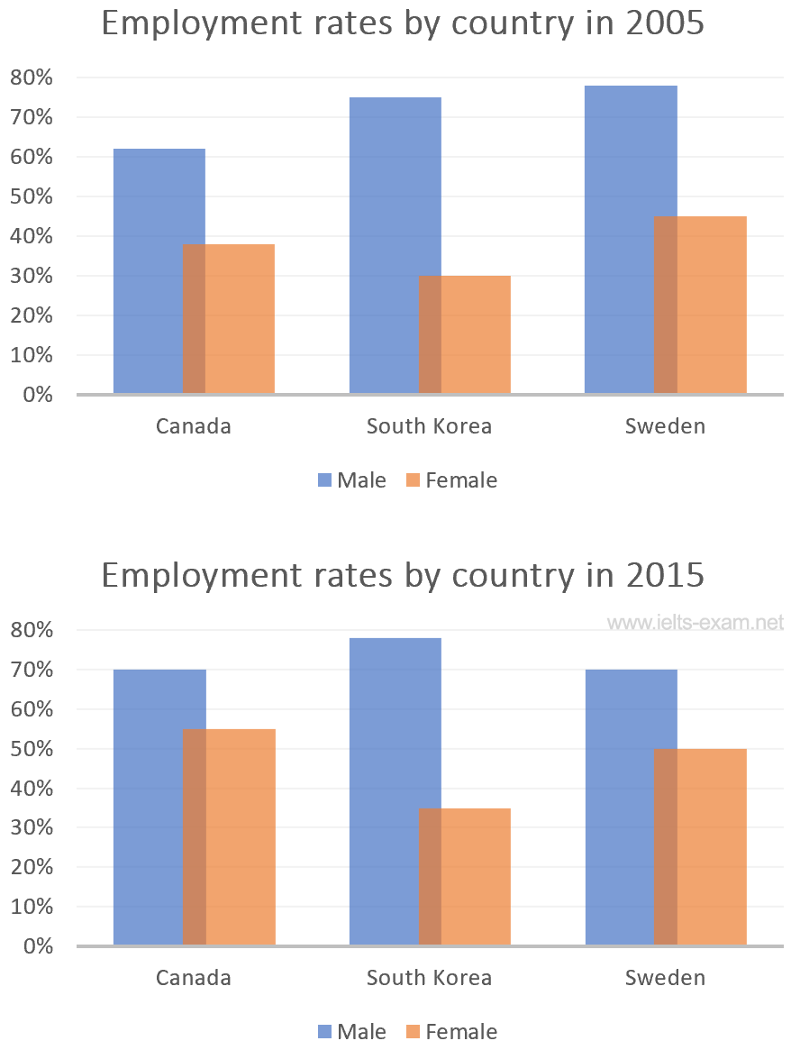
The two charts show the percentages of men and women in employment in three countries in the years 2005 and 2015. In general, we can see that the percentages of working people increased, with the proportion of women showing the most significant rise.
In all of the countries covered, and in both years, the number of men in employment was greater than the number of women. South Korea has the highest rate of male employment – approximately 75% in 2005, rising slightly to about 78% in 2015 – and Canada has the lowest – just over 60% in 2005 and 70% in 2015.
The proportion of women in employment was lower than men in all of the countries covered over the two years. It was below 50% everywhere in 2005, but the figures had risen by 2015. In Canada, over half of the women were working, and in Sweden the figure was exactly 50%. In contrast, the number of South Korean women who were working was only about 35% compared with a percentage which was more than double for men at over 70%.