Fresh Web Design Approaches for Small Business Success
A small business website has to work harder than ever. It is not just a digital brochure, and it is not a box to check because every competitor has one. It is your salesperson at midnight, your front desk on Sunday, your credibility test for first-time visitors, and often the deciding factor between a lead that calls and one that disappears.
That pressure changes how smart owners should think about web design. The old pattern, where a site only needed a nice logo, a stock photo banner, and a contact form buried in the footer, has lost its value. Customers arrive impatient. They compare quickly. They judge silently. If the site feels generic, slow, cluttered, or vague, they move on with almost no friction.
Fresh web design approaches are not about chasing trends for their own sake. They are about building trust faster, reducing confusion, and guiding people toward action with less resistance. For a local service company, a boutique retailer, a specialty clinic, or a professional office, that can mean more phone calls, stronger lead quality, and higher close rates without increasing ad spend.
I have seen small businesses spend thousands on traffic and then sabotage results with a weak website. I have also seen modest redesigns, often focused on messaging and structure rather than flashy visuals, lift conversion rates enough to change the economics of the whole business. Better design is not decoration. It is leverage.
The small business website is now a decision engineMost owners still talk about their websites in design terms. They mention colors, layout, logo placement, or whether they like a certain look. Customers do not think that way. They arrive with a question in mind. Can you solve my problem? Are you nearby? Can I trust you? How much effort will this take? If a site answers those questions quickly, visitors stay. If it makes them work, they leave.
That is why website design for small business needs a different mindset than a portfolio site for a designer or a brand site for a national company with massive recognition. A small business usually does not have the luxury of ambiguity. It needs clarity and momentum.
The strongest sites make their value plain within seconds. They tell people what web design the business does, who it serves, and what to do next. They do not bury the core offer beneath clever slogans. They do not open with abstract language like “elevating your experience” or “redefining excellence.” Those phrases feel polished, but they rarely answer the basic customer question.
A plumber, for example, should not lead with a cinematic video and a vague promise. A better opening might explain that the company handles same-day drain, leak, and water heater problems in a specific service area, then place a visible call button and a short request form above the fold. It sounds simple because it is. The hard part is having the discipline to keep the message direct.
Fresh design starts with fewer choices, not moreMany redesigns fail because they add too much. More animations, more sections, more services crammed onto the home page, more buttons fighting for attention. Owners often assume more information equals better persuasion. In practice, more options usually increase hesitation.
One of the freshest approaches in web design right now is restraint. The best small business sites simplify the decision path. They reduce visual clutter, tighten the copy, and make each section earn its place.
That does not mean sparse or cold. It means intentional. A visitor should feel guided, not overwhelmed.
I worked with a local home services company whose previous site had twelve items in the main navigation, rotating banners, four different shades of blue, and a wall of badges no one could process. Traffic numbers looked decent, but lead conversion lagged. We stripped the navigation down, rewrote the hero section, moved trust signals closer to the quote request, and reorganized service pages around customer intent. The final site looked calmer, but the bigger win was functional. Within a few months, form submissions rose noticeably, and call quality improved because users better understood what the business offered before reaching out.
Simple does not mean basic. It means clear.
Mobile-first is no longer enough, think thumb-firstMost businesses know their site should work on mobile. That awareness is old news. The sharper question is whether the site is actually comfortable to use with one hand, in bad lighting, while standing in a driveway, sitting in a car, or comparing options during a lunch break.
That is where many small business websites still fall behind.
A thumb-first design approach accounts for how people really behave. Buttons need enough size and spacing. Phone numbers should be tappable. Forms should ask for only what matters. Important information should appear before the user starts scrolling through long blocks of generic content. Sticky call or booking bars can work well when used with restraint.
This is especially relevant in local markets where customers often search in moments of urgency. Someone looking for an electrician, roofer, pediatric dentist, or towing company is not in a patient browsing mood. They are in decision mode. If the page loads quickly, states the service area clearly, and makes the next step obvious, that business has a real advantage.
For companies competing in local search terms like web design the woodlands, this matters on the service side too. Many prospects searching for a local agency are doing so on their phones between meetings or after hours. If your own site makes them pinch, zoom, or hunt for pricing context and examples, it quietly undermines your pitch.
Credibility now lives in the detailsTrust on the web is rarely built by one dramatic feature. More often, it is the accumulation of small signals that suggest professionalism, competence, and honesty. Small businesses that understand this tend to outperform competitors with larger budgets but weaker presentation.
Good design supports trust in subtle ways. Team photos feel more believable than generic stock imagery. Clear service areas reduce uncertainty. Recent testimonials tied to actual projects or neighborhoods feel stronger than anonymous praise. Before-and-after photos, when relevant, do more persuasive work than adjectives ever will. Straightforward copy about process and timelines can calm a nervous buyer faster than a list of buzzwords.
There is also value in showing limits. A business that says, “We serve clients within these counties,” or “We focus on residential jobs rather than commercial contracts,” often comes across as more credible, not less. Boundaries signal experience. They tell customers the company knows what it does well.
Design can reinforce that confidence through consistency. Fonts should be clean and readable. Spacing should feel deliberate. Headings should guide the eye. Photos should look like they belong to the same brand. Contact details should match across the site. These may seem like small matters, but visitors notice the opposite instantly. A site with conflicting styles and outdated pages feels neglected, and neglect is contagious. People start to assume service quality may be neglected too.
Home pages are not the whole strategyOne of the biggest mistakes in website design for small business is treating the home page as the entire experience. In reality, many visitors never start there. They land on a service page, a location page, a blog post, or a Google Business profile-linked URL.
Fresh web design approaches account for that by making internal pages stronger, not just prettier. A service page should do more than define the service. It should address concerns, set expectations, explain who it is for, and offer a next step that feels natural. A local landing page should not be a thin, repetitive SEO page. It should reflect real knowledge of the area, common customer needs, and practical logistics.
A landscaping company, for instance, may have separate pages for drainage, sod installation, irrigation repair, and seasonal maintenance. If each page simply swaps the keyword and keeps the same bland template, users can feel the duplication. Search engines can too. If each page instead reflects actual differences in customer goals, project timelines, and budget ranges, the content becomes more useful and more persuasive.
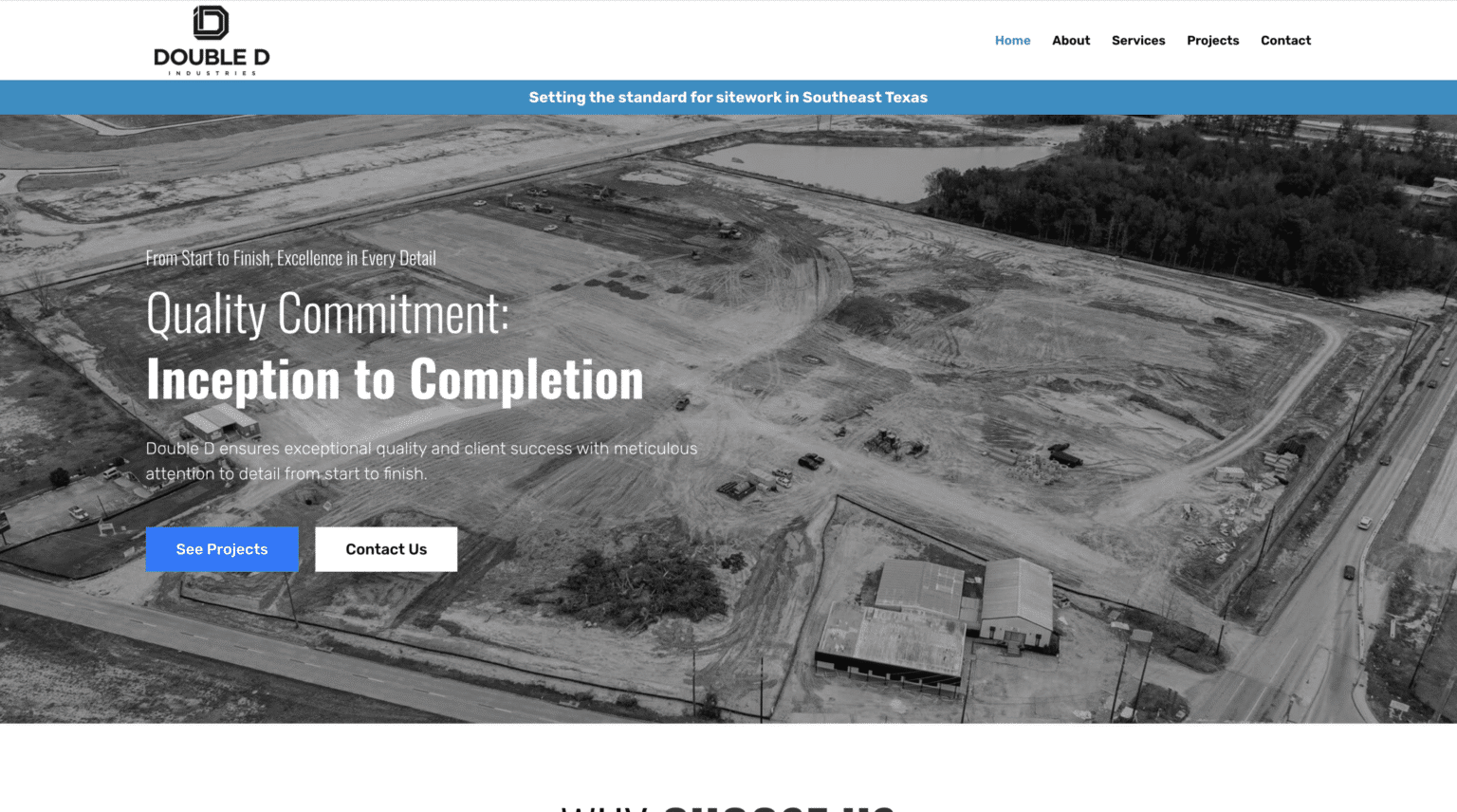
That is where web design and content strategy stop being separate conversations. Structure affects trust, and trust affects conversion.
The best calls to action feel low-frictionA call to action should not feel like a commitment trap. Too many small business websites push hard before they have earned confidence. “Buy now” and “Book today” can work in the right context, but service businesses often benefit from softer, more practical prompts.
“Request a quote,” “Check availability,” “Talk through your project,” or “See if we are a fit” can be more effective because they match the buyer’s mindset. The language respects uncertainty instead of pretending it is not there.
Placement matters just as much. A strong call to action near the top of the page catches ready buyers. Repeating it after sections that answer objections helps hesitant buyers move forward. The design around it matters too. Buttons should stand out, but not scream. Forms should feel short enough to finish. Confirmation pages should tell users what happens next so they are not left wondering whether the message went through.
One simple adjustment often improves results: replacing a long generic contact form with two paths. One for quick inquiries, one for detailed project requests. That lets people choose the level of effort they are ready to give.
Visual trends are useful only when they serve the businessThere is no shortage of design trends. Bold typography, dark mode, asymmetrical layouts, motion effects, interactive scroll sections, soft gradients, hand-drawn accents, and minimalist white space all have their place. The problem starts when trends drive decisions more than business goals.
A fresh look can absolutely help a small business feel current. It can signal energy, confidence, and care. But style choices need to align with audience expectations. A creative studio has more room to experiment than an elder care provider. A luxury custom builder can lean into cinematic visuals more than an emergency restoration company, where speed and clarity matter most.
This is where professional judgment matters. The strongest web design is not the most fashionable. It is the most appropriate.
A practical way to think about it is to weigh every design choice against three questions:
Does this help people understand what we do faster? Does it increase trust? Does it make the next step easier?If the answer is no, the element may still be attractive, but it is probably not helping the business.
Speed is part of the design, not a technical afterthoughtA website that looks beautiful in a design mockup can still underperform badly once it goes live. Heavy video headers, oversized images, unnecessary scripts, and bloated plugins can drag load times down. That cost is not abstract. Every extra second invites abandonment.
For small businesses, speed affects both user experience and lead generation. Slow sites frustrate visitors, especially on mobile connections. They also undermine ad performance because you pay for the click whether or not the page is ready when the user arrives. Even organic traffic can suffer when users bounce quickly.
Fast design is good design. That means compressing images, using modern formats where possible, limiting unnecessary motion, and making smart decisions about what belongs on the page. It also means being honest about trade-offs. A dramatic full-screen video may impress some visitors, but if it adds enough delay to lose urgent prospects, the cost may outweigh the benefit.
Owners do not need to become performance engineers. They do need to ask better questions. When reviewing a redesign, do not only ask whether it looks modern. Ask how fast it loads on a phone in real conditions. Ask what has been added that might slow it down. Ask whether that addition improves results enough to justify the weight.
Local relevance beats generic polishSmall businesses win when they feel close, real, and relevant. A site can be sleek and still feel disconnected if it could belong to any company in any city. Local relevance turns a generic website into a convincing one.
This matters whether you run a bakery, law office, HVAC company, med spa, or boutique consultancy. Mentioning neighborhoods served, showing recognizable project settings, using region-specific examples, and addressing local concerns can all increase trust. For businesses targeting searches tied to place, such as web design the woodlands, local specificity can be a real differentiator. A prospect in that market wants to know you understand local competition, local customer expectations, and the tone of the area, not just design theory in the abstract.
I have seen local firms gain traction simply by replacing broad language with grounded examples. Instead of saying they serve “businesses of all sizes,” they show how they helped a pediatric clinic improve appointment requests, or how they helped a contractor in a nearby suburb reduce missed calls with better mobile design. The examples do not need to be dramatic. They need to feel believable and close to the buyer’s reality.
Fresh content patterns that actually help conversionNot every innovation in web design comes from visuals. Some of the most effective improvements are structural and editorial. The page patterns themselves are changing in useful ways.
A strong service page today might include a concise opening explanation, a short section on who the service is best for, realistic FAQs, process notes, proof points, and a visible next step. That sounds obvious, yet many small business pages still offer only a few vague paragraphs and a stock photo.
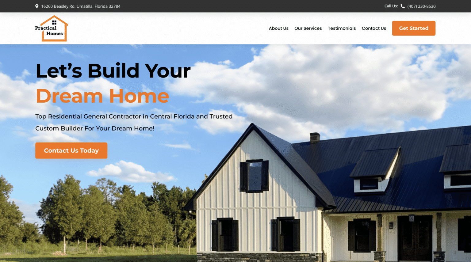
Likewise, FAQ sections are more useful when they tackle real hesitation. Questions about timing, pricing ranges, service area limits, preparation steps, financing, or what happens after submission can reduce friction. The best ones sound like they came from actual customer conversations, because they did.
Short comparison sections can also work well. A cleaning company might clarify the difference between recurring service and deep cleaning. A design agency might explain the difference between a template-based build and a custom website strategy. When these distinctions are written plainly, they help buyers choose rather than forcing them to guess.
Here are a few content elements that often improve performance when handled well:
A clear hero section that names the service, audience, and location Testimonials placed near decision points, not hidden on a separate page Real photos of team, projects, or workspace Short FAQs based on sales calls and customer emails A direct explanation of what happens after someone reaches outThat is not a formula. It is a reminder that good pages answer practical questions before buyers need to ask them.
Accessibility is not optional if you care about customersAccessibility still gets treated as a niche concern, which is shortsighted. Readable text, strong color contrast, descriptive buttons, logical heading structure, and keyboard-friendly navigation make websites better for more people. They also improve usability for everyone, not just users with permanent disabilities.
Small businesses often assume accessibility is a massive technical project. Sometimes it is more manageable than they think. Better font sizing, cleaner contrast, form labels that make sense, and avoiding text embedded in images can go a long way. If your site is difficult to read, navigate, or submit forms through, you are not only excluding potential customers. You are creating friction for all users.
From a business perspective, accessibility also aligns with trust. A site that is easy to use feels more professional. A site that fights the user feels careless.
What owners should ask before approving a redesignA redesign can become expensive theater if the wrong questions guide it. Small business owners do not need to micromanage their designer, but they should stay anchored to business outcomes.
A smart review conversation usually includes these points:
What specific customer action is each major page designed to encourage? What content has been removed, and why? How will this design perform on mobile under normal network conditions? Where are trust signals placed, and what objections do they address? How will success be measured after launch?Those questions keep the project grounded. They also reveal whether the team is thinking strategically or simply producing a prettier version of the old site.
Design is a living system, not a one-time eventOne of the healthiest shifts in web design is moving away from the “launch and forget” mentality. A small business website should evolve. Service offerings change. Customer questions change. Photos age. Messaging improves. Search behavior shifts. Competitors reposition themselves.
The most successful small business sites are maintained like active business assets. They are reviewed, tested, updated, and sharpened over time. That does not mean constant redesign. It means paying attention.
Sometimes the fix is small. A better headline. A shorter form. A stronger project photo. A more specific testimonial. A location page that finally reflects the area accurately. Sometimes it is structural, like reorganizing navigation or splitting an overloaded page into clearer sections.
This ongoing approach matters because business owners often expect too much from a single redesign. A new site can create momentum, but real gains usually come from launch plus refinement. That is where fresh web design approaches become durable, not just attractive.
A business that treats its website as a working sales tool tends to make better decisions. It watches where users hesitate. It notices which pages attract inquiries. It strengthens what works and trims what does not. That discipline often matters more than any one visual trend.
Small businesses do not need the biggest website, the flashiest animation, or the most complicated tech stack. They need a site that communicates clearly, loads quickly, feels trustworthy, and makes taking the next step easy. When web design does those things well, it stops being a marketing accessory and starts becoming a genuine growth engine.
Scalable Websites
Website design for contractors and small businesses
Based in Montgomery, TX, serving Montgomery County and greater Houston
Phone: (832) 979-2478
Website: scalablewebsites.com
Hours: Monday to Friday, 8 AM to 5 PM
Scalable Websites builds and manages mobile-first websites for contractors and small businesses on simple monthly plans, with hosting, security and unlimited updates included. Find us on Google.