🎨 Flutter Theme: Manage it like a Senior
FlutterPulseThis article was translated especially for the FlutterPulse channel. In this channel you will find many interesting things related to Flutter. Don't forget to subscribe! 🚀
Flutter Theme: Manage it like a Senior
From the title, you may have had "Ughhh" as your first thought, since Flutter theming can be a pain to manage and implement, with many classes. I want to show you how to do it consistently, with the Single Responsibility Principle and Separation of Concerns in mind.
Preparation
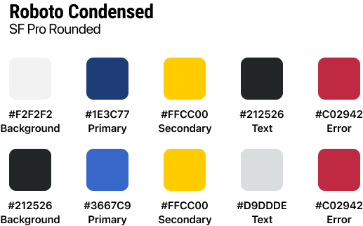
First, let's take a look at the app design, including features such as the colors and fonts we will use. We have the light theme, dark theme and the color palette.
Implementation
Let's start with the fresh new project. Inside the lib folder, let's create a basic folder structure:
lib
├── presentation
│   └── style
│        ├── colors.dart
│        ├── text_styles.dart
│        ├── extensions.dart
│        └── app_theme.dart
└── main.dart
Colors
// LIGHT COLOR PALETTE
const Color backgroundColorLight = Color(0xFFF2F2F2);
const Color primaryColorLight = Color(0xFF1E3C77);
const Color secondaryColorLight = Color(0xFFFFCC00);
const Color textColorLight = Color(0xFF212526);
const Color errorColorLight = Color(0xFFC02942);

// DARK COLOR PALETTE
const Color backgroundColorDark = Color(0xFFF2F2F2);
const Color primaryColorDark = Color(0xFF1E3C77);
const Color secondaryColorDark = Color(0xFFFFCC00);
const Color textColorDark = Color(0xFF212526);
const Color errorColorDark = Color(0xFFC02942);
I simply defined all colors and divided them into a light and dark palette. This way we have a single file that contains all colors used in the app.
Text Style
// COMMON
const TextStyle titleTextStyle = TextStyle(fontSize: 28, fontWeight: FontWeight.bold, fontFamily: 'Roboto Condensed');
const TextStyle subtitleTextStyle = TextStyle(fontSize: 16, fontFamily: 'SF Pro Rounded');
const TextStyle labelTextStyle = TextStyle(fontSize: 12, fontFamily: 'SF Pro Rounded');

// BLOGS
const TextStyle trendingBlogTitleTextStyle = TextStyle(fontSize: 22, fontWeight: FontWeight.bold, fontFamily: 'Roboto Condensed');
const TextStyle cardBlogTitleTextStyle = TextStyle(fontSize: 14, fontWeight: FontWeight.bold, fontFamily: 'Roboto Condensed');
I divided text styles here based on the topics, while the ones that are used across the whole app are defined at the top.
App Theme with Extensions
The error color doesn't exist as part of the ThemeData class, but we can make it part of the ThemeData using extensions:
class AppColors extends ThemeExtension<AppColors> {
  final Color? backgroundColor;
  final Color? primaryColor;
  final Color? secondaryColor;
  final Color? textColor;
  final Color? errorColor;

  const AppColors({
    required this.backgroundColor,
    required this.primaryColor,
    required this.secondaryColor,
    required this.textColor,
    required this.errorColor,
  });

  @override
  ThemeExtension<AppColors> copyWith({...}) => AppColors(...);

  @override
  ThemeExtension<AppColors> lerp(covariant ThemeExtension<AppColors>? other, double t) {
    if (other is! AppColors) return this;
    return AppColors(
      backgroundColor: Color.lerp(backgroundColor, other.backgroundColor, t),
      primaryColor: Color.lerp(primaryColor, other.primaryColor, t),
      secondaryColor: Color.lerp(secondaryColor, other.secondaryColor, t),
      textColor: Color.lerp(textColor, other.textColor, t),
      errorColor: Color.lerp(errorColor, other.errorColor, t),
    );
  }
}
AppTheme Setup
class AppTheme {
  static final lightTheme = ThemeData(
    fontFamily: 'SF Pro Rounded',
    shadowColor: Colors.black26,
    extensions: [
      AppColors(
        backgroundColor: backgroundColorLight,
        primaryColor: primaryColorLight,
        secondaryColor: secondaryColorLight,
        textColor: textColorLight,
        errorColor: errorColorLight,
      ),
    ],
  );

  static final darkTheme = ThemeData(
    fontFamily: 'SF Pro Rounded',
    shadowColor: Colors.black26,
    extensions: [
      AppColors(
        backgroundColor: backgroundColorDark,
        primaryColor: primaryColorDark,
        secondaryColor: secondaryColorDark,
        textColor: textColorDark,
        errorColor: errorColorDark,
      ),
    ],
  );
}
Custom Text Styles Extension
extension CustomTextStyles on TextTheme {
  TextStyle get titleStyle => titleTextStyle;
  TextStyle get subtitleStyle => subtitleTextStyle;
  TextStyle get labelStyle => labelTextStyle;
  TextStyle get trendingBlogTitleStyle => trendingBlogTitleTextStyle;
  TextStyle get cardBlogTitleStyle => cardBlogTitleTextStyle;
}
BuildContext Extensions for Clean Access
extension StyleExtension on BuildContext {
  Color get colorBackground => Theme.of(this).extension<AppColors>()!.backgroundColor!;
  Color get colorPrimary => Theme.of(this).extension<AppColors>()!.primaryColor!;
  Color get colorSecondary => Theme.of(this).extension<AppColors>()!.secondaryColor!;
  Color get colorError => Theme.of(this).extension<AppColors>()!.errorColor!;
  Color get colorText => Theme.of(this).extension<AppColors>()!.textColor!;

  TextStyle get textTitle => Theme.of(this).textTheme.titleStyle;
  TextStyle get textSubtitle => Theme.of(this).textTheme.subtitleStyle;
  TextStyle get textLabel => Theme.of(this).textTheme.labelStyle;
}
Final Usage
class HomeWidget extends StatelessWidget {
  const HomeWidget({super.key});

  @override
  Widget build(BuildContext context) {
    return Scaffold(
      backgroundColor: context.colorBackground,
      body: Center(
        child: Text(
          'Home',
          style: context.textTitle,
        ),
      ),
    );
  }
}
Now when we call theme properties, the code is much cleaner and with prefixes like "color" or "text", you get filtered available options in the dropdown menu.
Conclusion
After many projects of experimentation, this approach showed the best results. It helps you handle theming more consistently and makes it easier to maintain and change. The key is using extensions on BuildContext to provide clean, intuitive access to your theme properties.
Happy coding! 🎨