Flutter. The color theory with the Colorfull package
FlutterPulseThis article was translated specially for the channel FlutterPulseYou'll find lots of interesting things related to Flutter on this channel. Don't hesitate to subscribe!🚀
When we start learning about colors in Flutter, we find words with unclear meaning: hue, tint, shade, saturation, luminance, and more.
The first three even translate into Russian with the same word.
There is a new package on pub.dev called Colorfull that defines 11K colors. We will look at it more later, but I found its DEMO particularly useful for explaining basic color terms.
If you are a member, please continue; otherwise, read the full story here.
Basic color terms∘ Hue
∘ Luminance
∘ Tint
∘ Shade
∘ Contrast
∘ Saturation
∘ Tone
∘ SwatchColor wheel Color harmonies (combinations)∘ Complementary
∘ Analogous
∘ Triadic
∘ Tetradic (Square)
∘ Monochromatic
∘ Split complementaryPrimary, secondary, tertiaryColor wheel with Flutter's colors ∘ Color wheel with all Flutter Material shadesColorfull package∘ Colorfull wheel with main colors (hues)
∘ Colorfull wheel with all shades
Basic color terms
Hue
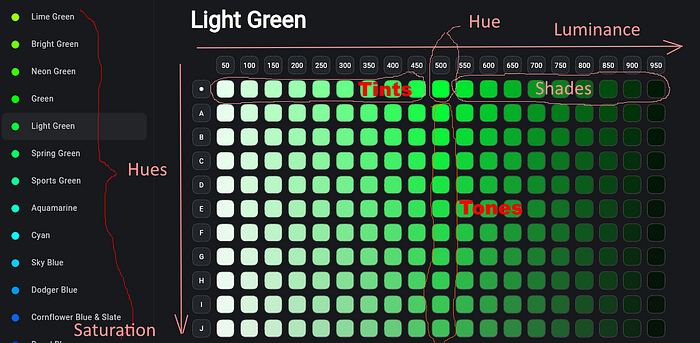
The hue is basically a color. Those colors that are typically shown on the color wheels are hues. In the above image, the left menu consists of hues (Lime Green, Bright Green, and so on). In Flutter's Material colors, the Colors.green.shade500 is a hue. In Colorfull package, the lightGreen500is a hue.
Luminance
The luminance is the amount of light(white) in the color. The lightGreen50is the color with the highest luminance. The lightGreen950is the color with the lowest luminance.
Lightness
Lightness is the concept related to luminance, but different. Luminance is a measurable physical characteristic that can be calculated. Lightness is the human perception.
Tint
Colors from 50 to 450 are called tints (of a particular hue). They are constructed by mixing the hue and white.
Shade
Colors from 550 to 950 are called shades(of a particular hue). They are constructed by mixing the hue and black.
👉Note that in Flutter's MaterialColor, both tints and shades are called shades. Thus, there are shades from shade50to shade900.
Contrast
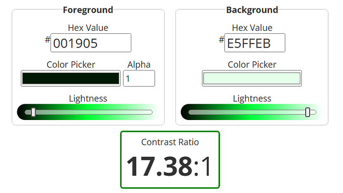
Color contrast refers to the difference in luminance between foreground and background colors. It is measured by the contrast ratio. The contrast ratio between lightGreen50(lightest tint) and lightGreen950(darkest shade) is 17.38 : 1. The maximum possible value (black on white and vice versa) is 21 : 1.
Saturation
Saturation is the amount of color(hue) in the tone. In the above image, the lightGreen500(the hue) has the highest saturation.
Chroma
Chroma is the concept related to saturation; they are sometimes used interchangeably, but they are very different. Saturation refers to the amount of grey in a color. The less, the more saturated. Chroma is about how bright the color looks. It is more about human perception of the color. The hue has higher chroma than its shades and tints, although they have the same saturation. For example, the lightGreenJ500color has a higher chroma than the lightGreenA900, despite the latter having a higher saturation.
Tone
Colors from A to S (the last letter we see is a J, but there are more) are called tones. They are constructed by mixing the hue and grey. By the letter A, tones with the highest saturation. By the letter S, tones have the lowest saturation.

Swatch
A swatch is an example (sample) of a particular color. The swatch can represent a hue, a tint, a shade, or a tone. The term swatch can be used as: "The palette contains several swatches. Each one is a different shade of blue."
Color wheel
Main color (hues) can be displayed in a wheel.

Color harmonies (combinations)
Complementary
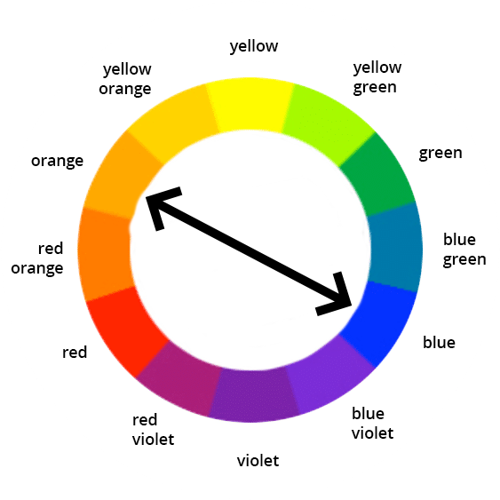
Colors resided on the opposite sides of the wheel are called complementary. Example: blue — orange.
Analogous
Colors that are neighbors on the color wheel. Example: blue — blue-violet — violet.
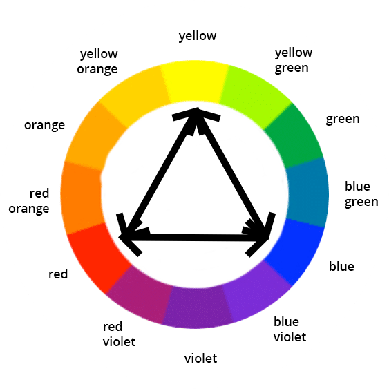
Triadic
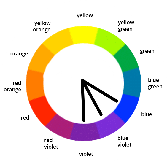
Colors at the vertices of an equilateral triangle. Example: blue — red — yellow.
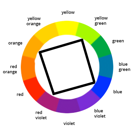
Tetradic (Square)
Colors at the vertices of a square. Example: blue — red-violet — orange — yellow-green.
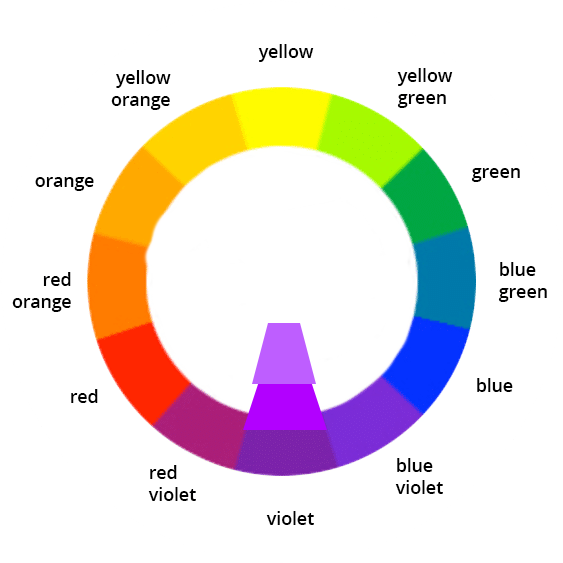
Monochromatic
Several shades (or tints, or tones) of the same color (hue).
Split complementary
Colors that are adjacent to complementary. Example: yellow — blue-violet — red-violet.
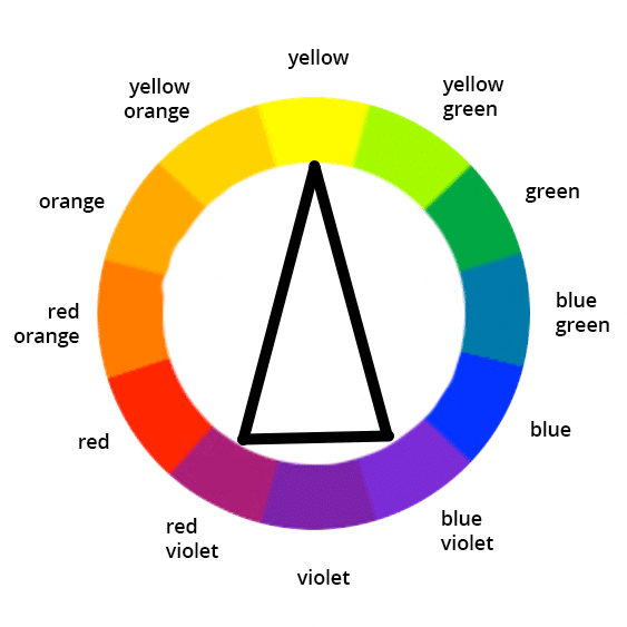
Primary, secondary, tertiary
In the context of the classic RYB color wheel, primary colors are: blue, red, and yellow, secondary: green, violet, orange, and tertiary are: blue-green, blue-violet, red-violet, red-orange, yellow-orange, yellow-green.
👉Note that, applied to the palette and Flutter's ColorScheme, the meaning of the primary, secondary, and tertiary is completely different. The primary color is the color that is used the most across the app. The secondary appears less frequently, and the tertiary even less than the secondary. With a recommended ratio of usage between primary, secondary, and tertiary of 60:30:10. The tertiary color of the palette is sometimes called accent.
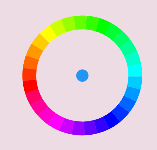
Color wheel with Flutter's colors
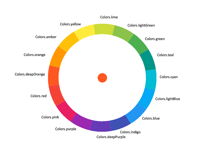
Note that Flutter has 16 main colors (displayed in the above image) as opposed to the classic color wheel with only 12 colors.
The above image is actually a screenshot of the Flutter application. I only added labels manually. It was done using the flutter_color_picker_wheel package. The package is very easy to use, but maybe I will write a dedicated article.
The above is the color wheel with accent colors. The main colors are on the inner wheel, and they look a bit darker.
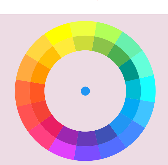
Color wheel with all Flutter Material shades
I couldn't resist and made a color picker. I will show the code in another article.

Colorfull package
The colorfull package also deserves a separate article, but since I used its demo screenshot, I will include a few words here.
Colorfull defines color constants similarly to Flutter's Colorsclass, but with some differences.
The Colorsclass has 16 main colors with 10 shades each and 16 accents with 4 shades each. 224 constants overall.
Colorfull has 29 main colors with 19 shades each. 551 constants.
const amber50 = Color(0xffFFFAE5);
const amber100 = Color(0xffFFF5CC);
const amber150 = Color(0xffFFF0B3);
//and so on...
Additionally Colorfull defines constants for tones, which Flutter doesn't. 20 saturation levels for each hue gives us 551 x 20 = 11020 constants.
const amberA50 = Color(0xffFEFAE6);
const amberA100 = Color(0xffFEF4CD);
const amberA150 = Color(0xffFDEFB4);
//and so on...
There are also 19 shades of grey, 20 white, and 20 black opacities.
There is also a very useful Swatchclass that extends Color. It can be created from any Material or Colorfull constant, or from the hex value:
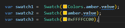
It provides sat, desat, darker, and lightergetters.
For example, swatch1.darker50 will create 5% darker shade, swatch1.lighter50 will create 5% lighter tint, and swatch1.desat50 will create 5% greyer tone.
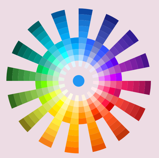
Colorfull wheel with main colors (hues)
Colorfull wheel with all shades
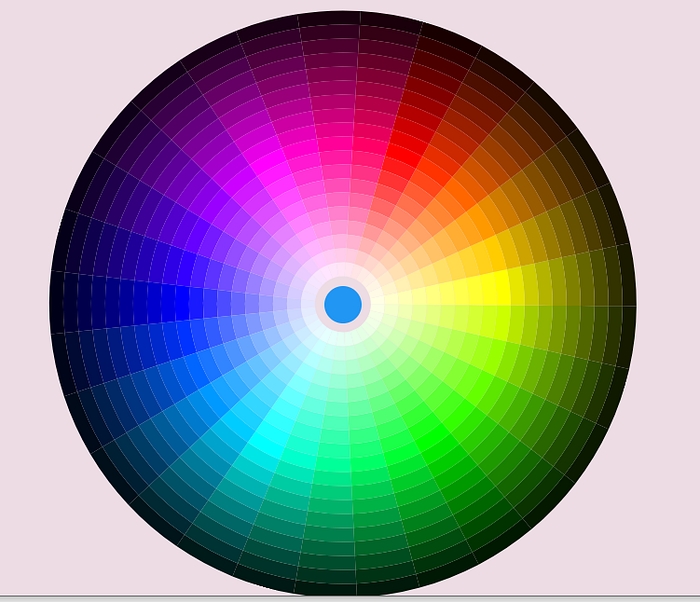
We can see that Colorfull's dark shades are much darker than Flutter's material colors.
Let's investigate some color. For example, blue.
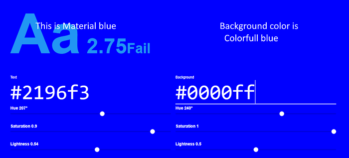
We can see that blue from the Colorfull package is the real blue with expected lightness of 0.5, while the "blue" from Flutter's Colors class is the kind of artwork by Google's Material designers.
Let's check blue shade 600.
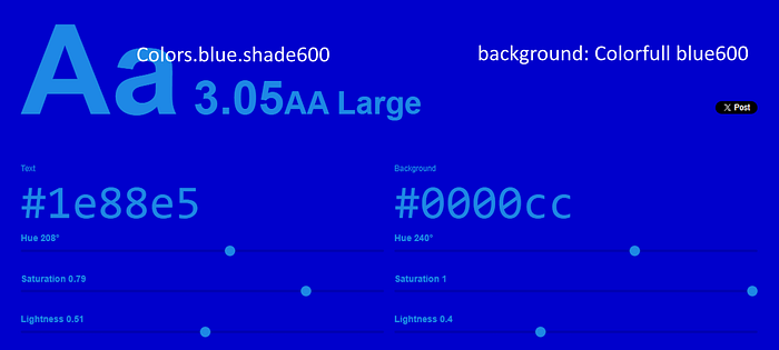
Again, we can see that the color from Colorfull is mathematically predictable with a lightness of 0.4, while the material color is a kind of fiction.
The last one is shade 900.
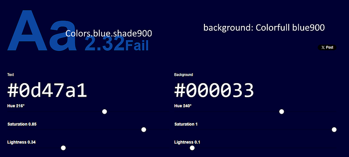
Again, Colorfull blue900has expected lightness of 0.1.
Okay, we get our answer why Colorfull wheel looks darker than the material one. Material colors are not real colors; they are artworks. Their shade names are misleading, as we can see shade900 has the lightness of 0.34 instead of 0.1.
Is that bad? Depends what we want. If we completely rely on ColorScheme.fromSeed, Material colors may provide better results since the fromSeedmethod was written to use those colors.
But if we want more freedom and want to create our own ColorSchemes, manually or by writing a generating method, Colorfull provides more predictable colors and flexible methods to manipulate them.
Thank you for reading!
Thoughts, questions? Welcome to the comments!