Design: How to Build Apps in Arabic
This article has been translated from its original publication at https://habr.com/ru/articles/738286/
My name is Sasha Shulgin, and I lead the Purrweb agency. Over the past couple of years, our team has worked on 5 projects with Arabic interfaces. It's not a large number, of course, but we already have some experience. While working on these projects, we have gathered a knowledge base. I decided that we shouldn't keep this knowledge only within our team in Notion, so I'm sharing with you how to adapt applications for the Middle East.

Problem: At first glance, developing an Arabic version of a design seems simple: translate the text and align it to the right = profit. In reality, it's a complex process with many nuances.
Solution: Take this article and go through each point. As a result, you will achieve a correct and user-friendly design for users from Arabic-speaking countries. Let's start with a brief overview of Arabic design.
2 User Scenarios
Right-to-left interface direction (RTL) is intended for users from the Middle East. In the following discussion, I will consider the Arabic version of the application, but the advice is also applicable to the Hebrew interface.
RTL differs from the familiar left-to-right (LTR) in terms of how the user views content on the screen:
LTR - the user reads from left to right;
RTL - the user reads from right to left.

Take a closer look at this image. Here, not only is the text aligned to the right, but the positioning of interface elements has also been altered. Additionally, some icons and buttons are flipped, while others are left as they are.
All of this follows a specific logic and is related to the order in which the user views the screen content of the application. Let's start with the text.
How to format Arabic text
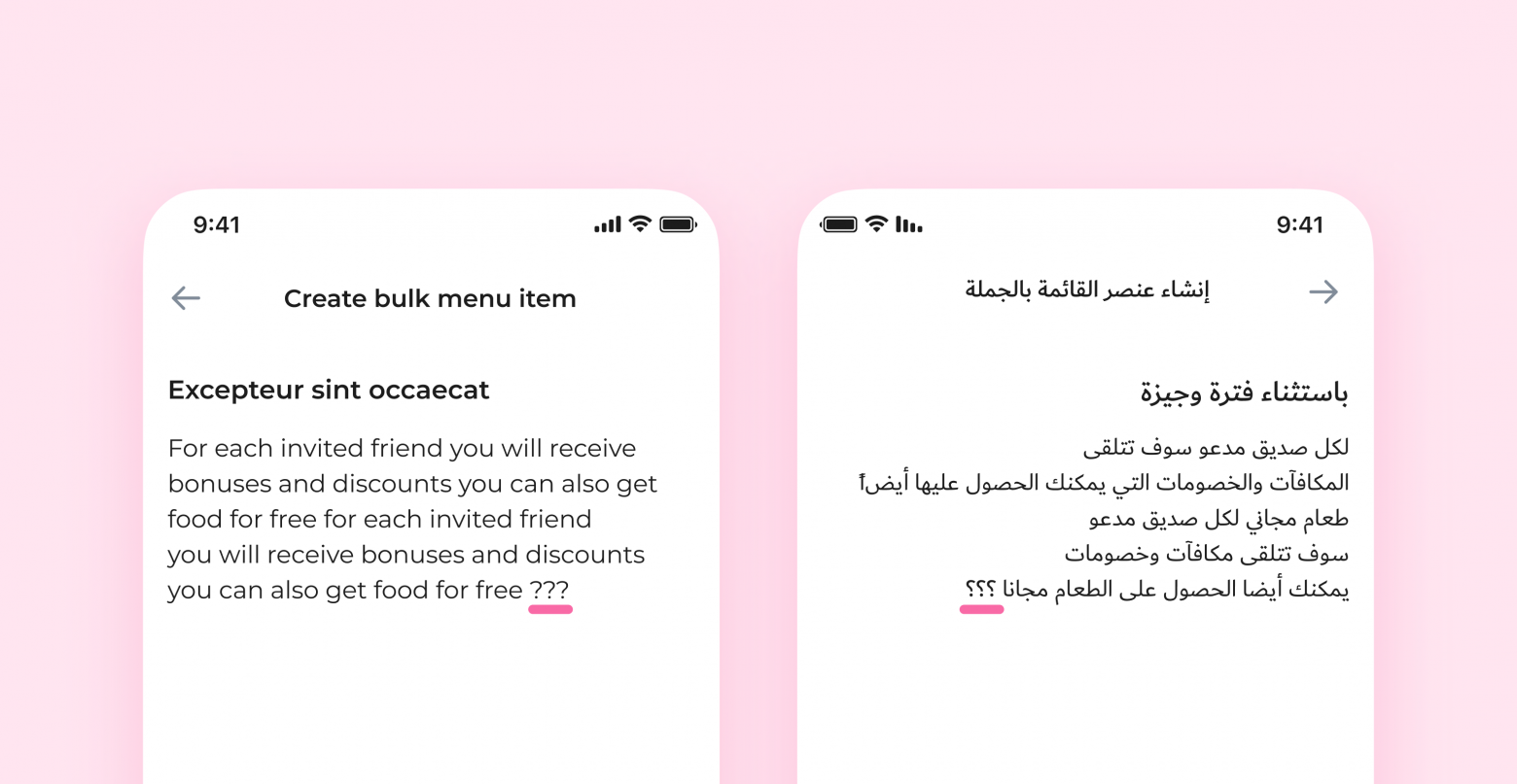
Align the text to the right. It's important for the text to be translated and mirrored for right-to-left reading. It can be difficult to determine visually if the text looks correct, so you can add a few question marks at the end for verification. If everything is okay, they will be displayed as shown in the screenshot. It makes life much easier :)
Words or sentences that need to be kept in the original language should be aligned to the right without flipping. The text should always be oriented correctly for its language.

Proper names, as well as words and sentences that only carry meaning in the original language, should not be translated.
❗️Exception: Sometimes it's necessary to keep an entire paragraph in the original language. In such cases, the text fragment should be aligned to the left, despite the right-to-left alignment of other elements.

Check that the fonts support the Arabic language. If the fonts used in the main version don't support Arabic, you'll have to apply a different style with appropriate fonts to this design version. For example, in April 2022, Apple added the SF Arabic font to its font family. Google offers the Noto font family.
Increase the font size in headings and buttons. If you use uppercase letters for buttons and headings in the English version, the text in Arabic may appear small because Arabic and Hebrew do not have capital letters. To fix this, increase the font size for these elements in the Arabic version by approximately 10%.

Correctly adapt numbers. Different countries and even regions within a country may use either Western or Eastern numerals. For example, both types are used in Egypt and Sudan. In Iran and Afghanistan, Eastern numerals are predominant.

Maintain the correct order of numbers regardless of the language. Western numerals don't need to be flipped; simply align them to the right. However, Arabic numerals are displayed from right to left.

❗️Exception: Elements that demonstrate progress, such as ratings, should be positioned according to the reading direction. However, the numbers themselves should not be flipped.

UI elements
If the previous section focused on text-related aspects, this section addresses the visual components of the interface. Icons, indicators, control panels—some of these elements need to be flipped, while others don't. Let's understand which ones and why.
Flip
Icons with motion. If the user reads from right to left, objects that face the same direction move "forward" for them. Therefore, all icons indicating "forward" movement in LTR design should be directed in the opposite direction in RTL: a courier doesn't move to the right but to the left.

Icons with simulated text. Message icons and other images that simulate text lines should be rotated based on how the user reads that text.

Redirect icons. "Forward" and "back" icons swap positions. If the "back" button in LTR design points to the left, in RTL it should face the right.

"Undo" and "redo." These indicate the direction of time: "undo" takes us back, "redo" moves us forward. These icons swap places, similar to the previous ones.

Control elements. Sliders, switches, and other elements with a start and end point should be mirrored.

Don't flip
Images. There are two reasons not to do this:
a) Photographers or illustrators carefully consider angles from which an image looks optimal and conveys context. Flipping an image may cause the intended meaning to be lost.
b) The image's creator has the full right to file a complaint against the misuse of their intellectual property.
Sometimes, changing the orientation of an image is necessary to maintain overall visual consistency on a page. In such cases, consider using different images for LTR and RTL versions.
Circular time display. Unlike "undo" and "redo" buttons that indicate the direction of time, "history" and "refresh" icons represent actual clocks. They show movement clockwise or counterclockwise in either design version.

Real objects. Anything that is a model of an existing object and does not indicate direction should be left unchanged. For example, a moving car is an icon of direction and should be flipped, while headphones or an open book are simply representations and should remain unaltered.

Pseudo-directed icons. Real objects that initially appear to have a direction. In reality, these items are simply designed for right-handed individuals.

Logos and universal symbols. These visual elements should never be reflected or altered. Doing so will only confuse users and may infringe on copyright.

Icons with letters and numbers. They can be flipped if necessary, but in most cases, it is not required. The main focus should be on translating the symbols in such icons.


That's all. If I haven't covered a particular topic, feel free to ask questions in the comments, and I'll respond to all of them.
Bonus: Recommendations for working with Figma layout
I will share the algorithm our team uses to adapt designs for the Arabic language.
- Set up your workspace. Decide whether you'll be creating all versions of the application in a single file or multiple files. If you're using multiple files, it's better to create a style library and link it to the new files.
Pro tip: Customize Figma based on project size.
- Small project (a few screens or a landing page): Work on a separate page within the same file.
- Medium project (versions for different user roles): Move everything to a separate file and work there.
- Large project (design for web and mobile applications): Work with multiple files.
- Adapt the UI kit for the RTL version. Create RTL variants of existing components. Start with master components and then move on to icons and other UI elements.
- Replace elements with RTL versions from the UI kit. Open both versions in parallel and systematically replace all elements.
- Prepare text fields. Apply a text style with a new font if the current style doesn't support the Arabic language. Then, align all text that will be translated to the right.
- Change the text to Arabic. Translate the text using Google Translate or have it translated by a specialist. Then, paste it into the layout.
Voila! The Arabic version of the interface is ready.