Color Theory & Psychology
Kaphal Studio & OthersWhat is Color Psychology?
In its simplest terms, color psychology has become a popular area of color theory that assigns emotional and psychological connotations between colors and emotions. Many of these meanings are universal because they have an effect on the brain but some are only cultural. When traveling, it would be wise to research the accepted and non-accepted colors for any family or cultural event you are attending abroad.
Whether you like a color frequently depends on childhood memories and your association between colors and feelings. If your mother made you wear yellow one day and your classmates made fun of you, yellow is not likely to be your favorite color as an adult.
Sometimes a hue can have many connotations for you. For example, you may choose to wear an orange blouse one day because:
- It lifts your mood
- You are ready to act
- You are feeling creative
- You want to make a statement
The Meaning of Colors
How do colors affect moods? While perceptions of color are somewhat subjective, some effects have universal meaning. Colors in the red area of the spectrum can be yellow-based such as scarlet red and red-orange are known as warm colors. These warm colors evoke emotions ranging from feelings of comfort and warmth to feelings of hostility and anger. Reds can also have an undertone of blue and are known as cool colors such as burgundy, ruby, raspberry, deep cherry. These colors are often described as calm but can also call to mind seriousness and dignity.
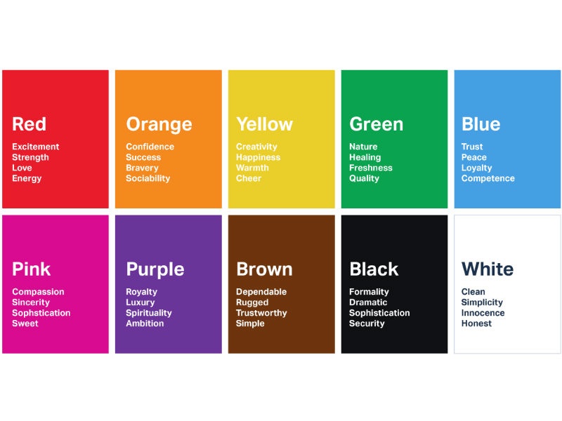
The subject is well documented, so we’ll take a look at some personal and professional connotations associated with six of the rainbow colors to give you a better understanding of the psychology of colors.
1. Red
Red attracts the most attention and is associated with strong emotions, such as love, passion, and anger.
It’s the universal color to signify strength, power, courage, and danger. Red is vibrant, stimulating and exciting with a strong link to sexuality and increased appetites.
Red is energizing and exciting, motivating us to act. It can also give confidence to those who are shy or lacking in willpower.
It’s warm and positive, generally associated with our most physical needs and our will to survive. It exudes a strong and powerful masculine energy. It enhances metabolism, increases respiration rate, and raises blood pressure.
Wear red to energize the group or the meeting but in smaller patches of the outfit, such as a blouse or scarf. It also does wonders to uplift your mood in a dark green, grey, black and navy basic ensemble. Red ties are also favored by politicians as part of the red and blue tie partnership they wear with everything.
A little can go a long way, however, and in large areas red can cause visual strain. Wearing it too much, too often can brand you as a person in charge, but also as a bossy person!
2. Orange
This is the hue of encouragement, optimism, and self-confidence, marking the extrovert. Orange radiates warmth and happiness, combining the physical energy and stimulation of red with the cheerfulness of yellow. Orange can inspire courage, enthusiasm, rejuvenation, and vitality. It can also have a stimulating effect, particularly on the appetite.
It can also be a sign of pessimism and superficiality.
In business applications, orange gives the impression of affordability, depending on the shade chosen and its combination with other colors. More gentle than red, orange represents more feminine energy and the energy of creation.
For networking or a business social gathering, wear it boldly in a blazer. Pair it with a coordinating multi-colored top and solid slacks, or more cautiously in small patches in a printed top or scarf. It also combines naturally and beautifully with the Autumn shades of the Northern US taking on an artistic or grounded feel with brown and spicy shades. The downside of wearing orange is that orange dye lots vary in quality. Be sure to check your orange purchase in daylight as the harsher light can downgrade the tone. Orange ties for men are still on the power list so wear in an expensive silk foulard so that the colors gleam and radiate success.
3. Yellow
Yellow is the color of the mind and the intellect, resonating with the left, logical side of the brain. It is creative, the tone of new ideas and new ways of doing things. Post-it notes and legal pads were invented in yellow for a very good reason!
Being the lightest hue of the spectrum, yellow is uplifting and illuminating, offering hope, happiness, and fun. It’s a warm and happy color that creates a sense of cheerfulness and playfulness, brightening people’s spirits.
However, too much yellow can cause anxiety, nervousness, apprehension, agitation, and confrontation particularly in people who are already stressed. It can also suggest impatience, criticism, and cowardice, and motivate people to become overly critical, judgmental, and deceitful.
Avoid dressing in yellow when trying to influence men. They tend to see it as cheap and unsophisticated. However, it’s brilliant to help stand out from the crowd and can easily be paired with a moderating shade to add more authority such as mid-blue or forest green. Yellow ties have fallen from the power tie rack recently but can still be worn successfully in a yellow and blue foulard print or polka dot.
4. Green
Green is of nature, of balance and growth. It is restful and secure, symbolizing harmony, healing, and stability.
It also represents security and self-reliance. Darker greens relate to money, wealth and prestige, while lighter greens relate to rebirth, growth, and freshness.
However, too much green can lead to feelings of envy, greed, jealousy, and selfishness.
In business, green is beneficial for anything to do with health and healing and promoting natural, safe, organic, environmentally friendly products. Dark green is a good choice for money and financial websites.
Wear it safely and to your advantage at work, in sales presentations, asking for funding or a loan. On the lighter side of the green, turquoise and aqua are two of the most popular colors, like the darker teal, all made from varying amounts of blue and green. They remind one of sunlight on a blue sea, health, peace and abundance. Use the colors in solids or prints as tops, blouses and shells under pantsuits with camel, beige, taupe as well as purple and charcoal. Men can wear teal ties to their advantage when they want to look approachable and authoritative.
5. Blue
Blue is the color of trust, serenity, and peace. It suggests loyalty and integrity as well as conservatism and predictability.
This has the opposite effect on the brain than red. It is calming, reducing tension and fear, slowing the pulse rate and reducing appetite. While inspiring wisdom and higher ideals, it is sincere, reserved, and quiet. Being cool, it creates a sensation of space.
Because blue is the most universally favored color of all, it is the safest to use in business and airline uniforms. It relates to trust, honesty, and dependability, therefore helping to build customer loyalty. Blue works well for the corporate world and is often used in important meetings. Wear it when interviewing, and meeting business professionals such as accountants, insurance companies, bankers and other financial companies where trust and reliability are important.
The downfall of blue and especially navy is that it can seem mature, conservative, boring or denote a rigid outlook. However, there are many blues that are more exciting than the navy. Think of a royal or a teal blue that is credible yet more interesting.
Royal blue ties are the politician’s uniform and very predictable. Great for a conservative audience perhaps. Vary it a little with a blue or navy suit and white or pale blue shirts. What about a tie in varying shades of blue with a splash of red!
6. Purple
Purple is the color of imagination and spirituality, inspiring high ideals. It can be creative and individual or immature and impractical. It is also an introspective tone, allowing us to connect with our deeper thoughts.
People drawn to purple are usually sensitive and compassionate, understanding and supportive, thinking of others before themselves. They will often have a peaceful and tranquil quality, with quiet dignity about them.
Purple implies wealth, even royalty, as well as quality, fantasy, and creativity. This tone heightens people’s sense of beauty and their reaction to more creative ideas.
It is often used to denote a high-quality or superior product. If you are in a service business, use some purple in your marketing to promote your premium service.
On your next shopping trip look for purple which is a much more creative choice than buying another black jacket. It’s a good substitute for red and goes well with most pastels to give a high contrast look of authority, without resorting to the black and white cliché. Wear it with the confidence that you are going to look expensive and creative. Purple ties and pastel mauve or pinstripe shirts for men are often favored by the more adventurous, creative dressers. Wear them with confidence if you are representing a creative industry, service or product.
Final Thoughts on the Psychology of Color
While tone can influence how we feel and act, these effects are subject to personal, cultural, and situational factors. More scientific research is needed to gain a better understanding of color psychology, as the concept has become extremely popular in marketing, art, design, fashion, and other areas the seek to connect colors and emotions.
Color Theory
Color theory is both the science and art of using color. It explains how humans perceive color; and the visual effects of how colors mix, match or contrast with each other. Color theory also involves the messages colors communicate; and the methods used to replicate color.
In color theory, colors are organized on a color wheel and grouped into 3 categories: primary colors, secondary colors and tertiary colors. More on that later.

So why should you care about color theory as an entrepreneur? Why can’t you just slap some red on your packaging and be done with it? It worked for Coke, right?
Color theory will help you build your brand. And that will help you get more sales. Let’s see how it all works.
Understanding color
–
People decide whether or not they like a product in 90 seconds or less. 90% of that decision is based solely on color.
Color is perception. Our eyes see something (the sky, for example), and data sent from our eyes to our brains tells us it’s a certain color (blue). Objects reflect light in different combinations of wavelengths. Our brains pick up on those wavelength combinations and translate them into the phenomenon we call color.
When you’re strolling down the soft drink aisle scanning the shelves filled with 82 million cans and bottles and trying to find your six-pack of Coke, what do you look for? The scripted logo or that familiar red can?
People decide whether or not they like a product in 90 seconds or less. 90% of that decision is based solely on color. So, a very important part of your branding must focus on color.
RGB: the additive color mixing model
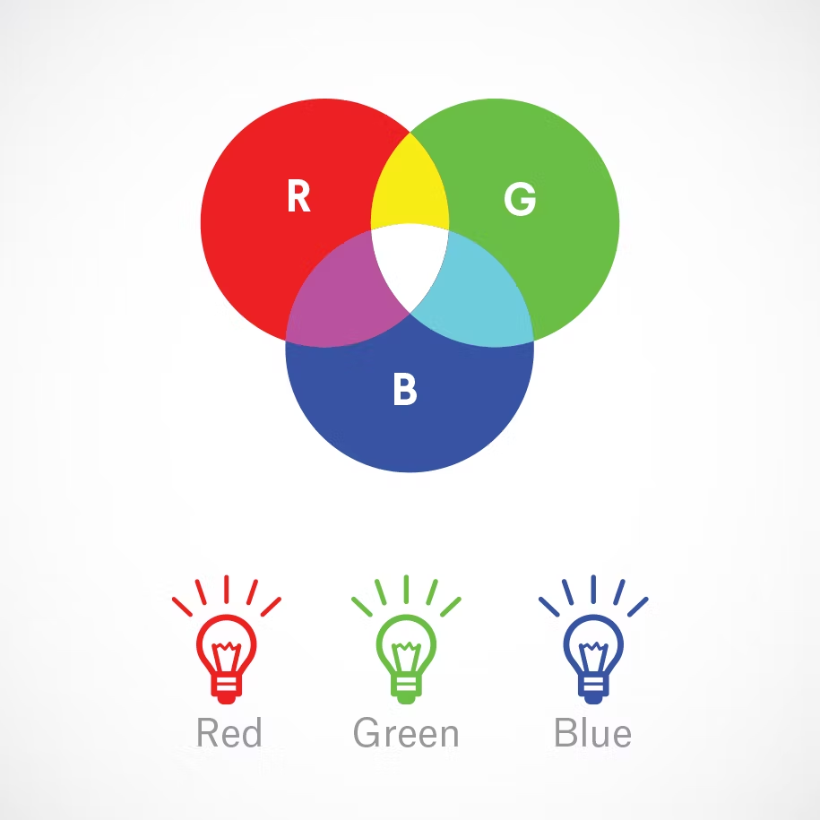
Humans see colors in light waves. Mixing light—or the additive color mixing model—allows you to create colors by mixing red, green and blue light sources of various intensities. The more light you add, the brighter the color mix becomes. If you mix all three colors of light, you get pure, white light.
TVs, screens and projectors use red, green and blue (RGB) as their primary colors, and then mix them together to create other colors.
Why should you care?
Let’s say you have a very distinct brand with a bright yellow logo. If you post the logo on Facebook, Twitter or your website and don’t use the correct color process, your logo will appear muddy instead of that bright yellow. That’s why, when working with files for any screen, use RGB, not CMYK.
CMYK: the subtractive color mixing model
Any color you see on a physical surface (paper, signage, packaging, etc.) uses the subtractive color mixing model. Most people are more familiar with this color model because it’s what we learned in kindergarten when mixing finger paints. In this case, “subtractive” simply refers to the fact that you subtract the light from the paper by adding more color.
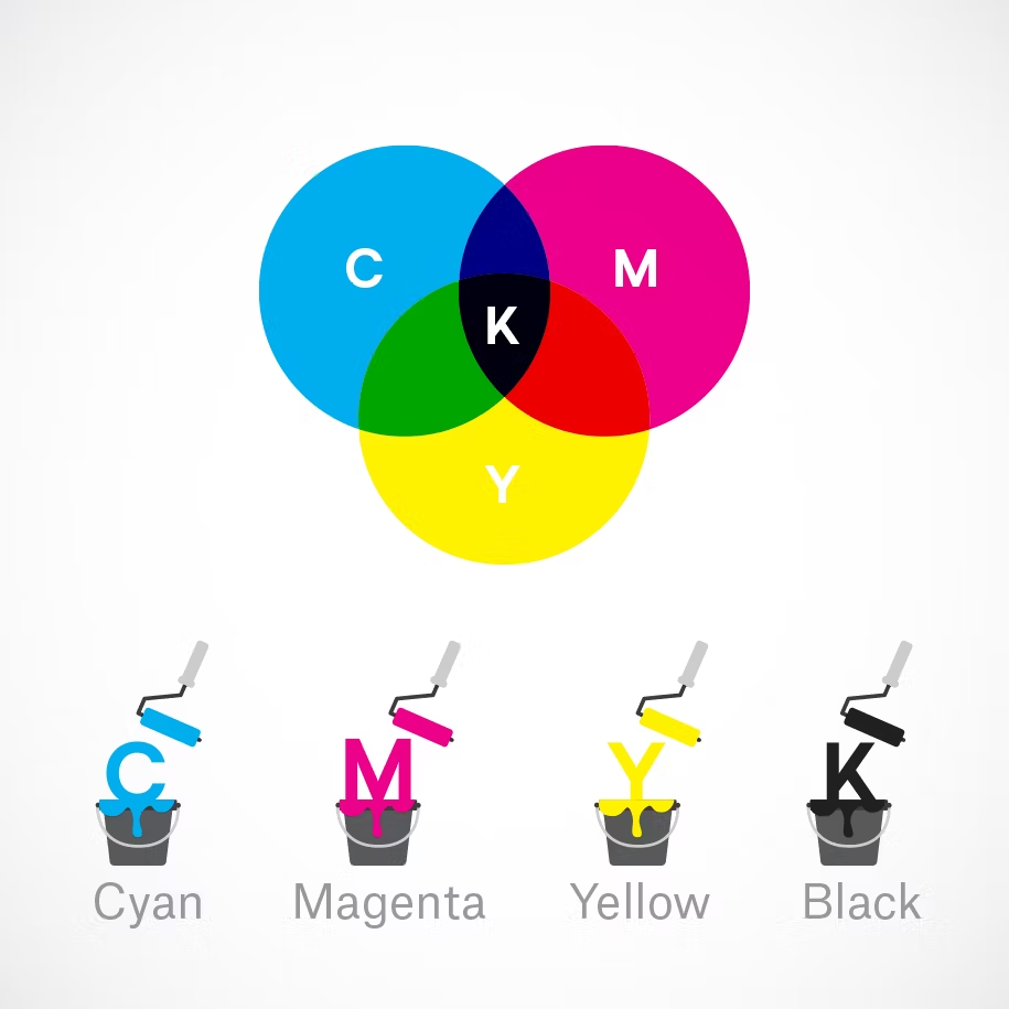
Traditionally, the primary colors used in subtractive process were red, yellow and blue, as these were the colors painters mixed to get all other hues. As color printing emerged, they were subsequently replaced with cyan, magenta, yellow and key/black (CMYK), as this color combo enables printers to produce a wider variety of colors on paper.
Why should you care?
You’ve decided to print a full-color brochure. If you’re investing all that money into your marketing (printing ain’t cheap!), you expect your printer is going to get the colors right.
Since printing uses the subtractive color mixing method, getting accurate color reproduction can only be achieved by using CMYK. Using RGB will not only result in inaccurate color, but a big bill from your printer when you’re forced to ask them to reprint your entire run.
The color wheel
–
I don’t know about you, but when I was a kid, the best part about going back to school in the fall was getting that new, pristine 64-count box of Crayola crayons. The possibilities seemed endless. Until I’d inevitably lose the black crayon.
Understanding the color wheel and color harmonies (what works, what doesn’t and how color communicates) is just as exciting as that new box of crayons. No really.
Being able to understand the terms and processes that go along with color will help you knowledgeably communicate your vision with your designer, printer, or even (maybe) an Apple Store Genius.
Color wheel basics
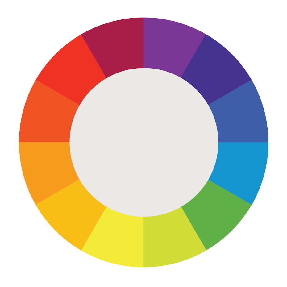
The first color wheel was designed by Sir Isaac Newton in 1666 so it absolutely predates your introduction to it in kindergarten. Artists and designers still use it to develop color harmonies, mixing and palettes.
The color wheel consists of three primary colors (red, yellow, blue), three secondary colors (colors created when primary colors are mixed: green, orange, purple) and six tertiary colors (colors made from primary and secondary colors, such as blue-green or red-violet).
Draw a line through the center of the wheel, and you’ll separate the warm colors (reds, oranges, yellows) from cool colors (blues, greens, purples).
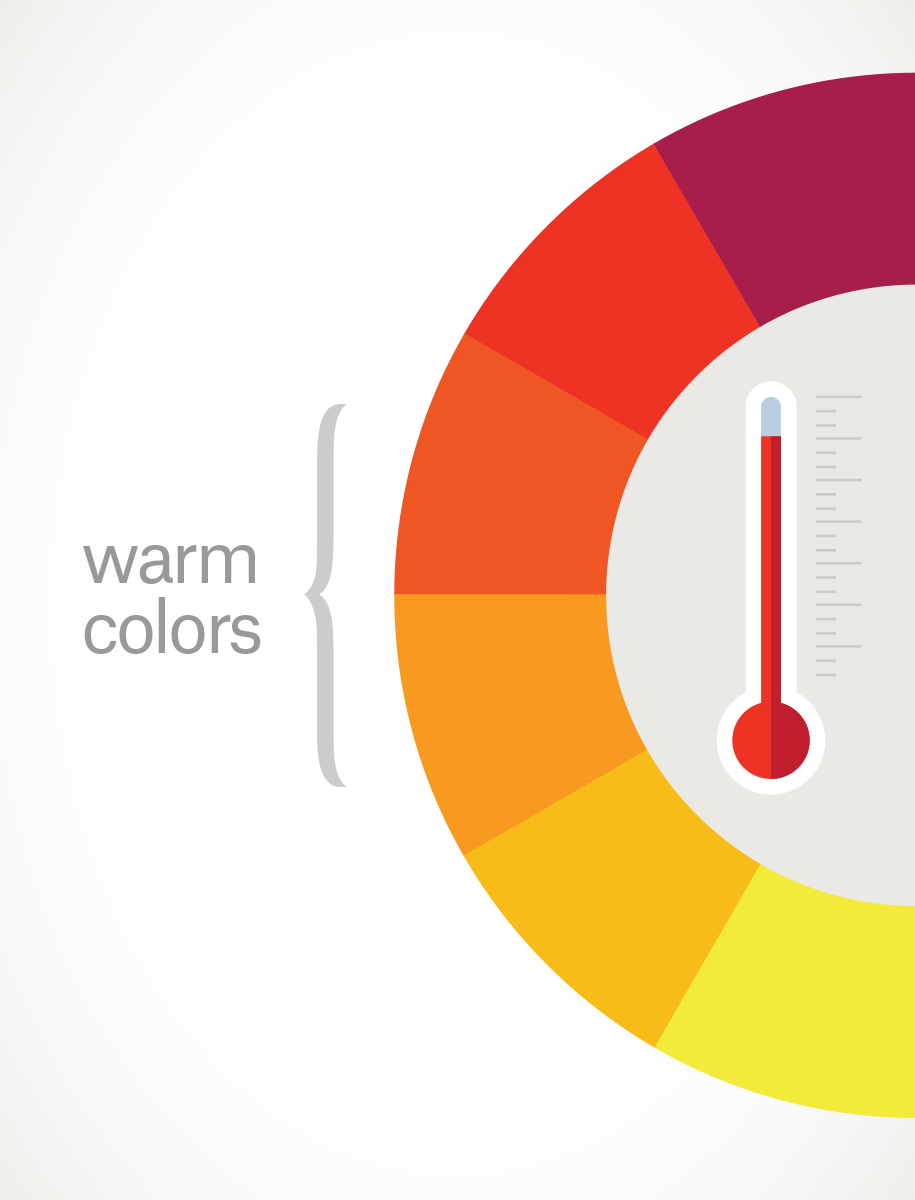
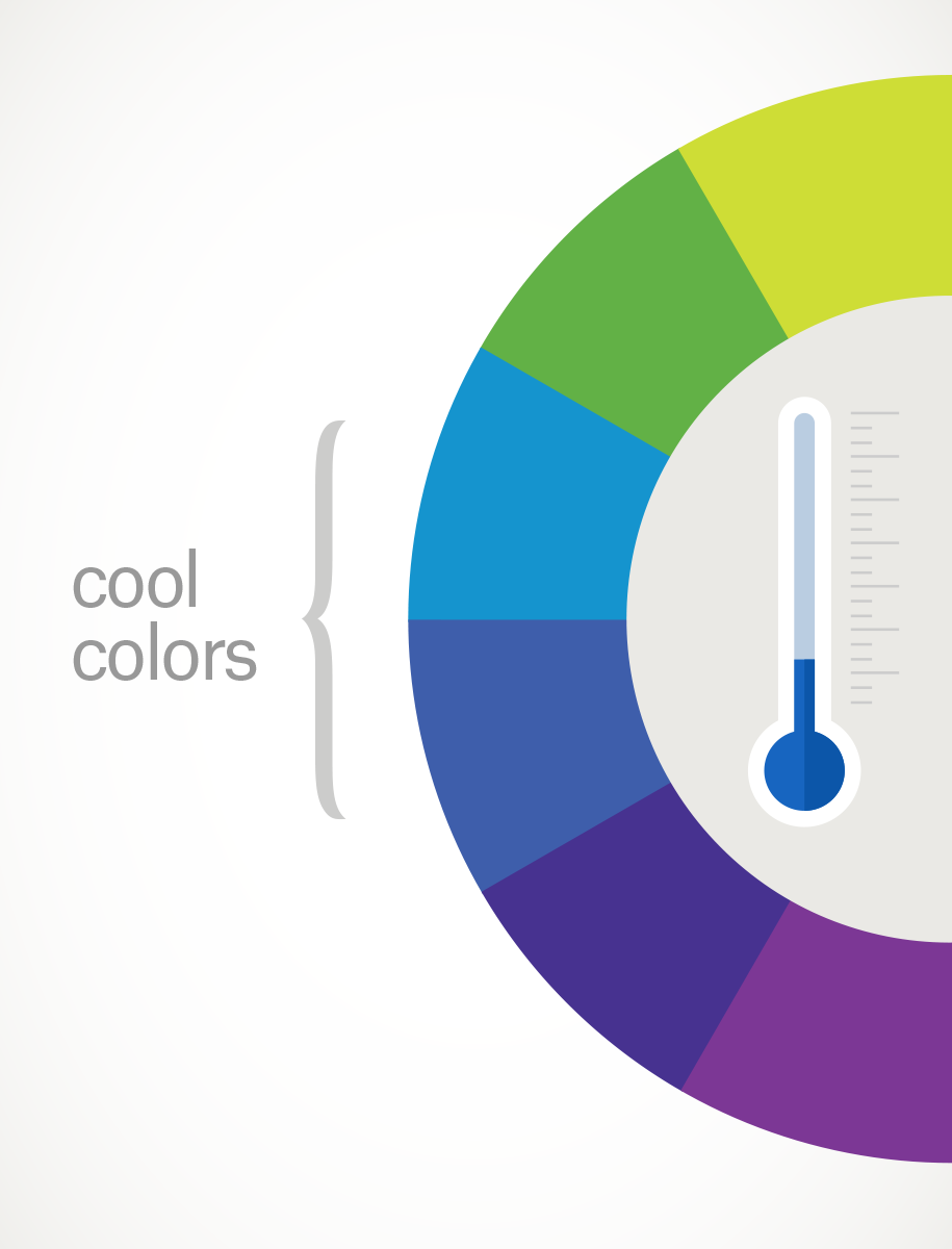
Warm colors are generally associated with energy, brightness, and action, whereas cool colors are often identified with calm, peace, and serenity.
When you recognize that color has a temperature, you can understand how choosing all warm or all cool colors in a logo or on your website can impact your message.
Hue, shade, tint and tone
Let’s go back to that 64-pack of crayons from our first day of school. (Remember “raw umber”? What is an umber anyway, and is it actually better raw than cooked?) Anyway, you might be wondering, how we got from the twelve colors on our original color wheel to all those crayons? That’s where tints, shades, and tones come in.
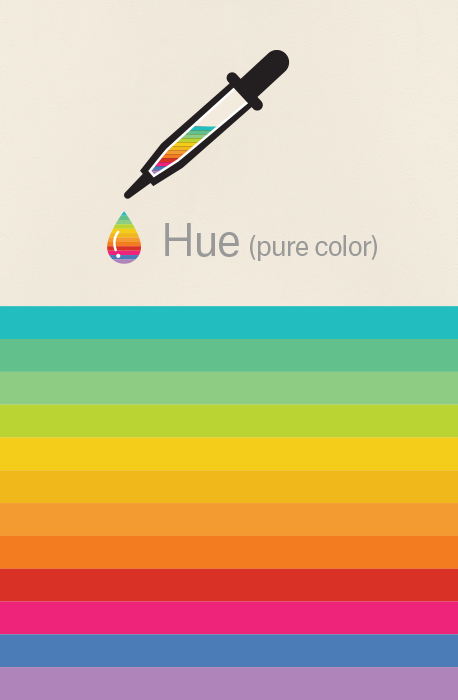

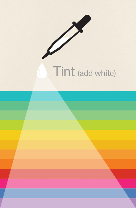
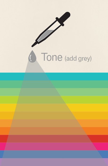
Simply put, tints, tones and shades are variations of hues, or colors, on the color wheel. A tint is a hue to which white has been added. For example, red + white = pink. A shade is a hue to which black has been added. For example, red + black = burgundy. Finally, a tone is a color to which black and white (or grey) have been added. This darkens the original hue while making the color appear more subtle and less intense.
Color schemes
Let’s talk schemes… (And not the kind that cartoon villains concoct. Bwahaha!) We’re talking color schemes. Using the color wheel, designers develop a color scheme for marketing materials.

Complementary colors
Complementary colors are opposites on the color wheel—red and green, for example.
Because there’s a sharp contrast between the two colors, they can really make imagery pop, but overusing them can get tiresome. Think any shopping mall in December. That being said, using a complementary color scheme in your business marketing offers sharp contrast and clear differentiation between images.
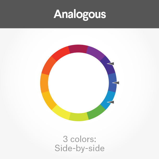
Analogous colors
Analogous colors sit next to one another on the color wheel—red, orange and yellow, for example. When creating an analogous color scheme, one color will dominate, one will support and another will accent. In business, analogous color schemes are not only pleasing to the eye, but can effectively instruct the consumer where and how to take action.

The Tostitos website uses an analogous color scheme. Notice the bright orange navigation bar draws the eye to explore the site, and accent-colored links at the bottom direct hungry consumers with the munchies to “Buy Online.”
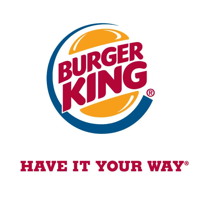
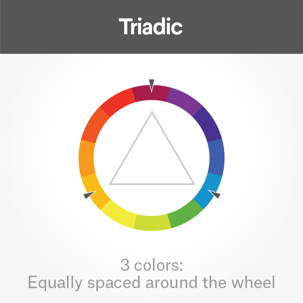
Triadic colors
Triadic colors are evenly spaced around the color wheel and tend to be very bright and dynamic.
Using a triadic color scheme in your marketing creates visual contrast and harmony simultaneously, making each item stand out while making the overall image pop.
Burger King uses this color scheme quite successfully. Hey, is it lunchtime yet?
But really, why should you care about color theory?
Two words: branding and marketing.
No wait, three words: branding, marketing and sales.
With this basic knowledge about colors and color schemes, you’re prepared to make effective branding decisions. Like what color your logo should be. Or the emotions that colors evoke in a consumer and the psychology behind color choices on your website.
Think it doesn’t matter? Take a look at this article on color combinations from hell. It just hurts.
Not only can knowledge of color theory guide you in your own marketing, it can also help you better understand what your competition is doing.

Web design by mute_work

Web design by Mila Jones Cann

Web design by MercClass
In a side-by-side comparison of three law firm web pages, you’ll notice a variety of analogous color schemes. Blue is generally associated with dependability, brown with masculinity, and yellow with competence and happiness. All of these are positive associations in a field that stereotypically has negative connotations, such as dishonesty or aggression.
Making your brand stand out and appeal to your target, plus understanding that poor colors can mean poor sales—that’s why you should care about color theory.