Building a Premium Glassmorphism Flutter Login
FlutterPulseThis article was translated specially for the channel FlutterPulseYou'll find lots of interesting things related to Flutter on this channel. Don't hesitate to subscribe!🚀
A complete code walkthrough for a premium, scalable login experience using GetX and Flutter's responsive architecture.
Introduction
The difference between a functional app and a premium experience often comes down to the login screen. It's the first impression, and frankly, a standard Material form doesn't cut it anymore.
We've been exploring a stunning Flutter login UI that serves as a masterclass in modern design, combining the popular Glassmorphism effect with a highly scalable, responsive architecture.
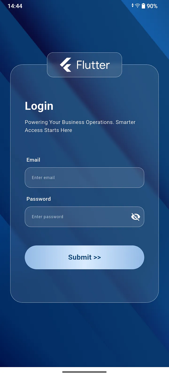
The Vision: UI Mockup (Figma)
🛠️ Dependencies and Setup
Before we write a single line of UI code, let's get our environment ready. This project relies on a few key packages for state management, SVG support, and responsive scaling.
In your pubspec.yaml Ensure you have the following dependencies:
dependencies:
  flutter:
    sdk: flutter

  ...
  get: ^4.7.2
  flutter_svg: ^2.2.1


...
...
...


flutter:

  ...
  assets:
    - assets/
Run:
flutter pub get
🏗️ The Core Architecture: Scaling and Styling
A great UI is responsive. Instead of hardcoding values, we'll build utility classes for dimensions and colors. This ensures our Glassmorphism effect scales beautifully across various device sizes.
1) Responsive App Configuration
This utility class calculates dimensions based on the device screen size and padding, allowing us to use relative units (like percentages) for height and width, making the UI inherently scalable.
In your app_config.dart:
import 'package:flutter/material.dart';

class AppConfig {
  BuildContext context;
  double? _height;
  double? _width;
  double? _heightPadding;
  double? _widthPadding;
  Size? _size;
  double? _textScale;

  AppConfig(this.context) {
    MediaQueryData queryData = MediaQuery.of(context);
    _size = queryData.size;
    _height = _size!.height / 100.0;
    _width = _size!.width / 100.0;
    _heightPadding = _height! - ((queryData.padding.top + queryData.padding.bottom) / 100.0);
    _widthPadding = _width! - (queryData.padding.left + queryData.padding.right) / 100.0;
    _textScale = queryData.textScaleFactor;
  }

  double deviceHeight(double v) {
    return _height! * v;
  }

  double deviceWidth(double v) {
    return _width! * v;
  }

  double rHP(double v) {
    return _heightPadding! * v;
  }

  double rWP(double v) {
    return _widthPadding! * v;
  }

  double textSizeScale(double v) {
    return v * _textScale!;
  }
}
2) Color Constant
Keeping all colors in one place makes branding updates trivial and dramatically improves code clarity.
In your color_constants.dart:
import 'package:flutter/material.dart';

class ColorConstants {
  static const Color primaryColor = Color(0xFF0F4479);
  static const Color whiteColor = Color(0xFFFFFFFF);

  static const Color blurColor = Color(0xFFD9D9D9);

  static const Color buttonGradient1 = Color(0xFF92BAE6);
  static const Color buttonGradient2 = Color(0xFFD9EBFF);
}
The Reusable UI Elements
To maintain the design consistency and reusability, we'll encapsulate the custom look for the text field and the gradient button.
3) Glassmorphic Text Field
This is a key component for the Glassmorphism look! Notice the use of ClipRRect and BackdropFilter to apply the blur specifically to the text field's background, and then the semi-transparent Container to provide the "frosting."
In your common_text_field.dart:
import 'dart:ui';

import 'package:flutter/material.dart';
import 'package:login_ui/app_config.dart';
import 'package:login_ui/color_constants.dart';

class CommonTextField extends StatefulWidget {
  final TextEditingController? controller;
  final String label;
  final String hintText;
  final bool? obscureText;
  final Widget? suffixIcon;
  final GestureTapCallback? suffixIconOnTap;
  final FocusNode? focusNode;
  final bool? isRequired;

  const CommonTextField({
    super.key,
    this.controller,
    required this.label,
    required this.hintText,
    this.obscureText = false,
    this.suffixIcon,
    this.suffixIconOnTap,
    this.focusNode,
    this.isRequired,
  });

  @override
  State<CommonTextField> createState() => _CommonTextFieldState();
}

class _CommonTextFieldState extends State<CommonTextField> {
  @override
  Widget build(BuildContext context) {
    AppConfig appConfig = AppConfig(context);

    return Column(
      crossAxisAlignment: CrossAxisAlignment.start,
      children: [
        Padding(
          padding: EdgeInsets.symmetric(horizontal: appConfig.rWP(1), vertical: appConfig.rHP(1)),
          child: Row(
            children: [
              Text(
                widget.label,
                style: TextStyle(
                  color: ColorConstants.whiteColor,
                  fontWeight: FontWeight.w600,
                  fontSize: appConfig.textSizeScale(18),
                ),
              ),
              if (widget.isRequired ?? false)
                Text(
                  "*",
                  maxLines: 1,
                  style: TextStyle(
                    color: Colors.redAccent,
                    fontSize: appConfig.textSizeScale(18),
                    fontWeight: FontWeight.w900,
                  ),
                ),
            ],
          ),
        ),
        ClipRRect(
          borderRadius: BorderRadius.circular(15),
          child: BackdropFilter(
            filter: ImageFilter.blur(sigmaX: 5, sigmaY: 5),
            child: Container(
              decoration: BoxDecoration(
                color: ColorConstants.blurColor.withAlpha(30),
                borderRadius: BorderRadius.circular(15),
                border: Border.all(color: ColorConstants.whiteColor.withAlpha(100)),
              ),
              child: TextFormField(
                focusNode: widget.focusNode,
                cursorColor: ColorConstants.whiteColor,
                style: TextStyle(fontSize: appConfig.textSizeScale(14), color: ColorConstants.whiteColor),
                controller: widget.controller,
                obscureText: widget.obscureText ?? false,
                decoration: InputDecoration(
                  border: const OutlineInputBorder(borderSide: BorderSide.none),
                  hintText: widget.hintText,
                  hintStyle: TextStyle(
                    fontSize: appConfig.textSizeScale(14),
                    color: ColorConstants.whiteColor.withOpacity(0.7),
                  ),
                  suffixIcon: IconButton(
                    visualDensity: VisualDensity.compact,
                    onPressed: widget.suffixIconOnTap,
                    icon: widget.suffixIcon ?? SizedBox.shrink(),
                  ),
                  suffixIconConstraints: BoxConstraints(minHeight: 24, minWidth: 24),
                ),
              ),
            ),
          ),
        ),
      ],
    );
  }
}
4) Common Gradient Button
This button uses a horizontal linear gradient for a modern, slightly metallic appearance.
In your button_widget.dart:
import 'package:flutter/material.dart';
import 'package:login_ui/app_config.dart';
import 'package:login_ui/color_constants.dart';

class ButtonWidget extends StatelessWidget {
  final GestureTapCallback? onPressed;
  final String? title;

  const ButtonWidget({super.key, this.onPressed, this.title});

  @override
  Widget build(BuildContext context) {
    AppConfig appConfig = AppConfig(context);

    return GestureDetector(
      onTap: onPressed,
      child: Container(
        height: appConfig.deviceHeight(6.5),
        decoration: BoxDecoration(
          borderRadius: BorderRadius.circular(32),
          gradient: LinearGradient(
            colors: [ColorConstants.buttonGradient1, ColorConstants.buttonGradient2, ColorConstants.buttonGradient1],
          ),
        ),
        child: Center(
          child: Text(
            "$title",
            style: TextStyle(
              color: ColorConstants.primaryColor,
              fontSize: appConfig.textSizeScale(24),
              fontWeight: FontWeight.bold,
            ),
          ),
        ),
      ),
    );
  }
}
💻 The Main Application and Controller
Of course, we start from main.dart.
In this, I will set the "DeviceOrientation"toPortrait Up, cause we don't want to deal with the mess that happens if the device orientation changes.
In MyApp class, I declared some theming rules & system overlay style here.
import 'package:flutter/material.dart';
import 'package:flutter/services.dart';
import 'package:get/get.dart';
import 'package:login_ui/color_constants.dart';
import 'package:login_ui/login_page.dart';

void main() {
  WidgetsFlutterBinding.ensureInitialized();
  SystemChrome.setPreferredOrientations([DeviceOrientation.portraitUp]);

  runApp(const MyApp());
}

class MyApp extends StatelessWidget {
  const MyApp({super.key});

  @override
  Widget build(BuildContext context) {
    return GetMaterialApp(
      debugShowCheckedModeBanner: false,
      title: 'Flutter Login UI',
      theme: ThemeData(useMaterial3: true, primaryColor: ColorConstants.primaryColor),
      builder: (context, child) {
        return AnnotatedRegion<SystemUiOverlayStyle>(
          value: SystemUiOverlayStyle(
            /// Status Bar
            statusBarColor: Colors.transparent,
            statusBarIconBrightness: Brightness.light,

            /// Bottom Navigation Bar
            systemNavigationBarColor: ColorConstants.whiteColor,
            systemNavigationBarIconBrightness: Brightness.dark,
          ),
          child: child!,
        );
      },
      home: const LoginPage(),
    );
  }
}
Logic with GetX Controller
The controller holds our form state (text controllers, focus nodes, error flags, and password visibility) and the logic to update them.
In your login_page_controller.dart:
import 'package:flutter/material.dart';
import 'package:get/get.dart';

class LoginPageController extends GetxController {
  //TODO: Implement LoginPageController

  TextEditingController emailController = TextEditingController();
  TextEditingController passwordController = TextEditingController();

  final emailFocusNode = FocusNode();
  final passwordFocusNode = FocusNode();

  bool obscurePwdText = true;

  void togglePasswordVisibility() {
    obscurePwdText = !obscurePwdText;
    update();
  }

  bool showEmailError = false;
  bool showPasswordError = false;
}
🖼️ The Login UI: Bringing Glassmorphism to Life
This is where all the pieces come together. The entire screen is wrapped in a Container with a background image. The login card and the floating logo are placed in a Stack to manage their overlapping positions.
The Glassmorphism Recipe:
- Background First: The
ContainerwithDecorationImageprovides the backdrop for the blur. - Define the Shape: A
ClipRRectensures the blur effect is constrained to a smooth, rounded rectangle. - Apply the Blur: The
BackdropFilterwidget is usedImageFilter.blur(sigmaX: 5, sigmaY: 5)to create the effect. - Add the Frosting: The subsequent
Containerprovides a slightly transparent color (ColorConstants.blurColor.withAlpha(30)) and a subtle white border, completing the frosted look. - Elevate an Element: We use a
Positionedwidget with a negativetopvalue to make the Flutter logo appear to "float" partially above the main card.
In your login_page.dart:
import 'dart:developer';
import 'dart:ui';
import 'package:flutter/material.dart';
import 'package:flutter_svg/flutter_svg.dart';
import 'package:get/get.dart';
import 'package:login_ui/app_config.dart';
import 'package:login_ui/button_widget.dart';
import 'package:login_ui/color_constants.dart';
import 'package:login_ui/common_text_field.dart';
import 'package:login_ui/login_page_controller.dart';
class LoginPage extends StatefulWidget {
const LoginPage({super.key});
@override
State<LoginPage> createState() => _LoginPageState();
}
class _LoginPageState extends State<LoginPage> {
@override
Widget build(BuildContext context) {
AppConfig appConfig = AppConfig(context);
return Scaffold(
body: GetBuilder<LoginPageController>(
init: LoginPageController(),
initState: (_) {},
builder: (controller) {
return SingleChildScrollView(
child: Container(
height: MediaQuery.of(context).size.height,
width: MediaQuery.of(context).size.width,
decoration: BoxDecoration(
image: DecorationImage(image: AssetImage("assets/login_bg.png"), fit: BoxFit.cover),
),
child: Stack(
alignment: Alignment.bottomCenter,
children: [
Padding(
padding: EdgeInsets.symmetric(horizontal: appConfig.rWP(6)),
child: Column(
mainAxisAlignment: MainAxisAlignment.center,
children: [
Stack(
clipBehavior: Clip.none,
alignment: Alignment.topCenter,
children: [
/// Login
ClipRRect(
borderRadius: BorderRadius.circular(30),
child: BackdropFilter(
filter: ImageFilter.blur(sigmaX: 5, sigmaY: 5),
child: Container(
decoration: BoxDecoration(
color: ColorConstants.blurColor.withAlpha(30),
borderRadius: BorderRadius.circular(30),
border: Border.all(color: ColorConstants.whiteColor.withAlpha(100)),
),
child: Padding(
padding: EdgeInsets.symmetric(horizontal: appConfig.rHP(4)),
child: Column(
crossAxisAlignment: CrossAxisAlignment.start,
children: [
SizedBox(height: appConfig.deviceHeight(9)),
Text(
"Login",
style: TextStyle(
color: ColorConstants.whiteColor,
fontSize: appConfig.textSizeScale(38),
fontWeight: FontWeight.bold,
),
),
SizedBox(height: appConfig.deviceHeight(1.2)),
Text(
"Powering Your Business Operations. Smarter Access Starts Here",
maxLines: 2,
style: TextStyle(
color: ColorConstants.whiteColor,
fontSize: appConfig.textSizeScale(18),
),
),
SizedBox(height: appConfig.deviceHeight(5)),
CommonTextField(
label: "Email",
hintText: "Enter email",
controller: controller.emailController,
focusNode: controller.emailFocusNode,
),
controller.showEmailError
? Padding(
padding: EdgeInsets.symmetric(
horizontal: appConfig.rWP(1),
vertical: appConfig.rHP(1),
),
child: Text(
"Email is required",
style: TextStyle(color: Colors.redAccent),
),
)
: SizedBox(),
SizedBox(height: appConfig.deviceHeight(1)),
CommonTextField(
label: "Password",
hintText: "Enter password",
controller: controller.passwordController,
focusNode: controller.passwordFocusNode,
suffixIcon: Icon(
controller.obscurePwdText ? Icons.visibility_off : Icons.visibility,
color: ColorConstants.whiteColor,
),
suffixIconOnTap: () => controller.togglePasswordVisibility(),
obscureText: controller.obscurePwdText,
),
controller.showPasswordError
? Padding(
padding: EdgeInsets.symmetric(
horizontal: appConfig.rWP(1),
vertical: appConfig.rHP(1),
),
child: Text(
"Password is required",
style: TextStyle(color: Colors.redAccent),
),
)
: SizedBox(),
SizedBox(height: appConfig.deviceHeight(5)),
ButtonWidget(
onPressed: () {
controller.emailFocusNode.unfocus();
controller.passwordFocusNode.unfocus();
if (controller.emailController.text.isEmpty) {
controller.showEmailError = true;
controller.update();
} else {
controller.showEmailError = false;
controller.update();
}
/// Password
if (controller.passwordController.text.isEmpty) {
controller.showPasswordError = true;
controller.update();
} else {
controller.showPasswordError = false;
controller.update();
}
if (controller.showEmailError == false &&
controller.showPasswordError == false) {
log("API CALL");
controller.update();
}
},
title: "Submit >>",
),
SizedBox(height: appConfig.deviceHeight(9)),
],
),
),
),
),
),
/// Flutter Logo
Positioned(
top: -appConfig.deviceHeight(3.3),
child: ClipRRect(
borderRadius: BorderRadius.circular(15),
child: BackdropFilter(
filter: ImageFilter.blur(sigmaX: 5, sigmaY: 5),
child: Container(
decoration: BoxDecoration(
color: ColorConstants.blurColor.withAlpha(30),
borderRadius: BorderRadius.circular(15),
border: Border.all(color: ColorConstants.whiteColor.withAlpha(100)),
),
child: SizedBox(
height: appConfig.deviceHeight(6.6),
width: appConfig.deviceWidth(44),
child: Center(
child: Padding(
padding: const EdgeInsets.all(12.0),
child: SvgPicture.network(
"https://storage.googleapis.com/cms-storage-bucket/flutter-logo.6a07d8a62f4308d2b854.svg",
color: Colors.white,
),
),
),
),
),
),
),
),
],
),
],
),
),
],
),
),
);
},
),
);
}
}
Conclusion: Beyond the Standard
You've successfully moved past the "functional app" stage to build a truly premium experience. This design showcases how combining a popular trend like Glassmorphism with a solid, responsive architecture can create a stunning first impression for any application.
By encapsulating the Glassmorphism logic in your CommonTextField and using responsive utilities in AppConfig, you have created a design that is not only beautiful but also highly maintainable and adaptable. Go ahead and drop this into your next project—your users will definitely notice the difference!
What other UI trends are you interested in implementing in Flutter? Let me know in the comments!