Article sample - Onchain analysis
Joele NovelliTwitter: https://twitter.com/ChainLogAnalyst
Telegram: https://t.me/ChainLogAlphaGroup
Youtube: https://www.youtube.com/@chainlog9504
LinkedIn: https://www.linkedin.com/in/joele-novelli-531101248/
Instagram: https://www.instagram.com/chainlog_ig/
Newsletter: https://chainlognewsletter.substack.com/
Good morning to all boys and girls of the #Cryptosphere.
Today we will talk about a #Bitcoin and #Ethereum, from the point of view of onchain analysis, and specifically with regard to all the metrics that we consider interesting and that can give us an idea of where we are in the short, medium and long term as far as it covers adoption, movement analysis, profit and loss, security, and the asset market.
This will be a complex analysis, which will take you 15 to 20 minutes to read and understand.
In this article we will therefore deal with:
Bitcoin
- Bitcoin: UTXOs in Profit/Loss
- UTXO: What are they? And how do they work?
- Bitcoin: Balance on Exchanges
- Bitcoin: SOPR
- Bitcoin: adjusted SOPR (aSOPR)
- Bitcoin: Spent Volume Age Bands (SVAB)
- Bitcoin: Conclusion
Ethereum
- Ethereum: Number of Active Addresses
- Ethereum: Active Validators
- Ethereum: ETH 2.0 Total Value Staked
- Ethereum: Value of Supply Burned [USD]
- Ethereum: Percent of Minted Supply Burned
- Ethereum: Proof-of-Stake Net Inflation Rate
- Ethereum: Conclusion
Bitcoin: UTXOs in Profit/Loss
This chart presents the total count of UTXO in profit/loss. A UTXO is considered to be in profit if the spot price is higher than the price assigned at the time of its creation and vice versa.
🟣 Total UTXO in set
🟢 Total UTXO in profit
🔴 Total UTXO at a loss
But first let's understand what UTXOs are
------------------------------------------------------------------------------------------------------------------------
UTXO: What are they? And how do they work?
UTXOs are like cash.
Each UTXO can be compared to a banknote or a coin. If you have $50 in cash, there are several combinations you could have:
- A single $50 bill;
- Five $10 bills;
- Ten $5 bills;
- A combination of $1, $5, $10 bills;
And so on…
In each of these cases, despite having a different number of bills, you always have exactly $50.
UTXOs behave the same way; when you see a single balance in your crypto wallet, it could actually be made up of any number of UTXOs, based on your past transaction history. When combined, these UTXOs add up to the total balance held at your specific address.
Also, like cash, UTXOs cannot be divided. Take the example of buying a cup of coffee that costs $3.75; if you only have five $10 bills, you must overpay (by handing over $10) and receive change, in this case $6.25 change.
UTXOs behave similarly. Just like you can't tear off a piece of your $10 bill to pay for your coffee, you can't send part of a UTXO. If you want to send someone 3.75 BTC, but only have one UTXO worth 10 BTC in your wallet, you need to send the entire UTXO to the recipient and then receive the rest, just like you would when paying with cash. (Of course, this process is handled by the blockchain and doesn't require you to trust the recipient to return change). Thus, when you make this transfer, the recipient would receive 3.75 BTC and the remaining 6.25 in "change" would be sent back to your address as a new, smaller UTXO.
------------------------------------------------------------------------------------------------------------------------
But let's go back to our graph
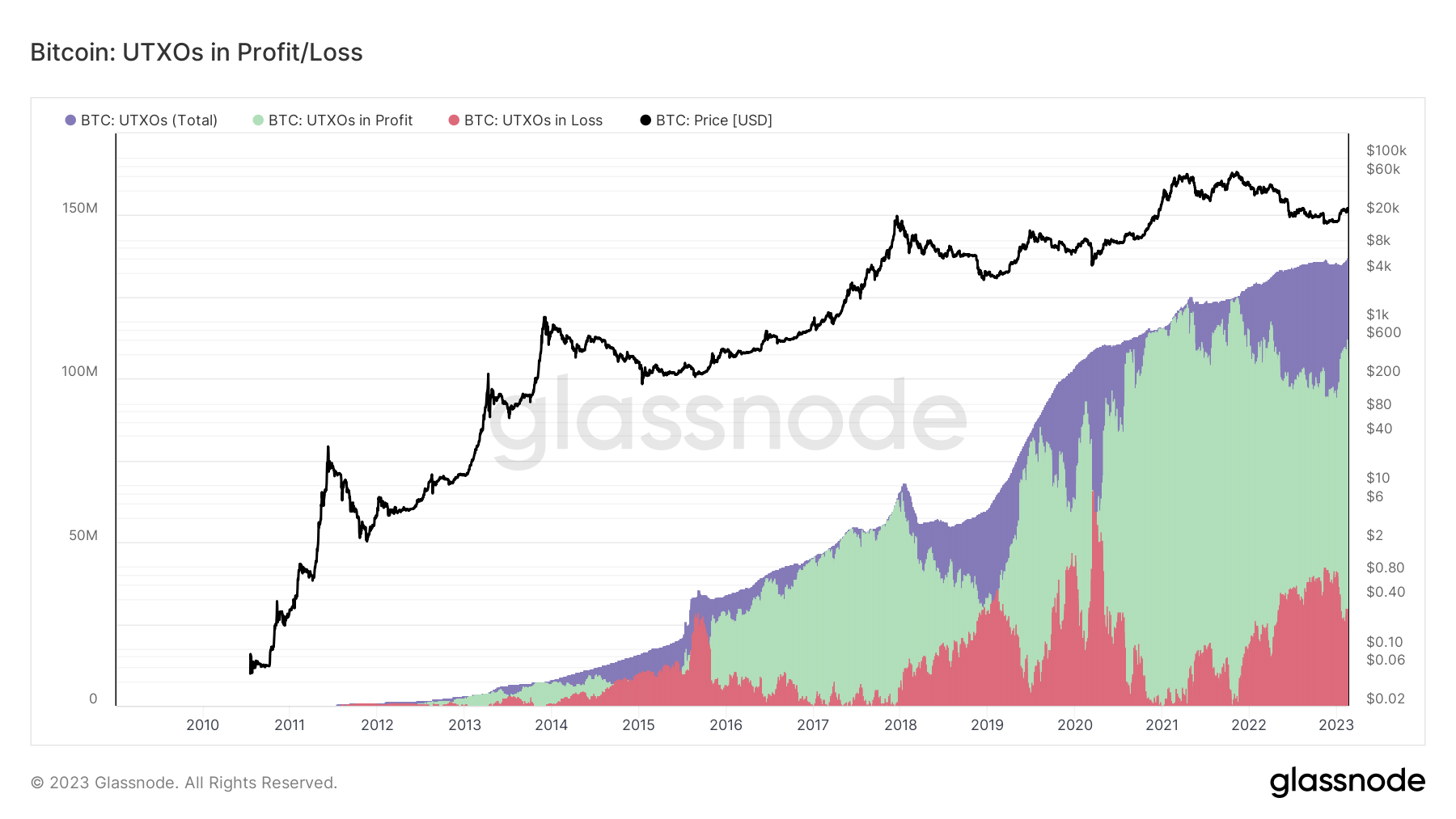
The chart above is a long-term chart to look at and serves as our confirmation of the long-term sell-off of Bitcoin.
in this case it is a question of waiting for most of the UTXOs to be in profit to gradually start selling our Bitcoins, a strategy that has proved to be excellent so far as you can also see.
In fact, every time the UTXOs in profit reach the peak, and remain there for months, we then have important discharges that allow us to accumulate even more Bitcoins, or in any case, if dodged, allow us to prevent the value of our portfolio from sinking. .
An interesting thing to note is that whenever losing UTXOs have outpaced profiting UTXOs we have bottomed the bear market, which has not happened this year yet.
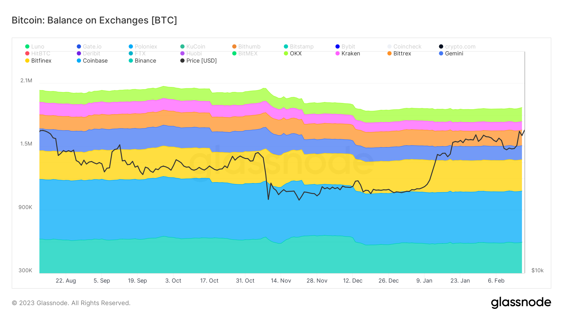
Bitcoin: Balance on Exchanges
The total amount of coins held by exchanges. Keep in mind that the exchange metrics are based on data from Glassnode which only labels a certain amount of exchanges, and that although very up-to-date it doesn't include all the existing exchanges in the world. Therefore these metrics are volatile: the data is stable, but especially the most recent data is subject to slight fluctuations over time.
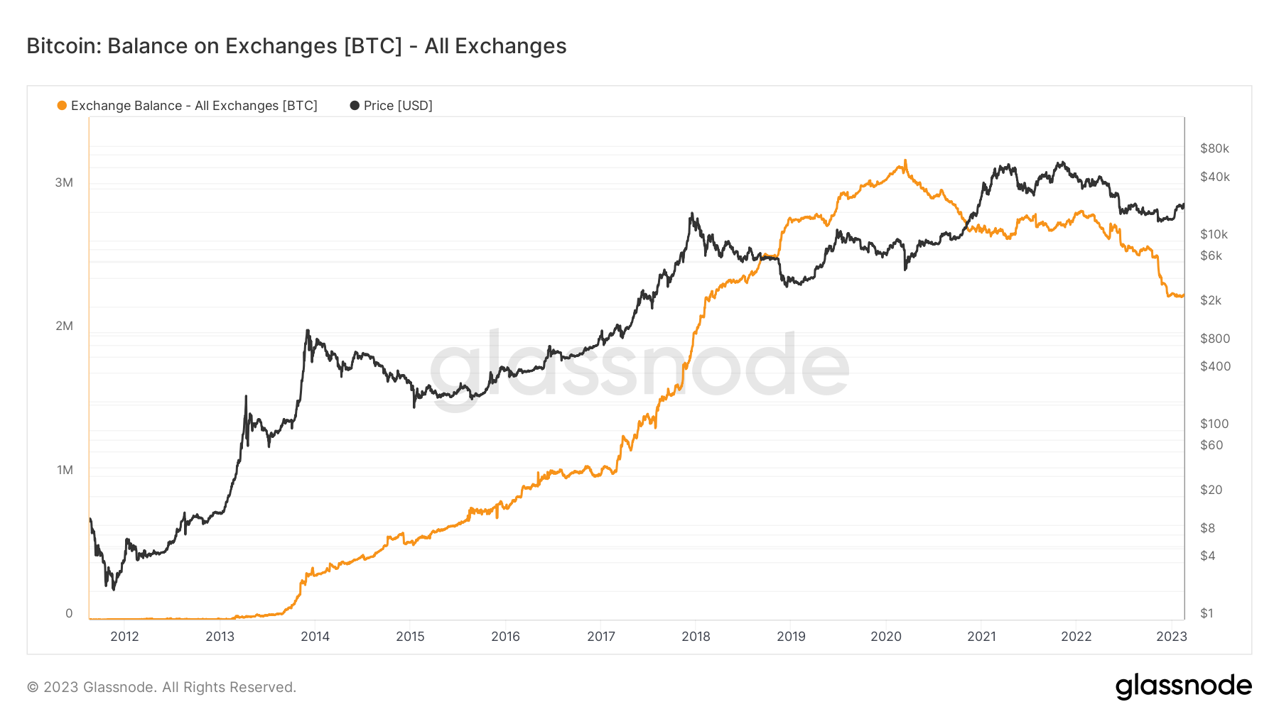
This very simple metric gives us an idea of the amount of coins held by exchanges. This is relevant in the case of an acute shortage of coins held by exchanges, as obviously the supply factor affects the price and in the absence of this factor and constant demand, the price can only tend to increase.
To date, as we can see, the decrease in coins at exchanges has become a well-known phenomenon, especially after what happened to large exchanges such as FTX.
If the trend continues, in the coming years we could see a real run on Bitcoin, but for now, all this is still a long way off.
What we are actually interested in knowing is which of these centralized entities holds the least amount of BTC, in order to be able to determine with greater precision which one is more at risk of bankruptcy or which in any case has less liquidity and which is therefore better to avoid.
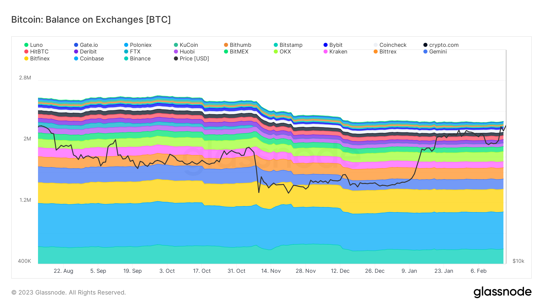
Below are the exchanges that hold the most Bitcoin
Bitcoin: Spent Output Profit Ratio (SOPR)
SOPR is a very simple indicator. It is the realized value (USD) divided by the value at creation (USD) of output. Or simply: price sold / price paid.
When SOPR > 1, it means that the market-participating investors are (aggregate) in profit at the time of the transaction; if not, I'm at a loss
Simply explained: The SOPR (Spent Output Profit Ratio) reflects the degree of profit made for all coins moved onchain.
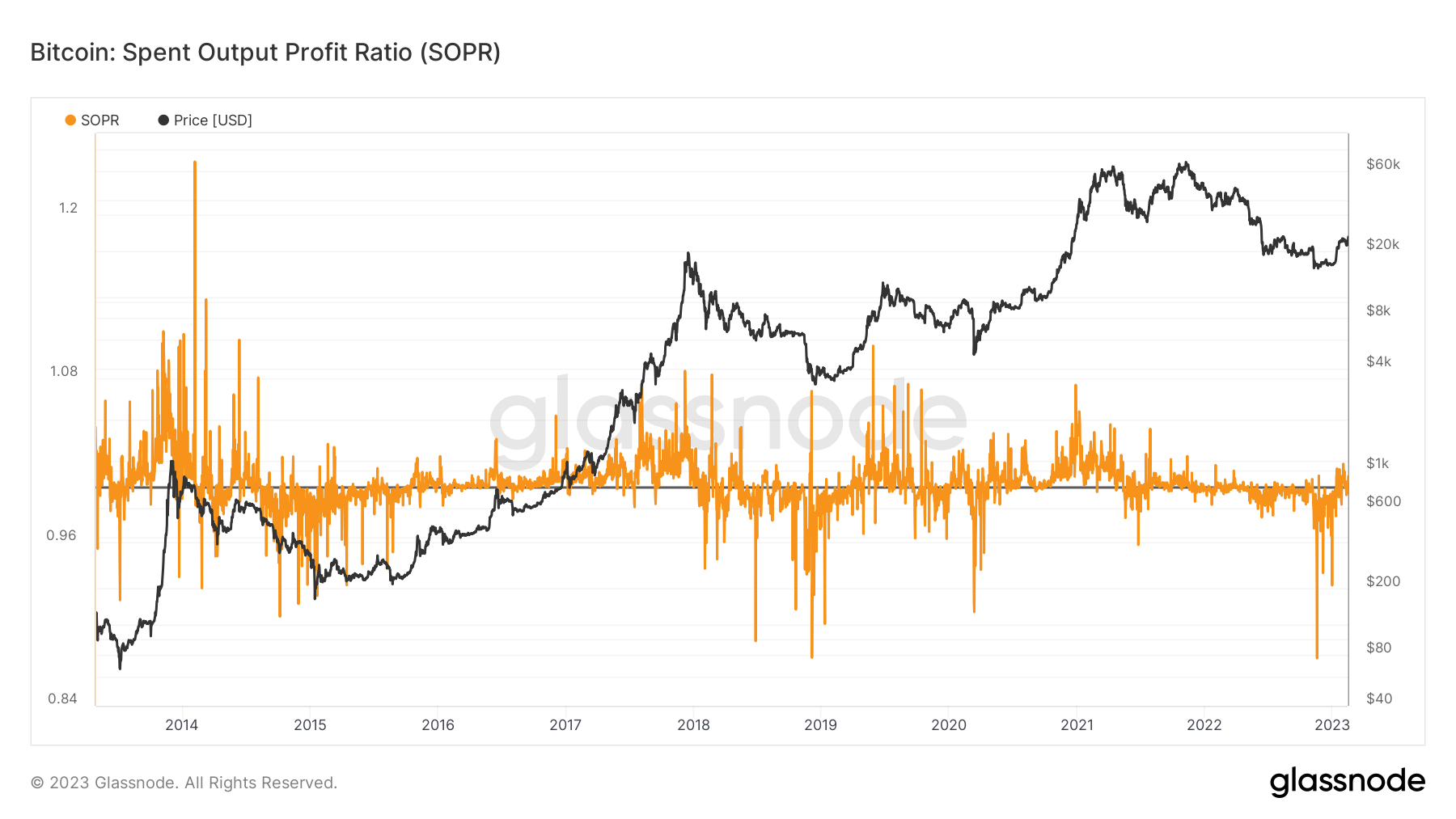
There are several interesting observations that can be made from the graph above. First of all, the SOPR appears to fluctuate around the number 1. Second, during a bull market SOPR values below 1 are rejected, and thus the value 1 is used as support for the next bounce, while during a bear market SOPR values higher than 1 are rejected, and therefore the value 1 is used as resistance for the next decrease. Therefore, the SOPR oscillator could serve as a reliable indicator to identify local highs and lows.
But I personally prefer to use aSOPR, as it is more accurate and ignores short-term movements that produce about 40% of the noise in the graph and do not have much value being Bitcoin transactions that are less than an hour old, come on then directly to the graph in question.
Bitcoin: Adjusted SOPR (aSOPR)
Adjusted SOPR is SOPR that ignores all transactions with a duration of less than 1 hour.
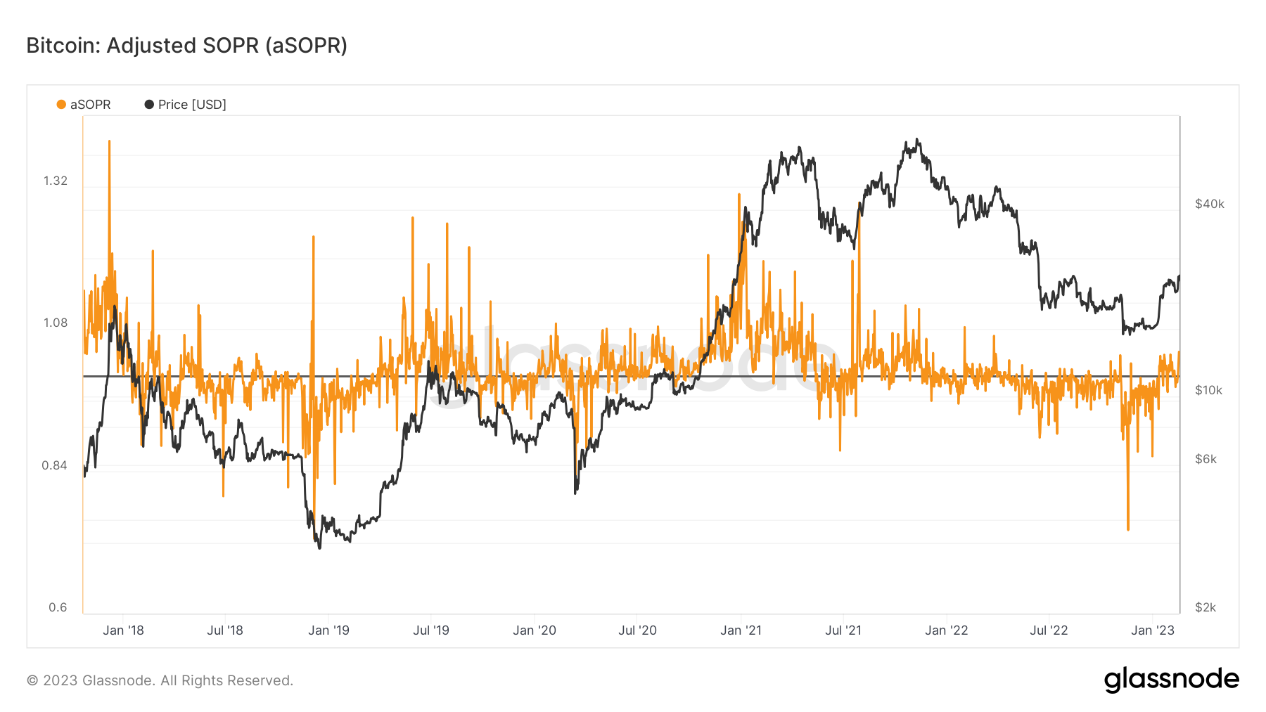
Returning to the discussion above, here I have highlighted the bearish and bullish phases
When in a bear market aSOPR tends to stay below 1, while in a bull market above
This means that people take the opportunity to break even on the downside and get in on the same downtrend, very simple.
and as of today we have yet to see a sustained trend above 1, although recently, after the last rise, we have started to have a small positive streak, which by itself does not mean much.
Indeed the same thing had happened in 2019, and we ended up back in a downtrend throughout 2020.
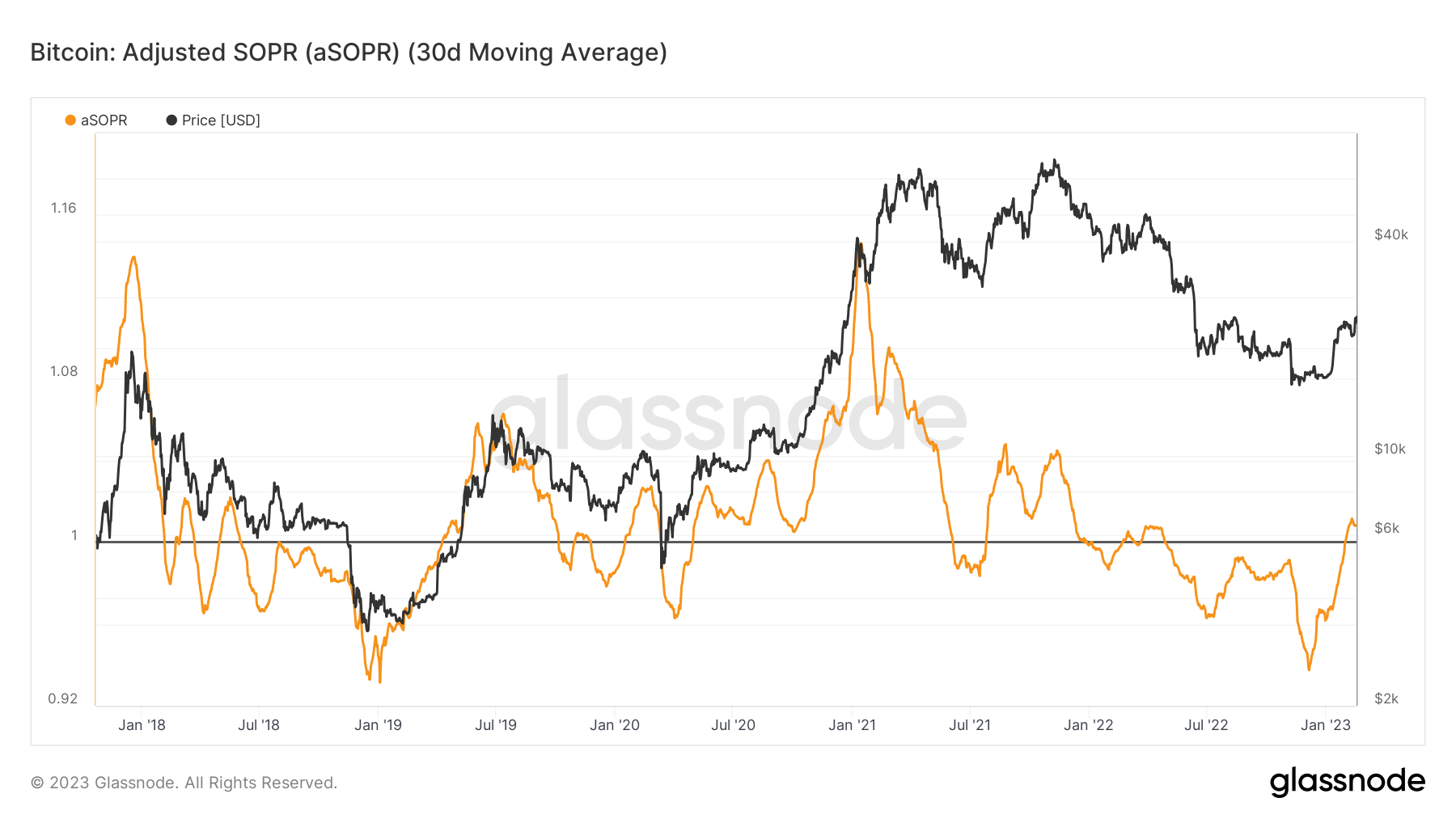
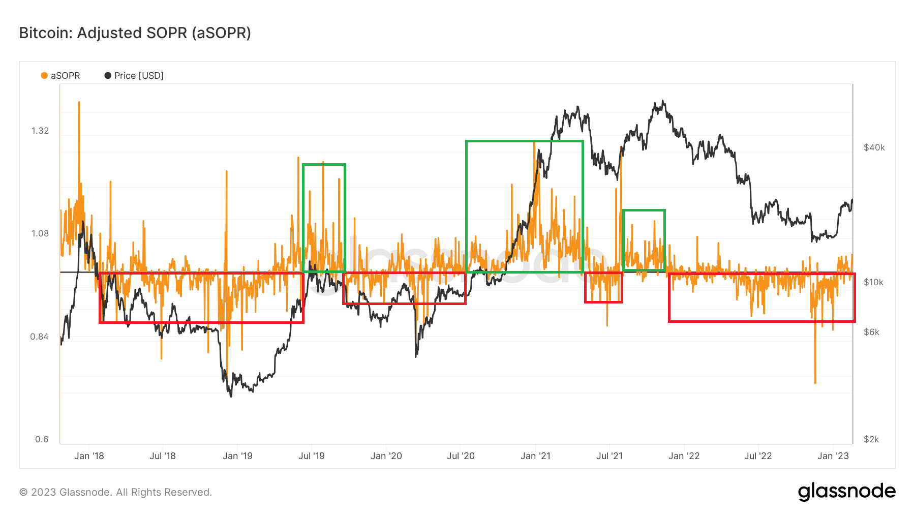
Being the SOPR and also the aSOPR a very noisy metric, it is advisable to use a simple 30-day average to smooth out the results and have greater clarity.
As you can see from the chart above every time we were able to recover the 1, with a monthly average, and keep it as support for the rebound, then a new bull market followed within a few months.
For now we have recovered 1, but will we be able to keep it?
Bitcoin: Spent Volume Age Bands (SVAB)
Spent Volume Age Bands (SVAB) is a separation of on-chain transaction volume based on the age of the coins. Each band represents the percentage of volume moved that was previously moved within the time period indicated in the legend.
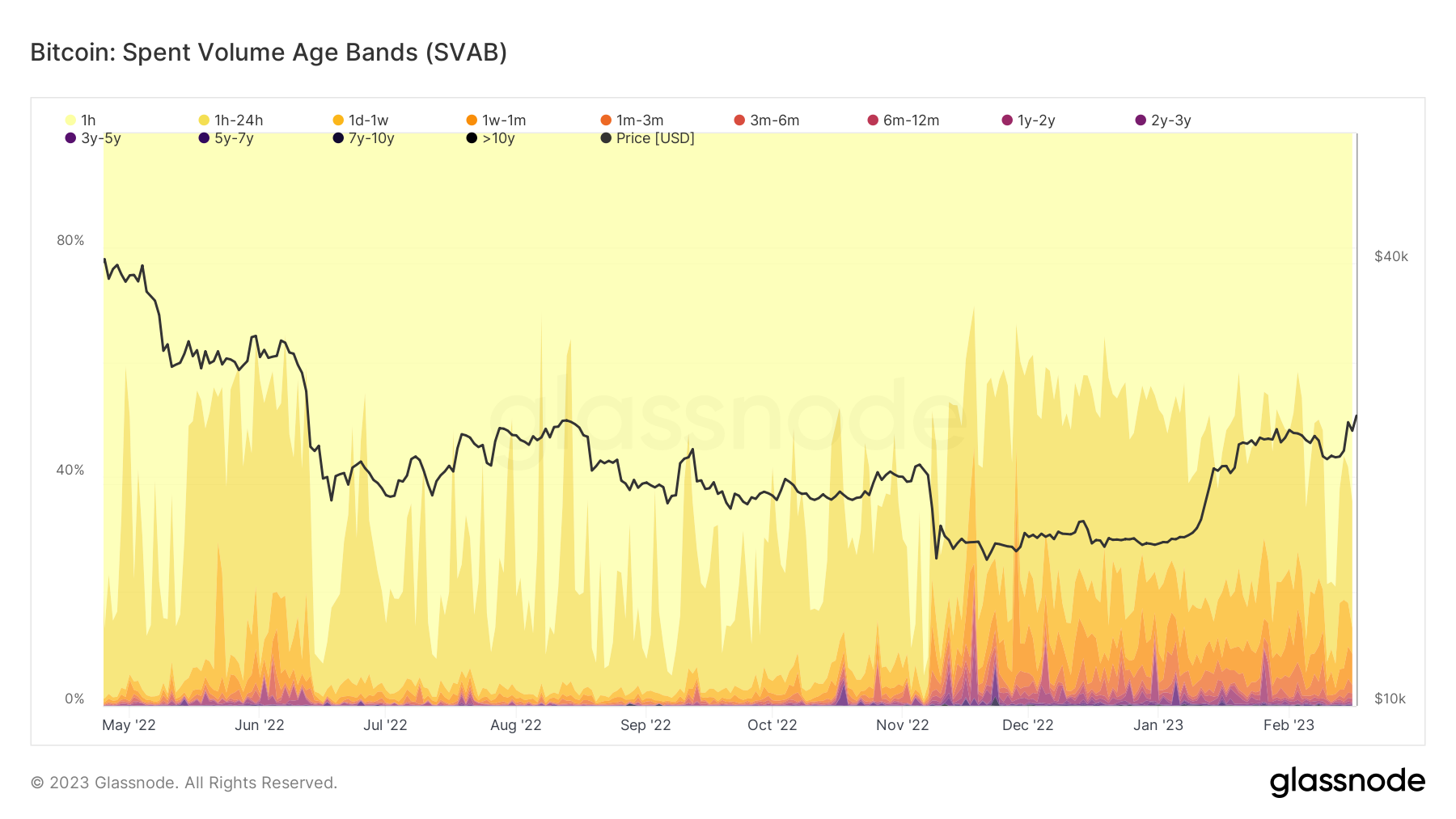
What interests us to note in this graph is that most of the coins moved in the period preceding FTX were attributable to young, unconvinced coins, of those so-called "paper hands", or speculators.
In the last period, however, many old coins have moved to probably be placed safely in cold storage or in the wallets of other centralized institutions.
Usually such volumes of coins moved without a reason like that of FTX indicate a market capitulation and a good time to enter, as in any case it was also the one just past as can already be seen from the price graph.
Bitcoin: Conclusion
In conclusion, having analyzed the available data and having therefore left emotions out of the analysis, what we can say is that we are close to a new bullrun, which could give the first signs of life next year, and which for now is still very immature.
In fact, more than a bullrun, right now we can say that we are in the depths of the bear market, waiting for that decisive turning point that will start the next cycle.
The data shows us general capitulation and very low price ranges, with a belief in holding the asset for the longer term stronger than ever.
In fact, the data indicates that we have found the bottom, or that we are very close to it, as demonstrated by the charts on the Top/Bottom which we will perhaps discuss in the next article.
So stay tuned for more information about the bottom and if it is the right time to invest.
Ethereum
And now let's talk about ETH, or rather its new PoS version, starting with the adoption and vitality of the blockchain.
Ethereum: Number of Active Addresses
Active Addresses provide a high-level overview of the relative activity of Ethereum blockchain users.
Generally speaking: The increase in Active Addresses is characteristic of periods of growing attention and awareness, as more users join the network and start adding coins to their balance. Higher relative values suggest a healthier state of network adoption. Declining relative activity is characteristic of periods when user attention and demand is declining.
An Active Address is an address that is used in the time frame under consideration to receive or send coins.
Example: An address used today will be considered active in the daily, weekly and monthly chart, but tomorrow it will no longer be considered in the daily chart unless it is used again.
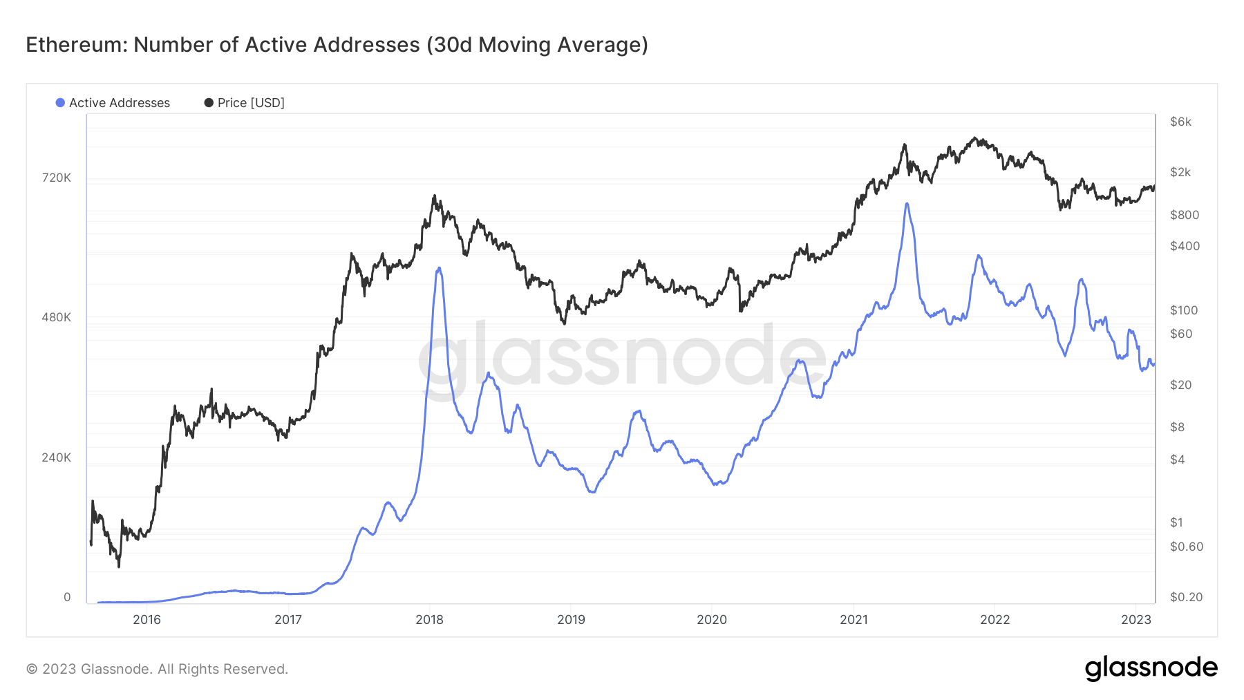
As regards the adoption of the Ethereum network, we can see from the graph that compared to the bottom of the last bear market, the active addresses have more than doubled, confirming a growing degree of adoption despite the recent downturn and the lack of appetite for DeFi protocols deriving from by the hacks and bankruptcy of many companies operating in the sector.
But how do we go in terms of validators and therefore network security?
Ethereum: Active Validators
The count of active validators. Active validators are validators who have completed their activation queue, are not in an exit queue, and have effective balances greater than 32 ETH.
Validators have the task of validating transactions on the Ethereum network and the higher their number the greater the security of the network.
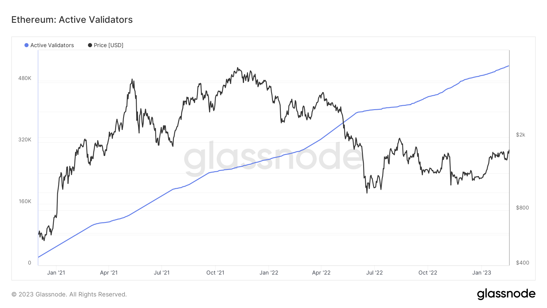
As can be seen from the graph, validators are constantly increasing, but this is mainly due to the fact that as of today it is not yet possible to unstake ETH, which will only be possible after the Shanghai upgrade, which is nearing completion and of tests on the various Ethereum testnets.
What is likely to be expected is a temporary drop in validators, followed by a further increase if the upgrade activates successfully and without any problems, since from that moment on it will be possible to put and remove ETH from staking without problems, where before, however, there was the insecurity of the upgrade and the possibility of not being able to get your funds back if something went wrong.
And security is something that institutions value, as we know.
Ethereum: ETH 2.0 Total Value Staked [ETH]
Here we talk about the value of the ETH staked to date.
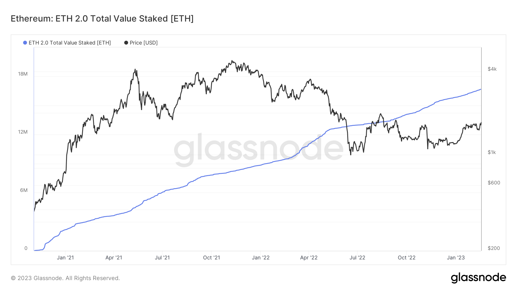
They too are constantly increasing, and with the above considerations. Here I just want to provide data relating to the current market value and the possible sell pressure in the case of even just 10% of those ETHs put on the market, also thanks to the fact that when they were staked Ethereum was at price levels in the low hundreds of dollars.
And here we are talking about 1.6 million ETH (about 10%) which hypothetically, if sold, would correspond to a current price of: about 2 billion and 640 million of sell pressure.
It is also true that it will not be possible to withdraw all the ETH at once and that there will be a queue for the exit of the validators and the unstake of ETH, but we can expect a minimum of sell pressure, probably also as a sell the news event, before a generalized pump of the asset if the upgrade is confirmed and everything is working properly.
But let's go into the detail of what the net inflation or deflation of the asset is after the EIP 1559.
Ethereum: Value of Supply Burned [USD]
With the activation of EIP1559, the supply of ETH that is burned in the BASEFEE can be evaluated by multiplying by the spot price. This models the USD value that has actually been removed from circulation on a daily basis and, in total, by the burn mechanism.
This graph has the following traces:
🔵 Daily Value Burnt: Reflects the total ETH burned that day, valued at the spot price.
🔴 Cumulative Value Burned: Reflects the cumulative sum of daily value burned.
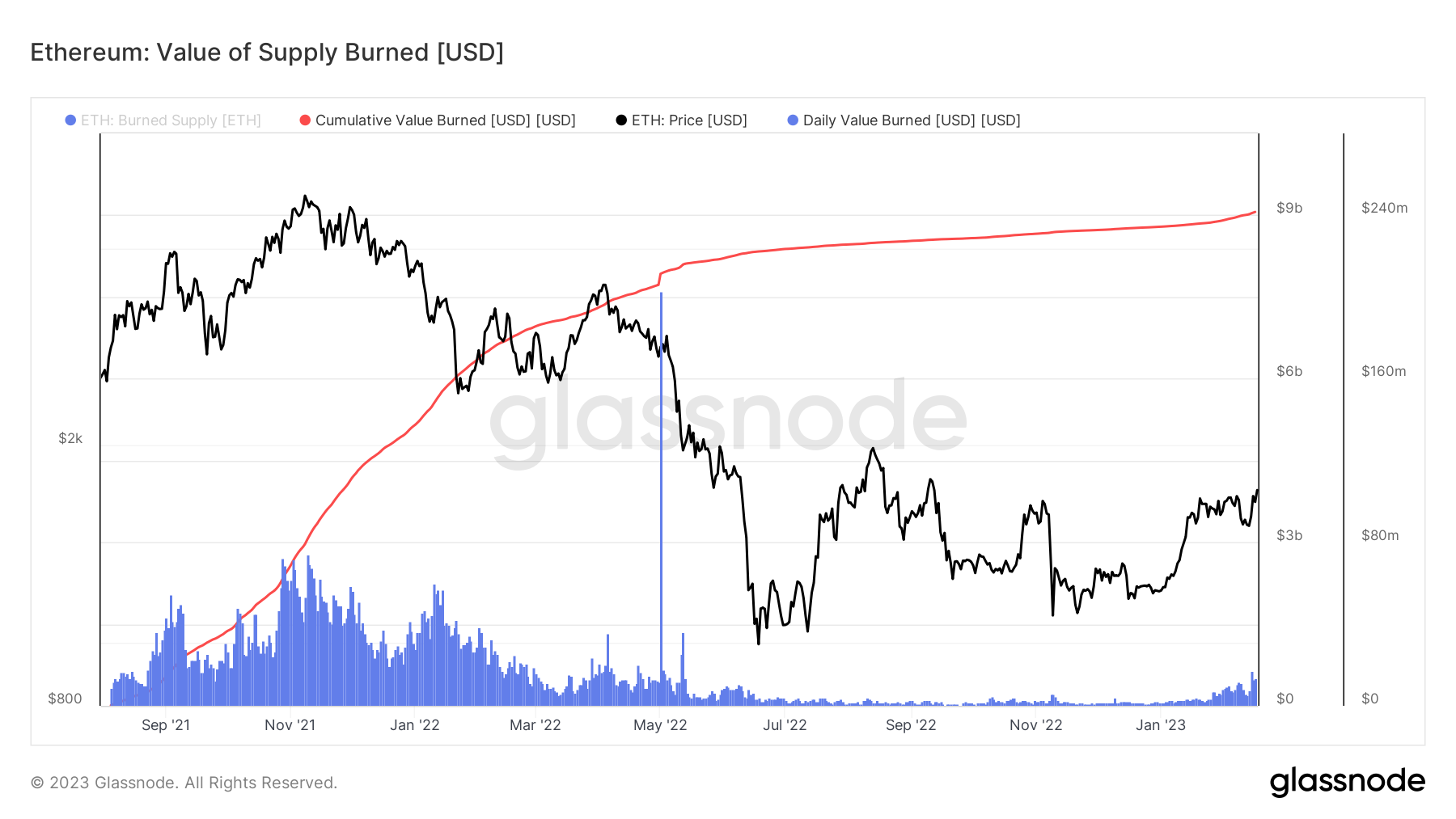
As can be seen from the graph, the cumulative burnt value of ETH is continuously increasing, even if in the last period it has had a slowdown due to the bear market and the collapse of many centralized entities, as well as the absence of FOMO in the NFT market, the which had given in a single day the largest spike of all the aforementioned graph.
To date, ETH worth about 9 billion has been burned, but this figure alone does not tell us much, so let's move on to the next graphs.
Ethereum: Percent of Minted Supply Burned
On August 5, 2021, the Ethereum London hard fork was executed (at block height 12,965,000), which triggered the EIP-1559 change. EIP1559 made changes to the Ethereum gas tariff market, with one key change being the burn of the BASEFEE portion of paid gas.
This graph has the following traces:
🟢 Minted Supply: The total supply of ETH released by the protocol to miners and validators over time.
🔴 Burned Supply: The total supply of ETH burned since the activation of EIP1559.
🔵 Circulating Supply: the total ETH in circulation, calculated as Minted Supply - Burned Supply.
🟣 Burned Supply Percentage: The percentage of the total minted supply that was burned by EIP1559.
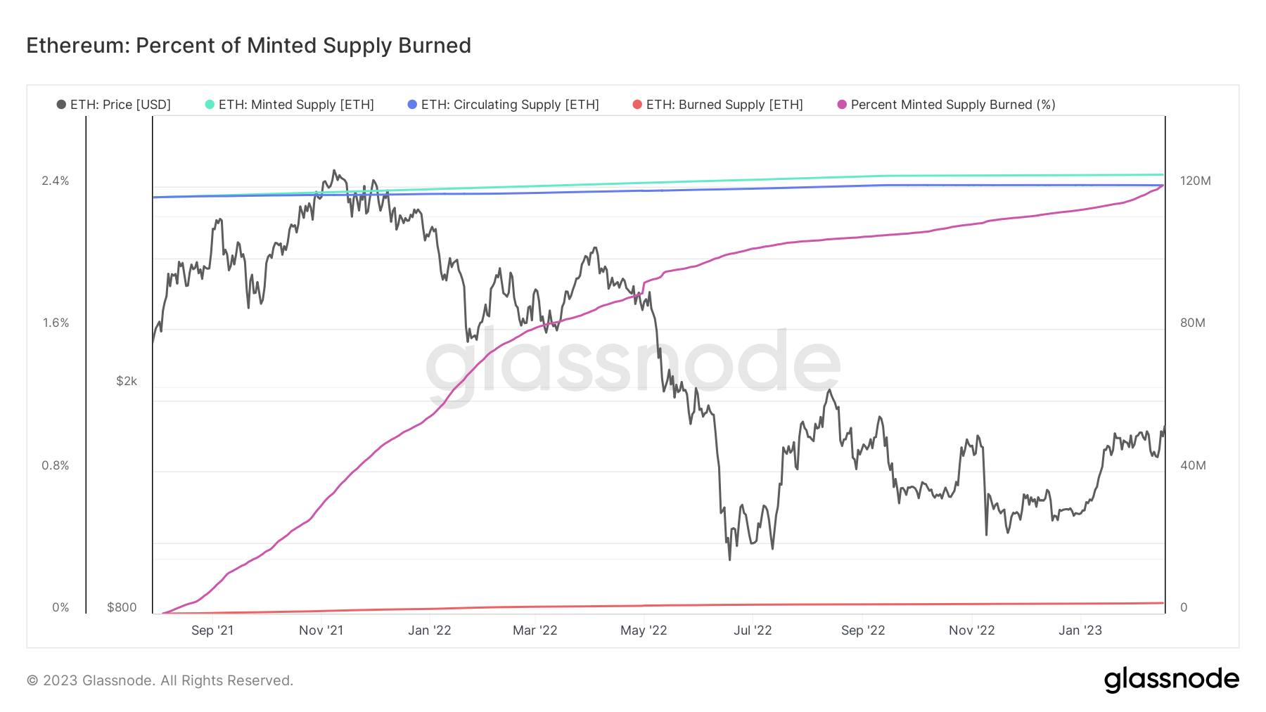
The graph above shows the percentage of the burned ETH supply which currently corresponds to 2.4%, corresponding to 3 million ETH. Number that can only increase, considering that we are in the bear market and the use of the Ethereum network is at its lowest.
Considering this as further bullish data concerning ETH, we now proceed to analyze the real inflation rate of the asset.
Ethereum: Proof-of-Stake Net Inflation Rate
The estimated net inflation rate of ETH via the Proof-of-Stake consensus protocol and supply burn via the EIP1559 protocol. The volume of ETH issued is dictated by the number of active validators participating in the consensus, with the total minted supply increasing as more validators enter the pool.
This inflation rate metric is annualized and presented in percentage terms (i.e. a reading of 0.5 = 0.5%).
- Positive values indicate inflation of the ETH supply
- Negative values indicate a deflation of ETH supply
With the ETH burn mechanism implemented in EIP1559, the net issuance can be calculated as Nominal Supply Issuance - Supply Burnt by EIP1559. This Workbench graph has the following traces:
- Nominal PoS Issuance Rate 🔵 indicative of the ETH annualized rate coined by both PoW and PoS consensus mechanisms.
- EIP1559 Burn Rate 🔴 indicative of the annualized burn rate of the supply each day.
- Net Rate of Change in Supply 🟣 calculated as the annualized rate of change in supply considering nominal issuance minus burnt supply, i.e. actual inflation or deflation of ETH.
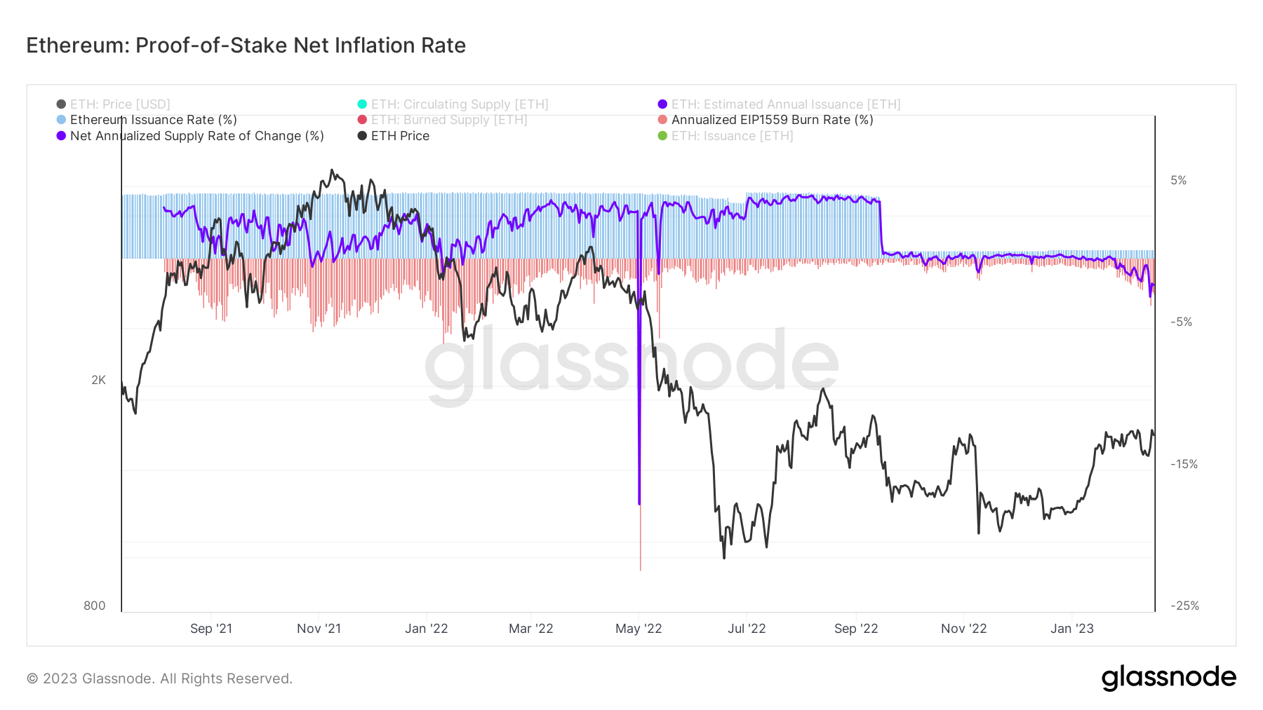
From the graph above, we can see how since the transition from PoW to PoS, with the previous help of EIP1559, Ethereum has now become deflationary.
Further confirmation therefore regarding the potential of ETH as an asset to be held alongside Bitcoin for the long term, waiting for times in which burn will be even more understood and adoption will be global.
In fact, there is no shortage of big news that can only make us bullish regarding ETH, but this is not exactly the right place to talk about it.
So at this point your question will be: is it a good asset?
Let's wrap up
Ethereum: Conclusion
Being already deflationary of 2% per year in the bear market, we can well hope that in moments of extreme use of the network and intense burns ETH will increase in value even if only due to the lack of supply, precisely taking into account a constant or growing demand as in case of Bitcoin halvings.
Network security will then increase accordingly, given the increased demand to become validators at institutional level.
At the same time we have also seen that the adoption of the network by users is there and is constantly expanding.
In conclusion, we can say that Ethereum seems to be an excellent long-term investment according to current data, provided that the next upgrades are functional and working.
(All opinions expressed above are the personal opinions of the authors and should not form a basis for making any investment decisions, nor be construed as a recommendation or advice for engaging in investment transactions.)