lol
Dive into the details of iOS 11: Is Apple still detail-oriented?
F
ew days ago, Apple had their fall special event at Steve Jobs Theater located inside Apple Park, unveiling the all screen iPhone X, and later pushing iOS 11 GM to beta testers, which is going out officially next week. I updated my phone as soon as I got the push of iOS 11 GM.
Since WWDC in June, I’ve been a beta tester for iOS 11 which has been through an intensive summer of incremental updates. With my 4.7 inch iPhone 7 and iOS 11 GM at hand, there still exist quite a lot of unfinished feeling of Beta software. As a designer, I can’t help writing about my feelings.
I’m writing this to help people with realizing many details requiring further polishes, who hopefully includes folks at Apple and can push forward with changes to improve those details.
The unfinished feeling in iOS 11 mostly comes from UI and animation. UI elements in iOS are quite inconsistent, mixing a variety of UI elements, which might look quite similar but introduce a disconnected feeling for UX. The inconsistency of those elements majorly stems from those UI element updated in iOS 11, such as Large Title and new Search Bar. In my opinion, those newly introduced elements, which might be unfamiliar and new even to Apple engineers, have caused many inconsistent UI experience in iOS 11.
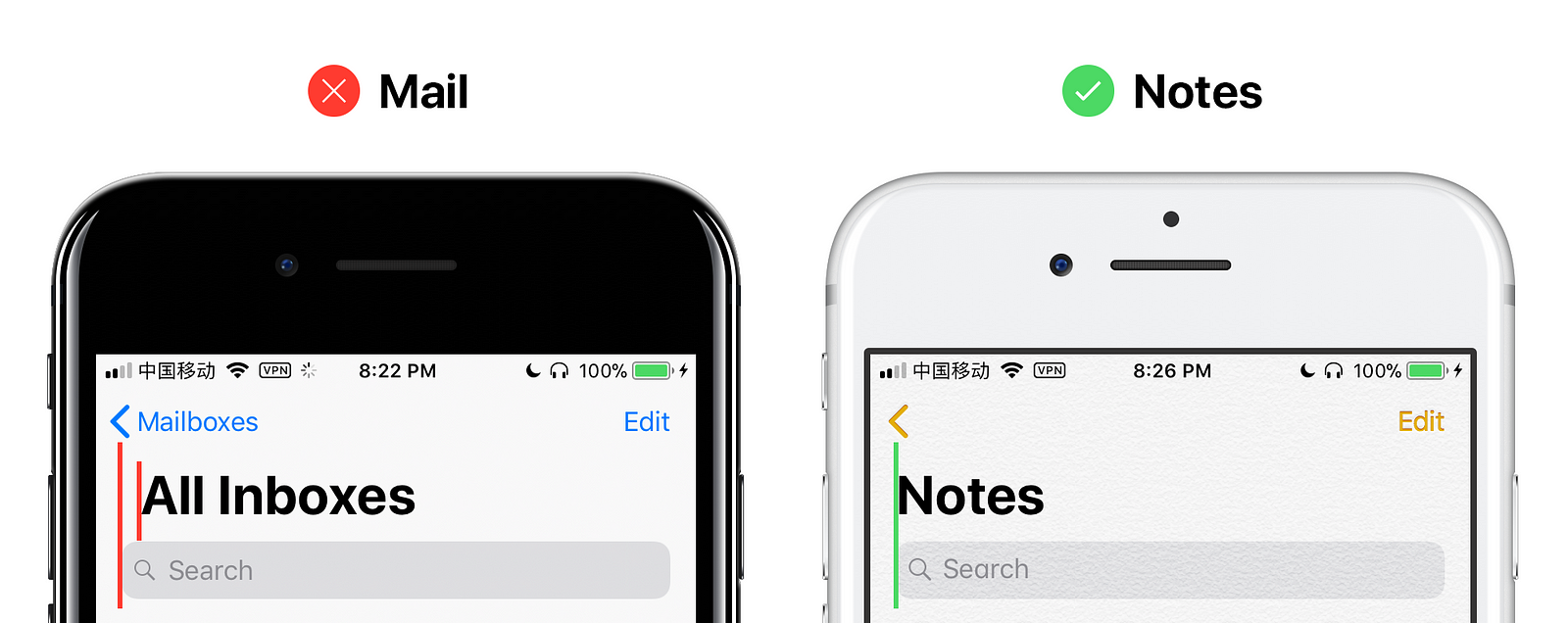
Mail.app
First let’s look at Mail.app in iOS 11. Like other native apps, Mail also introduces a new Navigation Bar with Large Title. However, Large Title in Mail, has extra left margin compared to the design guide example. Here we will use Search Bar as reference object. In design guide example, Large Title and Search Bar share same distance to the edge, but in Mail.app, Large Title clearly moves a bit right compared to Search Bar.
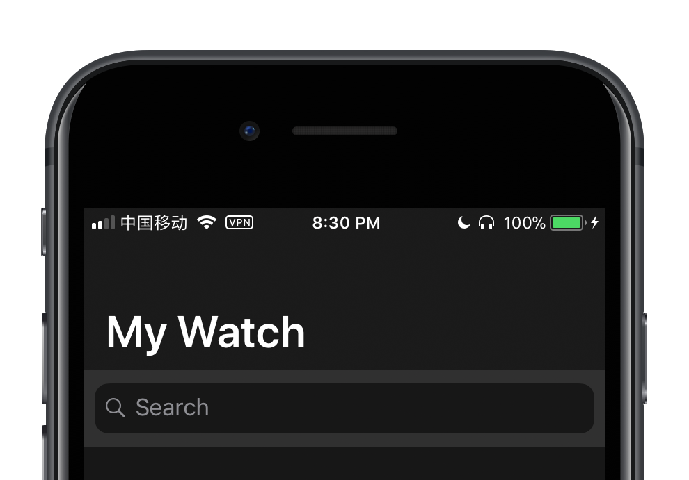
Watch.app
In Watch.app, Search Bar is not following the suggested style, standing out with its unfitted background. In native apps adopting iOS 11 styles, Search Bar should match Navigation bar naturally, unlike Watch.app.
In the instruction video of Building Apps for iPhone X published by Apple, they mentioned an exactly same case:
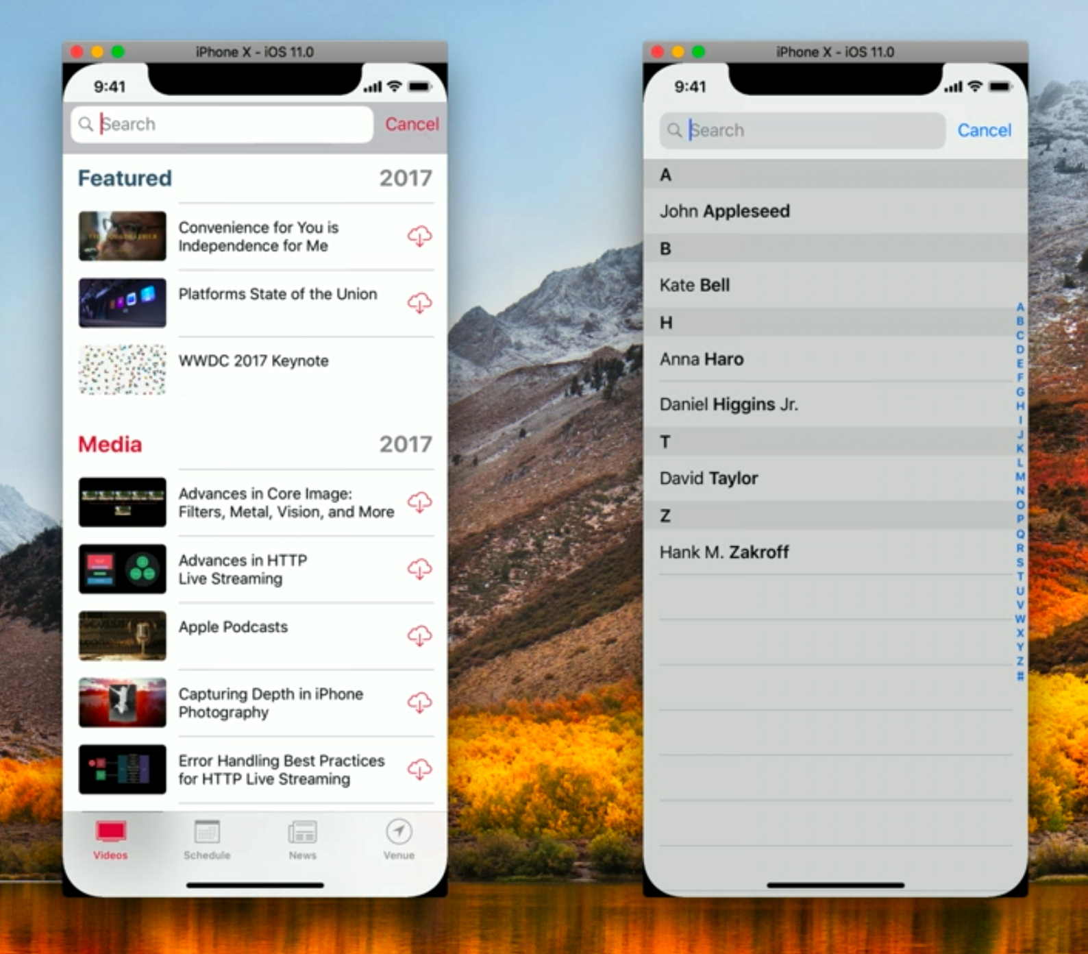
The WWDC.app on the left is counter-example which is not matching styles, and Contacts.app on the right is a best practice matching styles. The commenter in the video claims:
That’s move on to the second issue that I found… if I bring out the search field, well that doesn’t look quite right. Let’s compare this to the Contacts app list. A couple of things look wrong here. The color of the search bar background isn’t quite right. And the sizing is a bit off.
Therefore, iOS 11 is suggesting matched background between Search Bar and Navigation Bar. Yet Watch.app doesn’t follow it as a native app. What’s more, once clicked, Search Bar in Watch.app is almost kissing the Status bar, which shows more polish to do be done by Apple engineers.
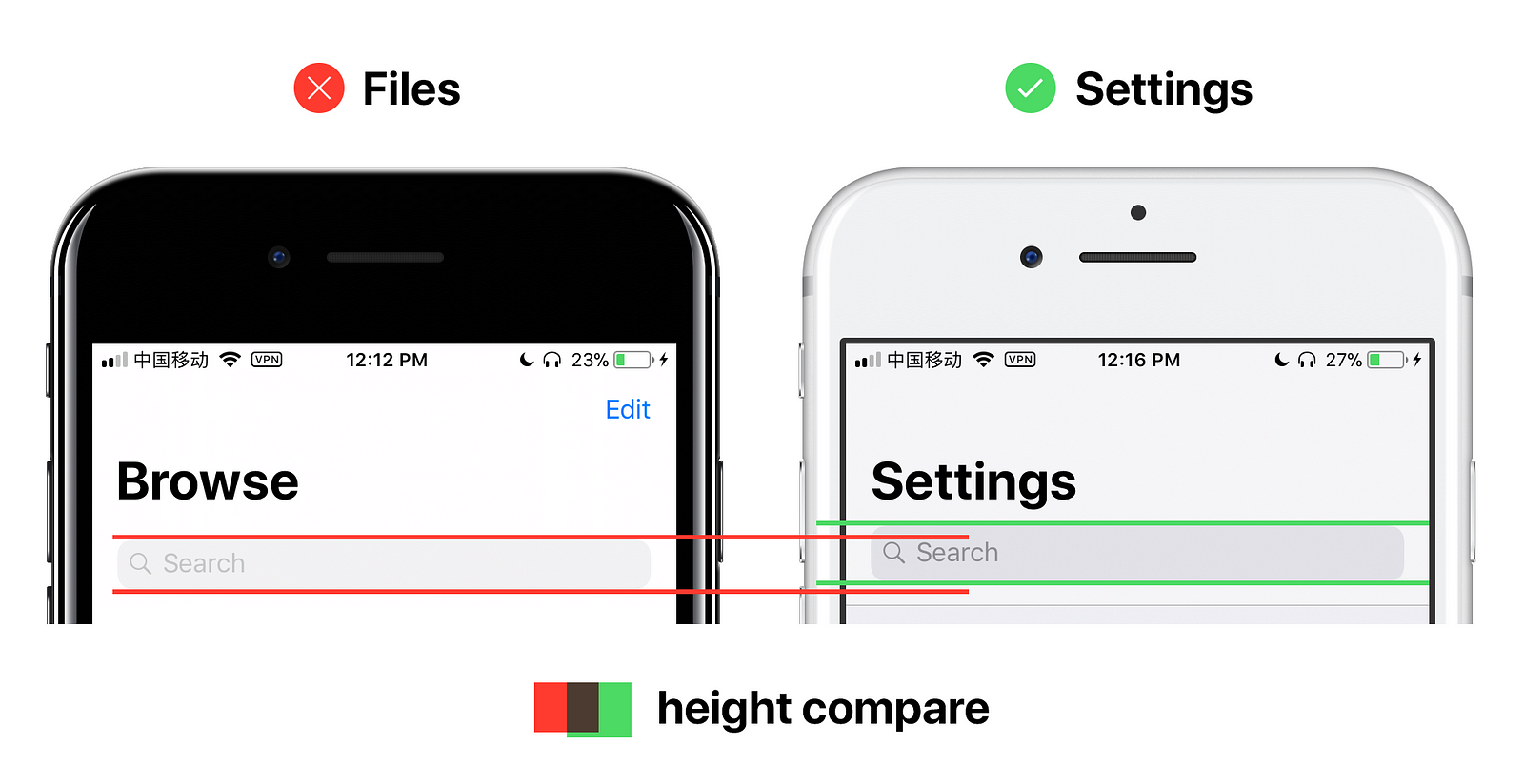
Files.app
Search Bar in Files.app also has some issues. Seems Files.app engineers used a non-standard Search Bar. From the picture below, compared to standard Search Bar in Settings.app, Files.app has a slightly smaller Search bar, and lighter font color.