Frontend
- HTML5, CSS3, jQuery
- The proven 7 real-world steps from complete scratch to a fully functional and optimized website
- Simple-to-use webdesign guidelines and tips
- How to get and use amazing images, fonts and icons
- Responsive web-design
- How to work with Brackets
Margin is white space between boxes
How to use clearfix:
.clearfix:after {
content: "";
display: table;
clear: both;
}
<div class="clearfix"></div>
RELATIVE VS ABSOLUTE
With absolute positioning we can put our elements wherever we want. We just need to mention that the parent element has position: relative;
A block element uses the full available width and forces line-breaks
TYPOGRAPHY
Use a font-size between 15 and 25 pixels for regular text.
Headlines - 60px
Subtitles - 30px
If you use bigger font-size, decrease the weight of the font
Line-spacing between 120% and 150%
45 to 90 characters per line
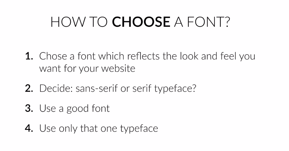
A couple of good fonts:
Sans-serif fonts:
Open Sans
Lato
Raleway
Montserrat
PT Sans
Serif fonts:
Cardo
Merriweather
PT Serif
COLORS
- Use only one base color and some gray color for text

2. Use a tool if you want to use more colors
3. Use color to draw attention

4. Never use black in your design (?)
5. Choose colors wisely
- Red is a great color to use when power, passion, strength and excitement want to be transmitted. Brighter tones are more energetic and darker shades are more powerful and elegant.
- Orange draws attention without being as overpowering as red. It means cheerfulness and creativity. Orange can be associated with friendliness, confidence, and courage.
- Yellow is energetic and gives the feeling of happiness and liveliness. Also, it associates with curiosity, intelligence, brightness, etc.
- Green is the color of harmony, nature, life and health. Also, it is often associated with money. In design, green can have a balancing and harmonizing effect.
- Blue means patience, peace, trustworthiness, and stability. It is one of the most beloved colors, especially by men. It is associated with professionalism, trust and honor. That's actually why the biggest social networks use blue.
- Purple is traditionally associated with power, nobility and wealth. In your design, purple can give a sense of wisdom, royalty, nobility, luxury, and mystery.
- Pink expresses romance, passivity, care, peace, affection, etc.
- Brown is the color of relaxation and confidence. Brown means earthiness, nature, durability, comfort, and reliability.
WORKING WITH IMAGES
How to effectively put text over images?
- Make the image darker and your text white. It can be black, any other color or a gradient
- Put the text in a box, but make the image opaque
- Blur the whole image or out-of-focus
- Use the floor fade

HOW TO USE WHITESPACE
- Put whitespace between your elements
- Between groups of elements
- Between website sections
- But don't exaggerate
Define hierarchy
- Define where you want your audience to look first
- Establish a flow that corresponds to your content's message
(Hierarchy means guiding your user from one element to the next) - Use whitespace to build that flow
THE ULTIMATE CHEATSHEET: ALL DESIGN PRACTICES IN ONE PLACE
This cheat sheet is intended to serve as a quick reference for you.
It contains all the guidelines I showed you in this web design section.
It is very important that you have all of the guidelines in mind at the same time when you're making your designs.
Beautiful Typography
1. Use a font-size between 15 and 25 pixels for body text
2. Use (really) big font sizes for headlines
3. Use a line spacing between 120 and 150% of the font size
4. 45 to 90 characters per line
5. Use good fonts
6. Chose a font which reflects the look and feel you want for your website
7. Use only one font
Using Colors Like a Pro
1. Use only one base color
2. Use a tool if you want to use more colors
3. Use color to draw attention
4. Never use black in your design
5. Choose colors wisely
Working with Images
1. Put text directly on the image
2. Overlay the image
3. Put your text in a box
4. Blur the image
5. The floor fade
Working with icons
1. Use icons to list features/steps
2. Use icons for actions and links
3. Icons should be recognizable
4. Label your icons
5. Icons should not take a center stage
6. Use icon fonts whenever possible
Spacing and layout
1. Put whitespace between your elements
2. Put whitespace between your groups of elements
3. Put whitespace between you website's sections
4. Define where you want your audience to look first
5. Establish a flow that corresponds to your content's message
6. Use whitespace to build that flow
7 STEPS TO A GREAT WEBSITE
1) Define your project
- Define the goal of your project
- Define your audience
- Design with your goal and audience in mind
2) PLAN OUT EVERYTHING
- Plan your content: text, images, videos, icons, etc.
- Start thinking about visual hierarchy
If you want you can be content-first, write before designing
- Define the navigation
- Define the site structure if it's a bigger project
3) SKETCC YOUR IDEAS BEFORE YOU DESIGN
- Get inspired and think about your design
- Get the ideas out of your head: sketch your ideas before you start designing
- Make as many sketches as you want, but don't make it perfect
- Never start designing without having an ideas of what you want to build