Design
DmitryDmitry,
So: this was an email I sent to the newsletter before you joined. Figured you might be interested in reading so you know more of what to expect. Without further ado...
Last week, I gave a few talks on UI design in Dhaka, Bangladesh. Unfortunately, Dhaka is having a "political situation", or, as everyone refers to it there, a strike.
To me, a strike means some people don't go to work. However, in Dhaka, a strike means the opposition party makes thinly veiled threats against anyone working or using roads. I say “thinly veiled” because these strikes are coincident with petrol bombs being thrown through bus windows on a daily basis.
It is a sad and serious situation, but for many, it's business as usual in Bangladesh.
The strike had a brief lull, but restarted the day of my first talk. I was warned of a "possible low attendance", and indeed, all of 9 people showed up.
Now, I'm not complaining. I would've given my talk for 2 people. That's my job, and I'm going to do it. And while giving those talks and answering some questions, I solidified a bit of material on color. I’d like to share it with you today.
The terrorists may have all but stopped my talk, but they can't stop this newsletter.
Creating a "Color Palette"
I dislike an enormous amount of the way designers talk and write about color. It’s often impractical, talking about the theory of colors that go well together, even while the vast majority of pretty pixels seem to have been chosen by some other magic.
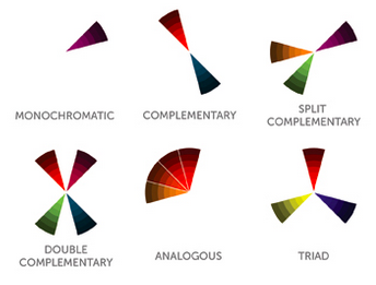
It FEELS like I'm learning something, but when is "split complementary" colors ever a useful thing to know?
In my opinion, even talking about a “color palette” is a misnomer, at least in practice. It’s not a matter of picking colors and then dabbing them on to the right places of the interface. No, a palette is an awfully prescriptive way of thinking about color.
The majority of color work (at least for me) is extremely iterative. Start with one color. Maybe it’s from the logo, or maybe the client requested blue (editor’s note: why? so you can look like facebook, twitter andLinkedIn!?). Now use a slightly different shade for the sub-menu background. Got it. Now re-adjust the first blue. Now add the red for that error message. Doesn’t go with the blue. De-saturate the red. That’s better. Another error state has a lighter red background. Create that. Wait– the corresponding yellow background doesn’t have enough contrast. Pick a different red and use dark text. And so on.
From that soup of micro-decisions, a color palette emerges. And ushering that emergence is what I want to focus on– not the idea that you have a few swatches and you just dab them on.
If you’re working at a place where designers have already lined up the 20 shades of orange you get and that’s that (and I’ve been there), this email’s not for you. But if you’re trying to pick colors for your side project, read on. I’m going to talk about how to help that color palette emerge.
How many colors should my design have?
This is one of the most common questions I get, so let me answer it clearly: mu.
If you’re wondering how many colors to have in a design, rest assured you’re coming from exactly the wrong place. This is a really simple course-correction though. You just need to have a reason to add more colors. As long as you have a reason to add another color, great. The moment you don’t have a reason to add more color, stop.
Example:
Can we get away with zero colors? (black and white first)
No, we are not going for ultra minimal or luxury.

The Chanel website, like many other luxury brands, in black and white.
Any reason to have more than one?
Well, the logo is 50% blue and 50% yellow, and it really seems to imply multiple colors in the design.
Ok, can we stop at two colors?
Probably not– the app is supposed to have a bold, vibrant, sporty feel. There will be enough colored background and gradients that two hues isn’t enough to work with.
And so on.
If you reach a point where you can give equally solid rationale for adding more color and not adding more color– awesome! Now it's time to use your Designer Gut Instinct, but either option should be fine.
Generally, clean and simple apps will use a hue or two as “base colors”, and have modifications of them for accents.
Modifying hues
I am an unabashed fan of the HSB color system. In my book, RGB values are hardly worth their weight in random hex. Much more useful for thinking of and modifying colors are hue, saturation, and brightness.
Think of hues as the base colors in your design. Saturation and brightness are ways of adjusting the base hue– and they should be moved in opposite directions to make different “versions” of the same color. In short, if you raise/lower your saturation, do the opposite to brightness.
Let’s look at an example.

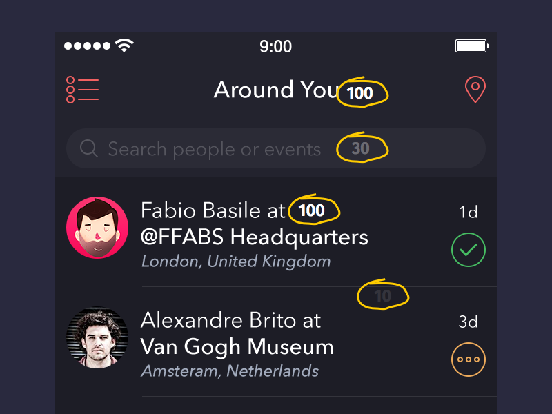
Here’s a cool mobile app design by Alexander Zaytsev (apologies if your monitor is not picking up the contrast in background colors here– try cranking up your screen brightness).
The list items have the dark background. The header background is a little bit lighter, and the search bar background is the lightest background of all.
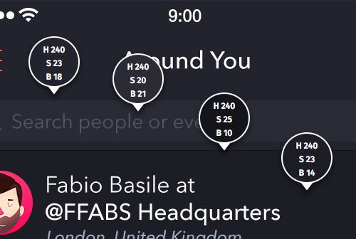
Now I’ve pulled out all the colors in HSB. Notice anything about the saturation and brightness values?
Sure enough, the background colors with the most brightness also have the least saturation. Somehow these two properties cancel each other out.
Note that this applies to colors that are supposed to be basically the same, but just a bit different. Alexander isn’t trying to include four shades of similar slate gray in the “color palette”– he’s just trying to get some variations on the same color.
Here's an example from a Remix Jobs redesign by Julien Renvoye. I’ve called out four specific background colors, and there’s a few things going on with them:
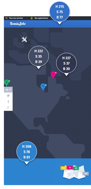
- The continent color is supposed to be a different, lighter version of the ocean color
- The more brilliant top and bottom menus are supposed to stand out entirely from the darker map behind them
With that in mind, it should make perfect sense that the continents are a higher brightness but a lower saturation. They’re different versions of the same color.
The menus, on the other hand, have a high saturation and a high contrast. Doesn't this violate the rule? No. While they’re still blue, these are not simply a different version of the map colors– they're supposed to stand out as entirely different colors.
The more astute among you may have noticed the two menu colors don’t have the saturation-brightness tradeoff. Good observation! In this case, the bottom menu is actually a semi-transparent overlay, so I’m not as sure what the designer was going for. If the bottom was an opaque menu, then I would love to see a version with saturation-brightness tradeoff.
Layering with white
The hue modification stuff above is useful for picking different background shades. But that leaves text, horizontal rules, and other elements– what colors for them? Well, that depends.
- On a white background, try a very dark gray– at full and non-full opacities
- On a dark background, try white– at full and non-full opacities
What does this mean?
Let's go back to Alexander’s example.
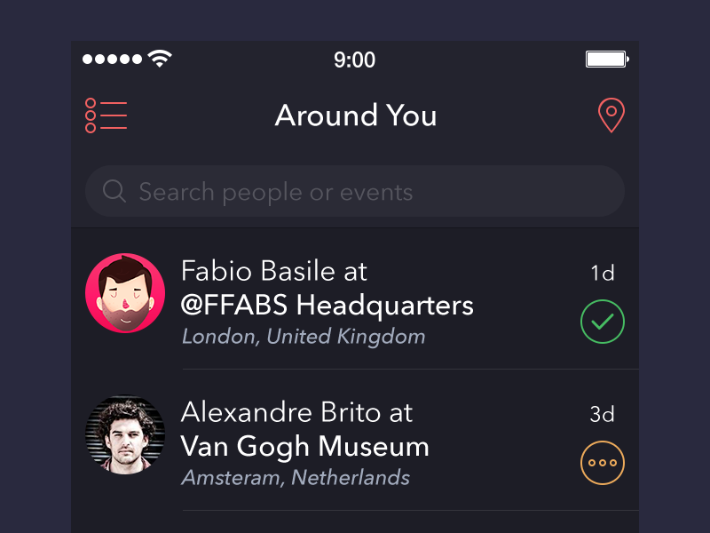
It's a dark background. There’s a lot of white or off-white text, some horizontal rules, and an icon– but Alexander didn’t really have to pick all of these colors individually.
Check this out.
The title text, search hint, list item titles, and horizontal rules are all white at various opacities between 100% and 30%. I’ve written them in so you can see.
By changing the opacity of the white elements, he's able to draw attention to the important ones and away from the accents.
And– ready for this?– white overlaid at various opacities fits the same saturation-brightness tradeoff curve that we were using to pick background colors.

#2B68A5

#2B68A5 overlaid with white at 0% opacity (left) to 100% opacity (right)
If we plot the saturation/brightness coordinates for sampled colors along this gradient from blue to white, we get the tradeoff curve.
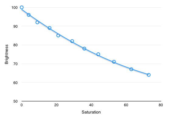
This is just the way light and our eyes work. If you want to keep things looking natural together (like a "palette"), always remember to be swapping saturation and brightness.
Now you might remember the first bullet in this section, talking about laying dark text/accent elements on a white background. With a white background, you’d do the same thing as above but in reverse. First, pick an “h1” color, then use less opaque versions of it for less important elements.
What color should you use for h1? Well…
Never use black
I owe all the foundations of what’s covered here to Ian Taylor’s article Never Use Black. If triads and that crap are the foundations of color theory, Taylor’s post is the foundation of color practice.
Read it for yourself, but here are a few ideas from it – and then some building on top of what we've already talked about.
- Flat black (#000000) should be avoided, as it does not really every appear in the real world
- Instead of black, use dark, saturated grays
- Because of the saturation-brightness tradeoff, dark grays and off-blacks tend to “want" to be highly saturated (30%, 40%, 50%, or even more, depending on how dark they are and what purpose they serve)
- Your darkest grays should be saturated in similar hues as your theme
Now these are just a few ideas with using color. I’ve heard from a number of you that it was still a big issue in your designs, and I hope this steers you in the right direction, or gives you some good ideas.
If you know a physical explanation for the saturation-brightness tradeoff, I'd love to hear. Otherwise, let me know if I missed anything, and what’s still got you curious.
Oh, and if you want to read a LOT more about color practice, check out Color in UI Design: A Practical Framework.
Until then,
-Erik D. Kennedy
The Design Newsletter is written by me, Erik Kennedy. I generally send out only (a) in-depth, (b) original design writing that (c) I would've wanted to read as a beginning UI designer, and occasional announcements about Learn UI Design. You can change your name/email here. If you are no longer interested in receiving design tutorials and news → Unsubscribe. Drop me a line if you're ever in my neck of the woods → PO Box 386, Maple Valley, WA 98038. Cheers!