Card
✎ ﹘࿈﹘𝓨𝓾𝓵𝓭𝓪𝓼𝓱𝓮𝓿 𝓜 🍀﹘࿈﹘⍟🜚࿈™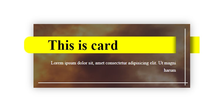
#html
<div class="card">
<img src="https://picsum.photos/id/705/705" alt=""
class="card-img">
<div class="card-body">
<h3 class="card-title">This is card</h3>
<p class="card-text">Lorem ipsum dolor sit, amet consectetur adipisicing elit. Ut magni harum</p>
</div>
</div>
#css
body{
display: grid;
place-items: center;
height: 100vh;
font-weight: 300;
line-height: 1.6;
border: 1px solid black;
}
.card {
position: relative;
width: 40%;
box-shadow: 0 0 25px 0 rgba(0,0,0, 0.35);
}
.card::before, .card::after {
content:'';
position: absolute;
border: 1px solid white;
}
.card::before {
top: 1rem;
bottom: .5rem;
right: 1rem;
}
.card::after {
bottom: 1rem;
left: 1rem;
right: .5rem;
}
.card-img {
position: absolute;
width: 100%; height: 100%;
object-fit: cover;
z-index: -1;
}
.card-body{
background: rgba(0,0,0, .5);
color: white;
padding: 3rem;
}
.card-title, .card-text{
margin: 0;
}
.card-title {
font-size: 3rem;line-height: 1;
margin-bottom: .5em;
position: relative;
z-index: 1;
color: black;
}
.card-title::before {
content:'';
position: absolute;
background: yellow;
width: calc(100% + 5rem);
top: -.1em;
bottom: -.1em;
left: -5rem;
z-index: -1;
box-shadow: inset -15px 0 10px -10px rgba(0,0,0,.5);
border-radius: 20px 0 0 20px;
}
.card-title::after {
content:'';
position: absolute;
top: -.1em;
bottom: -.1em;
left: calc(100% + 3rem);
width: 2rem;
background-color:yellow;
box-shadow: inset 20px 0 10px -10px rgba(0,0,0,.5);
}
.card-text {
text-align: right;
}