Apple
Muzaffar Rajabov| FOR CHANNEL "Logophics"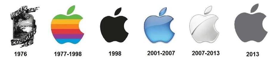
The graphic history of the Apple brand started with an ornate emblem designed by Ronald Wayne, one of Apple co-founders. The idea behind the logo was Newton’s revolutionary discovery of gravitation. Along with the company name (Apple Computer Co.), the logo featured a long quote that said: “Newton…a mind forever voyaging through strange seas of thought…alone.” Disappointed by the design, Steve Jobs demanded to replace it with something “not so pretty.” This is how Rob Janoff came up with a colorful logo in the form of an apple and the company name reduced to “Apple.” That happened in 1977. The new logo targeted a younger audience and conveyed the unique ability of the computer to reproduce colors. You may wonder why the apple on the logo has a bite. The answer is quite funny, actually! It was done to avoid confusion with a cherry!
In 1984, with the launch of Apple Macintosh, the tech giant decided that its symbol had become famous enough to represent the Apple brand on its own. This is how the company name was removed from the emblem. Since 1984, Apple has been loyal to its amazing logo, only experimenting with shades and shadows.