Android Theming Variables Glossary: Dialogs
@snejugal, @SventraPopizz, @NeoKio, @AlexStrNikThis part of Android Theming Variables Glossary is about dialogs.
Dialogs are the panels at the bottom or in the middle of the screen. For example, the one that appears when you tap a message or that one that appears when you hold a chat on the chat list.
Backgrounds
- dialogBackground sets the background of dialogs.
- dialogBackgroundGray sets the small space between sections in Supergroup settings → Event Log → Settings.
Text
- dialogTextBlack sets the color of almost all text on dialogs.
- dialogTextGray2 sets the color of descriptions on the attach panel.

Blue text
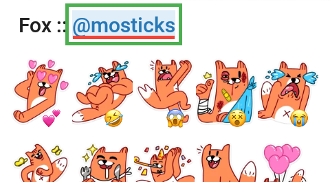
- dialogLinkSelection sets the link in sticker pack name underlay when you tap it.
Decorative elements
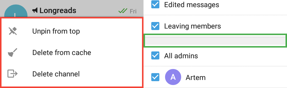
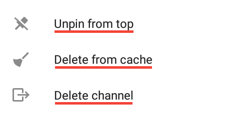
- dialogIcon sets the color of icons. For example, the ones that appear when you hold a chat on the chat list.
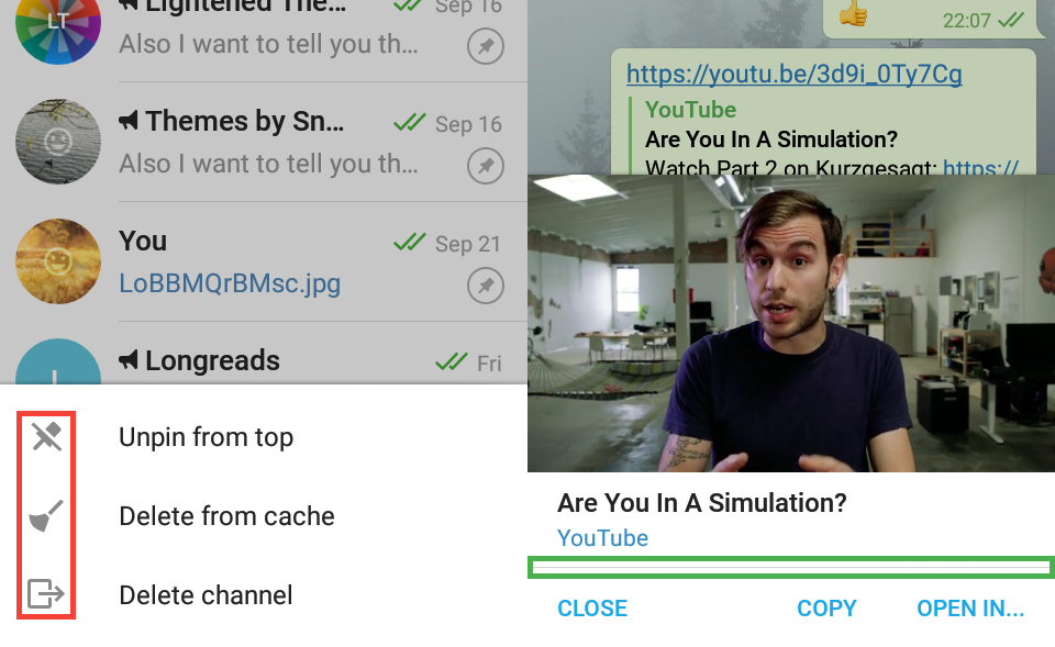
- dialogGrayLine sets the color of the border you can see in the in-app video player panel. You can open it by attaching a YouTube video link to your message, then tap the video preview image.
Badge
- dialogBadgeBackground sets the background color of a badge — the counter you see when you forward messages or add stickers.
- dialogBadgeText sets the text color on the badge when forwarding message but not when adding stickers — it's set by picker_badgeText.

Controls
Buttons
- dialogButton sets the text color of buttons on dialogs on those that appear in the middle of the screen — for example, when you're deleting a message.
- dialogButtonSelector sets the button background color when you tap it.

Radio buttons
- dialogRadioButton and dialogRadioButtonChecked should set radio buttons colors on dialogs, but they don't for some unknown reasons.
Square checkboxes
- dialogCheckboxSquareBackground, dialogCheckboxSquareCheck, dialogCheckboxSquareDisabled and dialogCheckboxSquareUnchecked set the same elements of the square checkboxes but on dialogs. Althrough, we don't know anything about disabled checkboxes on dialogs, if you do, please contact @snejugal.
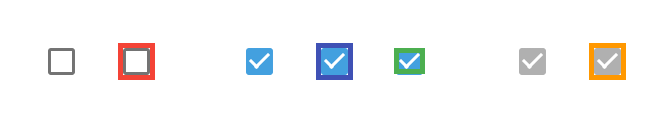
Round checkboxes
- dialogRoundCheckBox sets the circle background that appears when you select chats you want to forward messages to on the forward panel.
- dialogRoundCheckBoxCheck sets the color of the check mark on that circle.

Text fields
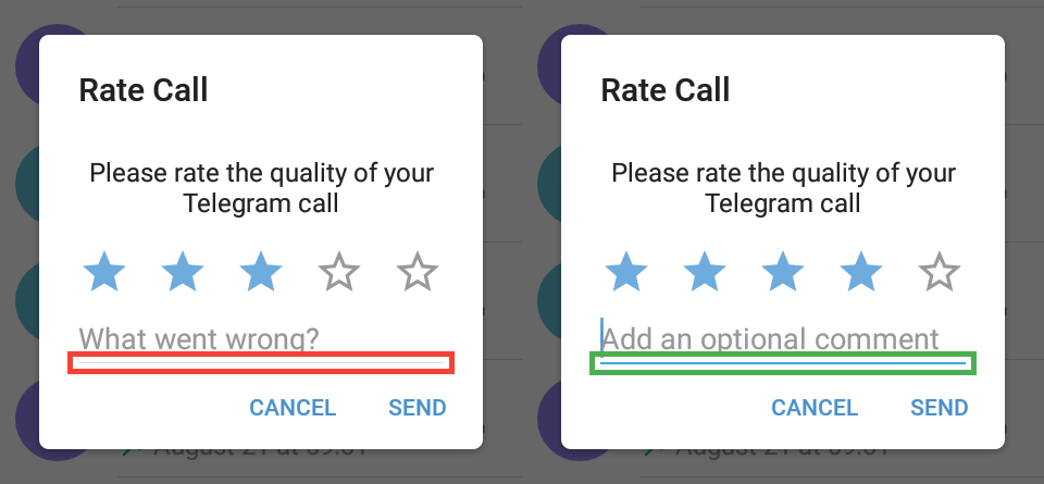
- dialogInputField sets the text field bottom border when the field is inactive. Inactive state is seen when you rate a call for 4 or less stars; you can get the ”Rate Call” prompt when you hold a call in Calls Log.
- dialogInputFieldActivated sets the color of the bottom border below text fields when the field is active — almost all text fields on dialogs right after they appear.
Progress indicators
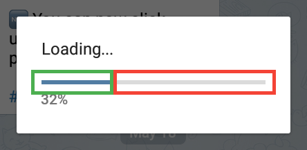
- dialogLineProgressBackground sets the background color of line progress you can see when you save to downloads any file (three dots beside a file on chat screen → Save to downloads).
- dialogLineProgress sets the color of the line that shows what percent has already been downloaded.
Attach panel
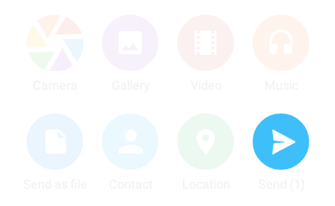
- dialogScrollGlow sets the glow color you can see when you quickly scroll the attach panel.
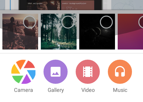
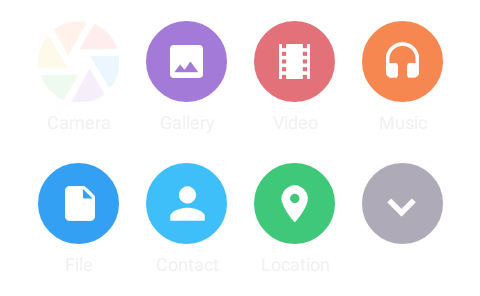
- chat_attachGalleryBackground, chat_attachVideoBackground, chat_attachMusicBackground, chat_attachFileBackground, chat_attachContactBackground, chat_attachLocationBackground, chat_attachHideBackground and chat_attachSendBackground set the background color of attach buttons.
- chat_attachGalleryIcon, chat_attachVideoIcon, chat_attachMusicIcon, chat_attachFileIcon, chat_attachContactIcon, chat_attachLocationIcon, chat_attachHideIcon and chat_attachSendIcon set the icon color of attach buttons.
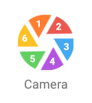
- chat_attachCameraIcon1, chat_attachCameraIcon2, chat_attachCameraIcon3, chat_attachCameraIcon4, chat_attachCameraIcon5 and chat_attachCameraIcon6 set the colors of the “leaves” of the camera icon, in the clockwise direction.
- The color of descriptions below buttons is dialogTextGray2.