XYPlorer - My Impressions
TzakShrikeI've recently started using the Free version of XYPlorer after having purchased the Light version of Directory Opus (via Humble Bundle, not at full price) and feeling like I was constantly being berated for not giving them enough money. XYPlorer, on the other hand, feels like it actually kind of deserves the amount of money that is being asked, so I'll almost definitely buy it shortly, however I want to use the free version for a while first to ascertain if I can recommend it to friends even without the upgrade.
I've divided this document into 4 parts. Things that I really love about XYPlorer, things that strongly hampered my experience with XYPlorer (mostly bugs, UI issues, accrued technical debt...), things that annoyed me that I wish worked a different way, and things that I would like to see in the future.
Good stuff (Things I loved)
Portability! XYPlorer doesn't require install, and can integrate with explorer via in-app options. It also determines where it was run from at runtime. This allows me to use the same copy everywhere.
More portability! You can define portable file associations rather than relying on the shell's defined types, and XYPlorer even creates a ?: drive, which I assume is the drive that XYPlorer was run from. This means if you have XYPlorer on a USB device, you can launch other portable apps from the same USB device, for example a portable text editor, by simply opening their associated files within XYPlorer! Unfortunately, this feature is not available in the Free version, however the upgrade price is reasonable enough for this particular function. I like that this can be used to get Open with on folders too, something which I realised was sorely missing from explorer a while back.
RegEx rename is a great feature for me, though it would be nice to have a reminder that $1, $2, etc. are used for backreferences, as I keep trying to use \1, \2, etc. instead. Named groups might be nice too, if people are sharing RegEx.
Folder thumbnail generation. XYPlorer has the one feature I always wanted in a File Browser, and is the primary reason I have tried so many! XYPlorer can generate directory thumbnails with a SINGLE image from within the folder. Excellent! This feature alone almost obviates my need for Plex (and probably some other applications, too), as scrolling through my media lists all of my Movies, TV Shows and Anime clearly with their posters. I only wish I could designate a list of image names to look for within those folders.
Configuration Options have short, descriptive names and are organised fairly logically! I can find any option I'm looking for (in Configuration) usually on the first click, and if I can't, the search function is quick and painless.
Right click > Move Up. Did I mention I love you?
The included image preview is AMAZING. It's incredibly fast, handles dithering and zooming quite well, and, best of all, allows me to click (and drag!) on part of the image to see that part at its native resolution. Also, MDBU (mouse down blow up) allows me to right click on a file's thumbnail to see it instantly at 100% size or, if too big, fullscreen. This is damn near perfect behaviour. I have about 20 image viewers/editors installed for different functions, and this simple preview does better (and faster!) than the vast majority of them. If I could just feed it an archive and have it show me the pictures within that as though it was a directory, it would replace at least 3 of those viewers.
Custom Move and Custom Copy work so well that I have actually been using them in favour of TeraCopy, mostly because they have a nicer interface. The absolute best thing about them is that when they are set to verify files, they verify each file individually after it copies, not all files together after all of them copy, allowing me to discover problems earlier and deal with them as they occur.
Bugs/Caveats/Problems/Issues (Things that hampered my experience)
Oh man there are quite a few of these. I've found ways to work around the majority, but there are many things that don't play nicely together, and finding a set that works well for you is mostly trial and error.
I've had a lot of hiccups using this program, but the one that almost made me drop it completely was that selection in the "Details with Thumbnails" view was weird. Like, really weird. I wanted to use fairly large thumbnails in this view, 128x128 give or take a factor of 2. This resulted in some early problems. The biggest of these was that file selection got weird. You could only select the file by its filename, and some of my files had 2 digit filenames. This is an incredibly small target for a really large tile, but what made this unbearable was the huge vertical gap between one filename and the next. I often wanted to quickly select a file, say, to open it, and would click or double click it, only to find that it hadn't selected at all. Even more frustratingly, I had double-click to go up a folder turned on, so I often went up folders by mistake. Anyway, it turns out that Details with Thumbnails actually is usable, but only if you also turn on Tools > Customise List > Full Row Select. Full Row Select should be on by default, because Details with Thumbnails view is SERIOUSLY unusable without it.
Overall, my biggest problems come from colours and fonts. I speak both English and Japanese, and use both languages (though primarily English) on PCs. Because of this, I need to make sure that all of the elements of the interface are big enough to clearly show kanji. Kanji generally needs about twice as much space as English text to be legible. This issue is compounded for me by the fact that I'm usually using my computer on my TV, from the lounge. Increasing the font size for the panes (Main Contents) works really well, however for some bizarre reason this also determines the font and size for tab labels, making them much too large. (I figured this one out later, but these elements should really being able to be set individually rather than selecting a set of them to be affected and a set of them left using defaults)
The next problem is the rest of the interface, as setting a larger size for Dialogues/Buttons and Labels pretty much breaks the configuration page, among others, as they can't really expand to allow a bigger font properly. Admittedly, this is often hard or even impossible to do, but in certain parts of the program no attempt was made at all.
Finally, I usually use my computer at night, so all of my commonly used applications are getting makeovers to have mostly black interface elements with pale yellow, white or grey text. XYPlorer handles this really well in the main panes, but the surrounding interface has no colour options whatsoever, and I'm left with system default lightish beige. Yuck. This is especially important now as it seems like there will be no way to modify the system colours for old-style applications on newer versions of Windows 10 (I'm on the slow ring for pre-release builds of Win10).
There's no way to replace "Explorer Blue" for selected items for the focused pane, despite being able to set colours for this in configuration. It seems as though the windows standard selection box is being drawn when it's wholly unnecessary. This becomes annoying when you switch to another pane while items are selected, and they unexpectedly switch colour to match the colour you actually selected. This may only affect Windows 10, I have no idea. It's interesting to note that is a different shade of blue depending on if I set Styles > Selections > Windows Themes/XYPlorer Classic. Why doesn't it just use the colours set in Colours > List > Browse > Focused Item/Selected Rows?
Why does Locked Home Zone not work correctly with Paper Folders? Trying to lock home zone to a paper folder results in locking that tab to a zone encompassing literally everything. Not at all useful.
Locked Home Zone and Default Tab do not interact well at all. The behaviour of Default Tab is preserved, and Locked Home Zone ignored. I was expecting the opposite, as I misunderstood what Default Tab actually was meant to do.
After some brief experimentation, I believe that Lock Location, Lock Home Zone, and Default Tab should be mutually exclusive. As such, they should be adjacent in the right click menu and represented by a radiobutton-like indicator, not a checkmark. Actually, views already uses a checkmark for this behaviour, so they should work the same.
I'm often confused by the naming differences for similar concepts while traversing menus, because the naming is slightly inconsistent within the application. The menu bar is the worst for this, with View, Panes and Window all having similar options distributed among them. From using the program, I believe that the term 'Pane' is meant to refer solely to those parts of the application which show a directory listing.
This observation is backed up by the commands presented in the Panes menu, which all relate to this part of the application. Dual Panes, Move to Other Pane and Sync Browse are all within this menu. If this is the case, then why oh why is the Preview Pane called a Pane??? None of these options affect it! Why is the Preview Pane listed under Window when there is already a menu option called Pane? This naming is a UI misstep, making the program much more difficult to navigate for new users.
I recommend keeping the terminology Pane purely for directory listings, and using the term Panel for all of the additional elements which provide additional support to these panes. That is to say, leave "Info Panel" as it is, rename "Preview Pane" to "Preview Panel" and (maybe controversial) possibly rename "Tree" to "Tree Panel", ie. the panel in which the tree is shown. This reduces the number of disparate terms in the program to just three. Panes, Panels, and Bars. This would potentially allow you to rename Window to Panels or Panels/Bars or, possibly even better, Layout.
Window > Arrangement > List Left/Right should be renamed to Tree on Right/Left. I had no idea what this option did for days, because I don't usually use a tree, and because "list" doesn't have a consistent meaning within the program.
It's often used to refer to textual lists such as in Tools > List Management, which I think makes sense, and it's sometimes used to refer to the contents of a directory pane, such as Tools > Customise List > Show Icons, which seems like a layover from borrowing ideas and naming from other applications. (Also, adding to the confusion, there is already a left and right "list" if you meant the contents of a pane).
To fix this, you could rename Customise List to Customise Panes (please note that this should be a plural as the options here often apply to both panes). Also please consider moving it under Panes rather than Tools. The same applies to Customise Tree. Please consider moving it under Window, below Show Tree.
(Edit: I'm coming across more and more places where the contents of a pane are referred to as a list, so that's fine, but in that case the other idea for list should be renamed. Data List? Array? Whatever.)
Configuration > General > Startup & Exit > Permanent Startup Path's [...] button doesn't allow you to select This PC, Libraries, or any of your libraries as a permanent startup path. It turns out I could work around this by literally typing "This PC" into the box, which I didn't do for days as I didn't expect it to work. I HAD tried using the shell folder command instead though, which didn't work.
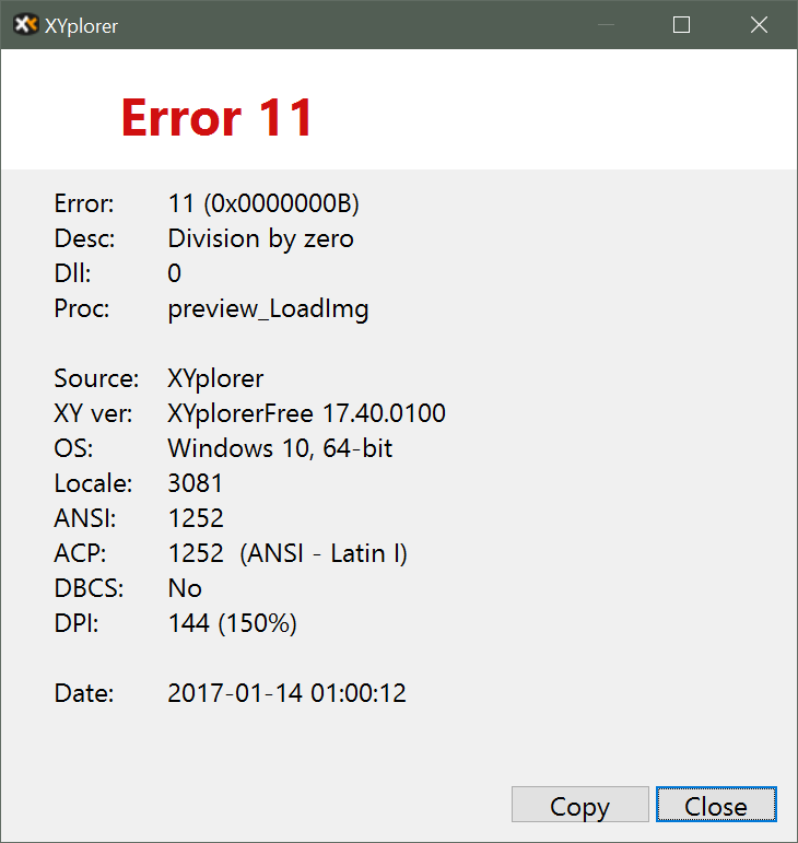
Rare Division by Zero (massive props for handling it well though!):
Though I can't seem to trigger it right now, I often encountered a bug whereby navigating quickly, especially in folders residing on a network drive with lots of image previews being generated, caused the active pane to automatically navigate to the folder it was just in once again. I assume this triggers when thumbnail generation completes, but really I have no idea.
This bug is annoying enough on its own, but its effect can be compounded as it can trigger itself! I often noticed this while descending into a folder with a lot of images (a manga) then realising I was in the incorrect folder and quickly navigating back up. More often than not, a few keystrokes later, I'd be dropped back into the folder that I was just in. Unfortunately, this then SOMETIMES caused the exact same effect on the parent folder, and half a second later I'd be navigated back up again, which could SOMETIMES cause the same thing again on the child folder! Incredibly frustrating.
What's interesting is that this isn't restricted to the current pane. I've switched tabs or even switched panes after navigating up-down-up-down into a few sibling folders, and then had some of those open in the pane/tab I eventually switched to! This is the only time I have EVER had a use for the back button in a file browser. :)
When running as an explorer replacement, opening a folder from another application opens the folder in the most recent tab. This behaviour is kind of dumb, as it results in losing whatever location you were in previously. This is the only other time I've ever had a use for the back button in a file browser. :) Default behaviour should be to check if a tab with the requested folder is already open, and switch to it if it is, otherwise open a new tab.
Wishlist/Annoyances (Minor annoyances)
Why can't I use Tiles with a larger icon/thumbnail?
Why can't I restrict Tiles to one per line and receive the benefits of line numbers? Of course, this would allow tiles to grow horizontally to fill the space too, effectively giving a more detailed, multi-line "Details with Thumbnails" mode. This would be my ideal mode for everyday file browsing if it existed.
Type Ahead find times out much too quickly. I imagine some people might prefer this behaviour though, so why can't I set the amount of time until it times out? You could even set it to infinite with escape to cancel it instead!
There should be an option to have type ahead find actually trigger the live filter box instead.
As mentioned before, I have never had a use for the Back button in a file browser. Forward is even more useless. Why can't I have just up and down on my breadcrumbs bar? I don't use down either, but I can at least imagine a time where I could get used to using it.
Some of my colour filters only define a text colour, and some of my colour filters only define a background colour, however even with an 'undefined' text colour, it shows black text rather than the background colour. So I guess there's no real 'undefined' colour, it just gets set to black. I wish we COULD undefine the colour though, and that if there was still an undefined (text) colour after a match that it continued working through the list of colour filters to determine the undefined colour.
Wishlist (Things I want to see in the future)
I wish I could designate a list of image names to look for within a folder when generating thumbnail folders. That is, to use filenames other than the default "folder.xxx or, failing that, whatever image I find first", because I use poster.xxx for my video files, cover.xxx for music albums, artist.xxx for music groups, and cover.xxx (or simply 00.xxx or 01.xxx) for manga. As it stands, picking the first file out of the folder means these are correct for me about 50% of the time anyway, which is better than every other file viewer. In my specific case, I'd want to define my list of image names as "poster,cover,artist,folder" and select "If none of these are found, use the first image found". Other sensible options might include "If none of these are found, use a generic folder icon".
I'd love to see support for vertical bars which could be mounted to left/right edge of the window or between the panes/panels. I'd like to put all of my file operations that affect both panes in the middle, for example. Copy to other pane and so on. Even better if I can have them appear/disappear depending on which panels are open.
You should be able to create a button as a shortcut to an application by dragging that application (or a shortcut) onto an empty space on a buttons bar. Using buttons to launch applications requires some workarounds at the moment. Actually I've just realised I can use "Favourite Files" together with "Open Directly" to do something similar, so this is less important to me now.
Separate font/size selection for Tabs please. Currently the Main Contents font controls the Panes and Tabs together.
Separate font/size selection for Breadcrumb Bar. Currently it can only be changed by the user along with everything else IF they check a box for it in the Apply to... menu to the right of the font selection. For whatever reason, this is the only one not on by default.
OK so how about just having three main fonts? Main Font, Dialog Font, Text Font. Then, have checkboxes or radio buttons or modal dialogues or something to choose default/defined/custom font for each sub-item? Forget all the stuff I said about fonts before now, just do this.
If you want wider adoption in Japan, you have to allow people to pay using a Konbini. Steam did this when they decided to finally try targeting Japan about 2 years ago. It doesn't matter if the Japanese price is a little higher to support konbini stuff. Debit cards (not credit cards) are becoming more widespread in Japan, but it's definitely not the norm.
While I've hacked it in anyway by changing explorer's behaviour, there should be an option to have the default behaviour of a left-drag operation be "Do nothing". I'm surprised create shortcut wasn't an option either.
I can't create a button for RegEx rename, which is one of my most used features. This is kind of a minor thing, but considering you can already get a full list of all commands, it'd be nice to be able to create a button for any command from that menu, even if they don't all have pretty icons.
Wild wish here: Support for WebDAV that DOESN'T use Explorer's implementation. Explorer's implementation is broken at best. I do have a separate File Browser to handle this at the moment (WinSCP), and it is a fairly niche feature owing to Microsoft massively screwing up their implementation, but it would be nice to have everything in one place. Put this on the list next to the people who want FTP/SFTP/SCP/whatever support, probably in the "Never getting around to" box. For now though, WinSCP covers these needs just fine.
Summary
All in all, I really like XYPlorer, and I think it might become my primary file browser for all but a few special cases. The list above tends towards the negative aspects because I wanted them to be better documented, but there are far more positives than negatives in reality.
I'm definitely going to buy it, however I'm not yet at the point where I would recommend it to my non-technical friends without assistance, because I had far too many teething issues, but it is definitely a close call.