League of Legends loading screen redesign by PixelPoncho (November 2017)
PixelPoncho

In this article I would like to briefly explain what I did and why.
First of all I want to say that I was't going to do a full redesign of the loading screen. I wanted to refresh it and make it fit for 2017, because currently it looks really old. I guess it's something like the update from iOs 6 to iOS 7 five years ago.
I believe that if Riot doesn’t want to fully rethink the design of loading screen, add new graphics and animation (i.e. animated frames for the ultimate skins) and solve existing problems, then they should at least make cosmetic updates like that.
How has the loading screen changed over almost 10 years of the League of Legends existence? The background image has changed, and periodically it changes to a thematic one. Awards, which now overgrow frames, were added. That’s all for almost 10 years.
What I wanted to do when I started to redesign the loading screen?
Firstly, I tried to make the screen more "clean" and not so "stuffy". Currently it is quite dark, with very large shadows and a rather outdated design. Secondly I wanted to give it more personality.

Now let’s take a look at all the changes separately.
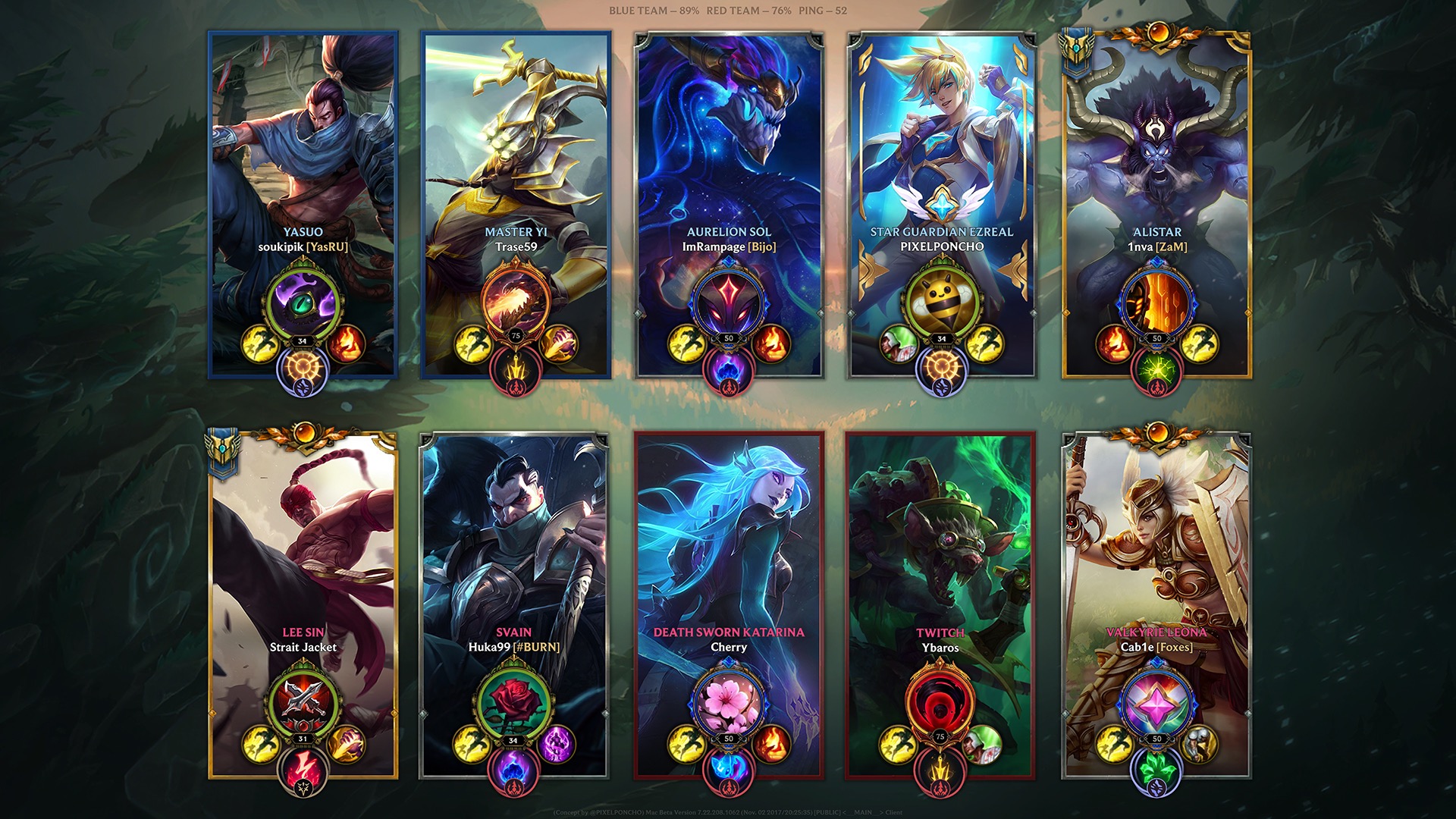
SPLASH ART
League of Legends is constantly replenished with more and more beautiful splash arts, so why hide them so much?
Splash art now takes up a much larger area. Now it is not covered by excessively large shadows and a rough frame underneath.
CHAMPION AND SUMMONER NAMES
There were no big changes as you can see. I just picked up a suitable font for the names, adjusted colors, and other trifles.
I agree that it looks quite simple, but for something more complex a redesign of the whole framework is needed. As you can remember, I just wanted to refresh loading screen so that it would correspond to our days.
SUMMONER ICON
I’ve made icon larger and placed it in the center of the frame – this change makes frame more personal.
The name is also above the icon, which correlates, unites them and makes up a more complex and balanced picture.
Icons are a reward for your achievements (or money) and they should occupy an important place in the frame. They personify the player. But on the current screen it's just a small, secondary picture in the corner of the frame.
Why not show other players your level? This is also an achievement, as well as the Champion Mastery Levels or Honor Levels. That's why the icon is beautifully framed depending on your level, which also shows your achievements.
In addition, the icons are now be round. The profile and client icons are round, but on the loading screen they are square, which is very strange and spoils some icons. I wanted very much like to bring them to a unified form.
SUMMONER SPELLS AND RUNES
Runes remained in the same form, but now they are located in a clean space and create a composition. I know that there is an opinion that it is necessary to colorize or somehow change the secondary rune. I tried different options.

In the end I still came to the conclusion that this arrangement creates a composition better. In addition, it was original Riot idea, and I'm sure that there were reasons for this.
Summoner Spells began to be placed in the same way as Runes. Yes, This is the biggest problem of my concept! Now one of them is smaller which can be confusing. But considering that in 90% of cases one of them is Flash, I decided this way will be better, because it emphasizes composition and creates symmetry.
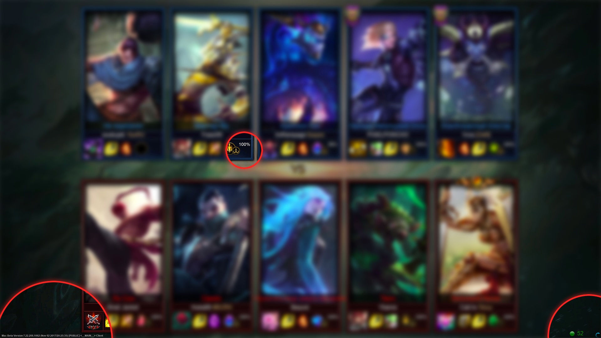
WHERE DID PERCENT AND PING GET LOST?
They are now in the lower left corner of the screen. There is still text with the client version in this place so I decided to place percents in the same way. I agree that this is not the best solution, but it is the most acceptable of all that I have tried. I even drew a separate graphics for this, but in the end I came to the conclusion that such a simple arrangement and designation would be the most acceptable. Something more interesting will require a more serious redesign of the whole loading screen.
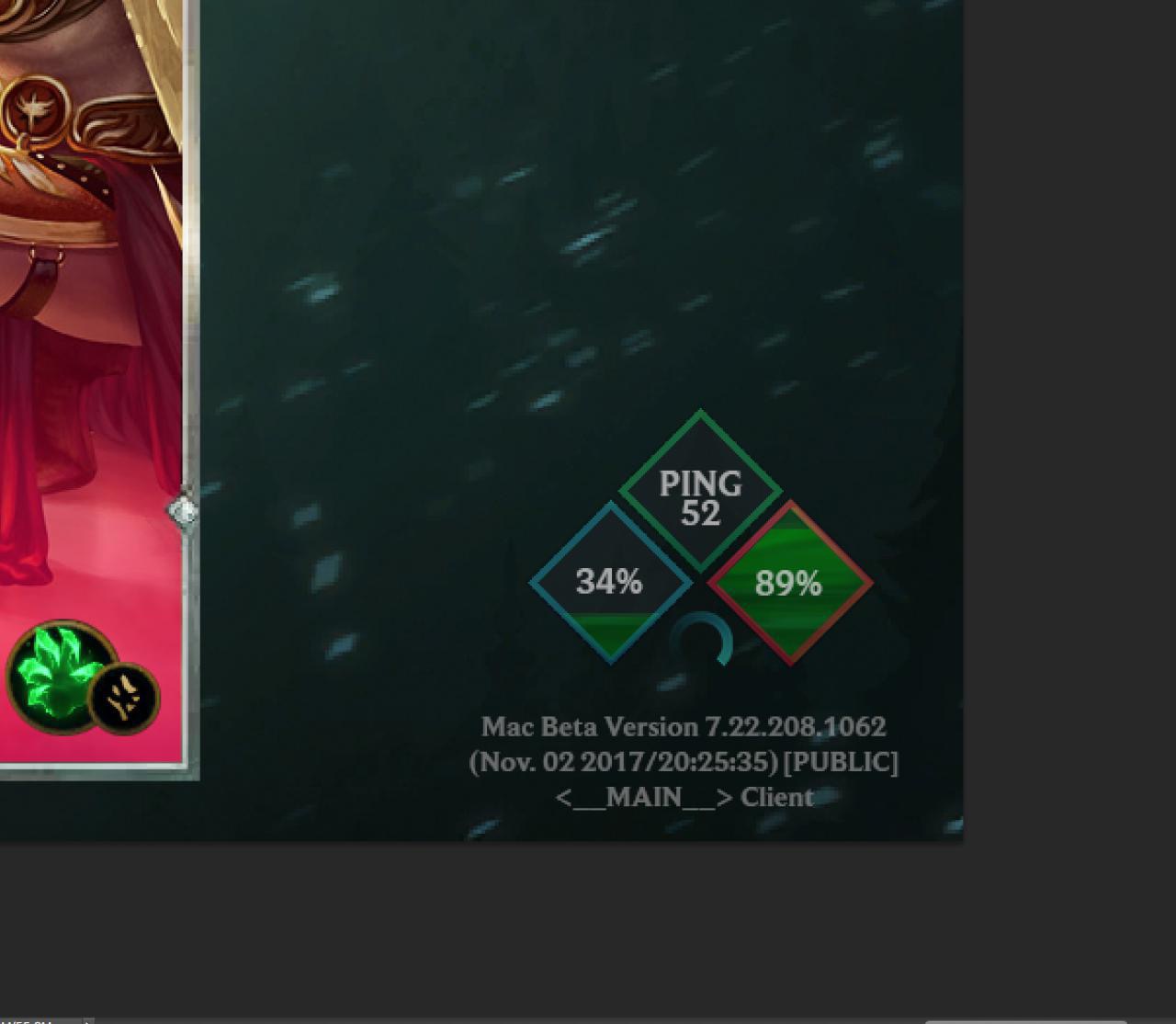
Also percentages are grouped by teams, not separate for each player.
To be honest any option is better than how it looks now. The percents placed on the first available space without any sense or design. Ping is in the lower right corner of the screen in the form of a huge circle with a number. Next to it is a loading wheel. This client version looks as if it is not the final product but some beta or developer mode...
I guess this is all I wanted to tell. Once again I note that I didn't want to do a global redesign of the loading screen, but just wanted to refresh it and remind the Riot again that it is very outdated. I'm not a professional designer or artist and I did it all for the sake of fun and I don't want my option to be in the game. Undoubtedly the loading screen should be redone by professionals, having thought over all the details, but it MUST be redesigned. But I still will be pleased if you liked my loading screen update :)
P.S. You might have noticed that I changed some icons, frames, awards and stuff. All this was done for more visibility and variation.
Also, here is the image on Imgure, if you want to save the image and see how it will look in a full screen mode on your PC
P.P.S. Sorry if I did some mistakes in this article. English is not my first language 🙁
PART 2
After I’ve posted my concept, I was bothered with the problems which still were not solved. From time to time I’ve returned to my concept and rethought some of its details. And now, a few days later, I made a second version of it in which I tried to solve some problems and make improvements.
Now let’s take a look at all the improvements separately.
SPLASH ARTS
In this version I’ve used the same shadow gradient for both teams. Thus, bright colors will not be badly combined with some splash arts anymore. Simple dark shadow is more universal and calm.
In addition, it seemed to me that only the name colors and unranked frames are not enough to separate two teams. I decided to try a quieter option (even tho I still love colors from first version 😢). In addition, it’s better suited to my idea to update the current loading screen, rather than to do a complete redesign.
PERCENT AND PING
I didn't really like them at the corner of the screen, so in this version I’ve put both at the top. Also I’ve made the client version text a little smaller but still readable and centered it at the bottom (just remove this completely already. Please.)
Now these things are easier to notice and much easier for you to read. I’ve decided to do that because this is the loading screen.
To be honest, it is possible to find a place in the center of the screen for percent, ping or tips. Unfortunately, I don't have enough artist skill to do something I would be satisfied with, but this would have been a better option in my opinion.

SUMMONER NAMES
Again, there are no big changes here, but I still made a few changes like resize, colors adjustments and shadowing for better readability
SUMMONER ICONS
The icon and its frame became smaller and now are located slightly higher. Icons now are framed by your chosen runes and summoner spells.
RUNES AND SUMMONER SPELLS
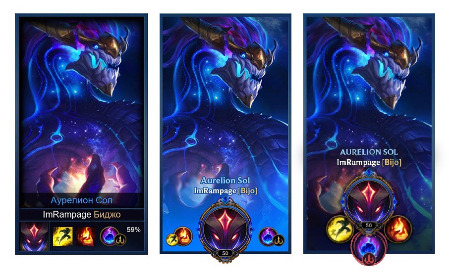
I finally figured out how to combine the keystone and the secondary rune into one simply and beautiful object!

I took the keystone art, put it in to the "nest" of the secondary rune and added secondary rune icon on the bottom. The central element is still the keystone, but the secondary rune now takes up more space in the composition, more obvious and understandable. And of course it is now colored.
I think that even if you apply this to the current loading screen, it will still work pretty well. Here is an example of how these runes would look in the current version of the loading screen.

Also, thanks to this, the summoner spells are now of the same size, which solves the main problem of the first version of my concept.
I've tried a bunch of different options for the location and size of the summoner spells and runes.

But I liked the final result the most and I consider it to be the best available. For something more beautiful, you need a more serious redesign of the loading screen, and not just a small update.
In a conclusion, I want to say that the second version of my concept was much more peaceful. It is more suited to the idea of the update, rather than a complete redesign of the loading screen. In addition, now it is much more informative, but still aesthetically more pleasant than the current live version.
Also, here is the image on Imgur, if you want to save the image and see how it will look in a fullscreen mode on your PC.
Once again I note that I didn't want to do a global redesign of the loading screen, but just wanted to refresh it and remind the Riot again that it is very outdated. I'm not a professional designer or artist and I did it all for the sake of fun and I don't want my option to be in the game. Undoubtedly the loading screen should be redone by professionals, having thought over all the details, but it MUST be redesigned. But I still will be pleased if you liked my loading screen update 🙂
P.S. Sorry if I did some mistakes in this article. English is not my first language 🙁