League of Legends loading screen redesign by PixelPoncho (July 2018)
PixelPoncho
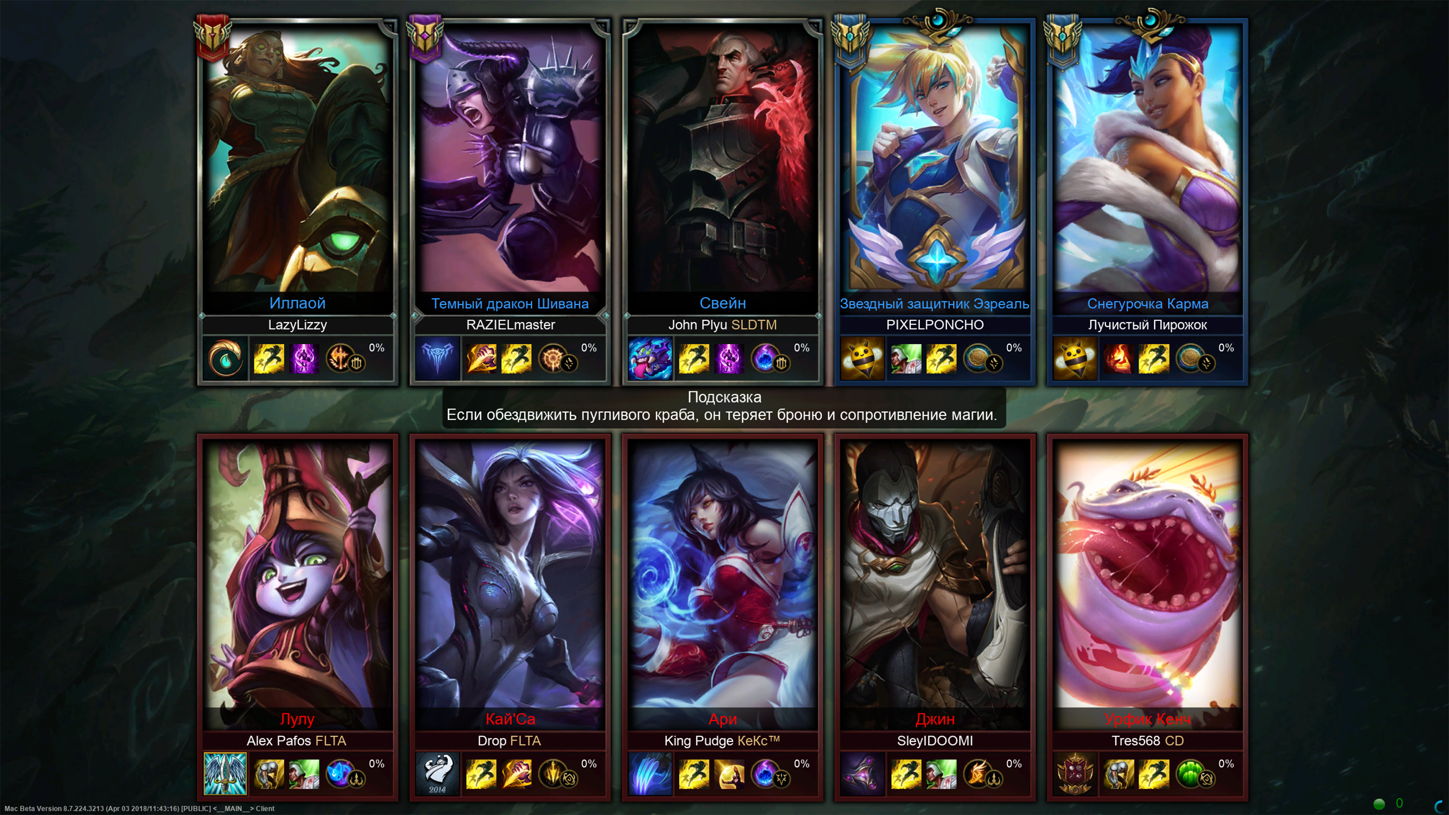
– Increased Champion "cards" almost by 25%.
This give us much more space for the beautiful splash arts, summoner icons and all information.
One of the negative effects of this decision is visual grouping of the teams but I guess this is acceptable considering other benefits that we have

– This is a loading screen, right?
So I made a loading circle for the each player
It has two different types

When your loading progress is less than 100%, circle has a visual effect of processing
When it’s 100%, then the progress ring looks complete and has a little bit more green gradient and numbers are painted in the same color as the circle
I did it to have a clearer vision which of the players have already loaded, and which of them are still in process.
I added these small circles for a better visual understanding of what do these numbers actually mean (like a battery icon near the charge percentage on your mobiles). I think that currently the percentages of the loading progress are shown very badly. First of all, this is a loading screen and the visibility problem is to be very well thought out and solved if Riot do redesign
In addition, this design fits well with the summoner spells and runes circles. So it looks like a line of 4 circles with information, but visually the loading circle is slightly separated thanks to a secondary rune

Also you might have noticed that I drew another type of circle for a large rune. So the differences between runes and spells will be a little bit better seen

– Summoner icons are now framed by beautiful level frames
Level frames have three different types: Profile, Statistic screen and little one for client
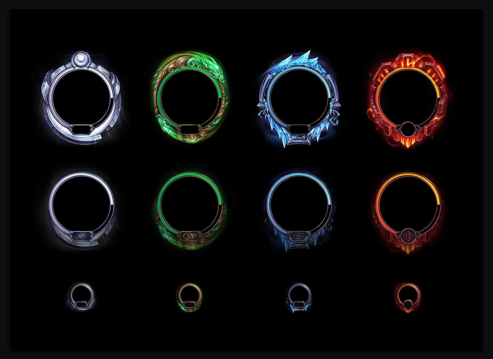
I’ve spent some time trying to solve the problem of the overly detailed profile frames for such small sizes as they are on the loading screen
I’ve tried different solutions of this problem - like using statistic screen type of frames. But at the end I've solved it by taking profile frames and enlarging area containing lvl numbers
– Divisions
As you can see I haven’t included divisions on the ranked boards.
I’ve tried a couple of options of how I can include divisions in my concept, and I think this little insignia might be not bad

But I decided to just leave this issue for a complete redesign
– Some fun things 🙂
These are some early stages of my concepts before I’ve increased champion "cards". In case you want to see how my concept might look like with the current sizes of champion "cards"

Here are also some thoughts from early stages of summoner icons frames design. I guess this type of frames does really great work but it's kinda boring

And so here...why not 😄

In a conclusion, I want to say that the third version of my concept was much more realistic and closer to the current one. As always the idea is to do a little update of the loading screen, not full redesign, and this concept suits to that idea. In addition, now it is much more informative, but still aesthetically more pleasant than the current live version.
Also, here is the image on Imgur, if you want to save the image and see how it will look in a fullscreen mode on your PC.
Once again I note that I didn't want to do a global redesign of the loading screen, but just wanted to refresh it and remind the Riot again that it is very outdated. I'm not a professional designer or artist and I did it all for the sake of fun and I don't pretend that my concept to be in the game. Undoubtedly the loading screen should be redone by professionals, who will think over all the details, but it MUST be redesigned.
But I still will be pleased if you like my loading screen update 🙂
P.S. Sorry if I did some mistakes in this article. I would be happy to express my thoughts more interestingly and extensively, but English is not my first language 🙁