Data Analysis Of Disney+ Using Python
python.plainenglish.io - Rohit Kumar Thakur
Data Analysis Of Disney+ Using Python
What you should watch on Disney+? Which month is perfect for adding a Disney+ subscription? Ratings of Disney Movies and shows and more.

Nov 26 · 6 min read

Hello, Data Scientists!
If you are following me on the medium from the beginning then, We have done several data visualization projects on different topics. Marvel vs DC, Spotify data analysis, Zomato analysis, Cars data analysis, and many such topics. If you miss out then here is the complete list of data science projects. Now, in the article, we are going to do some visualization and analysis of Disney data. We all know that Disney + is a big streaming platform where you can watch different shows and movies. So, without wasting more time, let’s start the project.
Disney+
The link to download the dataset is available at the end of this article.
You can write the Python code in Jupyter Notebook, Google Colab, or any other preferred editor. I will recommend you Google Colab because I use it more often.
Code & Analysis
- Import the libraries
#for mathematical computationimport numpy as np
import pandas as pd
import scipy.stats as stats#for data visualizationimport seaborn as sns
import matplotlib.pyplot as plt
import plotly
import plotly.express as px
from matplotlib.pyplot import figure
import plotly.graph_objects as go
import plotly.figure_factory as ff% matplotlib inline
- Let’s load the data and take a sneak peek at the data.
df = pd.read_csv("/content/disney_plus_titles.csv", encoding='latin-1')
df.head()

We have type, title, director name, cast, country, release year, rating, and much more.
- Gather some more information of data.
df.info()
We have mainly object and integer data types. Few data of some columns are not available. Let's move to the next part.
- Adding some Feature
Before we perform some further operations, we have to add some features to our data. It’s not mandatory but we are going to need them in our analysis
disney_movies = df[df.type == 'Movie']
disney_shows = df[df.type == 'TV Show']df["date_added"] = pd.to_datetime(df['date_added'])
df['year_added'] = df['date_added'].dt.year
df['month_added'] = df['date_added'].dt.monthdf['season_count'] = df.apply(lambda x : x['duration'].split(" ")[0] if "Season" in x['duration'] else "", axis = 1)
df['duration'] = df.apply(lambda x : x['duration'].split(" ")[0] if "Season" not in x['duration'] else "", axis = 1)
Run this cell, In the next cell, print out the first 5 values of our data using the code df.head(). You notice that we have now three different columns.
- Movies or TV Shows on Disney +
fig = plt.figure(figsize = (10,10))
ax = fig.subplots()
df.type.value_counts().plot(ax=ax, kind='pie')
ax.set_ylabel("")
ax.set_title("Movies & Shows")
plt.show()
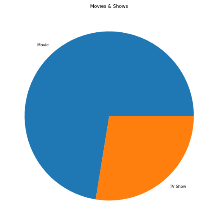
You can see that Disney focuses more on Movies than TV Shows. Maybe because Disney has an audience that prefers movies over TV Shows.
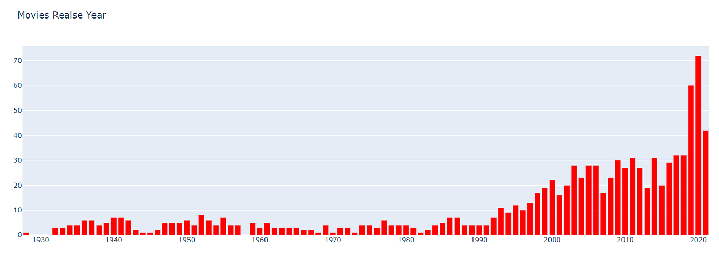
- The original release year of movies and Shows on Disney+
col = "release_year"dm = disney_movies[col].value_counts().reset_index()
dm = dm.rename(columns = {col : "count", "index": col})
dm['percent'] = dm['count'].apply(lambda x : 100*x/sum(dm['count']))
dm = dm.sort_values(col)fig1 = go.Bar(x = dm[col], y=dm['count'], name='Movies', marker=dict(color='red'))
data = [fig1]
layout = go.Layout(title='Movies content added on disney', legend=dict(x=0.1, y=1.1, orientation='h'))
fig = go.Figure(data, layout=layout)
fig.show()
col = "release_year"ds = disney_shows[col].value_counts().reset_index()
ds = ds.rename(columns = {col : "count", "index": col})
ds['percent'] = ds['count'].apply(lambda x : 100*x/sum(ds['count']))
ds = ds.sort_values(col)fig2 = go.Bar(x = ds[col], y=ds['count'], name='TV Shows', marker=dict(color='red'))
data = [fig2]
layout = go.Layout(title='TV Shows content added on disney', legend=dict(x=0.1, y=1.1, orientation='h'))
fig = go.Figure(data, layout=layout)
fig.show()
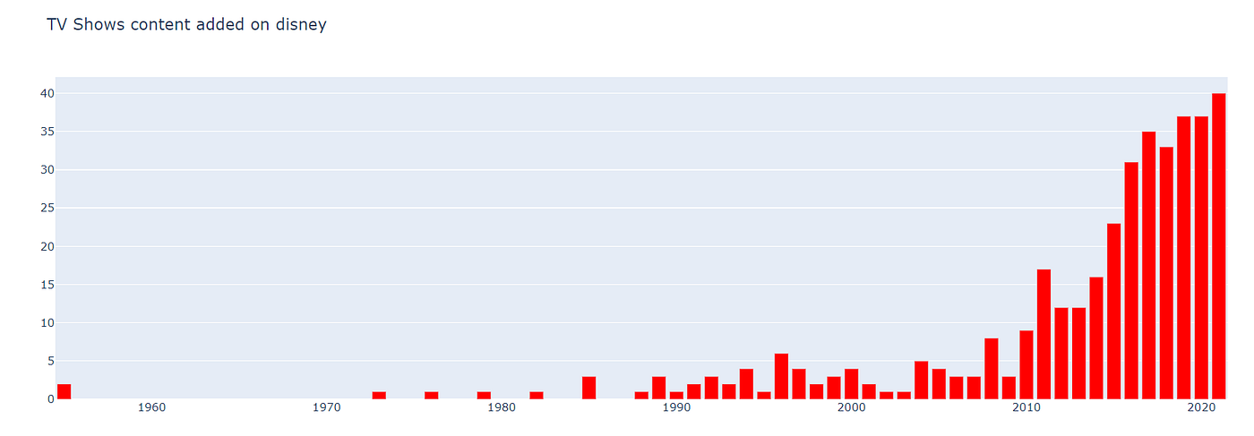
Here, you have the original release year of movies and shows available on Disney+. You can see that the quantity of content is rising over the years. More people get opportunities to work and more people are investing in them. So, if you want to become an actor or something then start today. Because you can see that the quantity of content on the OTT platform is rising over the years and it will rise dramatically because of the growth of the audience.
- Content Added oN Disney+ Over the Year
col = "year_added"vc1 = disney_shows[col].value_counts().reset_index()
vc1 = vc1.rename(columns = {col : "count", "index" : col})
vc1['percent'] = vc1['count'].apply(lambda x : 100*x/sum(vc1['count']))
vc1 = vc1.sort_values(col)vc2 = disney_movies[col].value_counts().reset_index()
vc2 = vc2.rename(columns = {col : "count", "index" : col})
vc2['percent'] = vc2['count'].apply(lambda x : 100*x/sum(vc2['count']))
vc2 = vc2.sort_values(col)trace1 = go.Bar(x=vc1[col], y=vc1["count"], name="TV Shows", marker=dict(color="#a678de"))
trace2 = go.Bar(x=vc2[col], y=vc2["count"], name="Movies", marker=dict(color="#6ad49b"))
data = [trace1, trace2]
layout = go.Layout(title="Content added over the years on Disney+", legend=dict(x=0.1, y=1.1, orientation="h"))
fig = go.Figure(data, layout=layout)
fig.show()
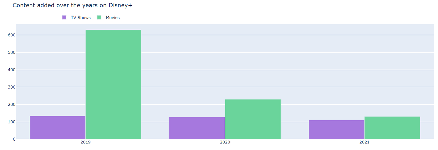
In the Year 2019, Disney+ has added more than 600 movies to their platform. But after that, the graph of movie addition is declined may be due to covid-19 problem. I don’t see a much larger difference in the addition of TV shows to their platform over the years. Maybe because Disney focuses more on Movies than TV Shows.
- Disney+ Content Ratings
fig3 = plt.figure(figsize = (10,10))
ax = fig3.subplots()
df.rating.value_counts().plot(ax=ax, kind='pie')
ax.set_ylabel("")
ax.set_title("Disney Rating")
plt.show()
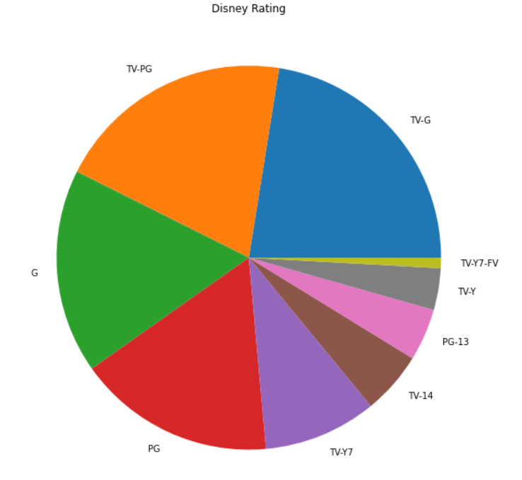
Almost 60% of Disney+ content is rated TV-G, G, and TV-PG.
- Distribution of Movie Duration
disney_movies = df[df.type == 'Movie']
disney_shows = df[df.type == 'TV Show']import plotly.figure_factory as ff
x1 = disney_movies['duration'].fillna(0.0).astype(float)
fig = ff.create_distplot([x1], ['a'], bin_size=0.7, curve_type='normal', colors=["red"])
fig.update_layout(title_text='Distplot with Normal Distribution')
fig.show()

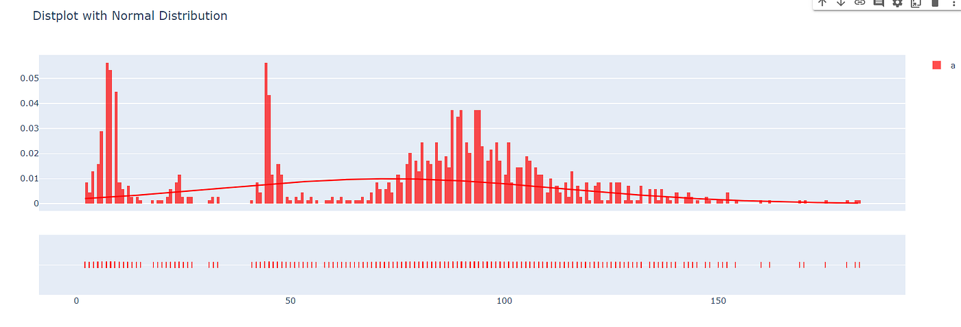
The duration of most movies on Disney+ is lying between 75 to 140 minutes.
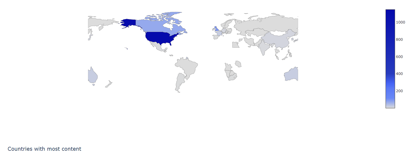
Now due to a large number of lines of code, I can’t write it here. But you can’t check out my Google Colab Code. In the Google Colab code, you will find out geography-wise content distribution, old movies, and shows on Disney+I want to give credit to Shivam Bansal for helping me out.

Well, that’s it for this article.
If this article sounds informative to you, make sure to follow and share it with your geek community.
You can download the dataset from this link
Source python.plainenglish.io