TYPE OF CHARTS/GRAPHS
Jacky Sieras (Lau👽🖖)Types of Graphs and Charts
There are various types of graphs and charts used in data visualization. However, in this article, we'll be covering the top 11 types that are used to visualize business data.
Bar Chart/Graph
A bar chart is a graph represented by spaced rectangular bars that describe the data points in a set of data. It is usually used to plot discrete and categorical data.
The horizontal axis of the chart represents categorical data while the vertical axis of the chart defines discrete data. Although the rectangular bars in a bar chart are mostly placed vertically, they can also be horizontal.

For horizontally placed rectangular bars, the categorical data is defined on the vertical axis while the horizontal axis defines the discrete data.
Types of Bar Chart
- Grouped Bar Chart
Grouped bar charts are used when the datasets have subgroups that need to be visualized on the graph. Each subgroup is usually differentiated from the other by shading them with distinct colors.
- Stacked Bar Chart
The stacked bar graphs are also used to show subgroups in a dataset. But in this case, the rectangular bars defining each group are stacked on top of each other.
- Segmented Bar Chart
This is the type of stacked bar chart where each stacked bar shows the percentage of its discrete value from the total value. The total percentage is 100%
Advantages of a Bar Chart
- Summarizes a large amount of data in an understandable form.
- Easily accessible to a wide audience.
Disadvantages of a Bar Chart
- It does not reveal key assumptions like causes, effects, patterns, etc.
- May require further explanation.
Pie Chart
A pie chart is a circular graph used to illustrate numerical proportions in a dataset. This graph is usually divided into various sectors, where each sector represents the proportion of a particular numerical element in the set.

Just like a pizza is divided into different slices, each sector in a pie chart represents the proportion of an element in the dataset. The proportion is defined by the degree of the sector and the percentage area with respect to the area of the circle.
Types of Pie Chart
- Simple Pie Chart
This is the most basic type of pie chart and can also be simply called a pie chart.
- Exploded Pie Chart
In an exploded pie chart, one of the sectors of the circle is separated (or exploded) from the chart. It is used to lay emphasis on a particular element in the data set.
- Pie of Pie
As the name suggests, a pie of pie is a chart that generates an entirely new (usually small) pie chart from the existing one. It can be used to reduce clutteredness and lay emphasis on a particular group of elements.
- Bar of Pie
This is similar to the pie of pie, with the main difference being that a bar chart is what is generated in this case rather than a pie chart.
- 3D Pie Chart
This is a type of pie chart that is represented in a 3-dimensional space.
Uses of Pie Chart
- It summarizes data into a visually appealing form.
- It is quite simple compared to many graph types.
Disadvantages of Pie Chart
- It is inapplicable for large datasets.
- It cannot visualize groups of data.
Line Graph or Chart
Line graphs are represented by a group of data points joined together by a straight line. Each of these data points describes the relationship between the horizontal and the vertical axis on the graph.

The graph may ascend, descend, or do both depending on what kind of data is being visualized. When studying the relationship between price and supply, it goes down and for peace and demand, it goes up.
When constructing a line chart, you may decide to include the data points or not.
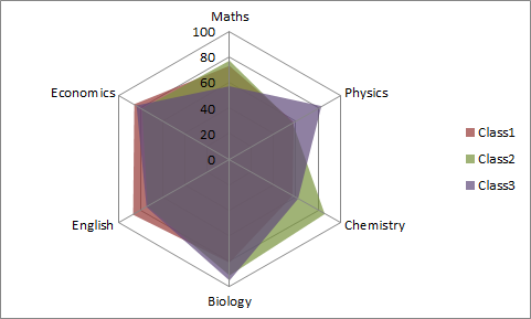
Radar Chart
A radar chart is a graphical method used for displaying multivariate data in the form of a two-dimensional chart of three or more quantitative variables represented on axes starting from the same point. (Source: Wikipedia). It is also called the spider graph.